Loading...
Loading...
Landing pages that compare products, services, or solutions against competitors, highlighting competitive advantages to drive purchase decisions.
17 examples in this category

Recently Added

Recently Added

Recently Added

Recently Added

Recently Added
Recently Added
Recently Added
Recently Added
Recently Added
Recently Added
Recently Added
Recently Added
Recently Added
Recently Added
Recently Added
Recently Added
Recently Added
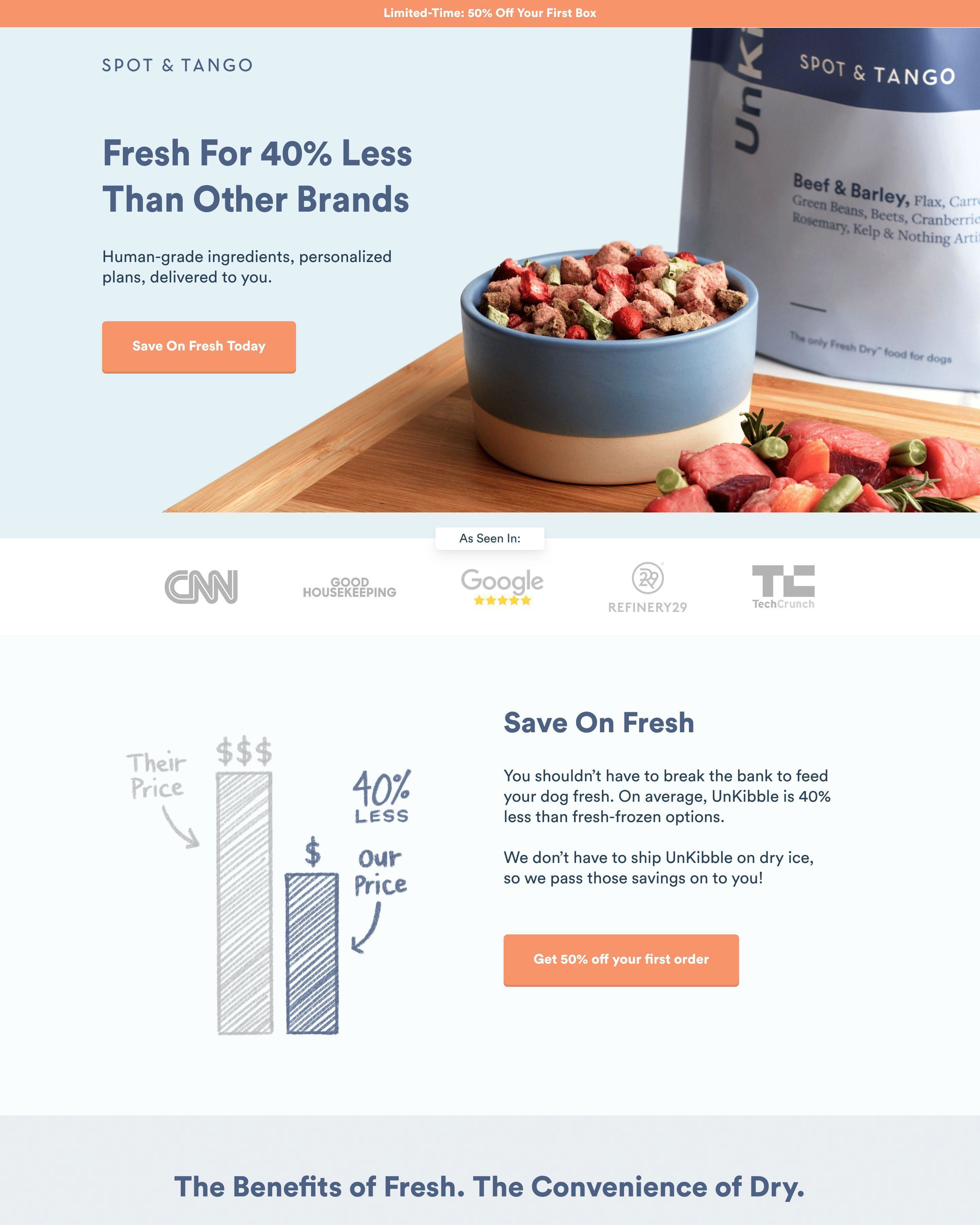
Comparison pages capture the highest-intent traffic available. Someone searching "Gleap vs Intercom" or "Autobrush vs manual" has already decided to buy something. They just need help choosing. Your comparison page makes that choice obvious.
Gleap built their entire positioning around being a better Intercom alternative. The page shows pricing side-by-side. It lists features Intercom charges extra for that Gleap includes. This is not subtle, and it does not need to be. Comparison shoppers want direct answers.
Monday.com takes a similar approach but focuses on enterprise features. The page shows how Monday stacks up against competitors for team collaboration. Specific, honest comparisons win trust.
See our expert picks: Best Landing Page Examples of 2026 →
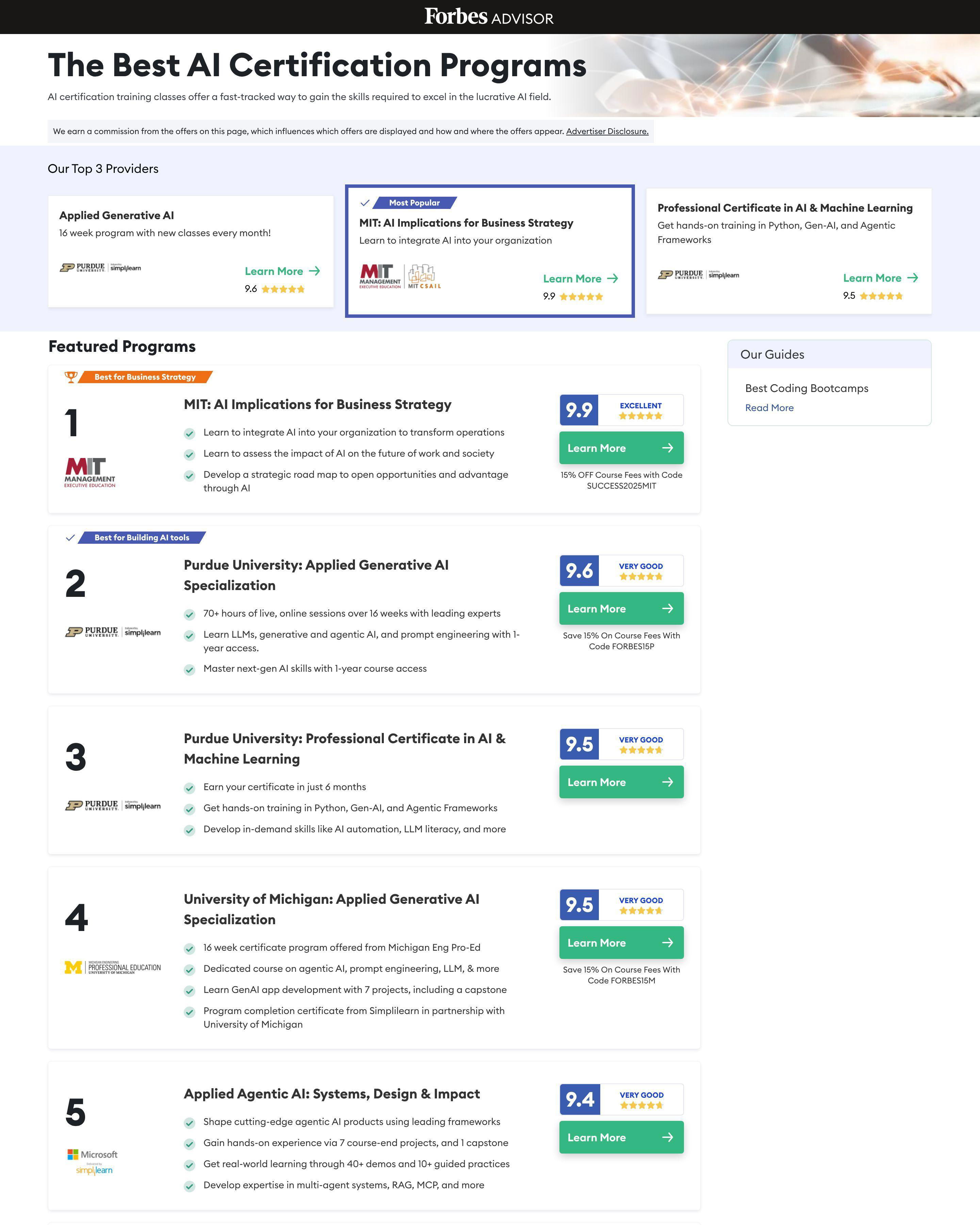
Pattern 1: Side-by-Side Feature Tables
Gleap displays a feature comparison table prominently. You vs. Them, feature by feature. Autobrush compares automated brushing against manual with clear metrics. These tables work because they answer questions immediately. Visitors do not need to click around or do mental math.
Pattern 2: Honest Positioning
Monday.com does not claim to beat competitors at everything. The comparison acknowledges where alternatives have strengths while emphasizing their own advantages. This honesty builds credibility. Visitors trust pages that do not oversell.
Pattern 3: Switching Incentives
Comparison pages often target users of competing products. Jones Road Beauty's comparison pages speak to customers frustrated with conventional makeup. Hollow Socks compares against standard socks with specific comfort benefits. The message: switching is easy and worth it.
What makes a good comparison landing page?
Specificity and honesty. Gleap wins by showing exact pricing differences: "119/month vs 850/month." Vague claims like "we're better" do not convert. Show the data. Let visitors draw conclusions from evidence, not assertions.
What conversion rate should a comparison landing page achieve?
Comparison pages convert at 10-20% because visitors arrive with high intent. Monday.com and Gleap capture users actively evaluating alternatives. These visitors have budget, need, and timeline. If your comparison page converts below 10%, the page is not meeting visitor expectations.
How long should a comparison landing page be?
Comprehensive but scannable. Autobrush provides detailed comparisons for readers who want depth. Feature tables let scanners get answers quickly. Most comparison pages run 1000-2000 words with clear sections that allow jumping to relevant comparisons.
What is the most important element on a comparison landing page?
The comparison table or key differentiator. Gleap leads with pricing difference because it is their biggest advantage. If your main differentiator is features, lead with features. If it is ease of use, show the simpler interface. Front-load your strongest argument.