Loading...
Loading...
Landing pages offering free trials or demo access to products and services, designed to lower barriers to entry and convert visitors into trial users.
20 examples in this category

Recently Added

Recently Added

Recently Added

Recently Added

Recently Added

Recently Added

Recently Added

Recently Added

Recently Added
Recently Added

Recently Added

Recently Added
Recently Added
Recently Added
Recently Added
Recently Added
Recently Added
Recently Added
Recently Added
Recently Added
Free trial pages remove excuses. Price objection? Gone. Commitment fear? Eliminated. The only question left is whether the product solves a real problem. These pages make trying risk-free.
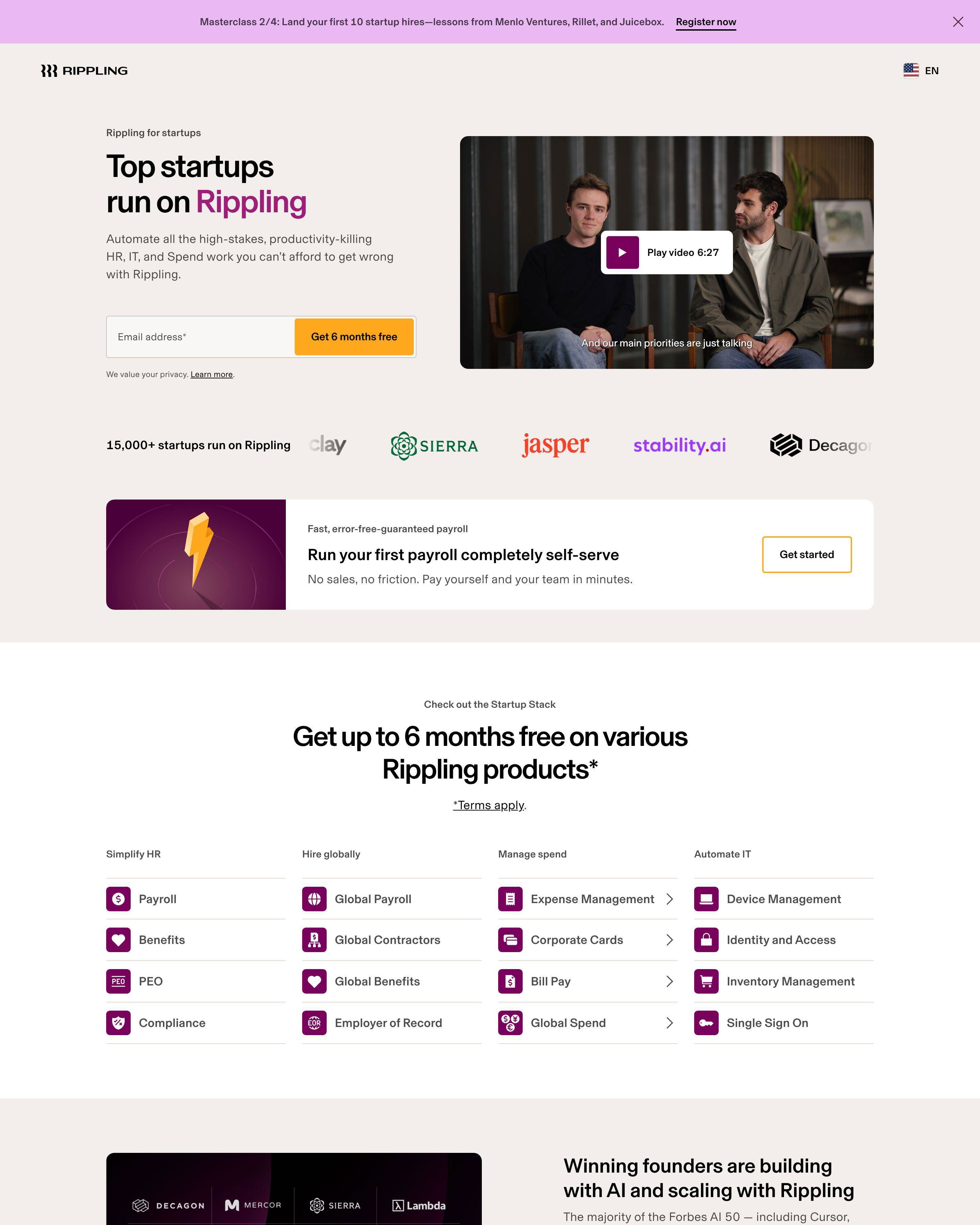
Shopify leads with a simple proposition: "Start free trial." No credit card required. The barrier to trying is typing one email address. Digital Ocean goes further, offering $200 in free credits. When the cost of trying is zero and the potential value is significant, conversion math tips in your favor.
The best free trial pages understand that trial quality matters more than trial quantity. Betterstack and Freshdesk attract users who actually need the product. Unqualified trials waste support resources and skew conversion data.
See our expert picks: Best Landing Page Examples of 2026 →
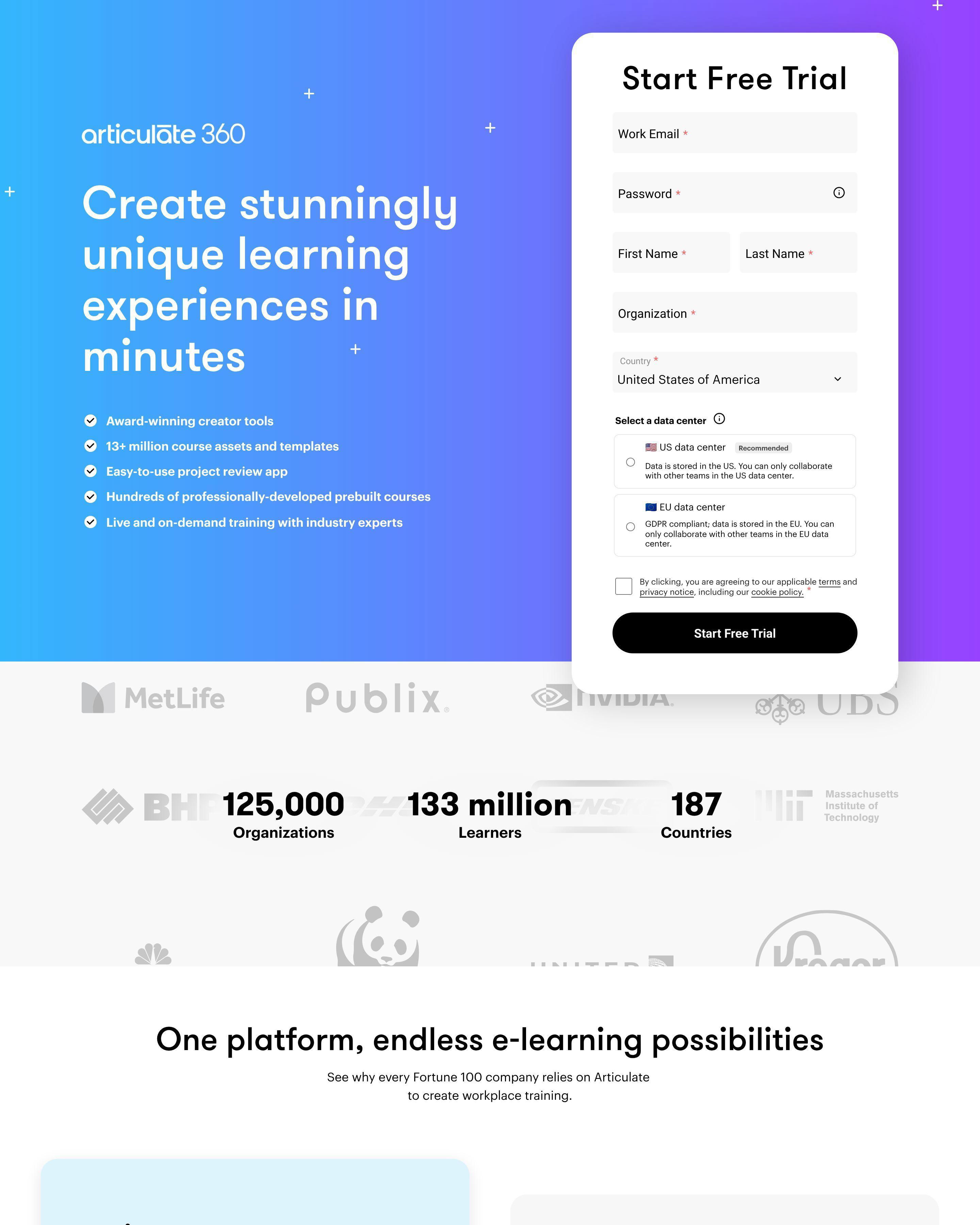
Pattern 1: Minimal Form Fields
Shopify asks for an email. That is it. ActiveCampaign keeps signup simple. Woodpecker follows the same pattern. Every additional field you add reduces completions. Free trial pages succeed by making the first step as easy as possible. Collect more information during onboarding, not before.
Pattern 2: No Credit Card Required Messaging
MongoDB Atlas, Digital Ocean, and Google Workspace all emphasize "no credit card required" or equivalent messaging. This phrase directly addresses the biggest trial objection: "What if I forget to cancel?" Removing payment friction increases trial starts significantly.
Pattern 3: Immediate Value Proposition
Betterstack says "the most reliable uptime monitoring" immediately. Freshdesk promises "effortless customer service." ActiveCampaign leads with automation benefits. Visitors need to understand what they will experience in the trial before they start. Vague promises do not convert.
What makes a good free trial landing page?
Friction elimination. Shopify converts because starting takes seconds. Freshdesk converts because the value is clear. Remove every obstacle between landing and trial activation. Ask only what you absolutely need to create the account.
What conversion rate should a free trial landing page achieve?
Trial starts should hit 10-25% from qualified traffic. Shopify, Digital Ocean, and MongoDB optimize their pages constantly. The real metric is trial-to-paid conversion. A 50% trial start rate with 1% conversion beats a 10% trial start rate with 20% conversion.
How long should a free trial landing page be?
Short for simple products, longer for complex ones. Woodpecker keeps their cold email page minimal. Google Workspace shows pricing tiers because enterprise buyers compare options. If your product requires explanation, provide it. If not, get out of the way.
What is the most important element on a free trial landing page?
The signup form and CTA button. ActiveCampaign makes "Get started" prominent and the form simple. Betterstack places their CTA above the fold. The path from landing to trial must be obvious and fast. Every second of confusion costs conversions.