Here’s a frustrating scenario: Your landing page is gorgeous. The headline grabs attention, the copy flows beautifully, and visitors are clearly engaged. They’re scrolling, they’re reading, they’re practically leaning into their screens.
Then…nothing.
So, what’s going wrong?
While you’re tweaking colors and testing new headlines, the real problem might be hiding in plain sight: your call-to-action (CTA) buttons.
In this blog post, we’re sharing real-life call to action examples that work so your ad spend starts pulling its weight.
What is a Call to Action (CTA)?
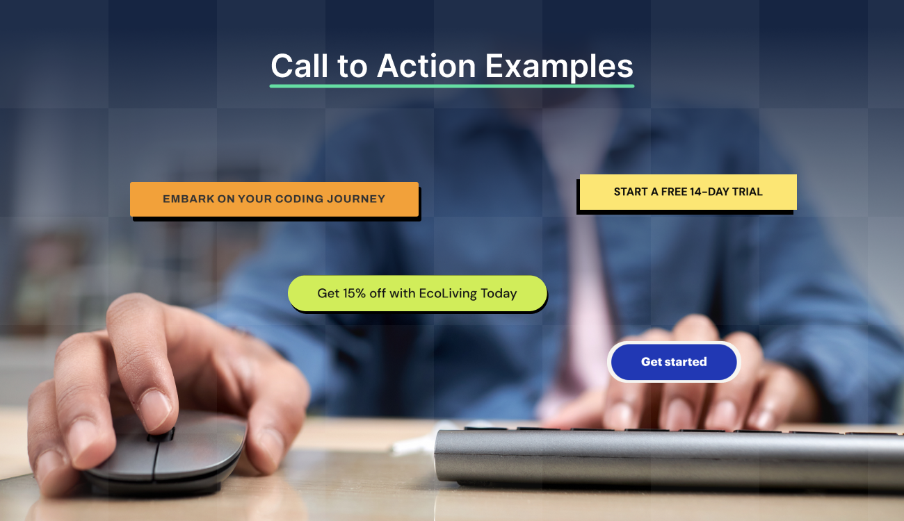
A call to action is a prompt that encourages your audience to take a specific step, such as clicking a link, leaving a comment, visiting a product page, or making a purchase.

CTAs can take different forms, including:
- Text links
- Buttons
- Plain text without a link
Short, direct phrases like “Buy Now” or “Download Now” are common, but CTAs can also be longer and more detailed. For example, “Subscribe today so you never miss a post.” There’s plenty of room for creativity depending on your goal.
Strong CTAs guide users by reducing decision fatigue and giving your content direction. Even something simple can help people understand what to do next. If your CTA keeps users engaged and nudges them toward the next step, it’s doing its job.
Why CTAs Matter for Paid Marketing Campaigns
Let’s understand why you need CTAs for your campaigns.
Improves Conversion Focus
A strong CTA directs users toward the desired action, making it easier to convert clicks into leads or sales. Without a clear CTA, users may hesitate or leave without engaging.
| For example, a Facebook ad for a SaaS product with the CTA “Start Your Free Trial” immediately informs users of the next step, increasing the likelihood that they’ll sign up. A vague CTA, such as “Learn More,” can cause hesitation. |
Ensures Ad and Page Message Match
When someone clicks your ad promising “Get Your Free Quote” but lands on a page that says “Request Information,” they feel tricked. That split-second confusion is enough to make them hit the back button. Visitors expect your landing page to deliver exactly what your ad promised, word for word.
Aligning your CTAs ensures that expectations set in the ad are fulfilled immediately.
| For example, when someone clicks your Google ad promising “Get Your Free Website Audit” but lands on a page with a CTA that says “Start Free Trial,” they feel bait-and-switched. They came for a specific audit, not to sign up for your software platform.That jarring disconnect makes them question whether you’ll actually deliver what they wanted. |
Enables Better Tracking and Testing
Your CTA is a data goldmine. Each button click gives you precise insights into what motivates your audience and which messages actually drive action.
Think about it this way: When you test “Download Free Guide” against “Get Your Marketing Playbook,” you’re discovering whether your audience wants something generic or craves specificity. The winner tells you exactly how to talk to these people in every future campaign.
| Take a SaaS company testing three CTAs: “Start Free Trial” vs. “See Demo” vs. “Get Started Free.” The results reveal whether their audience prefers trying the product hands-on, watching it in action, or being reassured about cost.This data then informs everything from future ad copy to email campaigns. |
Types of CTAs PPC Marketers Use
Marketers use a variety of CTAs depending on their campaign goals, user journey, and interface design.
Each CTA type has unique advantages and suits different scenarios within PPC landing pages or ad experiences. Understanding these types helps you select and optimize CTAs to boost engagement and conversion rates.
Button CTAs
Button CTAs are the most common and straightforward form of CTA used in PPC campaigns. These are clickable buttons embedded within landing pages or ads that prompt users to take a specific action, such as starting a free trial, “Buy Now,” “Sign Up,” or “Get a Quote.”

These CTAs are visible and designed to stand out through color contrast, size, and placement. This makes them easy for visitors to find and interact with.
Pop-Ups and Slide-Ins

Pop-ups and slide-ins are dynamic CTAs that appear over or alongside the main page content. They trigger based on user behavior, such as time spent on the page, scrolling depth, or exit intent (when a user’s cursor moves toward the browser’s close button).
These CTAs capture attention without relying solely on static page elements.
Additionally, pop-ups and slide-ins often promote special offers, call bookings, newsletter signups, or downloadable content. This encourages users to engage before they leave the page.
Forms and Opt-Ins

Forms are interactive elements embedded into landing pages to collect user details—typically in exchange for something of value, like a downloadable resource, webinar access, or a free trial. They act as entry points for lead generation.
When these forms require users to actively agree and submit their information, they become opt-in forms. This distinction matters; opt-ins signal permission-based marketing, helping you build a qualified and compliant lead list.
Effective forms are concise, focused, and paired with a strong call-to-action (CTA), such as “Download Now” or “Get Your Copy.” The goal: gather essential information without overwhelming users. A well-placed opt-in form can turn interest into intent, and intent into action.
Banners and Sticky Bars

Banners and sticky bars are placed at the top, bottom, or side of the webpage. They remain visible as the user scrolls, ensuring constant exposure to the CTA.
Sticky bars help highlight limited-time promotions, free shipping offers, or encourage newsletter signups without interrupting the browsing experience. Their unobtrusive nature makes them suitable for campaigns aiming to maintain user engagement.
For example, an e-commerce site might use a sticky bar at the top of the screen to promote “Free shipping on orders over ₹999—Ends Tonight” across every page. This keeps the offer visible during the entire session, subtly encouraging conversions without forcing a decision.
Social CTAs and Exit-Intents

Social CTAs integrate social proof and sharing capabilities within PPC campaigns. They might encourage users to “Follow Us,” “Share on Social,” or join a community, leveraging social engagement to build brand trust and expand reach.
Exit-intent CTAs are specialized pop-ups triggered when a user attempts to leave the page, offering last-minute incentives or reminders. These CTAs aim to reclaim abandoned visitors and increase conversion chances by presenting a compelling, timely offer.
How to Write a High-Converting CTA
A high-converting CTA tells your audience exactly what to do next and gives them a compelling reason to do it. Here’s how to write one that drives clicks, sign-ups, or sales.
Use Strong Action Verbs
The foundation of any compelling CTA is a strong action verb. These verbs tell users exactly what to do and inject energy into your copy. Instead of weak, passive language like “Click here” or “Submit,” use more specific and persuasive verbs such as:
- “Download Your Free Guide”
- “Start Your Free Trial”
- “Schedule a Demo”
- “Claim Your Discount”
Action-oriented language gives your CTA purpose and communicates a clear next step. The more direct and dynamic the verb, the more likely users are to act.
Build Urgency and Scarcity
People are more likely to act when they feel like they’re going to miss out on something valuable. This is where urgency and scarcity come into play. Adding time-sensitive or limited-availability language can increase the perceived importance of the action.
Phrases like:
- “Offer Ends Tonight”
- “Only 5 Spots Left”
- “Limited-Time Access”
- “Download Before It’s Gone”
Tap into your audience’s fear of missing out (yes, FOMO!) and motivate users to act now, rather than later. However, relying on fake scarcity or manufactured deadlines can backfire and damage trust if users realize the offer isn’t actually limited.
Make It Benefit-Focused
Rather than just telling users what to do, show them what they’ll get out of it. High-converting CTAs are benefit-driven; they highlight the value or outcome the user will experience after clicking.
For example, try swapping out a generic label like “Submit” with these options:
- “Get My Free E-Book”
- “Improve My Site Speed Now”
- “Boost My Sales Today”
Benefit-focused CTAs answer the user’s internal question: “What’s in it for me?” When users can see how the action benefits them, they’re more inclined to convert.
Keep It Short and Direct
Brevity is critical for CTAs. You only have a few words to capture attention and drive action, so your message must be concise. A great CTA is no longer than 5-7 words. Avoid fluff, jargon, or complex phrases that can confuse or overwhelm the user.
Examples of short and effective CTAs include:
- “Start Free Trial”
- “Book a Call”
- “Get Instant Access”
- “Try It Now”
Match Your CTA to Audience Intent
The most effective CTAs are aligned with the user’s stage in the buyer’s journey. If your visitor is at the top of the funnel (TOFU; awareness stage), asking them to “Buy Now” may be too aggressive. A soft CTA, such as “Learn More” or “Download the Guide,” may perform better.
Conversely, if your audience is lower in the funnel and already considering your offer, stronger CTAs, such as “Start Your Free Trial” or “Get 20% Off Today,” will convert more effectively.
| 💡 Pro Tip: Don’t guess what your users want, watch what they do. Use tools like heatmaps and session replays to see where they click, hesitate, or drop off. Pair that with direct feedback from on-page surveys to uncover what kind of CTA actually fits their mindset. Data beats assumptions every time. |
Best Call to Action Examples by Use Case
Looking for inspiration that fits your goals? Below are some of the best call-to-action examples, organized by use case so you can find exactly what works for your audience and where to use it.
SaaS Website CTA Examples
HubSpot
HubSpot is an inbound marketing, sales, and customer service platform designed to help businesses grow by attracting, engaging, and delighting customers through its CRM and marketing tools.

“Get a Demo” invites users to experience the product hands-on, which is key in the B2B space. Many HubSpot customers require a clear understanding of product capabilities before making a purchase. A demo builds trust and allows sales reps to tailor messaging to a user’s specific needs.
It reduces friction in the buyer’s journey by creating a low-pressure entry point and aligns with how enterprise users evaluate SaaS solutions.
| 💡 Pro Tip: Test CTAs that double as user status updates. For example, replace the usual “Get Started,” go with “Deploy My First Workflow” or “Generate My Custom Dashboard.” These create a sense of momentum as users feel like they’re already building something.This small shift turns passive interest into active ownership, which is exactly what most SaaS PPC traffic needs to convert. |
Evernote
Evernote is a popular productivity app that helps users organize notes, tasks, and projects seamlessly across devices.

The “Get Evernote Free” CTA highlights that the product is available for free use. It’s straightforward, simple, and instantly communicates value with no cost barrier.
Offering a free version allows users to try the product risk-free, which is critical for a freemium SaaS model. It encourages sign-ups and helps build a user base that can later be converted to paid plans.
E-Commerce CTA Examples
Glossier
Glossier is a direct-to-consumer (D2C) beauty brand founded in 2014, known for its minimalist skincare and makeup products, as well as a strong online presence.

“Shop Now” is a clear and urgent command that encourages users to browse and buy products immediately. It creates a sense of immediacy without any barriers.
In e-commerce, simplicity and clarity in CTAs are crucial for conversion. This CTA directs visitors straight to the purchase process, reducing distractions and boosting sales.
BarkBox
BarkBox is a subscription service delivering curated dog toys, treats, and goodies monthly.

“Get BarkBox” works because it feels personal and product-focused. It doesn’t ask you to “subscribe”; it offers something tangible.
You’re getting a box of treats and toys for your dog, not just signing up for a service. That small shift makes the CTA feel more like a reward than a transaction, which is exactly why it grabs attention and converts.
| 💡 Pro Tip: Run your top three CTAs as a rotating carousel on the product landing page: “Try Our Bestseller,” “Bundle & Save,” “Fast Checkout”. Track which one matches session time and device, then push the best performer as your default across all product ads.This turns call to action buttons into performance data collection tools. It’s a fast way to isolate your high-converting CTAs by behavior. |
Streaming Website CTA Examples
Hulu
Hulu is a popular streaming service offering live and on-demand TV, movies, and original content.

“Start your free trial” emphasizes a risk-free opportunity to try Hulu’s service. It’s both an invitation and reassurance.
For subscription-based platforms, offering a free trial lowers the barrier to entry, increases trial sign-ups, and sets the stage for converting users into long-term subscribers.
Netflix
Netflix is the world’s largest streaming platform, offering a vast selection of movies and TV shows.

“Get Started” is simple and inviting, encouraging users to begin the sign-up or exploration process without any pressure. Its broad wording caters to a wide audience, whether they want to browse, sign up, or learn more about the content. This flexibility makes it effective at attracting new users.
| 💡 Pro Tip: On genre-specific PPC campaigns, delay the main CTA by 3-5 seconds and show a short scene or character quote instead. Then load a CTA like “Start Streaming the Full Series” tied directly to that preview.Why it works? Pre-priming with content before a CTA lets you build emotional momentum. This leads to a response to something they just felt, which is how you build high converting CTAs without feeling transactional. |
Tech Website CTA Examples
Grammarly
Grammarly is an AI-powered writing assistant that helps users correct grammar and spelling and improve their writing style.

“Sign Up – It’s Free” communicates a no-cost, easy entry point, encouraging users to create an account and try the tool with no financial risk. The CTA lowers barriers to adoption, crucial for freemium tools.
Emphasizing the free aspect here appeals to users who want upfront value before potentially upgrading.
Service-Based Business CTA Examples
The Budgetnista
The Budgetnista offers financial coaching and resources primarily designed to help people manage their money effectively.

The “Take The 60 Sec Quiz” CTA promises quick value with zero commitment, which is exactly what skeptical or overwhelmed visitors need. For service-based businesses, this kind of CTA sidesteps the heavy “Book a Call” or “Sign Up Now” ask and pulls people in with curiosity.
It’s effective because it feels like help, not a sales pitch.
You’re not being asked to trust the service; you’re being invited to learn something about yourself. That shift in tone builds engagement, filters serious leads, and tees up the next step without ever feeling pushy.
Product-Based Business CTA Examples
Zoho
Zoho offers a suite of online productivity and business software applications designed for small to medium-sized businesses.

“Get Started for Free” combines an invitation to begin immediately with a risk-free proposition, encouraging users to explore Zoho’s tools without financial commitment. This CTA is crucial for SaaS and product companies that offer tiered pricing models. It helps onboard users quickly, encouraging product trial and eventual conversion to paid plans.
How Swipe Pages Helps You Create Better CTAs
If your CTA is too vague, too hidden, or poorly designed, you should consider using Swipe Pages. This landing page builder makes it easier to create CTAs that stand out and convert visitors. Here’s how:
Drag-and-Drop CTA Blocks
Swipe Pages empowers users to craft high-converting CTA elements with its intuitive drag-and-drop interface. This visual editor allows you to select from prebuilt blocks, including dedicated CTA modules, and place them anywhere on your landing page. No coding or designing experience required, of course.

Each block is fully customizable, allowing you to adjust colors, fonts, button shapes, and imagery to ensure your CTA stands out and aligns with your brand.
Dynamic Button Text and A/B Testing
Swipe Pages makes it easy to tailor CTA buttons using dynamic text replacement (DTR). You can personalize button copy based on URL parameters.

For example, a visitor from a travel ad might see “Start My Travel Budget Now,” while someone coming from a finance blog sees “Get My Free Guide”, all on the same landing page. This level of personalization increases relevance and keeps users engaged.
Alongside that, Swipe Pages includes built-in A/B testing, allowing you to test variations of CTA copy, button color, size, and placement. This helps you identify what drives the most clicks and conversions based on real user behavior, not assumptions.
You can also segment results by device, which is especially useful given Swipe Pages’ strong mobile optimization.

Mobile Optimization for High Performance
With 62.54% of web traffic coming from mobile devices, Swipe Pages prioritizes mobile landing page optimization to ensure your CTAs perform flawlessly on any screen. Pages are built to be fully responsive, automatically adjusting layouts and CTA block sizes for smartphones and tablets.

Even better? Advanced image compression and AMP technology ensure rapid load times, often under two seconds, which reduces bounce rates and keeps users engaged. The platform’s design principles emphasize clarity, a single prominent CTA, and frictionless navigation, all of which are crucial for mobile conversions.
| 💡 Pro Tip: Swipe Genie, an AI assistant built into Swipe Pages, helps you create persuasive, conversion-focused landing page content fast.To make the most of it, feed Swipe Genie with clear prompts like your target audience, pain points, and the desired action (e.g. sign-up, download, purchase). Then, generate multiple CTA variations such as “Start My Free Trial,” “Claim Offer,” or “Get My Plan” to test what resonates best. |
Make Big Impact With The Best Call to Action Examples
CTAs are the driving force behind converting visitors into customers. Whether it’s a button, pop-up, form, or sticky bar, these call to action examples can help you guide users toward the next step in their journey.
For paid campaigns, strong CTAs improve conversions and help maximize your marketing budget by turning clicks into conversions. Remember to keep your CTAs concise, benefit-focused, and matched to your audience’s intent for the best results.
Build faster, smarter landing pages with high-converting CTAs using Swipe Pages. Sign up for your free trial (no credit required!) today.
Frequently Asked Questions
What makes a CTA high-converting for PPC landing pages?
A high-converting CTA is clear, action-oriented, and relevant to the offer. It uses persuasive language, stands out visually, and creates urgency. Personalization and alignment with the visitor’s intent also improve conversions by making the CTA feel like a natural next step.
How many CTAs should I include on a landing page?
Ideally, include one primary CTA to maintain focus and reduce distractions. If necessary, you can add a secondary CTA, but ensure it supports the primary goal. Too many CTAs can confuse visitors and lower conversion rates, especially on PPC landing pages designed for specific actions.
Can I A/B test CTA buttons using Swipe Pages?
Yes, Swipe Pages allows A/B testing for CTA buttons. You can test variations in text, color, size, and placement to identify which version performs best. This helps optimize conversions by using data to understand what resonates most with your audience.