Loading...
Loading...
Detailed product landing pages showcasing specifications, features, pricing, and purchase options optimized for conversion in ecommerce contexts.
14 examples in this category

Recently Added

Recently Added

Recently Added

Recently Added
Recently Added
Recently Added
Recently Added
Recently Added
Recently Added
Recently Added
Recently Added
Recently Added
Recently Added
Recently Added
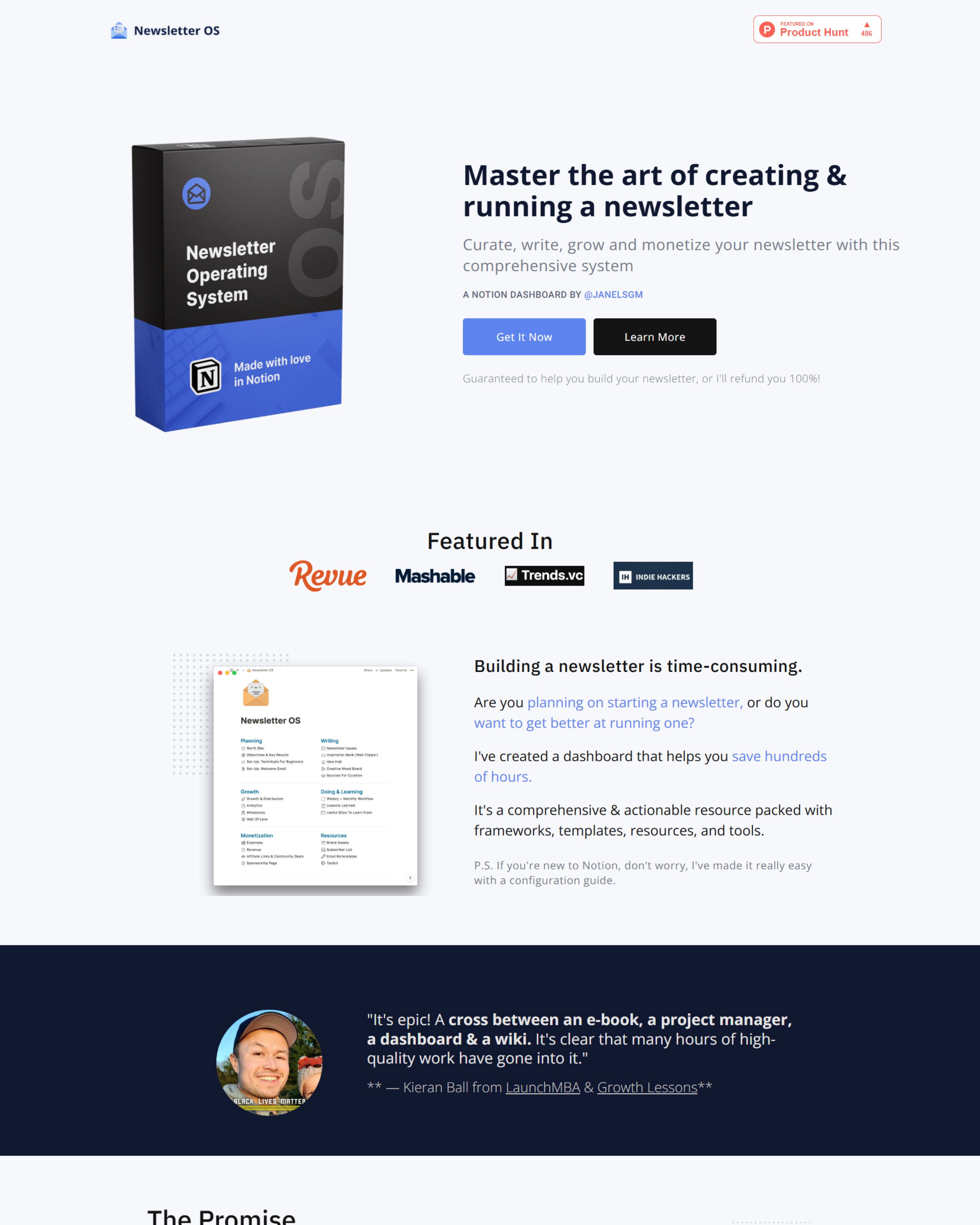
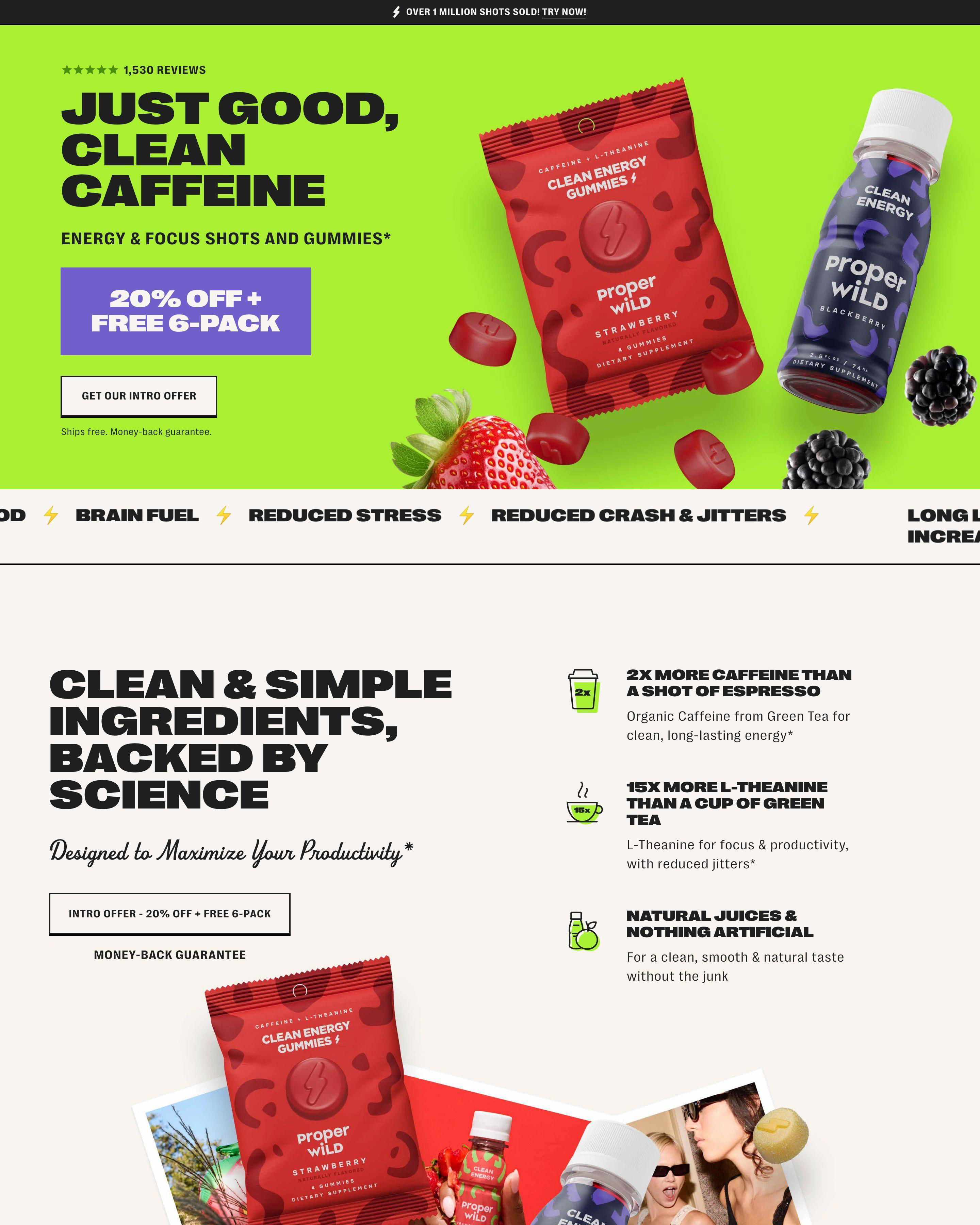
Product detail pages close sales. Visitors arrive knowing what they want. The page provides the information needed to commit: specifications, pricing, reviews, purchase options. Every element serves the decision.
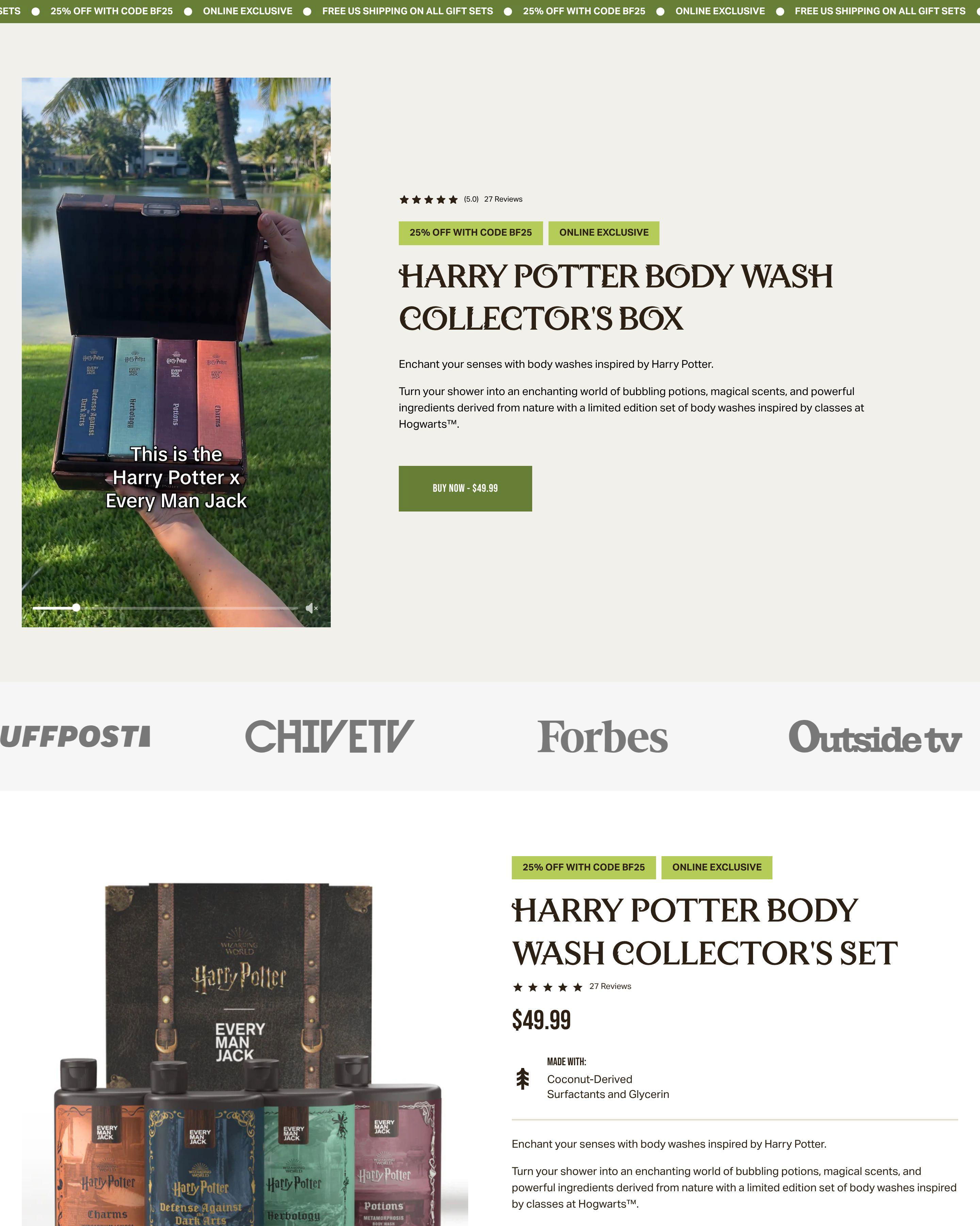
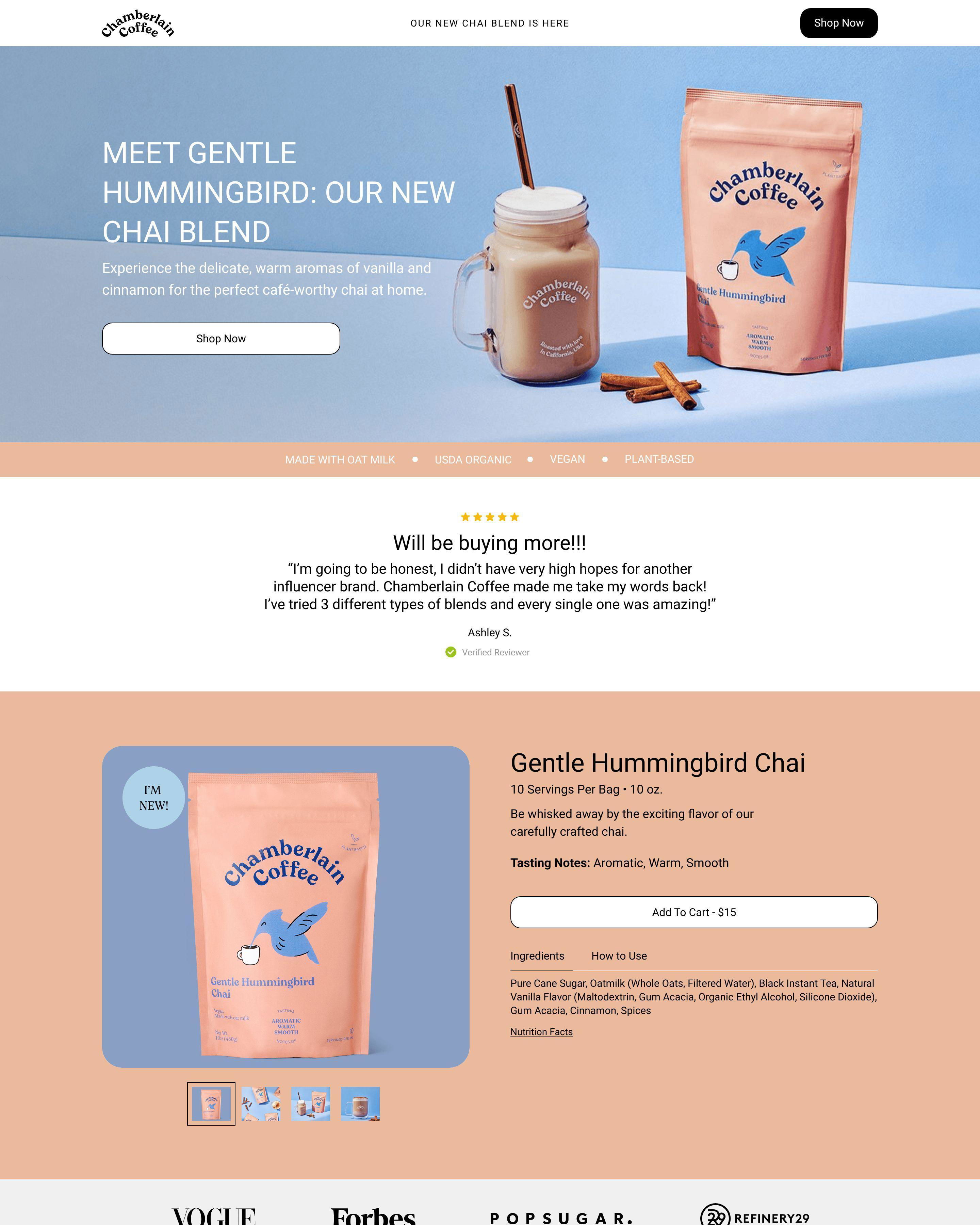
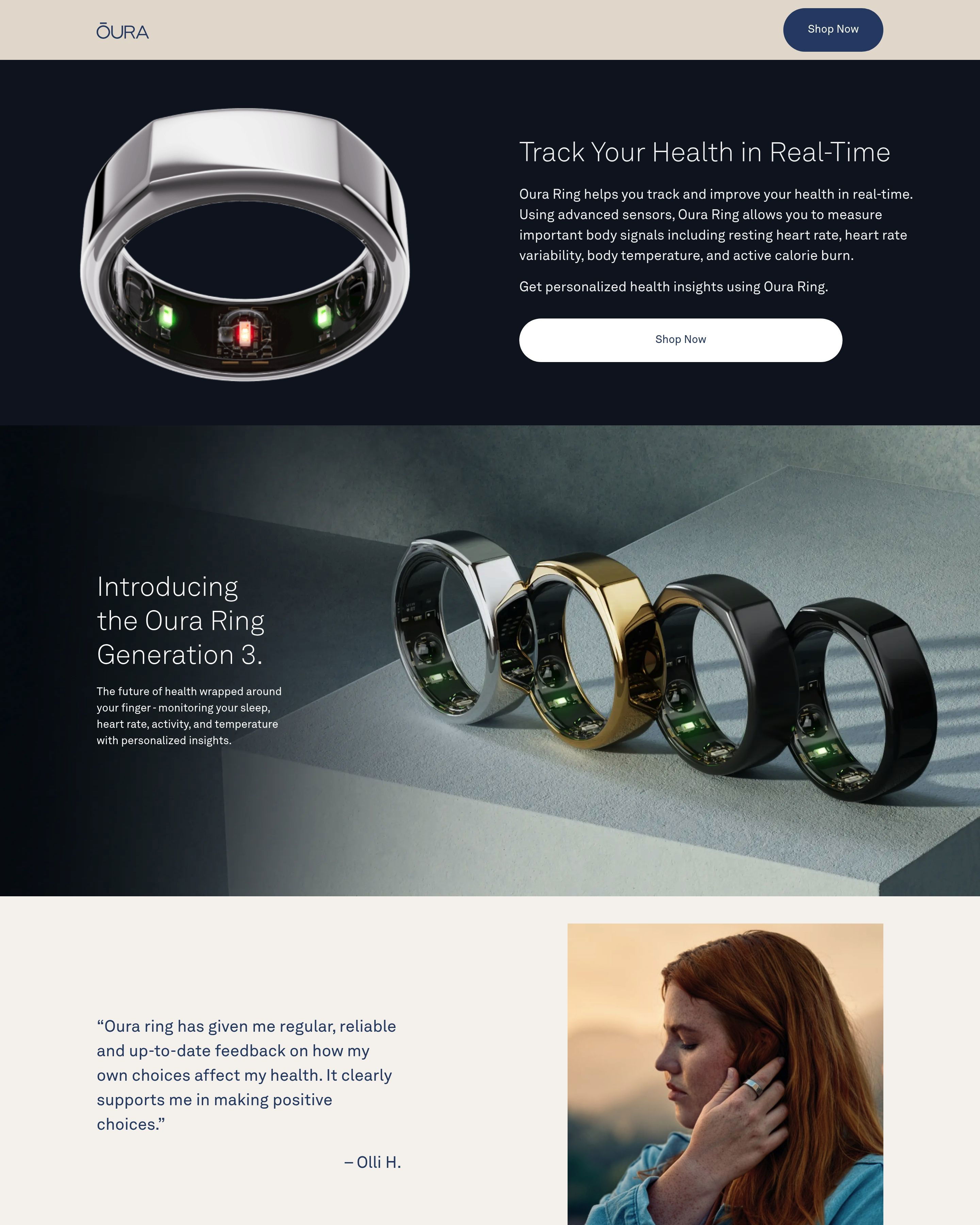
Ekster's backpack page demonstrates the format well. Product photos show the bag from multiple angles and in use. Specifications answer practical questions. Price is visible. The buy button is obvious. Huel's product pages follow similar principles: nutritional details for informed buyers, subscription options clearly presented, checkout straightforward.
These pages assume interest. The visitor clicked because something caught their attention. Now the page needs to confirm the product matches their needs.
See our expert picks: Best Landing Page Examples of 2026 →
Pattern 1: Multi-Angle Product Photography
Ekster shows their backpack from the front, back, side, and in use. Autobrush displays their toothbrush bundle with all components visible. BrightLand photographs their olive oils with beautiful styling. Online shoppers cannot touch products. Photography must answer every visual question.
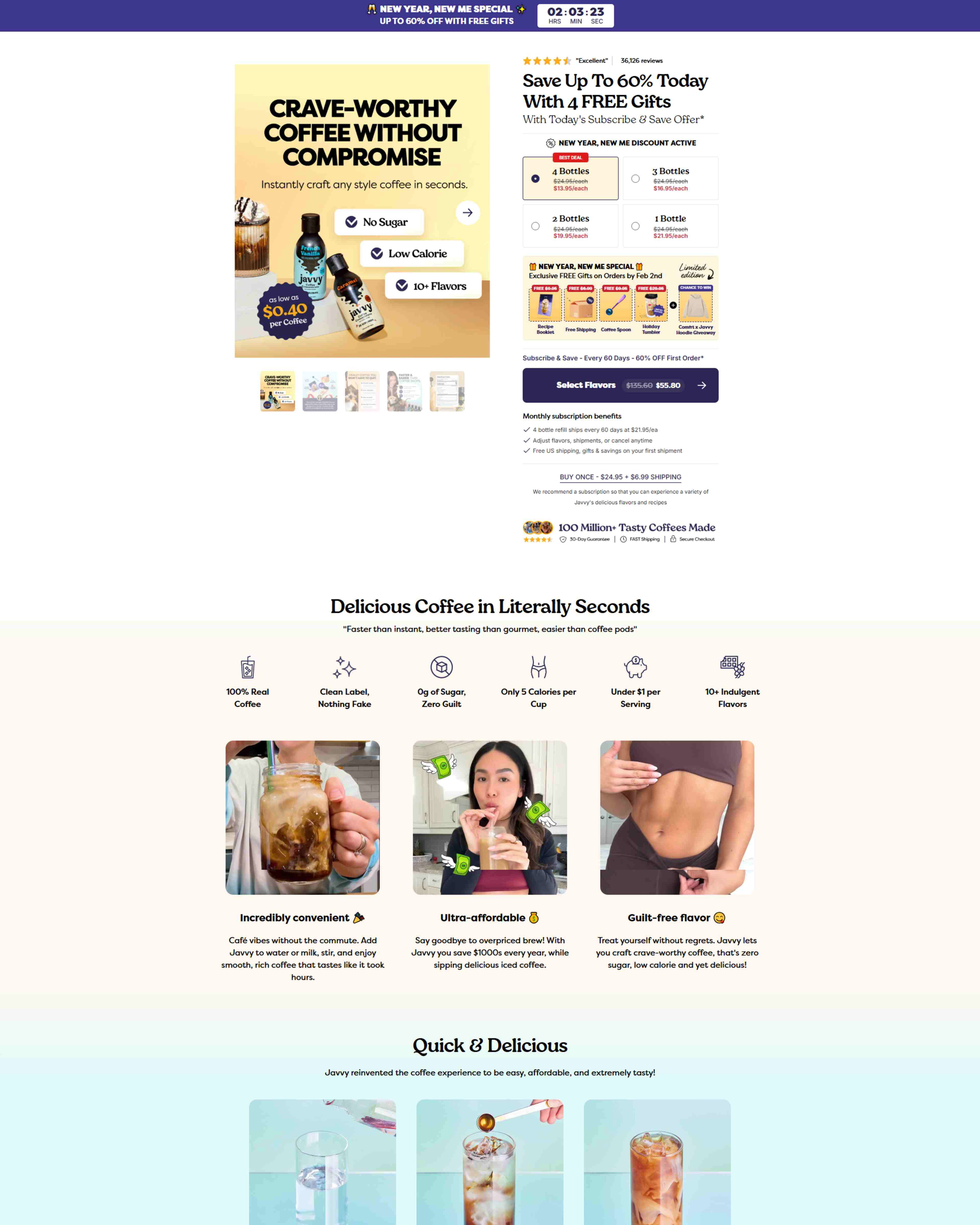
Pattern 2: Clear Pricing and Purchase Options
Huel shows pricing with subscription savings highlighted. Ekster displays the price prominently near the add-to-cart button. Hidden pricing frustrates visitors who are ready to buy. Place cost information where decision-makers look: near the product image and CTA.
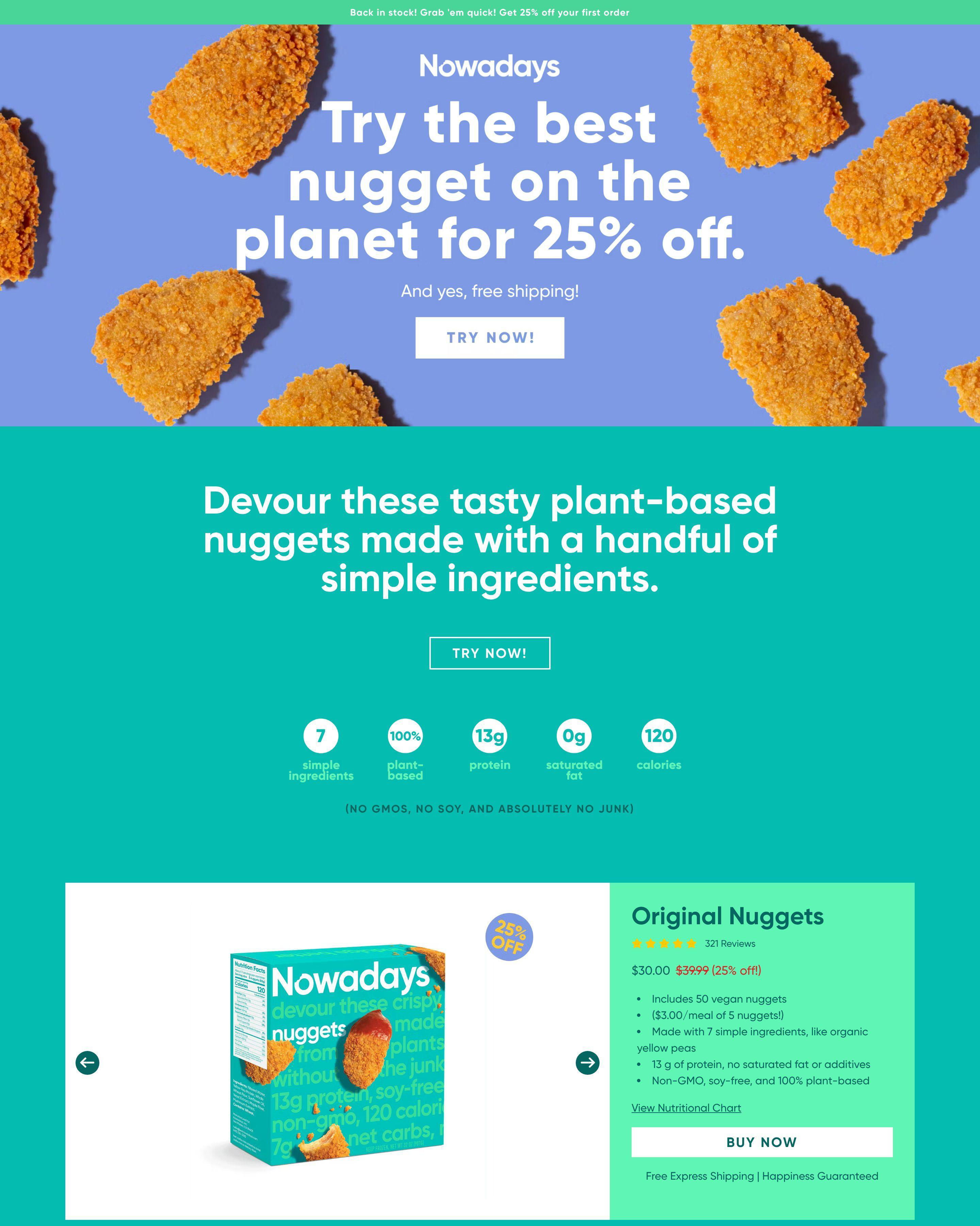
Pattern 3: Specification Depth for Considered Purchases
Autobrush provides detailed information about brushing technology. BrightLand includes olive oil origin and tasting notes. These details matter to informed buyers who research before purchasing. Specifications demonstrate product quality and help visitors justify the purchase.
What makes a good product detail page?
Comprehensive information with clear purchase path. Ekster provides everything a buyer needs without overwhelming them. Huel presents nutrition facts for health-conscious customers. Answer the questions your specific audience asks, then make buying easy.
What conversion rate should a product detail page achieve?
Product pages convert at 3-8% from browsing traffic, higher from targeted advertising. BrightLand and Ekster optimize for buyers who arrive with purchase intent. The key metric is not just conversion rate but revenue per visitor.
How long should a product detail page be?
Long enough to address objections, short enough to maintain focus. Autobrush needs space for brushing technology explanation. BrightLand can rely more on visual appeal. Match page length to how much convincing your product requires and how informed your audience is.
What is the most important element on a product detail page?
Product photography and buy button. Huel shows their products clearly with professional photography. The purchase path is obvious. Visitors should never wonder how to buy or what they are buying. Visual clarity and checkout simplicity drive conversions.