

Chai Blend Landing Page Example
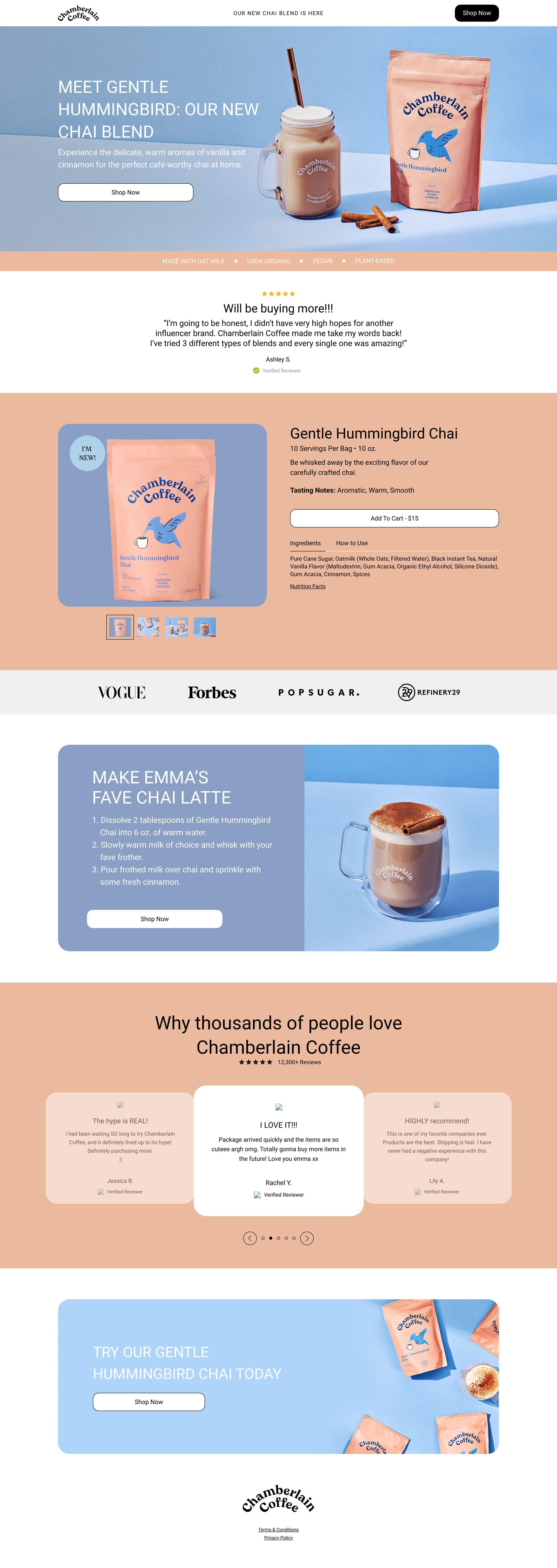
The landing page is for Chamberlain Coffee's new "Gentle Hummingbird Chai" blend. The primary business goal is to promote this specific product and drive direct purchases.
Check out our curated database of landing page examples to see what is working right now.
To create a high-converting page like this, use Swipe Pages, a leading landing page builder and funnel platform for conversion focussed marketers
Key Insights
What Works Well
- Clear Value Proposition: The headline "MEET GENTLE HUMMINGBIRD: OUR NEW CHAI BLEND" immediately communicates the product, and the accompanying text describes its unique flavor profile.
- Prominent CTA: "Shop Now" buttons are strategically placed in the hero section, below the product details, and at the bottom, ensuring clear next steps for the user.
- Trust Signals: Customer testimonials with star ratings, quotes, and reviewer names provide social proof. Additionally, logos of reputable publications like VOGUE and Forbes lend credibility to the brand.
- Mobile Responsiveness: The page adapts effectively to mobile devices, stacking content vertically for optimal viewing and ensuring CTAs and key information remain easily accessible.
- Supporting Content: High-quality imagery of the product packaging and prepared chai latte enhances visual appeal. Icons highlighting key attributes like "MADE WITH OAT MILK" and "VEGAN" address specific customer preferences.
Opportunities for Improvement
- Social Proof: While testimonials are present, incorporating quantitative social proof, such as the total number of happy customers or reviews, could further boost confidence.
- Objection Handling: A concise FAQ section could preemptively address common customer queries regarding ingredients, allergens, shipping, or returns, thereby reducing potential purchase barriers.
- Visuals: Introducing a short, engaging video demonstrating how to prepare the chai or showcasing its sensory appeal could deepen user engagement and desire.
- CTA Optimization: The "Add to Cart" button within the product detail section could be made more prominent or "sticky" on scroll to facilitate quicker purchases. Considering a secondary CTA for those not ready to buy (e.g., "Discover More Flavors") could cater to different user intents.
Layout Differences: Desktop vs Mobile
- Desktop: The hero section features a side-by-side layout for the headline, description, and product image. The product detail area also uses a multi-column approach, displaying product images alongside specifications and an "Add to Cart" button. Multiple customer reviews are visible simultaneously in a carousel.
- Mobile: Content is primarily stacked vertically, ensuring readability and ease of navigation on smaller screens. The hero image and text adapt by occupying full width. Product details and the "Add to Cart" button are presented in a single column. The customer review carousel focuses on one review at a time, requiring swiping to view others.
Summary
The Chamberlain Coffee landing page effectively introduces its new chai blend with appealing visuals and multiple trust signals. Its strengths lie in a clear value proposition and solid mobile responsiveness. Key areas for optimization include bolstering social proof with quantitative data, pre-empting customer concerns with objection-handling content, enhancing visual engagement with video, and refining CTA placement and variety to maximize conversions.


