

Unwind Drink Landing Page Example
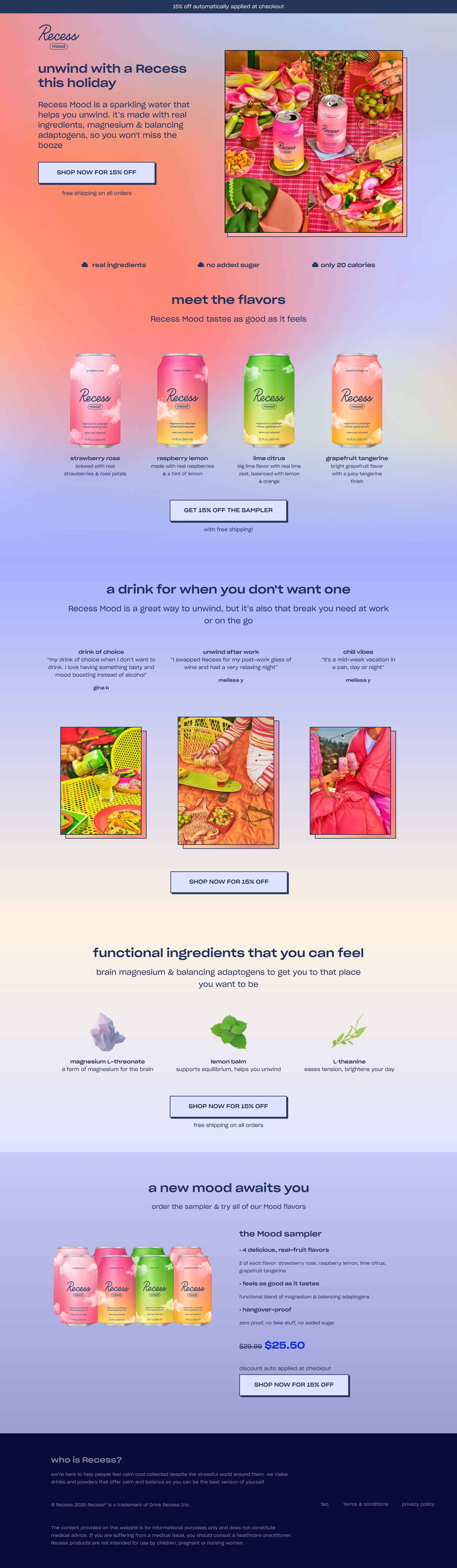
The landing page is for Recess sparkling water, positioned as a calming, unwinding beverage alternative. The primary business goal is to drive direct sales of Recess sparkling water, especially promoting a discount and sampler pack.
Check out our curated database of landing page examples to see what is working right now.
To create a high-converting page like this, use Swipe Pages, a leading landing page builder and funnel platform for conversion focussed marketers
Key Insights
What Works Well
- Clear Value Proposition: The headline "Unwind with a Recess this holiday" and the descriptive text "sparkling water that helps you unwind, de-stress and calm via magnesium & adaptogens" clearly communicate the product's core benefit and purpose.
- Prominent CTA: Multiple "SHOP NOW FOR 15% OFF" buttons are strategically placed throughout the page, along with a distinct "GET 15% OFF THE SAMPLER" CTA, using a contrasting color for high visibility.
- Trust Signals: Statements like "real ingredients," "no added sugar," and "only 20 calories" serve as trust signals by addressing common health and dietary concerns without needing external badges.
- Mobile Responsiveness: The mobile layout is well-adapted, stacking content vertically, maintaining clear readability, and ensuring CTAs remain prominent and easily tappable.
- Supporting Content: Detailed descriptions of flavors, benefits of key ingredients (magnesium L-threonate, lemon balm, L-theanine), and engaging use cases ("a drink for when you don't want one") provide comprehensive information.
Opportunities for Improvement
- Social Proof: There is no visible social proof such as customer reviews, testimonials, star ratings, or media mentions. Incorporating these elements could significantly enhance trust and encourage conversion.
- Objection Handling: The page lacks a mini-FAQ or a dedicated section to address potential customer objections or common questions regarding shipping, ingredients, or product usage.
- Visuals: While product shots are high quality, integrating lifestyle imagery showing people enjoying Recess in calming environments or short explainer videos could further enhance engagement and emotional connection.
- CTA Optimization: A sticky call-to-action button on mobile devices could improve accessibility and conversion rates as users scroll through the page. Exploring a clearer hierarchy between primary and secondary CTAs might also be beneficial.
Layout Differences: Desktop vs Mobile
- Desktop: The desktop version features a broader layout with a hero image positioned to the right of the headline, product lineups arranged in a grid, and ingredient details presented horizontally. Navigation is present in the header and footer.
- Mobile: The mobile version effectively stacks the hero image and text vertically. Product listings and ingredient explanations are also vertically arranged, ensuring a smooth and readable flow. Key CTAs are full-width and remain easily accessible, preserving functionality and message clarity.
Summary
The Recess landing page effectively communicates its primary value proposition as an unwinding beverage with clear calls to action and excellent mobile responsiveness. The page successfully highlights product benefits and flavor options. However, significant opportunities for optimization exist in adding social proof (e.g., reviews), incorporating more explicit objection handling (e.g., a mini-FAQ), and enhancing visual content with lifestyle imagery or videos. The mobile adaptation is particularly strong, maintaining the core message and user experience across devices.


