With a drag and drop builder like Swipe Pages, anybody can build beautiful landing pages in minutes. But most marketers and business owners get stuck when it comes to landing page conversion rates.
They don’t get the desired conversion rate and blame the traffic source. To some extent, the quality of traffic plays a vital role. But it’s up to your landing page to deliver value and motivate visitors to take the desired action.
See, your visitor has seen your ad and he is interested to know what’s next so he clicks on the ad and lands on your landing page with curiosity. But for some reason, he isn’t convinced enough to become a lead or customer.
Why is it so? You will get all the answers soon. We will reveal all the advanced conversion optimization strategies to grow your business.
What is Landing Page Optimization?
Nobody can create a perfect landing page on day 1, not even experts. First, you need to understand your audience, craft an offer, create a landing page, and deploy it on the battlefield.
Then you come to know that the landing page isn’t converting well. So you start optimizing each component of your landing page such as headline, CTA, form, etc. Landing page optimization is the process of tweaking the elements of a landing page to improve conversions.
In this ultimate guide, we will learn some of the best landing page practices to create high converting landing pages.
1. Buyer Persona and Segmentation
The first step in creating a high-converting landing page is to know who your buyers are and figuring out how best to communicate with them. Marketers refer to this process as identifying “Buyer Persona”.
From the information you have at this point, you’ll have to initiate the process of segmentation. This is where you’ll filter out your entire target audience and separate them into multiple groups by analyzing specific characteristics (demographic details, interests, and behavioral traits).
This process would narrow down the list and help you find your ideal customers. Segmentation helps you come up with highly-personalized communication strategies to which your prospects can relate and resonate.
To put it in perspective, the process of Segmentation helps you:
- Frame the topics and modify the tone of the message.
- Prepare a highly-customized content strategy.
- Sharpen the message that appears on your website.
2. Understand Your Campaign Goals
The goal of your landing should be obvious and clearly understandable to prospects. Your CTA must focus on achieving one particular goal without confusing the users with multiple offers which distract their field of focus away from the conversion aspect of your page.
Your landing page should provide solutions to just one problem at a time to keep your visitors engaged and focused on the goal.
3. Live Chat Works & Is Worth Investing In
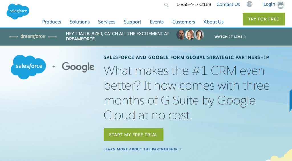
Including a live-chat feature has become one of the major game-changers when it comes to landing page optimization.
There was a time when live-chats were ineffective because one could tell that they are talking with a robot. But it is truly behind us. Today’s chatbots can engage at least 10% – 50% of your visitors. If you do it right, you can at least convert one-third of them.
Whereas pages without chatbots can only assure you a 2% conversion rate. In case of an emergence, 37% of your website visitors would only prefer using a customer service bot to get a quick answer.
4. Create AMP Landing Page For a Better Mobile Experience
You can expect a 20% drop in conversions for every additional second your landing page takes to load.
You should also remember that even a small change in your landing page speed can have a huge positive impact on your ad campaigns, ad ranks, and pricing.
Building your landing page using Google’s AMP can offer a 4X boost to your loading speed.
This means that with proper landing page optimization, your visitors can now browse through your site three times faster than a regular page.
5. Headline With the Big Promise
Most of you know that a headline is the first thing that a visitor would see on your page but do you know that only 2 out of 10 people continue to browse through your page after reading it?
Your headline should compel your visitors to read through the rest of your site. Your headline should promise to solve a problem that your visitor is going through or at least address it.
Make your headline sound like a question and use words that sell (Free, Discover, Secret, Results, Quick, Lead, etc.,) to design a landing page that converts.
6. Remove Navigations and Other Distractions
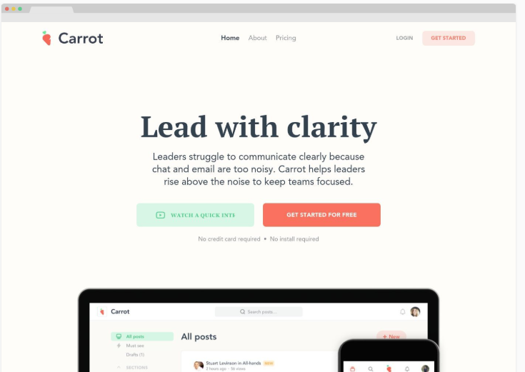
The purpose of a landing page is to keep your visitors laser-focused on your intended goal. Having a navigation bar on your landing page is an unnecessary distraction.
This can tank your conversions and drive your leads away from taking action. 84% of landing pages still have navigation bars which can give you a competitive advantage.
Just by removing it and other navigable links, you can see a 1-4% increase in TOFU and MOFU landing pages.
7. Drive Your Visitors Into the Isolation Tank
This is the process of isolating the visitor and not letting them distract until your intended purpose gets fulfilled.
Essentially, your landing page should have no links except a few hidden ones in your footer which may distract them from filling out the form/clicking the CTA.
This process of isolation will effectively help you combat the “Zeigarnik Effect” which says that the brain will recognize the links as incomplete tasks and usually remembers them better than the ones they’ve finished.
8. Leverage Image and Videos
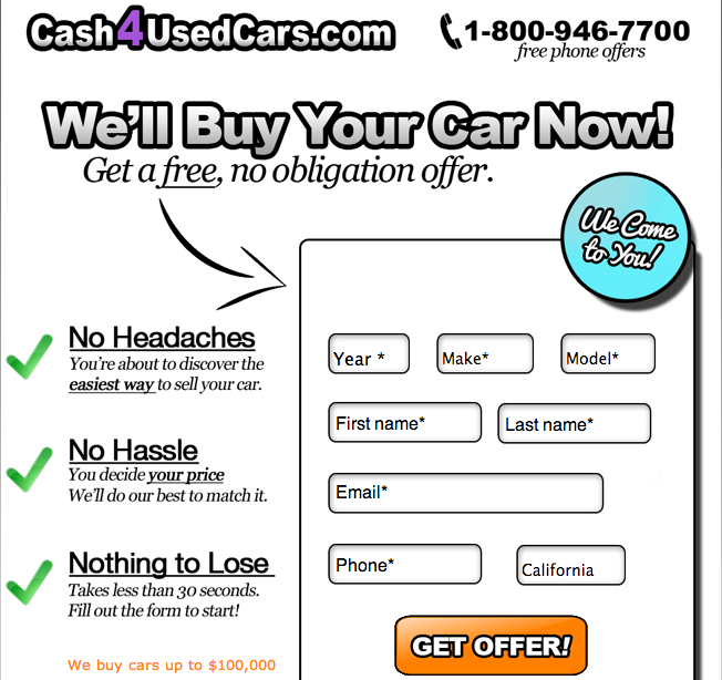
A high-converting landing page talks less but shows more. Your brain processes images and videos 60,000 times faster than it processes text. They are engaging, appealing, and visually pleasing.
Brace for impact, having an engaging video on your landing page can instantly increase your conversion rates by up to 80%.
The videos have to be short and must be able to instill a quick sense of trust. A thumbnail of a smiling person and a lead capture form in the first few seconds could also boost your chances of getting a conversion.
9. Show How Your Product/Services Works
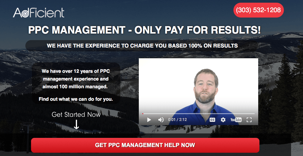
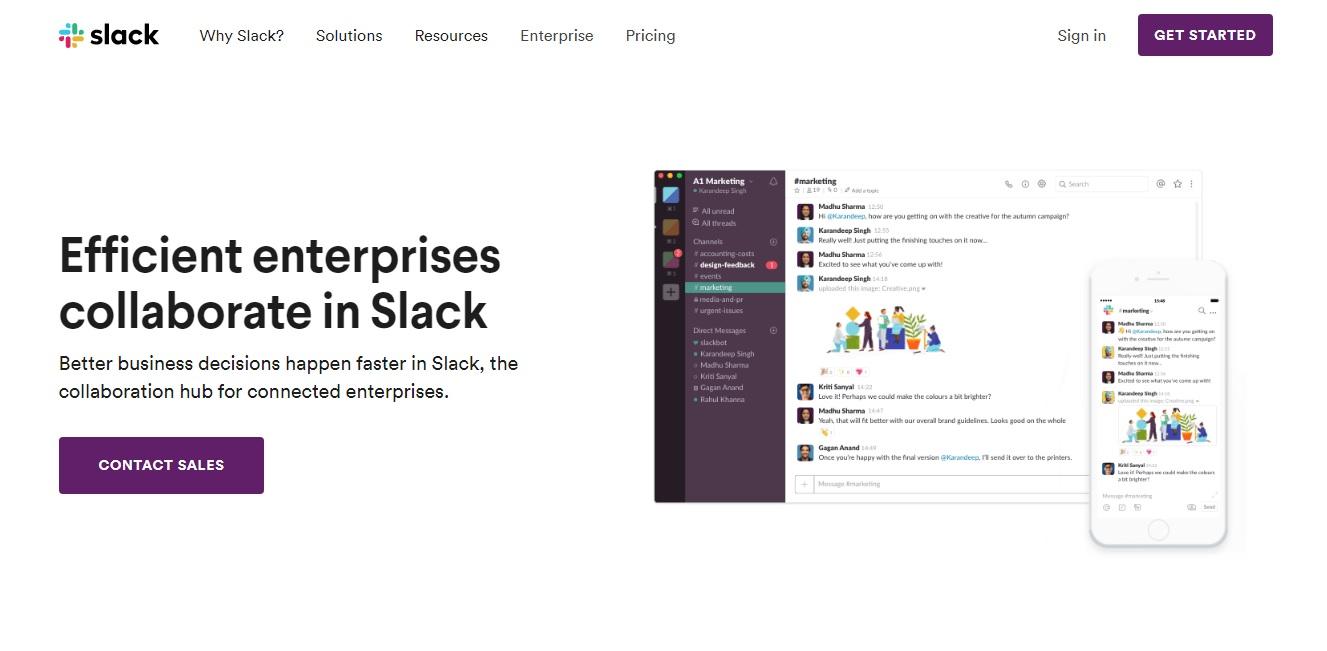
The only way to get a sale or a conversion is to provide value and by being transparent. One of the best landing page practices is to describe how your product/service works with clear images from various angles and a description that covers every aspect of your product.
To make it more interesting, keep reminding the visitor about the value that they can add to their lives by making this purchase.
Larger images can give you a 9.46% increase in conversion and also make sure you add a zoom-in feature.
10. Avoid Annoying Pop-ups
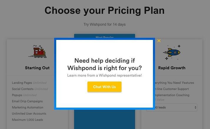
Making a pop-up appear even before the visitor gets a good look at your webpage is not the best idea. Timing is everything.
Full-page pop-ups are a big NO! The only intention of a pop-up is to remind the visitor about something and not to interrupt their experience. A landing page that has too many pop-ups often has a negative impact on your conversion.
Generic pop-ups with a lazy design can also bring down the trust. A pop-up should have a clean design and an effective CTA with keywords scattered all around the place.
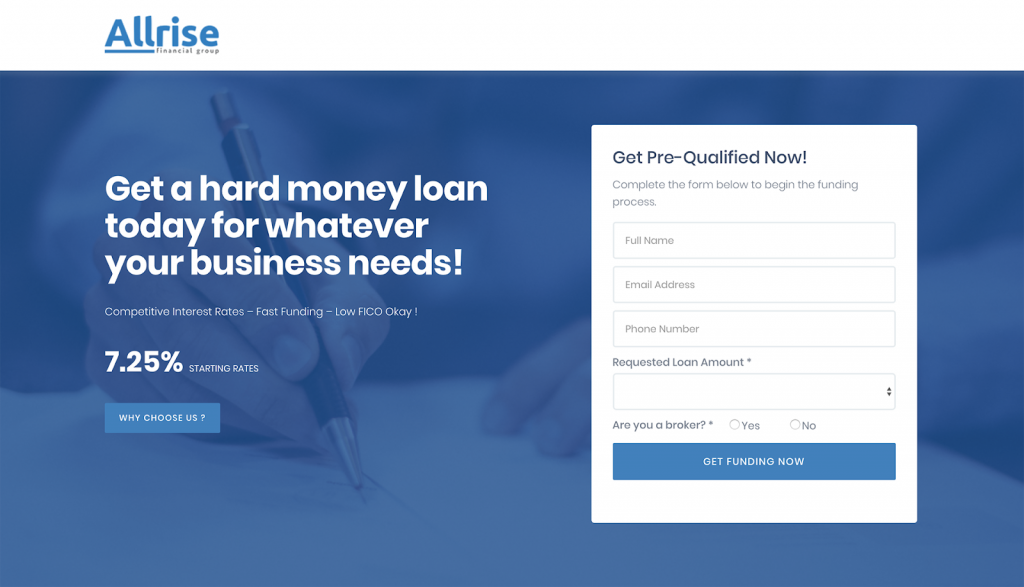
11. Optimize the Form: Don’t Ask for Too Much Information
Landing page form designers are the usual victims of the ‘Goldilocks Syndrome’. They often get confused between designing a huge form which could be annoying or end up designing a really short form that does not gather all the important information.
Landing page conversion statistics say that visitors lose interest after filling 7 fields in a landing page form.
The title of the form should either offer a promise or pose a compelling question. Only ask for information that you absolutely need and save the rest for later.
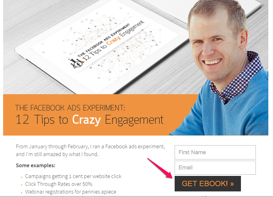
12. Appropriate CTAs That Can Convert
Call-to-action (CTA) is the single most important feature that determines the landing page conversion rates. Not every CTA tactic can end up in a conversion.
If you ask a customer to purchase your product/service at the very first encounter, 84% of them would leave. But replacing the “Purchase Now” with a “Free Trial” can increase your conversions by up to 328%.
A benefit-oriented CTA that can convince your visitors that they can instantly receive something for free, can convert even the most stubborn leads.
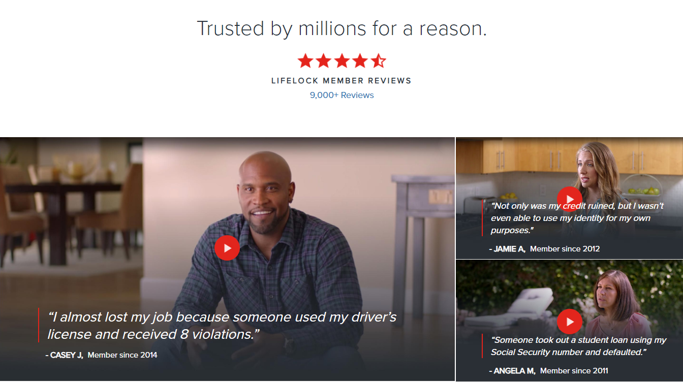
13. Relatable Social Proofs in Different Formats
Social proof is an absolute necessity when it comes to landing page optimization. It helps you have an instant positive influence over your visitors as they find others benefiting through your product/service.
Instead of sticking to a common pattern, try to use social proofs in various formats. This includes,
- Customer testimonials
- Number of shares
- Embedded social media posts
- Number of users/downloads
- Images or videos of customers using your product [HIGH IMPACT]
Embedding trust seals (logos of companies) at the end of your site is also an effective convincer.
14. A/B Test: Testing Different Offers, Copy, Designs, and Audiences
A/B testing your landing pages helps you find a balance between data-driven decisions and using your intuition.
In A/B testing, you can design several versions of a landing page with each having their own headline, offers, copy, designs, CTA, positioning, images, and social proof.
Without having to invest a huge sum of money and time in designing and marketing multiple pages at once, A/B testing will offer you detailed analytics of what converts and what doesn’t.
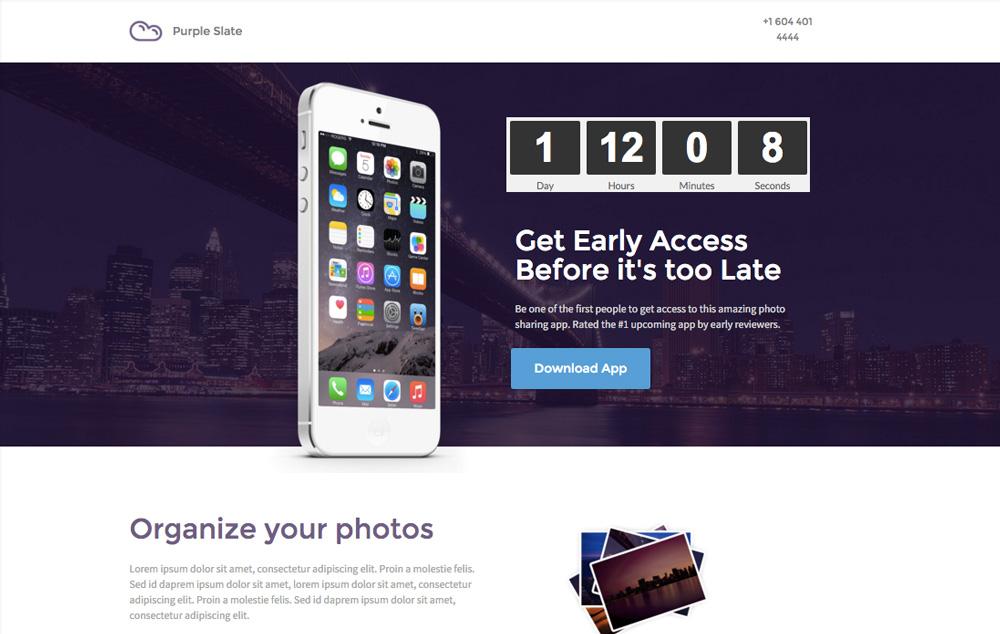
15. Use Scarcity and Urgency to Motivate Visitors
Even though we’d like to think otherwise, most of us, including your prospects, are procrastinators. Whenever you offer time to make a decision, your visitors may begin to lose interest in your product/service.
This is exactly why it is essential to introduce scarcity into the equation to let your customers know that they might never get a chance like this again.
Mentioning a timeline or an end date for an offer can work wonders for your overall conversion rate. Introducing scarcity of resources (eg., “Only 3 slots left”) is also equally effective.
16. Mandatory: Your Landing Page Should be Load Instantly
You probably know how customers lose interest in web pages that take more than 3 seconds to load.
But apart from this, a fast-loading landing page can improve your brand image, boosts your paid ad campaigns, and builds customer trust.
The speed of your site has a significant influence not just on the buyer persona, but also on your site’s search engine ranking.
For a user who either needs to buy/sell products and if it takes too long to access a particular page, he’d prefer another site’s landing page who’s loading speed is fast enough.
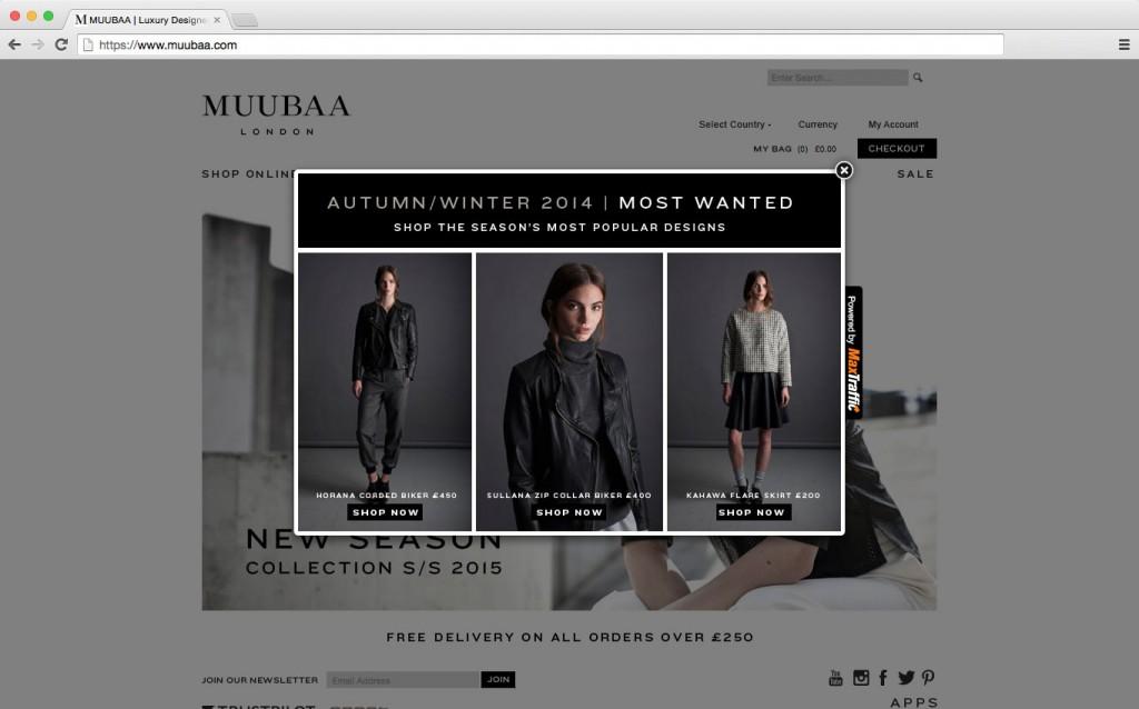
17. Include Exit-intent Popup
The exit-intent popup is your last chance in retaining a visitor since this is the last page they’ll see when they’re about to leave or close the window. But if you plan it right, you can use it to your advantage.
Exit-intent popups that ask for the visitor’s e-mail has a 10% chance of success. For every 100 visitors, you get, you can at least get 10 of them to sign up for your newsletter.
A properly optimized and tested pop-up can have a significant increase in its conversion rates (from 10% to 60%). This is also a great place to remind a visitor about their abandoned shopping carts.
18. Thank You Page with Extra Value
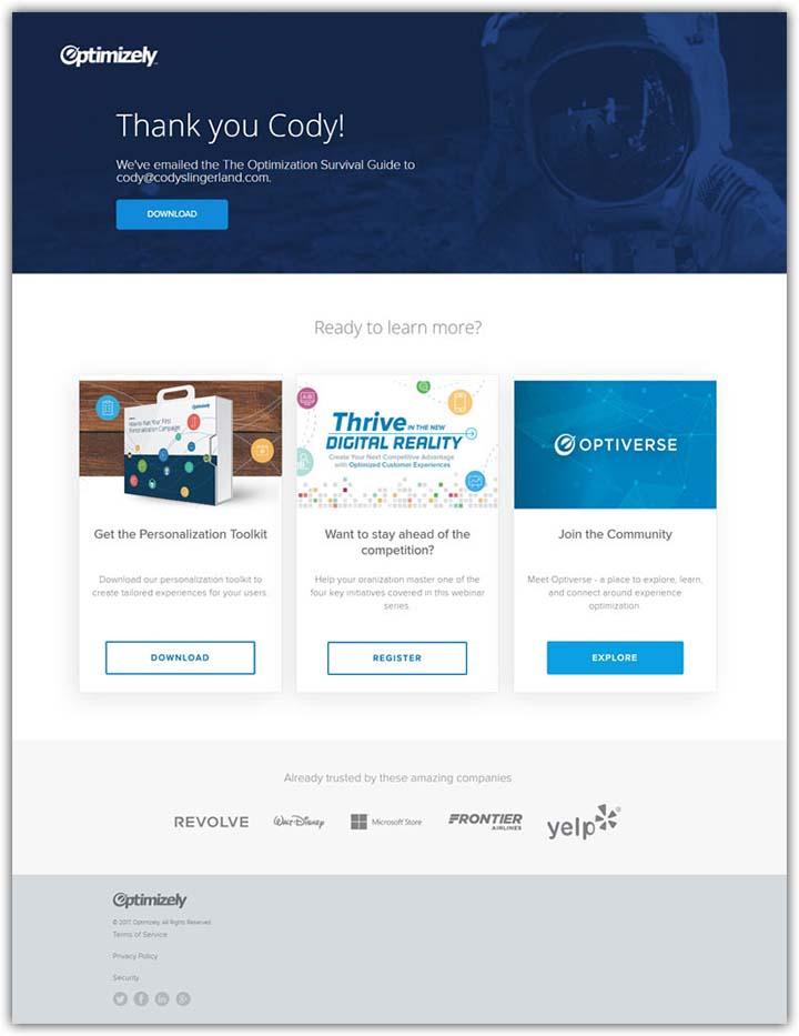
A thank you page is generally where a converted lead gets transferred. A visitor who has already taken action using your CTA is much likely to go a step further.
This is a great opportunity to push your visitors further into your marketing funnel by upselling, asking them to sign-up for your newsletter, or getting them to follow you on your social media handles.
Offering value is the most genuine way to do this instead of sounding too compelling. Restate the value that they have received through the purchase to reassure your audience.
Once you’re here, you can start recommending similar products/services, introduce them to a “refer a friend bonus”, offer a coupon code, or even include a low-price offer.
19. Monitor On-site Behavior (Record Visitor Sessions+Leveraging Google Analytics)
A marketing campaign demands a lot of work but the only way to know if it was truly worth it is to monitor the on-site behavior of your prospects.
Through active monitoring of your page and by analyzing various metrics, you can track its performance and also modify your strategies accordingly.
Google Analytics is a great tool and has a well-design dashboard that you can use to understand the performance of your landing page.
Here are some of the metrics that you shouldn’t miss:
- Landing page views
- Analyzing the source of traffic
- Average Conversions / Goal Completions
- Visitors-to-contact ratio
- Average time on page
- Bounce rate
- Average page load time
Conclusion
A good landing page conversion rate is hard to achieve when you don’t know the best practices, tips, and tools. Once you know what to tweak and how to tweak, you are bound to achieve higher conversion rates.
Hope this guide helped you learn actionable landing page optimization techniques that are easy to implement and drive conversions. Remember, it takes time and rigorous testing to find what works.
Swipe Pages is a landing page builder that helps you build high converting landing pages in minutes. With 50+ conversion-optimized templates, you can quickly create landing pages and launch your campaigns profitably.