A Video Sales Letter asks someone to sit through minutes of your pitch before they make a decision. That’s a big ask. They could click away at any moment. Your page needs to hold attention, build trust, and answer objections before they ever hit pause.
The 7 pages in this list sell everything from German job placements to marriage coaching. They come from different industries and target different audiences. But they all solve the same problem: turning skeptical viewers into buyers through the power of long-form video storytelling.
Here’s what makes them work.
Key Takeaways:
Social Proof Numbers Replace Written Claims – VSL pages lean on massive credibility markers. Frese Recruiting claims “Over 500 physiotherapists trust us.” SJAK leads with “90,000+ Women Have Transformed Their Lives.” Elite Businessman opens with “5,375+ Marriages Saved.” When you’re asking someone to watch a long video, these numbers answer the “who else believed you?” question before it’s asked.
Value Stacking Makes the Offer Irresistible – The best VSL pages don’t just sell one thing. SJAK assigns specific values to bonuses like “Worth ₹2000” and “Worth ₹2499” to create a “Total Value: ₹7499” perception for a free workshop. Grant Cardone slashes an “Executive” ticket from $6,500 down to $497. When you stack value visually, the decision feels obvious.
Urgency Needs a Real Deadline – Vague pressure doesn’t work. Real scarcity does. SJAK uses countdown timers at both the top and bottom of the page. Inc42 displays “25/50 seats left” in real time. Grant Cardone lists specific event dates for Miami and Scottsdale. When the clock is ticking or the seats are filling, people act instead of procrastinating.
Repeated CTAs Work If They Guide the Journey – VSL pages use the same CTA multiple times because the video is long. Elite Businessman places the red “Book My Free Session” button six different times. Grant Cardone repeats “YES! I’M READY TO 10X MY BUSINESS!” throughout. The criticism of “too many identical CTAs” is valid only when the copy doesn’t evolve. Smart pages change the supporting text to match where the visitor is in their decision journey.
Key Elements of High-Converting VSL Landing Pages
Before diving into the list, here are the elements that separate VSL pages that convert from those that don’t:
Lead with authority and big numbers immediately – Todd Brown places Russell Brunson’s endorsement right at the top calling him a “genius.” GermanyFastlane shows “93/100 Exam Success” on video thumbnails. Persuasion Experience displays logos from Amazon and Forbes above the fold. Your viewer needs to know within three seconds that you’re credible. Big names and specific numbers do that instantly.
Break the promise into visible steps – Long videos feel overwhelming. Frese Recruiting uses a “Frese Framework” with six clear stages like “Housing support” and “Visa support.” Elite Businessman lists a 5-step roadmap including “Clarity” and “Action.” When you turn a complex transformation into numbered steps, the viewer can see the path. It makes success feel achievable instead of abstract.
Use comparison visuals to prove value – Persuasion Experience shows actual Facebooks Ads screenshots with “$23,555 SPENT” and “$10.86 COST PER LEAD.” Elite Businessman includes a table comparing their program to “Marriage Counselling.” These aren’t just claims. They’re visual proof. When viewers can see the data, you don’t need to convince them with words.
Disqualify the wrong people openly – Elite Businessman states their program is “100% Bullshit Free” to filter out people who want fluff. Grant Cardone clarifies the summit is “Not a Motivational Event” and says “No walking on hot coal.” This honest filtering makes serious buyers feel like they’re in the right place. It saves everyone’s time.
Place the form above the fold when possible – Frese Recruiting puts “Apply for free now!” directly in the hero section. GermanyFastlane displays the registration button immediately. When you’re asking for a lead, don’t make people hunt for the form. The easier you make it to say yes, the more yeses you get.
Stack trust signals beyond just logos – SJAK shows media logos from Hindustan Times and Max Bupa. GermanyFastlane highlights a specific “200,000+ subscribers” YouTube following for the instructor. Todd Brown displays fifteen team members with titles. VSL viewers are skeptical by nature. Stack every type of credibility you can find: media mentions, client counts, team size, awards, certifications, and platform presence.
Make the guarantee visible and specific – GermanyFastlane promises “Complete the course and take the official exam. If you fail, you get your money back within seven days.” Elite Businessman lists “$67/week” in the FAQ. Persuasion Experience offers a “100-Day, Risk-Free Trial” badge in multiple places. Vague guarantees don’t work. Specific terms remove the fear of wasting money.
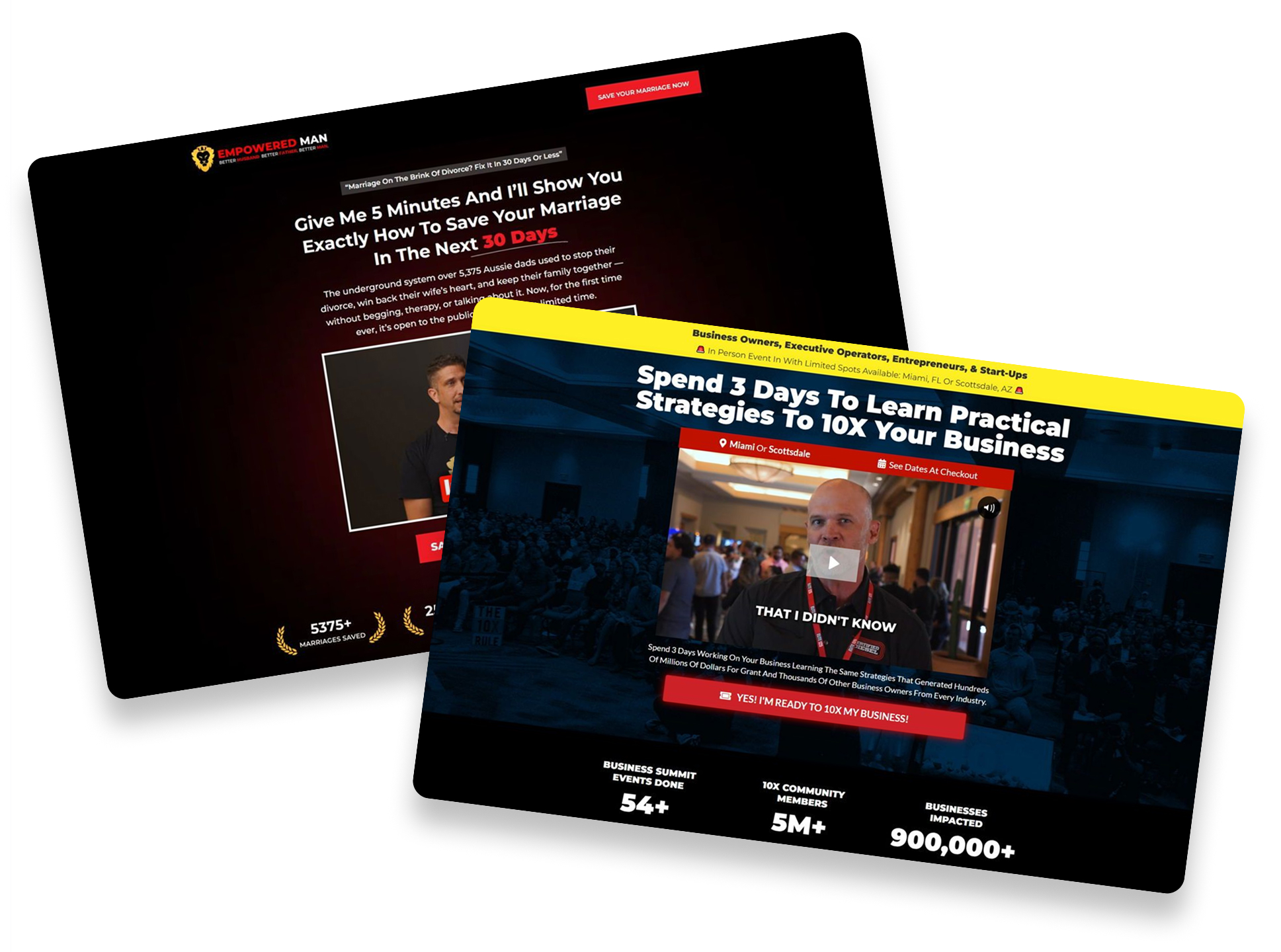
1. Elite Businessman

Caption: This landing page for Empowered Man uses a bold red and black color scheme. It features a prominent video from the founder right at the top. You can see huge numbers like “5375+ Marriages Saved” to build immediate trust. The page uses many red buttons to encourage men to take action.
Industry & Purpose: This is a lead generation page for the relationship coaching industry. It’s meant to convert husbands facing divorce into free coaching session signups.
What Works: Here’s what I love: the hero section uses very specific numbers. It claims to have helped “5,375 Aussie dads” stop their divorce. This makes the system feel proven and reliable. It targets a very specific group instead of trying to help everyone.
The “100% Bullshit Free” branding is a smart move. It tells men they won’t have to deal with fluff or confusing therapy talk. The 5-step approach like “Clarity” and “Action” makes a complex problem feel solvable. It gives the reader a clear roadmap to follow.
The comparison table is another strong element. It shows why this program is better than “Marriage Counselling” which many men dislike. It highlights the “Supportive community of high-performance men” as a unique benefit. This makes the offer feel like more than just a course.
What can be Improved:
- The page is very long and requires a lot of scrolling. Moving the “8 Reasons Why High-Achieving Fathers Work With Us” section higher could keep people interested.
- Some of the font sizes in the testimonial grid are quite small. This makes them hard to read on mobile devices.
- The pricing is hidden in the FAQ section. Making the “$67/week” cost more visible earlier could help qualify leads better.
Why it inspires: This page shows how to use raw and honest language to connect with a specific audience. It doesn’t use corporate jargon. Instead, it speaks directly to the fears of a father trying to save his home.
2. Frese Recruiting GmbH

Caption: This landing page by Frese Recruiting helps physiotherapists find jobs in Germany. It highlights a free service that handles everything from visas to housing. The design uses clear blue and white colors to look professional. You can see real success stories and a step by step guide.
Industry & Purpose: This is a lead generation page for a medical recruitment agency. It is meant to convert international physiotherapists into job applicants for German clinics.
What Works: Here is what I love: the hero section is very bold. It says “Work as a Physiotherapist in Germany – Fast, Easy, and Free!” This hits every major concern a candidate might have. They know it will be quick and they know it costs nothing.
The logo bar builds trust right away. Seeing names like “ntv” and “General-Anzeiger” makes the agency look official. It tells the reader that this is a real business with a good reputation. The “Over 400 physiotherapists trust us” claim adds even more social proof.
The “Frese Framework” is a great way to show the process. Moving to another country is scary. Breaking it into six simple steps like “Housing support” and “Visa support” makes it feel doable. It turns a complex life change into a clear checklist.
What can be Improved:
- The success stories have a lot of text. Most people will skim these instead of reading the whole “Problem” and “Solution” blocks. Breaking these into bullet points would make them easier to digest.
- The page is very long. A sticky navigation menu would help users jump to the FAQ or the testimonials without scrolling forever.
- Some of the blue boxes use small white text on dark backgrounds. This can be hard for some people to read on small mobile screens.
Why it inspires: This page works because it solves a huge problem for a very specific group. It does not just offer a job. It offers a complete plan for a new life. Every section answers a specific fear which makes the “Apply for free now!” button very hard to ignore.
3. Persuasion Experience

Caption: This landing page for the PX Agency focuses on scaling paid ads. It features a clear pink call-to-action button and a video from the founder. You can see logos from famous brands like Linktree and Forbes. Detailed screenshots of ad dashboards show the real results they get for clients.
Industry & Purpose: This is a lead generation page for a performance marketing agency. It’s meant to convert high-growth business owners into booking a strategy session.
What Works: Here’s what I love: the proof is incredibly specific. They show actual screenshots of Google Ads accounts with “$23,555 SPENT” and “$10.86 COST PER LEAD.” This makes their big claims feel honest and grounded in reality.
The “Before” and “After” section is also a winner. It shows a CPA dropping from “$712.28” to “$273.85” for a finance client. Most agencies just talk about success, but these guys show the math behind it.
I also like the comparison table near the end. It compares their team to “Typical Agencies” and “Hiring In House” across six different categories. It makes the decision feel like a simple logical choice for the reader.
What can be Improved:
- The page is very long. Some users might lose interest before they see the “How it Works” section. Moving the process steps higher could help keep people engaged.
- The wall of social media proof at the bottom is hard to read. The text in those screenshots is too small to see on a mobile phone.
Why it inspires: This page wins by showing its work. It doesn’t rely on flashy slogans or vague promises. Instead, it uses data and transparent comparisons to prove why they are the best choice.
4. Todd Brown

Caption : Todd Brown’s landing page starts with a big video about his story. It explains the origin of the E5 Method. The page uses dark and light blocks to separate different ideas. You can see many faces of team members at the bottom.
Industry & Purpose : This is a personal brand authority page for the digital marketing industry. It is meant to convert entrepreneurs into book buyers or workshop students.
What Works : Here’s what I love: the expert endorsements are top tier. Seeing Russell Brunson from ClickFunnels right away builds massive trust. He calls Todd a genius. That is a huge win for social proof.
The team section is also a smart move. Most gurus pretend to work alone. Todd shows fifteen different team members with their titles. This makes the business look stable and professional. It proves there is real support behind the products.
I also like the “E5 Method Book” section. The 3D book image looks very real. It lists specific benefits like “predictable sales” for any product. The yellow “Get This Book” button stands out well against the white background.
What can be Improved :
- The “Real Client Wins” section has several broken video links. Seeing “Media not found” messages looks very unprofessional. It makes the website feel old or broken.
- There are too many different things to do on one page. You can buy a book, join a newsletter, or watch a workshop. This can confuse new visitors who don’t know where to start.
Why it inspires : Todd Brown sells himself as an expert through his personal history. He uses a documentary style to make his method feel like a discovery. The page turns a single person into a high level agency through great team photos.
Swipe Pages stands out as a robust landing page builder, offering marketers the tools to design effective sales funnels without any programming
5. Grant Cardone (10X Boot Camp)

Caption : This landing page promotes a three-day business summit. It uses a high-energy video right at the top to grab attention. Large red buttons encourage you to join the 10X community. You can see the specific event dates for Miami and Scottsdale near the middle.
Industry & Purpose : This is a sales and lead generation page for the business coaching industry. It’s meant to convert entrepreneurs into ticket buyers for an in-person event.
What Works : Here’s what I love: the hero section is very bold. It makes a specific promise to “10X Your Business” in just three days. The social proof below the video is also strong. Seeing “900,000+ Businesses Impacted” builds instant trust with new visitors.
I really like the section that explains what the event is not. It says “Not a Motivational Event” and “No walking on hot coal.” This addresses common fears about business seminars. It tells the reader that this weekend is about real work.
The pricing table uses heavy price anchoring. They show an “Executive” price of $6,500 slashed down to just $497. This makes the offer feel like a huge bargain. It creates a lot of pressure to buy before the price goes back up.
What can be Improved :
- The page uses the exact same red button six different times. Repeating “YES! I’M READY TO 10X MY BUSINESS!” can feel a bit pushy. They could change the text on lower buttons to focus on specific benefits.
- The map images are static and hard to read on smaller screens. Using an interactive map would be better. It would let users see exactly where the convention centers are located.
Why it inspires : This page shows how to use authority to sell high-ticket items. It uses big names, huge numbers, and clear photos of past crowds. This makes the attendee feel like they are joining a winning team.
6. SJAK Card Reading

Caption : Shree Dembla’s landing page offers a free workshop on angel card reading. It features a bright red “JOIN NOW FOR FREE” button in several places. The page includes many logos from brands like Hindustan Times and Max Bupa. A countdown timer at the top and bottom creates a sense of urgency.
Industry & Purpose : This is a workshop registration page for the spiritual coaching industry. It’s meant to convert spiritual seekers into attendees for a live 90-minute online event.
What Works : Here’s what I love: the social proof is everywhere. They claim “90,000+ Women Have Transformed Their Lives” right at the top. This huge number builds instant trust with the target audience.
The “FREE Bonuses” section is very clever. It assigns a specific value to each gift like “Worth ₹2000/-” or “Worth ₹2499/-“. This makes the “Total Value: ₹7499” feel like a massive win for the user. People love getting high value for a “FREE” price.
I also like the “CLICK Areas of Life” section. It uses cards for Love, Career, and Health. This helps visitors see their own problems in the offer. It turns a broad topic into a personal solution for their specific needs.
What can be Improved :
- The page has too many red buttons with the exact same text. Using “Save My Spot” or “Claim My Free Ticket” on some of them would feel more natural.
- The background on the celebrity photo section is a bit busy. Some of the photos look crowded together. Cleaning up the white space would make the professional endorsements stand out more.
Why it inspires : This page does a great job of tackling spiritual topics with logical value. It uses clear numbers and specific ratings to make the workshop feel reliable. The celebrity photos and news logos prove this is a mainstream and trusted brand.
7. Germany Fastlane

Caption : This landing page promotes an intensive German language course. It features a main video and a list of student benefits. The layout uses many red call-to-action buttons with clear discount pricing. You can see many photos of successful students holding their certificates.
Industry & Purpose : This is a sales page for an online education platform in the language learning niche. It is meant to convert aspiring learners into paid students for the A1 to B1 course bundle.
What Works : Here is what I love: the page uses very specific proof. Seeing “93/100 Exam Success” on the video testimonials is powerful. It shows that the course delivers actual results on official tests. This builds more trust than a generic quote.
The instructor section is another strong point. Max Yoko mentions he has “200,000+ subscribers” on YouTube. This gives him instant authority. It makes the student feel they are learning from a proven expert.
I also like the clarity of the money-back guarantee. It says “Complete the course and take the official exam.” If you fail, you get your money back within seven days. This specific promise removes the fear of wasting money.
What can be Improved :
- The list of course features is very long and hard to scan. Using icons or breaking the list into two columns would make it much easier to read.
- The red CTA buttons are very bright and feel a bit aggressive. A slightly softer color or more white space around the buttons would help the page feel more premium.
- The FAQ section is quite collapsed. Moving one or two common questions about “how long the course takes” into the main body could help answer doubts faster.
Why it inspires : This page succeeds because it focuses on a clear outcome. It does not just sell “German lessons” but instead sells the goal of passing the B1 exam. The combination of student photos and specific test scores makes the promise feel very achievable.
Final Thoughts:
VSL landing pages sell something different than most. They sell time.
Your visitor needs to believe the video is worth watching. They need to believe the transformation you promise is real. And they need to trust you won’t waste the next 20 minutes of their life on fluff.
If your VSL page isn’t converting, check these three things first. Lead with massive social proof numbers. Stack value so the offer feels irresistible. And make the urgency real with specific deadlines or limited seats.
Want more inspiration? Check out our full list of 40 best landing page examples across industries.