Key Takeaways:
1. AI Templates Streamline Lead Gen Design – AI-powered templates automate content creation, layout, and optimization—enabling fast, effective landing page creation without technical skills.
2. Boost Efficiency and Conversion Rates – These tools use machine learning and A/B testing to build high-converting pages tailored to your business goals and audience needs.
3. User-Friendly and Cost-Effective – Most AI landing page builders are accessible to non-designers and reduce development time and cost compared to traditional methods.
4. Integration and Optimization Are Key – Top tools like HubSpot, Leadpages, and Wix offer customization, analytics, and integration with CRMs and email platforms to support end-to-end lead generation.
If you’re using landing pages in your lead generation campaigns, you already know that not everyone jumps at the chance to make a purchase during their initial visit to your site.
But, here’s the deal – don’t let that valuable traffic slip through your fingers.
What you can do instead is grab their contact details and keep delivering value to gradually turn them into loyal customers.
Enter the lead generation landing page – your secret weapon to persuade visitors to share their contact information.
Excited to boost your leads?
Let’s dive into seven stellar lead generation landing page examples that’ll inspire you to craft your own compelling ones.
Ready? Let’s get started!
What Sets Lead Generation Landing Pages Apart From Regular Landing Pages?
A regular landing page aims for quick actions, like making a purchase or signing up. It’s like a welcoming doorstep, straightforward and immediate.
In contrast, a lead generation landing page aims to gather visitor information, often emails, by offering something valuable in return, like a free ebook.
Instead of pushing for instant sales, these pages focus on building a lasting connection, nurturing leads over time for future conversions.
In short, a standard landing page goes for a quick win, while a lead generation landing page plays the long game, building relationships for future success.
With that in mind, here are some essential do’s and don’ts to consider when crafting your own lead generation landing page.
✅ The Do’s
- Clear Value Proposition: Clearly communicate what visitors will gain by providing their information.
- Compelling Headlines: Capture attention with concise and compelling headlines.
- Minimal Form Fields: Ask for essential information only to reduce friction in form submission.
- Strategic Placement of CTA: Position the call-to-action (CTA) prominently for easy access.
- Trust Elements: Include trust signals such as testimonials, certifications, or privacy assurances.
- Visual Appeal: Use engaging visuals to enhance the overall aesthetics of the page.
- Mobile Optimization: Ensure the landing page is optimized for seamless mobile experiences.
❌ The Don’ts
- Cluttered Design: Avoid clutter; streamline the layout to guide visitors without overwhelming them.
- Unclear Messaging: Ensure your message is concise and easily understandable.
- Excessive Form Fields: Minimize form fields to only ask for essential information; too many fields can deter visitors.
- Hidden CTAs: Make your call-to-action noticeable; avoid burying it in the design.
- Lack of Trust Signals: If missing trust elements, incorporate testimonials or security badges to instill confidence.
- Slow Load Times: Optimize page speed to prevent potential visitors from bouncing.
- Non-Responsive Design: Ensure your landing page adapts well to different devices for a seamless user experience.
How do we know the do’s work? Take a look at these pages:
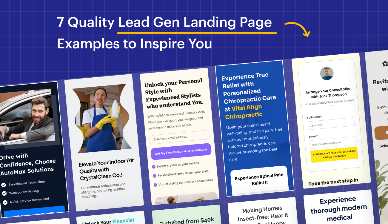
#1. Vital Align Chiropractic

The lead generation strategy by VAC, a Personalized Chiropractic Care provider, is effective for several reasons.
By offering a free consultation on their landing page, they immediately incentivize visitor engagement.
The request for only essential details simplifies the opt-in process, reducing friction for potential leads.
Moreover, the emphasis on providing personalized care for two specialized sections establishes a targeted approach, demonstrating a deep understanding of diverse patient needs.
The powerful and non-generic call-to-action further compels visitors to take action, combining a valuable offer with tailored information, ultimately increasing the likelihood of conversion and capturing qualified leads.
Additionally, the heading paired with the description is highly effective for a lead generation page.
The heading creates an immediate appeal by promising a genuine sense of relief through personalized chiropractic care, capturing the audience’s attention and addressing a common pain point.
The descriptive text further emphasizes the tailored approach, highlighting the benefits of improved spinal health and overall well-being. The assurance of providing the best care instills confidence in potential leads.
Overall, this combination effectively communicates the value proposition, encouraging visitors to consider and engage with the chiropractic services, ultimately driving lead generation.


Showcasing social proof in quantifiable terms, such as the example featuring Laura, a busy lawyer, significantly enhances the lead generation process.
By highlighting specific, measurable outcomes – such as a 70% decrease in chronic back pain severity and a 50% increase in flexibility and overall mobility – the audience gains tangible evidence of the product or service’s effectiveness.
This not only establishes credibility but also directly addresses potential customers’ concerns, providing them with concrete reasons to engage.
The quantifiable results serve as compelling testimonials, instilling confidence in prospective leads and increasing the likelihood of conversion.
| If you’re just getting started, it’s essential to understand what is a landing page and how it compares in structure and purpose to a full website—landing page vs website. |
#2. Onecard

This example stands out for its compelling and transparent value proposition. It offers a $100 joining bonus and 1.5% cashback on every purchase, providing clear and tangible benefits.
The tiered rewards system encourages increased card usage, while exclusive benefits like airport lounge access add a premium touch.
The absence of annual fees and minimum spend requirements is highlighted, contributing to the overall transparency and building trust.
The concise and engaging language, coupled with a prominent “Apply Now” call to action, creates a sense of urgency, prompting potential customers to take immediate action.
The global appeal of privileged access to over 150 premium airport lounges worldwide enhances the card’s attractiveness to a diverse audience.

The decision to place the rewards section above the key features is a strategic move that maximizes the appeal of the card.
By introducing the enticing rewards first, such as extra cashback, discounts with partner brands, and exclusive perks like free rides and flight discounts, the marketing strategy taps into the consumer’s desire for immediate benefits.
This approach effectively captures the audience’s attention and generates interest by highlighting the tangible advantages of owning the card.
Following this, the key features are presented, offering crucial details about the card’s security, mobile app functionality, and contactless payment convenience.
Placing these technical aspects after the rewards ensures that potential customers remain engaged and informed, reinforcing the practical benefits of the card.
The “Apply Now” call to action at the end provides a clear and immediate next step for interested individuals, completing a well-orchestrated lead generation narrative that combines the allure of rewards with the essential features of the credit card.
#3. Instanode

This example addresses a common pain point by highlighting the issue of losing customers to a slow website, immediately capturing the attention of website owners who may be experiencing this problem.
The solution is presented clearly – “Instanode’s managed cloud servers designed to supercharge WordPress websites with blazing speed”.
The offer of a significant 70% discount for the first year on any plan creates a sense of urgency, encouraging potential customers to act quickly.
The inclusion of prominent brand logos such as Uber, Netflix, Spotify, Airbnb, and Google adds credibility and trust, suggesting that Instanode’s services are trusted by well-known brands.
Additionally, key features like a 99.9% uptime guarantee, free site migration, and a 1-click WordPress install are highlighted, showcasing the value and reliability of the service.
This section overall effectively combines a compelling solution, a time-limited offer, social proof through brand logos, and key features to attract and convert potential customers.

Further into the page this section below is cleverly crafted by strategically placing customer reviews and accolades to build trust and credibility.
By boldly claiming the position of the “#1 Managed WordPress hosting provider,” the company establishes itself as an industry leader, but rather than relying solely on self-promotion, it immediately follows up with a brilliant move – shifting the focus from their own words to those of their customers.
The decision to showcase an actual customer review, complete with a positive experience and a personal touch adds authenticity and relatability.
The 4.4/5 Trustpilot score and the mention of powering over 100,000 domains further reinforce the company’s reliability and popularity.
By letting customers speak for the service’s quality, the section effectively leverages social proof, a powerful psychological trigger that can significantly influence potential customers.
#4. Skydiving

This example diving head first grabs the attention of the audience by offering an exciting experience, tandem skydiving in Las Vegas, at an attractive price point of $129.
The use of bold and enticing phrases such as “thrill of flying” and “memories for a lifetime” creates a sense of excitement and urgency.
The call-to-action (CTA) to “Book Your Dive” is prominently displayed, prompting potential customers to take immediate action.
The description also highlights the unique selling points of the experience, including breathtaking views of the desert, canyons, and the glittering Vegas skyline, emphasizing the exclusivity of the offer.
The repetition of “Book Now” reinforces the urgency and encourages potential customers to take the desired action.

Moving down further this section in the page provides essential information about the location, contact details, and the step-by-step process of the tandem skydiving experience, contributing to its brilliance.
The clarity in presenting the location, including the specific address and its proximity to recognizable landmarks instills confidence in potential customers regarding accessibility.
The operating hours stated assure flexibility and availability, emphasizing customer convenience.
The inclusion of a phone number and email address establishes direct communication channels for inquiries or bookings.
The subsequent breakdown of the on-site experience into four concise steps is informative and helps manage customer expectations.
From a quick paperwork initiation to safety briefing, training, ascending to 12,000 feet, and finally, the dive itself, the sequential details create a clear mental picture for potential customers, enhancing transparency and trust.

Furthermore, the inclusion of a dedicated section on safety within the lead generation page demonstrates a commitment to transparency and customer well-being.
By addressing the potential concerns associated with skydiving, such as its perceived risks, the page aims to build trust and reassure prospective customers.
The detailed safety measures underscore the professionalism and reliability of the skydiving company.
The mention of membership in the US Parachute Association and adherence to FAA aviation guidelines further instills confidence in the safety protocols followed.
Additionally, practical information such as the maximum weight allowance, minimum age requirement, estimated duration of the experience (2-3 hours), and the availability of food and beverages enhances user understanding and manages expectations effectively.
By placing these details before the end of the page, users are well-informed about the safety precautions and logistical considerations, helping them make informed decisions and contributing to a positive user experience.
The “Book Now” call-to-action that follows is strategically placed, ensuring that users are reassured about safety before being prompted to take action.
| For SaaS marketers aiming to boost conversions, leveraging landing page copywriting, ai landing page optimization, and landing page optimization tips can lead to significant performance gains. |
#5. Tax Buddy

TaxBuddy’s page stands out for its effectiveness in capturing potential leads.
It goes beyond simply highlighting the benefits of the service, such as online tax filing with TaxBuddy, by incorporating elements like clear content and Google reviews to establish trust.
The prominently placed Call to Action (CTA) encourages immediate engagement, guiding visitors to take action and use TaxBuddy’s services.
This combination of valuable information, trust-building features, and a strategically positioned CTA makes the page a compelling tool for lead generation, ensuring it effectively converts visitors into potential customers.

Tax Buddy’s lead generation strategy excels by leveraging quantifiable data, such as the number of users and the percentage of tax liability reduction.
This not only establishes credibility but also creates a compelling reason for potential leads to take action.
The strategic placement of a call-to-action (CTA) right below the tax liability number further enhances the effectiveness of the lead generation effort.
By incorporating Swipe Pages, a trusted landing page builder, Tax Buddy not only showcases its commitment to quality but also encourages visitors to explore the possibilities with a free 14-day trial.
This combination of data-driven persuasion, strategic CTA placement, and a clear call to action makes Tax Buddy’s approach highly effective in converting visitors into leads.
Power your marketing with Swipe Pages, the landing page builder trusted by top-performing brands.
#6. StylishYou Studio

The headline, “Unlock your Personal Style with Experienced Stylists who understand You,” is attention-grabbing and promises a personalized experience.
The use of “StylishYou Studio, the style companion for vintage hearts” sets the tone and creates a sense of belonging for the target audience.
The call-to-action (CTA) button, “Get My Free Personal Color Analysis,” is clear and enticing, offering a tangible benefit.
The supporting pointers below the button succinctly outline the key offerings: expert stylists, personalized looks tailored to individual styles, and virtual styling options for added convenience.
This information helps visitors quickly understand the value they’ll receive by engaging with StylishYou Studio.
The overall composition balances style and substance, focusing on the emotional aspect of feeling good through personal style while providing concrete details about the services offered.
The inclusion of a simple form for visitors to enter their email addresses makes it easy for them to take the next step, aligning with the goal of lead generation.

Moving down further, the lead generation page excels in presenting reviews through both quantifiable metrics and plain-worded testimonials accompanied by images.
This dual approach caters to diverse audience preferences, providing concrete data for those seeking specifics and relatable narratives for others.
Strategically placing the FAQ section beneath reinforces transparency and addresses potential concerns right after showcasing the product’s positive impact.
This seamless integration of reviews and FAQs enhances the lead generation process, building trust and credibility among visitors, ultimately facilitating a smoother conversion journey.
| Dive deeper into landing page design, experiment with landing page split testing, and explore landing page examples and landing page best practices to maximize the impact of your landing page builder and track key landing page metrics with the help of landing page optimization tools. |
#7. ZenSpace

The compelling heading, “Revitalize Your Home with ZenSpace Organizers,” immediately communicates the value proposition of clutter-free living through professional organization services.
The concise and action-oriented description further entices potential leads by promising the experience of a more organized and joyful lifestyle.
The inclusion of a clear call-to-action, “Start My Zen Journey,” followed by a time-sensitive incentive to “Schedule Your First Session and Get 10% Off Now!” creates a sense of urgency and motivation for users to take the desired action.
This combination of a captivating message, clear value proposition, and incentivized call-to-action is well-crafted to capture leads and drive conversions.

Popup forms are effective for lead generation because they grab immediate attention and encourage user interaction.
They are a direct and non-intrusive way to collect valuable user information. In the case of ZenSpace, incorporating a popup form for their newsletter is a smart move.
By offering updates about the brand and providing a clear value proposition, such as staying informed about organizational tips or exclusive offers, they not only engage visitors but also create an opportunity to collect data on potential leads.
This proactive approach helps build a targeted audience for future marketing efforts, ultimately contributing to the growth and success of the brand.

Further down into the page, ZenSpace showcases testimonials in the form of transformation stories, making it excellent for lead generation.
The testimonials highlight real-life experiences and the positive impact ZenSpace has had on individuals, creating a relatable and compelling narrative.
This approach builds trust and credibility, addressing potential leads’ concerns and motivating them to take the desired action.
By featuring transformative testimonials, ZenSpace effectively leverages social proof to encourage visitors to engage with the lead generation process, fostering a higher likelihood of conversion.
So, are you convinced that you need a lead generation landing page just like these or are in the process of revamping yours? Then speed up the process with our lead generation landing page templates.
The best part? No need to depend on developers – just DIY it effortlessly with Swipe Pages Templates.
FAQ: Lead Generation Landing Page Templates
1. What are AI-powered lead generation landing page templates?
They are pre-designed landing page layouts generated using artificial intelligence to match your business goals, target audience, and visual preferences—making it easier to create high-performing pages with minimal effort.
2. How do AI landing page builders help with lead generation?
AI tools automatically generate persuasive content, optimize layout, and run A/B tests to increase conversion rates and reduce the time required to build pages.
3. What features should I look for in a landing page template tool?
Key features include customization options, A/B testing, analytics, CRM/email integrations, and the ability to personalize content for different audiences.