Whether you want people to buy something, join your newsletter, or grab useful stuff, it’s vital to know how a landing page works to turn visitors into customers.
Today, let’s dig into Byte’s homepage and see why it’s so good at getting people to take action. We’ll look at each part closely and figure out how they team up to make more people say ‘yes.’
In this post, we’ll take a close look at each piece, explaining what they do and why they matter. By the end, you’ll have what you need to make a landing page of your own that convinces people to take the next step.
Let’s get started!
But first, What is Byte?
Byte is a dental brand that sells teeth aligners. They link you with licensed dentists and orthodontists across all 50 states in the U.S and DC.
When you start using Byte your state-licensed doctor first reviews and approves each treatment plan to make sure you’re a good fit for clear aligners before you even begin the treatment.
With that said, let’s check out Byte’s homepage and see a quick summary of what works and the potential areas they can improve.

✅ What Works with this page?
- Inspiring headlines radiate confidence and a sense of belonging.
- Promotional offer is prominently displayed at the top for increased visibility.
- Valuable comparisons emphasize Byte’s advantages over traditional methods.
- Byte elevates credibility by showcasing snippets, not just publication logos, offering authenticity and authority alongside Celebrity endorsements and testimonials.
- Strategic use of color theory (bright red, bold black) stimulates emotional responses for CTA clicks.
❌ What needs to be improved?
- While a prominent promotional offer is displayed at the top, the presence of scattered offers throughout the page might create confusion for visitors.
- Breaking down offerings into three parts highlights key information. But, a drawback is that users must click each box for details.
To improve, consider providing a brief summary or hover-over feature for each box, offering users quick insights before they decide to click for more information. This would streamline the user experience and encourage engagement. - Byte’s Unique Selling Proposition (USP) is spread across the page, lacking a dedicated section for clear communication.
Byte can improve by having a dedicated section that clearly shows the main problem their product solves. They should use simple statements about the features to effectively explain Byte’s unique selling points. - Benefits in the “perks” section have explanatory text, but it’s accessible only through a click. This design is simple, but it might confuse new users unfamiliar with aligners.
To improve, consider making essential information more visible or providing a brief overview for better user understanding. - Having four CTAs with unclear copy like “Start Here” is a problem on Byte’s page and needs fixing. The CTAs should clearly indicate the user’s next action, whether it’s subscribing, taking a quiz, or scheduling a consultation.
Byte can improve by offering straightforward information and avoiding conflicting offers. - Byte’s homepage could improve by adding a Frequently Asked Questions (FAQ) section. This would address common concerns, enhance the user experience, and provide valuable information.
- Enhance the Calls to Action (CTAs) by incorporating confidence-boosting messages to the buttons like “Join 20,000 confident users,” “Lifetime Guarantee,” and “Starts at $70/month, no pricey clinic visits.”
This will make potential users feel more secure and clear about Byte’s offerings.
Lets breakdown each section in detail.
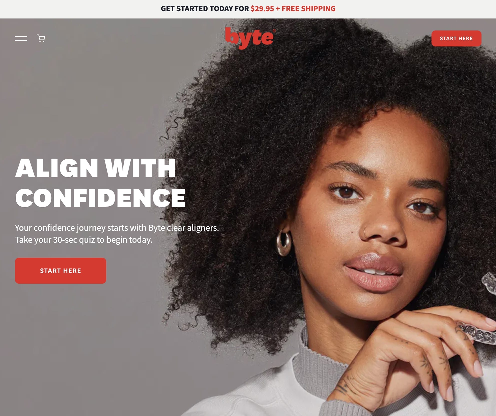
We’ll start with the Hero section.
What Is A Hero Section?
Think of the hero section as your homepage’s spotlight. It’s there to showcase what you offer using things like sliders, a catchy headline, and a clear call to action. This section packs a punch, giving visitors all the key details while encouraging them to take the next step.
In Byte’s Hero Section:
1. The main headline and The supporting headline

Main Headline: “Get a smile you’ll love to share”
The main headline is concise and clear, immediately conveying the core message which is transformation.
It suggests that Byte’s clear aligners can enhance not just your smile but also your confidence, creating a positive association.
As social beings, we naturally crave a sense of belonging. The headline skillfully taps into our core emotions – the genuine motivations behind our purchasing decisions.
If you’re curious to explore further insights on why people choose to buy from you, take a look at this.
Supporting Headline: “Will our invisible aligners work for you? Take your 30-second assessment to find out.”
The supporting headline as a question sparks curiosity by prompting visitors to consider their suitability for Byte’s invisible aligners, encouraging engagement by inviting visitors to take a quick quiz, making the process interactive and personalized.
The picture in the hero section, paired with the main headline, exudes confidence and showcases the product and the results of the aligner all in one.
2. The Navigation Bar
A navigation bar is a menu at the top of a website that helps you easily move around and find different pages. It usually has links to important sections like Home, About, Products, Contact and more.

The navigation bar at the top of Byte’s homepage is well thought out. When your Landing Page is part of a larger website, keeping the navigation visible prevents potential customers from getting lost.
The main goal of your Landing Page is to guide visitors toward a specific action, and sending them to another page isn’t it.
Having the navigation bar on the homepage makes it easy for visitors to explore and find what they’re looking for.
Plus, the bold red ‘Start Here’ button next to the navigation bar encourages them to take that next step.
The offer presented above the bar ‘Get started today for $29.95 + free shipping’ adds more value, appealing to our love for cost-effective choices and anything that’s free.
Byte plays it smart by using the color bright red to grab attention and make the purchase option stand out.
3. The Unique Selling Proportion
A USP is a brief statement highlighting what sets a product or service apart from the competition. It communicates the unique benefits that make it stand out and convinces visitors to choose it over alternatives.
On Byte’s homepage, they’ve cleverly scattered their USP’s throughout the page instead of keeping them in one place.
They’re mainly comparing themselves to braces, highlighting that Byte is clear and won’t change your appearance.
The cool part is, you can skip the clinic visit because Byte lets you take teeth impressions at home.
They’re so confident in their product that they offer a lifetime guarantee and even send free replacements if your teeth shift.
They emphasize this point three times, so you know it’s a big deal.
They do have a separate page showing results, but it would be even better if they put those transformations and video reviews right on their main page.
Seeing real people’s before-and-after pictures and hearing their stories helps us understand the product better and builds trust in Byte.

So, Byte’s homepage not only talks about how they’re different from braces but also gives you the confidence that their product works through real stories and results.

Byte could have additionally made things better by adding a clear section that highlights the main problem their product solves.
Using simple statements about the features would help explain Byte’s unique selling points, just as Supply did here.

4. The offering and its benefits
The Offering and Benefits section on a landing page highlights what a product or service provides and why it’s valuable. This section aims to persuade visitors to take action based on the benefits presented.

Byte strategically divides its offering into three parts, each accompanied by a subtle headline, a supporting line and a small explanation. For instance:
Part 1 – “Our Guarantee
Your smile, for life.
You own your smile, and you should own it forever. If your smile moves out of alignment at any time after your treatment with Byte aligners, we’ll help get it back at no additional cost”.
While this approach effectively highlights key information, one drawback is that users need to click each box for details.
An alternative method could involve presenting the essential details directly without requiring users to click, providing a more streamlined and user-friendly experience.
In the second part of Byte’s benefits, they break down how it works into three simple points. This makes it easy to understand and adds more value to what users will get.
In another section of Byte’s homepage, the advantages of Byte’s aligners are presented in a comparative format against traditional braces.

This comparison not only showcases Byte’s aligners but also establishes Byte as a brand, emphasizing how aligners surpass the traditional method of using braces..
Under the “Perks” section, each benefit is accompanied by an explanatory text that can be accessed by clicking on it.
While this design appears minimalist and straightforward, there’s a potential drawback new users may be diverted if they don’t grasp the perks, especially if they are new to aligners.
Additionally, using a simple ‘check’ or ‘cross’ is an easy way for visitors to understand this type of content.
The guarantee statement, coupled with the comparison, is effective in establishing trust with visitors who may become users.
However, reiterating the offer in the statement, stating ‘we’ll help get it back at no additional cost,’ is a positive strategy for conversion, it could potentially create confusion. This repetition might lead visitors to believe there are multiple offers available.
5. Social Proof
A social proof section on a landing page showcases positive feedback from customers or users.
It includes testimonials, reviews, or endorsements to build trust and credibility. Essentially, it highlights real experiences to influence visitors positively.
On Byte’s landing page, the incorporation of social proof is a strategic content move and Byte has presented social proof in 3 different sections.
In section one byte instead of merely displaying logos of publications, Byte goes a step further by incorporating testimonials.

This approach boosts authenticity by showcasing highlighted mentions and expert reviews, strengthening brand authority and trust.
These snippets serve as powerful endorsements, conveying the value of Byte’s product or service through the firsthand experiences of those who have used it.
When implemented effectively, leveraging testimonials in this way can significantly bolster the credibility of Byte’s offerings and resonate more strongly with potential users.
In the second section, Byte cleverly merges celebrity endorsements with its referral program, strategically placing its Instagram ID in between to capture attention.

While this is a smart move, it introduces another offer, potentially causing confusion for visitors. Multiple offers can be overwhelming, diverting users from completing a purchase.
The use of numerous offers distracts users from the main CTA, which can result in lower conversion rates. It’s often proved more effective if the page sticks to a single, clear CTA to ensure users take decisive action.
In section three, Byte gathers reviews and ratings neatly to wrap up the homepage.

Although this looks great it could be more beneficial for conversions if the Call-to-Action CTA presented above were placed below this section.
While a visitor reaches the end of the homepage, strategically positioning the CTA here could generate more clicks and enhance overall engagement.
6. The Call-To-Action
CTA buttons on a landing page are clickable prompts that encourage users to take a specific action, like making a purchase or signing up.
They serve as direct invitations, guiding visitors to engage with the desired goal and navigate through the website.
The text and design of CTA buttons are crafted to be compelling and clear, prompting immediate response.
Byte adopts a clever strategy by incorporating four CTAs – three prominently visible and the other subtly embedded within the secondary headline.
CTA – 1 “Start Here” next to Byte’s navigation bar is effective as it offers clear guidance, encouraging immediate action from visitors.
It keeps users focused on the main objective of the landing page and contributes to an overall user-friendly experience by providing a straightforward starting point for engagement.
CTA – 2 “Take Your 30-Sec Quiz To Begin Today” is specific and prompts immediate action. It provides a low-barrier entry point for potential customers to start their interaction with Byte.
The embedded CTA also caters to diverse preferences, leading users smoothly from initial interest to immediate, specific engagement with Byte with the bold CTA button below.
The “Start Here” CTA button – 3 is clear and attractive, but there’s an issue with CTAs 1 and 3 – they’re too similar.
CTAs should be specific and clear about what you’re starting. Is it a subscription, a quiz, a consultation? Right now, it’s a bit vague.
Byte’s CTAs could be improved by providing more clarity and avoiding contrasting offers.
Additionally, The vibrant red color of the CTA button isn’t just eye-catching; it’s a deliberate choice to trigger urgency and passion.
Red signifies importance and immediate action, making users more inclined to click. Its boldness ensures the CTA stands out, enhancing engagement and boosting conversions by tapping into the psychological impact of this energetic color.
CTA – 4 “Get Started”

CTA 4 takes a unique approach by being positioned in a distinct section above the compiled reviews and testimonials on Byte’s homepage.
The call-to-action begins with a compelling question: “Are Byte aligners right for you?” immediately engaging the visitor.
The subsequent invitation to take a 30-second quiz adds an interactive element, promising to provide personalized insights.
The quiz concludes with a bold black CTA button, providing a clear next step.
Byte’s choice of a single, well-placed CTA within a red box avoids clutter, ensuring visitors stay focused and are more likely to take the desired action by reaching out for more information.
Byte’s smart strategy also involves a compelling closing line: “we’ll help you find out.” This not only prompts visitors to explore the brand through a quiz but also sparks their curiosity to learn more.
The deliberate wording guides them naturally, and the quiz’s end features a bold black button, offering a clear next step.
Byte’s choice to keep it simple with one well-placed call-to-action prevents confusion, keeping visitors focused and more likely to reach out for additional information.
But, they haven’t tackled common concerns or questions on Byte’s page either. Having a Frequently Asked Questions (FAQ) section would be really useful.
Right below the button where you sign up, they could include reassuring messages like “Join over 20,000 people who feel more confident with Byte,” “Guaranteed for a Lifetime,” and “Start at just $70 a month, no need for costly clinic visits.”
This would make people feel more comfortable and confident about giving it a try.
With this, we conclude decoding the Byte’s homepage. The strategic placement of engaging elements, such as the compelling question leading into a interactive quiz and a singular, well-positioned call-to-action, reflects Byte’s thoughtful approach.
By simplifying the user journey and subtly guiding visitors through a seamless experience, Byte maximizes engagement and encourages users to take the next step.
The intentional use of language and design on the homepage ensures clarity, preventing overwhelm and increasing the likelihood of visitors reaching out to Byte for more information.
Byte’s homepage stands as a testament to the power of strategic content and design in capturing and retaining user interest.
Ready to apply these insights? Begin crafting your homepage now using the valuable information you’ve gathered.
Kick things off with a 14-day trial on Swipe Pages. The best part?
You can choose from over 1000+ templates to customize and align with your brand’s voice, tone, and appearance. Start building your impactful homepage today!