Key Takeaways:
1. Lead with a Compelling Headline and Value Proposition – Your headline should instantly grab attention and your value proposition must clearly explain what the user gains and why they should care.
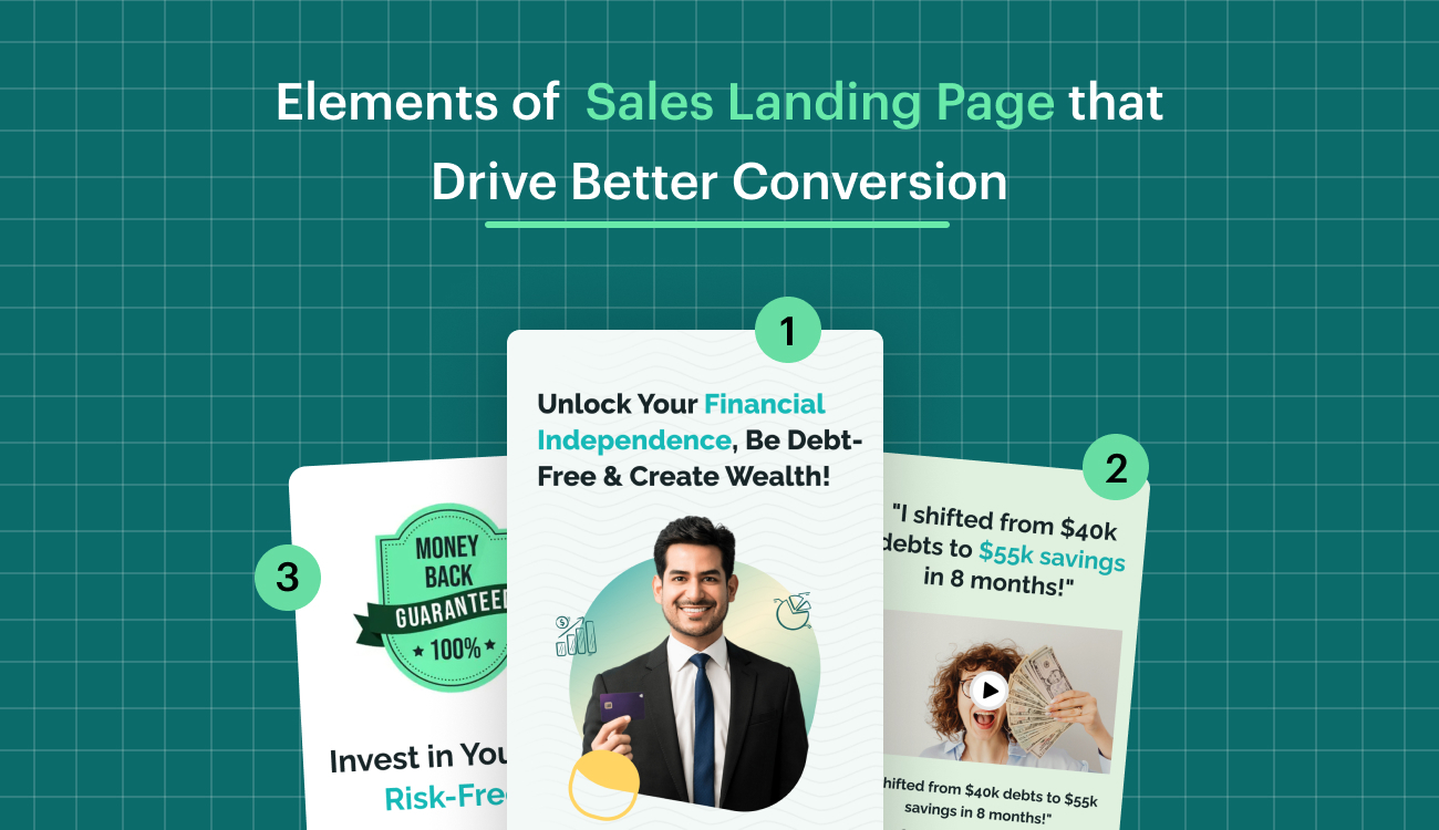
2. Use Visuals, Social Proof, and Trust Builders – Include product visuals, testimonials, reviews, and guarantees to reinforce credibility and reduce buyer hesitation.
3. Design for Focus and Mobile Usability – Stick to one conversion goal, use a strong CTA, and ensure fast loading speeds and mobile responsiveness for a seamless experience.
4. Structure Content for Easy Scanning and Clear Prioritization – Use bullet points, headings, and intentional visual hierarchy to make content digestible and guide visitors toward the CTA.
Sales pages are like the star players of landing pages. While most landing pages work hard to lead you towards making a purchase or capturing leads, a sales page is where the actual sale takes place.
To put it simply, if landing pages were a game, sales pages would be the ones scoring the goals.
Unlike regular pages that aim for actions like downloads or signups to build leads, a sales page’s main goal is to turn ad clicks directly into paying customers. It’s a crucial task, and your sales pages need to deliver the win.
Let’s explore what makes a great sales landing page and guide you on creating pages that turn clicks into satisfied customers.
But, before we delve into the details, let’s address some common questions about sales pages for online stores and services.
What Is A Sales Page?
A sales landing page is like a special webpage made to sell stuff. It tries to turn people visiting the page into customers by convincing them to buy what you’re offering.
These pages usually talk about what the product or service is, why it’s good for you, and how it can solve your problems.
Sometimes, they also have buttons or messages urging you to buy now, along with special deals to make you more interested.
There are two kinds of sales pages: short ones and long ones. Short sales landing pages are quick and to the point, giving you just the important details.
Long ones, often called ‘sales letters,’ are like detailed stories about the product, covering everything you might want to know before deciding to buy.
Are Landing Pages And Sales Pages Different From Each Other?
Yes, they are! A landing page is like a friendly invitation to explore a website. It’s there to guide you into doing something specific, like signing up or checking out a new product.
Now, think of a sales landing page as a bit more focused – its main mission is to convince you to buy something.
It goes into detail about the product, its benefits, and might even sweeten the deal with special offers or discounts.
So, while all sales landing pages are a kind of landing page, not every landing page is geared towards selling stuff. They each have their unique roles!
Take a look at this one for example:

What makes this sales page good?
Here, the big title kind of tells you how this thing can help with snoring, without saying it directly.
They also used bullet points to quickly say what the thing is and why it’s good.
And if you want to check it out, there’s a button at the end to take you to the online store. Easy, right?
This type of sales page is also called a short-form sales page. Now, what’s a short-form sales page? Even better, why don’t I tell you about the two types of landing pages that exist?
Short-Form Sales Page Vs Long-Form Sales Page
Short-form sales pages get straight to the point. They’re brief and only have the important info about a product or service. These pages make it easy for customers to decide to buy.
When to use short-form sales pages?
1. Connecting with People Who Already Know You:
You’re telling about your cool stuff to folks who already know you, like your friends on social media or those who read your newsletters.
They trust you, so you don’t need a big sales pitch. Just a quick and simple offer can make them want to buy.
2. Selling a Simple Product:
Imagine you’re selling something easy, like a simple course without extra fancy stuff. No bonuses, no complicated things – just the basics.
For this kind of simple stuff, you only need a short and straightforward sales page. People just want to know what it is and what they’ll get.
3. Budget-Friendly and Easy to Decide:
If what you’re selling doesn’t cost a lot (like between $20-$40), and it’s not a big decision to buy, that’s awesome.
A short sales page is perfect for things that are easy on the wallet and don’t need a lot of thinking. It’s quick and simple for a quick and simple decision.
When to use Long-form sales pages?
1. Reaching Potential Users/Buyers Online:
If you’re trying to connect with people who’ve never heard of you (we call them “cold traffic”), use a detailed sales page to build trust.
Explain why they should learn from you, share stories of how you’ve helped others, and show why you can do the same for them.
This is especially handy when they find you through ads, social media, or articles.
2. Making Things Clear with Bonuses:
Sometimes, during big product launches, you might add extra goodies like bonus ebooks or one-on-one sessions.
But here’s the trick: these extras can be confusing without explanation. So, use a longer sales page to guide your audience through how these bonuses enhance your main course and help them reach their goals.
3. Dealing with Higher Prices:
If your product has a premium price tag, say, $500 or more, your audience might hesitate.
They’ll wonder if it’s worth it, if they’re ready, or if they have the time and support.
To ease their concerns, use a comprehensive sales page. Dive into their worries, address objections, and paint a picture of how your product can help them overcome challenges and achieve their goals.
Now that you know about both types,
how do you Create a sales page?
Make sure your sales page looks like the ad that brought visitors here.
This is super important because you don’t want to confuse people by showing them something completely different on the page compared to what they saw in the ad.
In layman’s terms here’s what to do:
✅Do’s
1. Clearly match your sales page with your ad.
2. Use compelling and honest language.
3. Highlight benefits and solutions.
4. Include a strong call-to-action (CTA).
5. Use persuasive visuals.
❌Don’ts
1. Don’t mislead with false information.
2. Avoid cluttered or confusing layouts.
3. Don’t neglect mobile optimization.
4. Avoid jargon or complex language.
5. Don’t overlook the importance of customer testimonials.
Here’s how to get it onto your page:
1. The Introduction:
The intro block on a sales landing page sets the tone for the entire sales journey, providing visitors with a compelling snapshot of what awaits them.
It’s an opportunity to grab attention, evoke interest, and establish a connection with the audience.
A well-crafted introduction not only introduces the product but also addresses the pain points and desires of the target audience, creating an immediate resonance.
It piques curiosity and encourages visitors to explore further, guiding them seamlessly into the sales funnel.
An effective intro has the ability to captivate and persuade, laying the foundation for a positive user experience and increasing the likelihood of converting casual visitors into engaged leads and, ultimately, satisfied customers.
Keep these in mind when you start:
✅Do This
1. Craft a compelling and concise headline.
2. Clearly communicate the value proposition.
3. Address the target audience’s pain points or desires.
4. Use engaging visuals that align with the product or service.
5. Maintain a consistent brand voice and style.
❌Don’t Do This
1. Overloading with excessive information.
2. Using jargon or complex language.
3. Neglecting to highlight key benefits.
4. Using generic or cliché phrases.
5. Ignoring mobile responsiveness in design.
Here’s how to do it for your page:
In the intro block, the main heading serves as the focal point, aiming to convey the primary value or benefit that the target audience will derive from the product or service. This headline should be compelling and concise.
The text description beneath the heading further introduces the product or service, providing a brief but clear explanation of how it creates value for the user.
This involves outlining key features, addressing pain points, and emphasizing the unique aspects that set the offering apart.
The goal is to captivate the audience’s interest, establish a connection with their needs, and entice them to explore more of what the sales landing page has to offer.
For example:

The headline, “Shrink the world, expand your experiences,” captures attention and sets an adventurous tone.
It clearly communicates the central theme of traveling more for less, resonating with budget-conscious individuals.
The short points elaborate on how the product/service can turn travel dreams into reality by maximizing rewards, finding the best deals effortlessly, and confidently exploring budget-friendly destinations.
The call-to-action, “Start My Adventure for Only $29,” is both clear and enticing, inviting users to take immediate action.
The inclusion of a high rating from 750+ travel enthusiasts adds social proof, reinforcing the credibility of the offer making it a strong and effective intro block for a sales landing page.
2. Key Features/Benefits:
The Key Features/Benefits block provides a clear and concise overview of the core features and benefits, addressing the audience’s key questions and concerns.
It plays a crucial role in influencing the decision-making process by highlighting how the offering meets the specific needs and desires of the target audience.
The relevance lies in its ability to communicate the distinct advantages, showcase the value, and differentiate the product or service from competitors.
A well-crafted Key Features/Benefits block enhances transparency, builds trust, and guides visitors toward a deeper understanding of why the offering is the solution they’ve been searching for, ultimately increasing the likelihood of conversion.
Keep these in mind when you start:
✅Do This
1. Clearly communicate unique value.
2. Focus on benefits for the audience.
3. Use persuasive and engaging language.
4. Include a strong call-to-action.
5. Keep content concise.
❌Don’t Do This
1. Avoid confusing jargon.
2. Don’t overwhelm with excessive information.
3. Skip generic phrases; be specific.
4. Ensure mobile optimization.
5. Include visually appealing elements.
Here’s how to do it for your page:
Start with a compelling main heading that introduces the product or service as a solution to a pressing pain point, incorporating specific numbers or data points related to the industry or customer pain point and then pitch the product or service as a solution.
Explain how the product or service effectively addresses and solves that pain point, using strong action verbs and emotional triggers to resonate with the audience.
List key features and benefits, focusing on the value and outcomes that users can expect, creating a clear and persuasive narrative that guides potential customers toward understanding the unique advantages of the offering.
For example:

The main heading, immediately introduces the solution as a transformative approach to travel.
It effectively highlights the pain points using specific issues such as exorbitant expenses, time-consuming research, and missing out on deals.
The subsequent section not only presents a solution but also employs strong action verbs like “Discovering,” “Grabbing,” and “Maximizing” to convey the benefits.
The inclusion of specific outcomes, such as “Traveling more while spending less” and “Maximizing travel rewards like a pro,” focuses on the value and outcomes for the audience.
The call-to-action, “Experience The Transformation Now,” invites immediate engagement effectively communicating the unique value proposition and benefits of the travel solution, aligning with the principles of a strong Key Features/Benefits block.
| If you’re just getting started, it’s essential to understand what is a landing page and how it compares in structure and purpose to a full website—landing page vs website. |
3. The Pricing Package:
The Pricing Package block on a sales landing page is of utmost importance as it directly addresses one of the critical considerations for potential customers – the cost.
It provides transparency and clarity about the investment required for the product or service, which is crucial for building trust.
The pricing information helps users make informed decisions, aligning their expectations with the value they will receive.
This block is relevant as it streamlines the user journey, guiding visitors seamlessly from interest to conversion by presenting a clear path for purchasing.
A well-structured pricing section showcases different packages or options, catering to diverse customer needs and budgets.
Additionally, it helps filter leads by ensuring that those who proceed to explore pricing are genuinely interested and more likely to convert.
Keep these in mind when you start:
✅Do This
1. Clearly display pricing details.
2. Highlight the value in each package.
3. Offer a comparison table for easy evaluation.
4. Use straightforward and transparent language.
5. Include a compelling call-to-action (CTA).
❌Don’t Do This
1. Hiding pricing information.
2. Using complex or confusing terms.
3. Neglecting to showcase value in each package.
4. Overwhelming with too many package options.
5. Failing to provide a clear CTA for purchase or inquiry.
Here’s how to do it for your page:
Present clear and transparent pricing options, potential discounts, or promotions.
Each package should be thoroughly described, highlighting the specific features and benefits included, and emphasizing the value relative to the price.
To enhance user understanding, consider incorporating a comparison table or chart that succinctly illustrates the distinctions between the various packages.
This approach ensures that potential customers can easily evaluate the offerings, make informed decisions, and choose the package that best aligns with their needs and budget.
For example:

The customer testimonial from Sarah Wilson adds a personal touch, providing social proof and emphasizing the value of the workshop.
The pricing is clearly stated at $29, and the contents of the package are outlined in a straightforward manner.
The inclusion of specific features, such as a live workshop, bonus guide, and practical tips, highlights the value for the price.
The layout is concise and easy to understand, and the call-to-action at the end is clear and compelling.
Overall, presenting the pricing options with transparency and emphasizing the value proposition to entice potential customers to sign up.
| For SaaS marketers aiming to boost conversions, leveraging landing page copywriting, ai landing page optimization, and landing page optimization tips can lead to significant performance gains. |
4. The Author Block:
The author block on a sales landing page plays a crucial role in establishing trust, credibility, and a personal connection with the audience.
By featuring the author’s name, credentials, and a brief bio, it humanizes the content and lends authenticity to the offering.
Visitors are more likely to trust and engage with a product or service when they know there’s a real person behind it.
The author block helps build a sense of authority, showcasing the expertise and experience that underpin the content.
This, in turn, can alleviate potential concerns, answer questions, and provide assurance to the audience, contributing significantly to the overall persuasive power of the sales landing page.
Additionally, it fosters a connection, allowing potential customers to relate to the author and feel more confident in their decision to explore and possibly purchase the product or service.
Keep these in mind when you start:
✅Do This
1. Introduce the author with credibility.
2. Include a professional photo.
3. Briefly mention key achievements.
4. Express passion for the offering.
5. Connect personally with the audience.
❌Don’t Do This
1. Overemphasizing personal details.
2. Using an unprofessional photo.
3. Omitting relevant credentials.
4. Lack of enthusiasm.
5. Neglecting to establish a personal connection.
Here’s how to do it for your page:
In the author block the headline should be succinct yet compelling.
The description beneath it delves into the background, expertise, and notable achievements of the author, providing a clear snapshot of their qualifications and relevance to the product or service.
The inclusion of a visual element, such as a professional photo or video, adds a personal touch, fostering a sense of trust and connection with the audience.
The goal is to convey the author’s expertise, build credibility, and establish a personal connection that resonates with potential customers, ultimately contributing to the overall effectiveness of the sales landing page.
For example:

The headline immediately establishes authority and credibility.
The concise descriptions of each co-founder, John Smith and Doe Johnson, provide relevant background information, showcasing their expertise and the unique perspectives they bring to the product, “Travel Hacking 101.”
The use of titles like “Co-founder” and descriptors such as “Globe-trotter” and “Backpacker Extraordinaire” adds a touch of professionalism and credibility.
The inclusion of their roles and contributions reinforces their authority effectively building trust and connection with potential customers interested in budget travel tactics.
5. The FAQ’s:
The FAQ block plays a crucial role in addressing potential concerns and uncertainties that visitors may have, ultimately serving as a trust-building and conversion optimization tool.
In the decision-making process, potential customers often seek additional information or clarification before committing to a purchase.
By proactively providing answers to common questions in the FAQ section, the landing page addresses these uncertainties and helps users make informed decisions.
This transparency fosters a sense of trust, showcasing the business’s commitment to customer satisfaction.
Additionally, the FAQ block streamlines the user experience, reducing friction in the conversion process and increasing the likelihood that visitors will take the desired action.
It is an invaluable component for building credibility, overcoming objections, and ensuring a positive and informed interaction with potential customers.
Keep these in mind when you start:
✅Do This
1. Provide clear and concise answers.
2. Address common concerns and objections.
3. Organize FAQs logically for easy navigation.
4. Use plain language; avoid unnecessary jargon.
5. Regularly update content based on user feedback.
❌Don’t Do This
1. Overloading with excessive information.
2. Neglecting mobile optimization.
3. Using vague or unclear language.
4. Forgetting to include important questions.
5. Ignoring the impact of user-generated FAQs.
Here’s how to do it for your page:
Focus is on listing common questions and providing clear answers that address potential concerns or objections that users may have.
It’s crucial to ensure that the answers emphasize the value and benefits of the product or service, highlighting what sets it apart.
Keeping both questions and answers concise and easy to understand is key for accessibility.
This approach proactively overcome objections, establish credibility, and facilitate a smoother decision-making process for potential customers.
For example:

The heading clearly indicates that common questions about ‘Travel Hacking 101’ are addressed, creating transparency and indicating a willingness to provide information.
The questions are concise and directly address potential concerns a user might have, such as the definition of travel hacking and who would benefit from the workshop.
The answers emphasize the value by highlighting the goal of mastering budget travel strategies and assuring cost savings.
The call-to-action button strategically follows, inviting users to sign up, which is a direct response to the positive information provided in the FAQ contributing to a positive user experience in turn and potentially boosting conversions.
6. The Risk Renewal Block:
The Risk Renewal Block addresses potential hesitations or objections that a prospective customer may have.
By introducing a risk renewal or money-back guarantee, this section mitigates perceived risks associated with the purchase, instilling a sense of confidence in the buyer.
It signals the seller’s commitment to customer satisfaction and belief in the product or service’s efficacy.
This block not only fosters trust but also serves as a powerful conversion tool by minimizing the perceived downside for the customer, making it more likely for them to commit to the purchase and ultimately boosting sales.
Keep these in mind when you start:
✅Do This
1. Clearly explain the terms of any trial or money-back guarantee.
2. Highlight the benefits of the risk-free offer.
3. Use reassuring language to address potential concerns.
4. Include customer testimonials related to the risk renewal.
5. Feature a prominent and visible call-to-action for the risk-free offer.
❌Don’t Do This
1. Using vague or complex language in the terms.
2. Neglecting to emphasize the value of the risk-free offer.
3. Overlooking the importance of customer testimonials for reassurance.
4. Burying the risk renewal information in small text or an obscure location.
5. Failing to make the risk-free offer prominent on the landing page.
Here’s how to do it for your page:
Focus is on explaining any guarantees or warranties provided, such as a money-back guarantee or free trial.
The goal is to address potential concerns that users may have and establish trust in the offering.
Clearly articulating the terms of the guarantee or warranty, including the duration and conditions, provides transparency and reassures potential customers.
This section serves to reduce perceived risk, making it more enticing for users to engage with the product or service, ultimately encouraging conversions by demonstrating the confidence the business has in its offering.
For example:

This example clearly presents a guarantee – 100% Satisfaction or Your Money Back – offering a strong assurance to potential customers.
The language used is straightforward and builds confidence by expressing the belief in the workshop’s effectiveness.
By explicitly stating that a full refund is offered if not satisfied, the landing page addresses potential concerns and establishes trust with users.
This transparency and commitment to customer satisfaction are likely to reduce perceived risk, making the workshop more appealing to individuals who might be hesitant to engage.
7. Case Study:
The Case Study block serves as a powerful tool for building trust, credibility, and authenticity.
By showcasing real-world examples of successful implementations or satisfied customers, a case study provides tangible evidence of the product or service’s effectiveness.
This not only validates the claims made on the landing page but also offers potential customers a glimpse into the practical impact and benefits they can expect.
Case studies go beyond mere assertions, providing detailed narratives of how the offering has addressed specific challenges and delivered positive outcomes.
This instills confidence in the potential buyer, helping them visualize the value and potential results they could achieve.
Keep these in mind when you start:
✅Do This
1. Showcase real, quantifiable results.
2. Use engaging visuals like charts or graphs.
3. Tell a compelling story with a clear structure.
4. Highlight the problem, solution, and outcome.
5. Include customer testimonials for authenticity.
❌Don’t Do This
1. Using vague or generic case studies.
2. Overloading with excessive information.
3. Neglecting to quantify outcomes where possible.
4. Omitting the customer’s perspective or feedback.
5. Ignoring the relevance to the target audience.
Here’s how to do it for your page:
Try narrating a compelling transformation story that vividly demonstrates how the product or service has positively changed users’ lives.
This involves showcasing specific examples or case studies that provide tangible evidence of the impact.
The narrative should use vivid language and emotional triggers to engage the reader, creating a connection and resonance with the experiences of others.
By presenting real-world scenarios and outcomes, the case study block adds authenticity and credibility to the sales pitch, helping potential customers visualize the practical benefits and value they can expect from the product or service.
For example:

The use of a 5-star rating immediately communicates a positive endorsement, setting a favorable tone.
The brief testimonial from John Pearson, a solo backpacker, tells a succinct yet impactful transformation story.
By mentioning the epic journey becoming a reality without draining the bank account, it illustrates a tangible and positive impact on the user’s life.
The use of descriptive language, such as “phenomenal,” adds an emotional touch, engaging the reader and creating a sense of authenticity providing social proof and reinforcing the product’s positive impact on users’ lives.
| Dive deeper into landing page design, experiment with landing page split testing, and explore landing page examples and landing page best practices to maximize the impact of your landing page builder and track key landing page metrics with the help of landing page optimization tools. |
8. The Review Block:
The review block holds immense importance serving as a powerful tool for building credibility and influencing potential customers.
Real testimonials and reviews from satisfied customers provide authentic social proof, showcasing the positive experiences others have had with the product or service.
This validation helps to instill trust and confidence in prospective buyers who may be considering the offering.
Reviews offer insights into the practical benefits, addressing potential concerns and uncertainties.
They contribute to the overall narrative of the product’s value and effectiveness, influencing the decision-making process positively.
Keep these in mind when you start:
✅Do This
1. Include diverse testimonials for broader appeal.
2. Use authentic language to maintain credibility.
3. Highlight specific outcomes and benefits.
4. Incorporate visuals like customer photos.
5. Regularly update with fresh reviews.
❌Don’t Do This
1. Excessive editing; keep testimonials authentic.
2. Using only positive reviews; mix in constructive feedback.
3. Neglecting mobile optimization.
4. Using generic or vague testimonials.
5. Ignoring user feedback for improvements.
Here’s how to do it for your page:
For a review block on a sales landing page, it is essential to include testimonials or endorsements from satisfied customers, providing authentic social proof.
Additionally, incorporating logos of well-known clients, partners, or publications featuring the product or service enhances credibility.
The inclusion of any awards, certifications, or recognitions the product or service has received further bolsters its reputation.
This approach combines the voice of satisfied customers with external validations, creating a robust display of the product or service’s credibility and value.
For example:

This example incorporates various elements to build trust and credibility.
The star review provides a quick visual summary of satisfaction, while the textual review offers specific feedback in the customer’s own words.
Including the customer’s name and designation adds authenticity, and the tiny high-quality image personalizes the testimonial.
The headline, “Join 1000+ Travelers Who Transformed their Globetrotting with Travel Hacking 101,” creates a sense of community and showcases the product’s popularity.
Altogether, providing a compelling endorsement also visually engages the audience, making it a strong addition to a sales page.
9. The CTA Block:
The Call-to-Action (CTA) block embodies the entire persuasive effort of the page, prompting potential customers to take a specific step, such as making a purchase, signing up, or requesting more information.
The CTA is the linchpin that transforms casual visitors into engaged leads, guiding them through the conversion funnel.
It’s a crucial element for driving conversions and achieving the landing page’s primary goal.
A well-crafted CTA has the ability to be clear, compelling, and aligned with the overall messaging, enticing visitors to take action confidently making it an indispensable component of an effective sales landing page.
Keep these in mind when you start:
✅Do This
1. Craft a compelling and clear CTA message.
2. Use action-oriented language that encourages engagement.
3. Ensure the CTA button stands out visually.
4. Create a sense of urgency or exclusivity.
5. Align the CTA with the overall messaging and value proposition.
❌Don’t Do This
1. Using vague or unclear CTA language.
2. Over complicating the design of the CTA button.
3. Neglecting mobile optimization.
4. Including too many CTAs that confuse the user.
5. Failing to convey the value or benefits of taking the desired action.
Here’s how to do it for your page:
Write a persuasive headline that succinctly reiterates the value proposition. The headline should hold the key benefit or outcome that users will gain from taking the desired action.
Additionally, design a prominent and visually appealing CTA button or form that clearly invites users to make a purchase or sign up.
To enhance the sense of urgency and prompt immediate action, consider incorporating elements such as a limited-time offer or a countdown timer.
This combination of persuasive language, compelling design, and urgency elements creates a powerful CTA block that encourages users to take the next step in the conversion process.
For example:

The headline in the example, clearly reiterates the value proposition by emphasizing the ability to explore the world cost-effectively.
The CTA button, “Start My Travel Budget Now,” is prominent and uses action-oriented language, inviting users to initiate their journey immediately.
The inclusion of details such as the 90-minute live workshop, maximizing travel rewards, and a free bonus guide adds specificity to the offer, enhancing its appeal.
The urgency is subtly implied with the use of “Today” in the headline, creating a sense that this opportunity shouldn’t be missed making it a strong component of a sales landing page.
Turn clicks into customers using Swipe Pages, the lightning-fast landing page builder.
What’s Next?
Time to apply what you’ve learned into building your own sales page!
Remember, a sales page is made to sell more of what you offer. It’s there to convince people to buy your product or service.
A good sales page is clear, simple, and has all the important info about your brand in one spot. Look at these examples for ideas and make a sales page that your audience will love.
It might seem like everyone who clicks on your ad is super interested in your whole business. But, that’s not usually the case.
When people click on an ad, they just want to know more about what the ad promised, not everything else you offer. So, if you send them straight to your website, they might not end up buying.
Even if your products practically sell themselves, making a special sales page just for your campaign makes sure people don’t get lost on your website and actually buy something.
Want to see how Swipe Pages can help you make awesome landing pages? Just sign up for our 14-day trial and find out!
FAQ: Elements of Sales Landing Pages
1. What’s the most critical element of a sales landing page?
A strong headline and clear value proposition are essential. These draw in users immediately and set the tone for the entire conversion experience.
2. Why is having only one conversion goal important?
Focusing on a single goal (like a purchase or signup) eliminates distractions and decision fatigue, increasing the chances of a successful conversion.
3. How does social proof influence conversions?
Testimonials, reviews, and recognizable brand logos build trust and credibility, reassuring visitors that others have benefited from your product or service.