Key Takeaways
1. AI-Powered Design Automation Accelerates Landing Page Development AI landing page design tools leverage artificial intelligence to automate content generation, layout suggestions, and design optimization, enabling faster development cycles and rapid iteration compared to traditional manual design methods.
2. Data-Driven Personalization Improves User Experience and Conversions AI analyzes user behavior, demographics, and preferences to deliver personalized content, optimize call-to-action placements, and suggest ideal color schemes and layouts, resulting in higher conversion rates and more engaging user experiences.
3. Automated Testing and Optimization Streamline Performance Enhancement AI-powered A/B testing tools continuously optimize landing page elements, automate form submissions and chatbot responses, while providing valuable analytics and insights to identify areas for improvement without manual intervention.
4. Leading AI Tools Offer Comprehensive Design Solutions Popular AI landing page platforms include Landingi (content generation and translations), Leadpages (AI-driven copywriting), Elementor AI (WordPress integration), HubSpot’s AI generator (headline creation), and Wix AI Website Builder (scalable design suggestions).
Landing pages have one job: to convert visitors into customers. With fierce competition, shorter attention spans, and users making snap decisions, landing page design is no longer just about looking good. It’s about guiding user behavior, building trust, and making every element work toward a single and focused goal.
In this blog, we’ll break down the key principles of high-converting landing page design, share best practices, and show you how to avoid common mistakes. Whether you’re starting from scratch or optimizing an existing page, this post will help you design smarter and convert better.
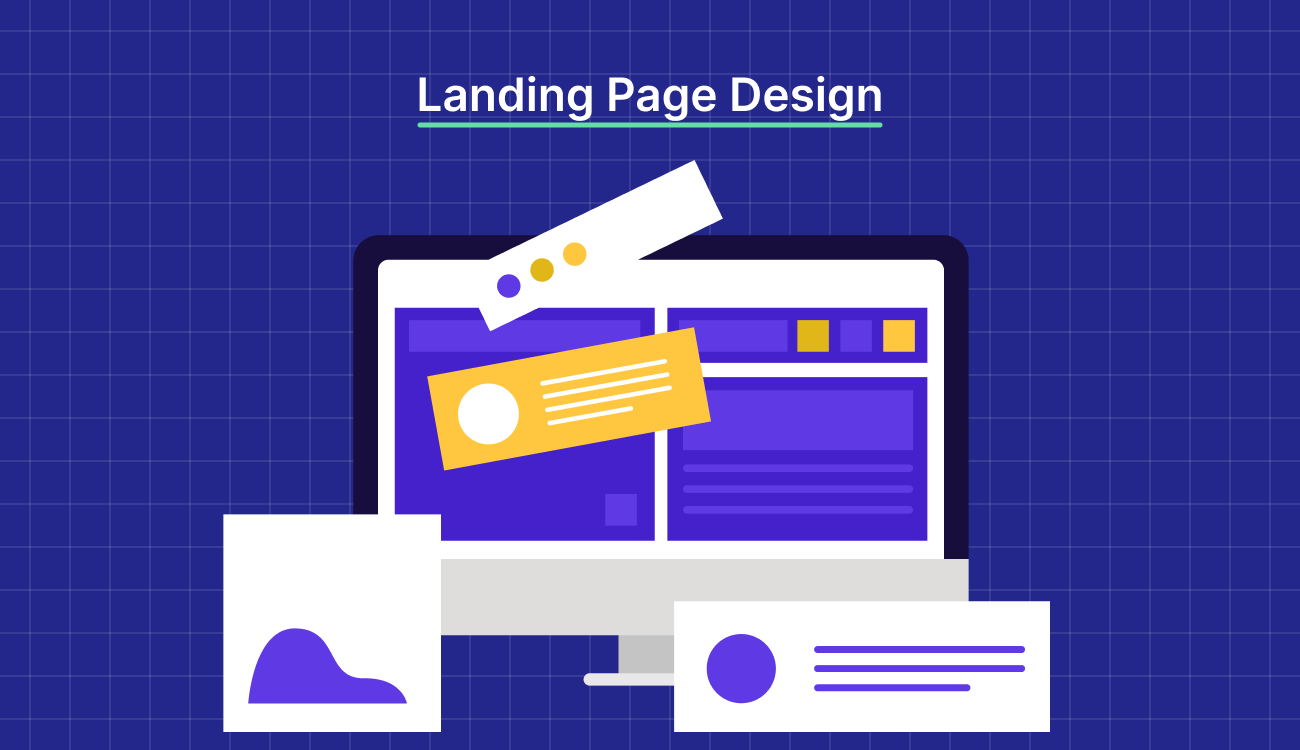
What Is Landing Page Design?
Landing page design is the strategic layout, structure, and visual styling that is focused on a single conversion goal. It is your most relevant sales pitch, where every element of the design guides visitors to one specific action.
Landing page design is not limited to making your offering look pretty. It’s about creating an intuitive and immersive experience that helps visitors understand the value quickly and take action confidently.
Why Landing Page Design Matters for Conversions
Design is one of the most influential drivers of the landing page. According to research, two key visual factors shape a user’s judgment of a website:
- Visual complexity – How clean and uncluttered the design appears
- Prototypicality – How familiar the layout feels based on expectations from similar pages
When a landing page feels both familiar and simple, users are more likely to engage and convert. So, why does responsive landing page design drive conversions?
- Builds instant trust through clarity and structure
- Guides visitors’ attention toward high-priority actions like CTAs
- Reduces cognitive load, making it easy to understand the offer
- Improves usability across mobile devices
- Increases conversion by removing distractions from the decision-making process
Types of Landing Pages and Their Design Goals
As we are talking about landing page designs, let’s look at the various types and their design goals, to help you identify what fits your needs.
Lead Generation Pages
This type of landing page collects your visitors’ contact information, like email or phone number, with the aim of engaging them with value-adding offers.
The goal of a lead generation landing page is to establish communication with potential customers and pre-quality leads, so you invest time and effort into customers who’ll convert.
Design goals
- Use copy that speaks directly to the visitor’s pain point, ensuring that only genuine prospects submit their information
- Build trust with benefit-driven copy, client testimonials, and privacy reassurance
- Ensure the offer is reinforced with urgency, relevancy, and exclusivity cues
Click-Through Pages
Click-through landing pages are bottom-of-the-funnel pages that warm up your potential leads by giving them relevant information. The goal is to send the visitor to a page where they can take action that converts them into customers.
Unlike Lead Pages, it doesn’t include any form, nor does it offer a “buy” button. Instead, when a visitor clicks on the CTA, it “clicks through” to the page where visitors can create their account or start a trial.
Design goals
- Use persuasive storytelling and benefit-driven content to educate visitors before sending them to the final conversion point
- Address common doubts with FAQs, relevant sources, and comparisons
- Avoid distraction and use a single call-to-action
Product Landing Pages
Product landing pages are designed to promote or sell a specific product. Unlike product pages, a product landing page is designed for visitors looking for a specific product. It can be used for a wide range of products like digital products, SaaS products, physical products, and subscription/membership services.
Design goals
- Translate product features into tangible outcomes that highlight how it solves a pain point and adds value
- Showcase social proofs and results with testimonials, stats, case studies, and client logos
- Keep the calls-to-action clear and strategically place them across the page
Webinar and Event Pages
A webinar or event landing page should serve as the central page for all the information about your webinar/events. It is a dedicated page where attendees can look for details about the event, view the agenda, learn about speakers, and more.
Design goals
- Clearly communicate the value of attending the event with bold headlines, explaining what and who it is for, and the speaker’s credibility
- Drive registration to trigger urgency; add countdown times, limited seats, or “last chance”
- Make a simple form, offer one-click calendar adds, request for reminders, and send immediate confirmation to reduce friction and ensure zero drop-offs between interest and sign-up
Key Principles of Effective Landing Page Design
Every element in a landing page should contribute to the narrative. Let’s look at five key principles that help design a responsive landing page.
1. Visual Hierarchy and Layout Strategy
An effective landing page layout uses visual hierarchy to lead the visitor’s eye, making it easy to scan. Use headers, subheaders, spacing, and size to guide attention from the most to the least important elements.
Stick to an F- or Z-pattern layout to align with a person’s natural eye movement. The F-pattern and Z-pattern describe common ways users scan a landing page with their eyes, and understanding these patterns is key to designing high-converting landing pages.


2. Color, Contrast, and Typography Choices
Color and contrast help create focus. A high-contrast element draws attention where it matters most, while a limited color palette maintains visual consistency. Typography is used to ensure readability and tone and to create rhythm and clarity.
3. Hero Section That Grabs Attention
The hero section sets the tone in seconds. It communicates the pain point and core value proposition with a concise headline, subheading, a supporting visual, and a CTA. There’s no room for vague messaging, it should be informative and aligned with the purpose of the landing page.

4. CTA Placement and Design Tips
In a landing page layout, CTAs are placed where intent peaks, often in the hero section above the fold and again after key sections. Design prominent and compelling CTA buttons that stand out with action-driven texts like “Start Free Trial” or “See It in Action”. Avoid generic labels like “Learn More” or “Submit”.
Additionally, test CTA designs, colors, and copy to find the combination that is noticed within seconds.
5. Use of Media: Images, Videos, Animations
Media elements should support, not distract from, the message. Use real product screenshots, short demo videos, or animated explainers to simplify your message and give users a glimpse of your product. Every image or video should reinforce the value proposition. Ensure they are optimized for speed and placed where they enhance clarity.
If you’re just getting started, it’s essential to understand what is a landing page and how it compares in structure and purpose to a full website—landing page vs website.
For SaaS marketers aiming to boost conversions, leveraging landing page copywriting, ai landing page optimization, and landing page optimization tips can lead to significant performance gains.
Content That Converts: Writing for Landing Pages
A good visual design might pull visitors, but a great copy closes the deal. Your landing page copy should be simple, concise, persuasive, and relevant to your target audience.
Here’s a tip. Before you start writing the content, answer these questions:
- Who is your target audience?
- What are their challenges that you can address in this landing page?
- How can your CTA address the pain point?
This will help you write focused content without distractions and avoid falling into the common trap of writing about your product instead of writing for your audience. Keep your copy simple and short so you don’t overwhelm or confuse the reader. Every sentence should move them one step closer to the CTA.
Crafting Headlines That Hook Visitors
Your landing page headline is the first impression and it needs to be clear, compelling, and conversion-ready. A great headline grabs attention by communication your offer, highlighting the value, and giving a reason for visitors to stay.
Here’s a simple formula to craft headlines that hook visitors
- Be clear about your offer: Tell visitors what you’re offering instead of making them guess. Lead with a unique value proposition that instills confidence
- Promise a specific benefit: Instead of being vague, start with a strong benefit that answers How your service solves their problems
- Add a hook: Give your headlines an edge that makes them memorable, for example, use words that erase any doubts in the visitor’s mind
Structuring Persuasive Body Copy
A well written landing page copy will help drive up qualified leads, built trust and credibility, increase conversions across marketing campaigns, and improve brand awareness and recognition.
Here are some tips to ensure your copy communicates without being too wordy
- Align the content with intent: Understand where your traffic is coming from. High-intent users from search engine ads need direct, conversion-focused copy. While low-intent visitors from social media ads, who may not be aware of your offering, need softer, more educational content that builds credibility and confidence
- Ensure copy matches from ad to landing page: Keep your headline, subheadline, and CTA consistent with your ad copy. If your ad copy says “Free trial for 15 days”, your landing page should reflect that exact promise.
- Communicate your unique value clearly: Answer what are you offering? Who is it for? And how can it help? This is your value proposition and it should tell visitors why they should choose your over competitors.
Leveraging Social Proof and Testimonials
People trust people. Adding authentic social proof in your landing pages can build trust, reduce hesitation, and boost conversion.
Here’s how you can use social proofs and testimonials
- Use proven formats: Testimonials, logos, user-generated content, case studies, awards, or recent sales notifications are some popular and proven ways to show others trust your brand
- Place social proof throughout the page: Don’t limit it to one format or one section. Add logos above the fold, use testimonials next to key benefits, or awards near forms.
- Make your proof relevant and believable: Choose testimonials that reflect your actual audience; show faces, names, and company info to make it feel real
Best Practices for Landing Page Design in 2025
Landing pages should be built on speed, clarity, relevance, and intent. These landing page design best practices reflect what your page needs to stay ahead of the curve.
Keep It Minimal and Focused
High-converting landing pages don’t confuse visitors with too many options. They focus on one goal and eliminate any visual element that dilutes attention and kills conversion. Your landing page needs a consistent message and minimal scrolling.
Here’s how you can ensure that your visitors focus on the key areas:
- Remove navigation menus or links to other products/services that lead visitors away
- Don’t add social media links or sharing buttons that distract them
- Stick to one call to action and design it to demand attention
- Your above-the-fold content needs to highlight key details and value propositions
Use Authentic Visuals Over Stock Images
Your audience can tell when the visuals you use in your landing pages aren’t relevant to your offerings. Visuals aren’t just a nice-to-have element; they’re strategic tools to build trust and drive action. Stock photos reduce credibility.
Make your visuals work for conversion:
- Use authentic product shots, customer photos, and branded graphics
- Add images that support the objective and guide the viewer’s eye naturally to your CTA
- Avoid filler images
- Choose visuals that spark emotion and help users relate to the goal
Test Different Layouts and CTAs


The two landing page templates by Swipe Pages make it evident that no single landing page layout works for every audience. There’s no perfect formula, which makes ongoing testing a key step when designing a landing page. Run A/B tests on layouts, copy, and CTA placements to optimize your landing page based on data.
Even small changes can lead to measurable improvements in engagement and conversion:
- Run A/B tests to identify what’s working
- Try different layouts, Z-pattern, F-pattern, or single-column to match how your audience consumes content
- Experiment with CTA copy and placement
Prioritize Mobile-First Design
A mobile-responsive landing page shows your intention to not only accommodate visitors but also prioritize their experience. But mobile-first designs don’t simply mean shrinking the desktop version. It means rethinking the layout, structure, and user flow for optimal performance across various mobile devices.
Here are some considerations to keep in mind when designing a responsive landing page:
- Use a vertical and scrollable layout for smooth thumb navigation
- Design large and finger-friendly buttons with generous whitespaces
- Choose readable and responsive fonts that adjust well across devices
- Avoid pop-ups or overlays that block content
- Ensure the website is quick to load on devices with limited processing power
Ensure Fast Loading Speed and Performance
Along with a responsive landing page, fast loading speed and performance have become industry standards. A delay of one second can cause significant drop-offs in conversion. Your visitors won’t wait, and neither will Google’s ranking algorithm.
To optimize for speed and performance:
- Compress images and videos
- Defer non-essential scripts to prioritize what matters most at first load
- Regularly test your landing page speed
- Use fast and reliable hosting to deliver content without lag
| Dive deeper into landing page design, experiment with landing page split testing, and explore landing page examples and landing page best practices to maximize the impact of your landing page builder and track key landing page metrics with the help of landing page optimization tools. |
Swipe Pages Templates: Built for Beautiful Design
Swipe Pages offers professionally crafted, industry-specific templates that are designed to work seamlessly across devices.
Pre-Designed Layouts That Convert
Well-crafted templates take the guesswork out of landing page design. Swipe Pages offers 40+ landing page templates, each built with proven UX principles, best practices, and real-world performance data.
Whether you’re building a click-through page, lead gen form, or product launch landing page across any industry, these designs offer a reliable starting point and inspiration for high-converting experiences.
Drag-and-Drop Builder for Visual Flexibility
Swipe Pages gives you the freedom to design without requiring a single line of code. Its intuitive drag-and-drop builder, paired with 80+ prebuilt blocks and 1,000+ Google Fonts, makes it easy to design and launch tailored and on-brand pages in seconds.
From responsive typography and gradient styling to a library of 1M+ Unsplash images and 8,000+ icons, everything is built to help you create fast, personalized, and high-performing landing pages.
Swipe Pages: The landing page builder that helps you design, test, and grow your campaigns faster. |
Landing Page Design Examples for Inspiration
Having learnt how to design a landing page that converts, let’s look at some examples for landing page design inspiration.
SaaS Landing Page Examples
A SaaS landing page is a standalone web page created specifically to promote a Software-as-a-Service product or feature and drive a fingle action. It is designed with conversion in mind and aligns with user intent, highlight key features and benefits.
Here are two SaaS landing page design examples, that caught our attention.
1. Ballpark – Websit Testing Feature Page

What makes it stand out:
- Minimalist hero section with a focused messaging and bold CTA makes it instantly clear what the user can do and why it matters
- Scannable content with short, digestible copy blocks with icons and visuals help users retain information quickly
- Realistic mockup and UI screenshots instead of stock photos, builds trust by offering a sneak peek into the product experience
- Gentle transitions and hover effects add interactivity without adding distractions
2. Cartesia AI- Sonic
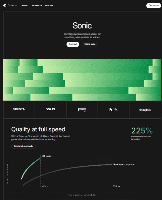
What makes it stand out:
- Black-and-neon theme showcases a futuristic visual design evoking a high-tech feels, aligning with its AI-focused positioning
- Hero section with animated background and clear CTA makes a strong first impression
- Highlighting features by showing how Sonic fits into different use cases, making it relatable and outcome driven
Ecommerce Landing Page Designs
An ecommerce landing page is designed with intentional structuring and styling to drive a specific action related to a product, such as adding to cart, making a purchase, or signing up for a pre-order or discount.
Here are two examples of ecommerce landing page designed to convert visitors.
1. Eight Sleep – Pod 5

What makes it stand out:
- Hero image showing the product in a real-life bedroom setting, with a benefit-driven heading “Perfect your Sleep”
- Scroll-based storytelling walks you through benefits, features, and testimonials, anchored visually with beautiful, realistic product images
- Concise and straight-forward copy focusing and reentering key elements
2. Lomi – Lomi 2

What makes it stand out:
- Product images and video demonstration of Lomi in action makes the product tangible
- Social proofs like “250,000+ households” and user reviews builds trust
- FAQs section ensures all buyer questions are answers without leaving the page
Agency or Service-Based Landing Pages
An agency or service-based landing page promotes specific service offerings or highlight a company’s capabilities, tailored to a target audience or industry.
Here’s are two examples of service-based landing pages that showcase differentiation and expertise.
1. YourCreative – Services Offered

What makes it stand out
- Editorial-like visual design makes the layout feel like a magazine, with clean and elegant style
- Each service category appears as you scroll with microcopy that keeps the experience intuitive and sophisticated
- Font, colors, and animations are consistent across the page, demonstrating professionalism
2. Webflow – Design Page

What makes it stand out
- The headline is short and directly targets designers by offering immediate value “Experience the power of code. Without writing it.”
- Interactive scroll-based storytelling showcasing users how they can design websites in the order of the process with ease
- A clear and single-focused CTA naturally guides visitors to take the next step and “Get Started”
Mobile-Optimized Landing Page Samples
A mobile landing page is a standalone web page specifically tailored for mobile devices, ensuring fast loading time, clear content, and seamless user experience.
Here are two mobile-optimized landing page design with minimal text and smooth layout.
1. Todoits – Task Management

What makes it stand out
- Clean, single column mobile layout with generous white space and icons and buttons properly sized for easy navigation
- Video showing how it works in the hero image makes a clean introduction to the feature
- Expandable card presents information in concise and visually appealing way, reducing any distraction and eliminating visual clutter
- Shows how the task manager looks on different devices helping users visualize how it will work in their daily lives
2. Vivint – Home Security Packages

What makes it stand out:
- Mobile-friendly cards displays its unique propositions and values clearly
- Content hierarchy is clear with minimal and scannable copy
- Tap-to-expand FAQs offer detailed information without overwhelming mobile view
Common Landing Page Design Mistakes to Avoid
After learning all about responsive landing page design best practices, let’s look at three common mistakes that can become a hurdle in your landing page’s performance.
Overloading Pages with Content
Too much content overwhelms and distracts from the core message. Focus on reinforcing the key objective of the landing page across the content.
Weak or Missing Visual Hierarchy
If the landing page layout has a complex visual hierarchy, it’s hard to scan, or is overloaded with UI elements, visitors will leave. Use clear copy, consistent spacing, and balanced visual elements to guide attention.
Slow Page Load Times
A slow page will send your visitors to your competitors. Optimize images, limit scripts, and prioritize page speed as a part of your design process.
Final Thoughts: Design Smarter, Convert Better
Landing page design isn’t like decorating for Christmas. It’s about emphasizing the core message of your page and guiding visitors’ actions towards a single goal. In 2025, the best pages won’t be the flashiest; they’ll be the ones that are fast, focused, and conversion-first.
If you’re looking for a platform that helps you put these landing page design best practices into practice, Swipe Pages is built for exactly that. With a fast landing page builder, built-in A/B testing, and seamless integrations, it’s never been easier to create landing pages that convert.
Try Swipe Pages for free (14-day free trial) and experience how effortless high-performance landing page design can be.
Frequently Asked Questions
1. What is AI landing page design and how does it work? A: AI landing page design uses artificial intelligence to automate and optimize the creation of high-converting web pages. AI tools analyze user data, generate content like headlines and copy, suggest optimal layouts and color schemes, and personalize experiences based on individual user behavior and demographics.
2. What are the main benefits of using AI for landing page design? A: AI landing page design offers faster development times, improved conversion rates through data-driven optimization, personalized user experiences, valuable performance analytics, and streamlined workflows by automating content generation, design suggestions, and A/B testing processes.
3. Which AI tools are best for creating landing pages? A: Top AI landing page tools include Landingi for content generation and automated translations, Leadpages for AI-driven copywriting and A/B testing, Elementor AI for WordPress integration, HubSpot’s AI Landing Page Copy Generator for headlines and content, and Wix AI Website Builder for scalable design suggestions.