Key Takeaways:
- Optimize for Conversions
Focus on improving headlines, CTAs, forms, and copy to guide visitors toward your desired action—be it sign-ups, purchases, or leads. - Use A/B Testing and Analytics
Test different page elements and leverage user behavior data to identify what drives better performance. - Enhance User Experience (UX)
Design for clarity, simplicity, and speed to keep users engaged and reduce friction in the conversion journey. - Boost Marketing ROI
An optimized landing page increases conversions, improves alignment with business goals, and maximizes campaign returns.
A well-optimized landing page can be the difference between a lost visitor and a new customer. Whether you’re driving traffic through ads, email marketing, or organic search, your landing page needs to capture attention, engage visitors, and guide them toward taking action.
With the top landing pages seeing conversion rates of 11.45% or higher, it’s clear that a well-designed landing page can quickly become one of the best ways to get sales and leads.
But what exactly makes a landing page effective?
In this blog post, we’ll dive into the key principles of landing page optimization. You’ll also learn how to test and refine your pages to maximize conversions. Let’s get started!
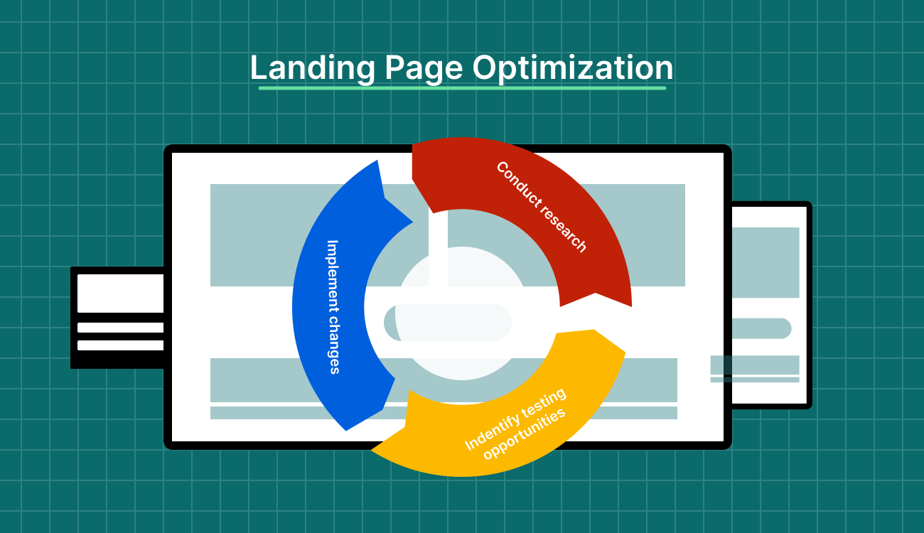
What Is Landing Page Optimization (LPO)?
Landing page optimization (LPO) is the process of refining a landing page to increase the likelihood of converting visitors into customers or leads. It focuses on enhancing key elements, including design, copy, layout, forms, and calls to action (CTAs), by leveraging insights from user behavior, A/B testing, and data analysis.
The goal is to create a seamless, engaging experience that encourages visitors to take the desired action. A well-optimized landing page reduces friction, builds trust, and communicates the value of the offer, ultimately boosting conversion rates.
Minor tweaks, like clearer messaging, faster load times, or more compelling visuals, can significantly increase the number of visitors who convert. This allows businesses to achieve better results without raising advertising costs.
Additionally, LPO helps lower the cost per acquisition (CPA). When more visitors convert without raising your ad spend, you get more value from every campaign and a better return on investment (ROI).
Key Elements of a High-Converting Landing Page
Think of your landing page like a first impression. If it feels right, visitors stay. If not, they are gone. Let’s take a look at the components that make the moment count.
1. Attention-Grabbing Headlines
The headline is the first thing visitors will notice, and it often determines whether they will stay on your page or bounce.
To make your headline truly effective, it must capture immediate attention. This can be achieved by evoking curiosity, promising value, or directly addressing a problem your visitor wants to have solved.
Your headline is not the place to get clever. Visitors are not here to solve a riddle—they want clarity, fast. Make your value clear, specific, and outcome-focused.
To get this right, ask yourself:
- What is the visitor hoping to achieve?
- What problem are they trying to solve?
- What would make them say, “Yes, this is exactly what I need”?
Then, write your headline to reflect that. If your traffic comes from ads, emails, or social posts, make sure the headline mirrors the message they clicked on.
For example, if your ad says “Cut Meeting Time by 50%,” your headline should not suddenly talk about collaboration tools. Stay consistent. When your headline matches their expectations, you reduce friction, build trust, and increase the chance they keep reading (or converting).
Look at this example from Oura.

Caption: Oura’s headline example
The headline is short and impactful, emphasizing that the ring can track over 30 biometrics and has a stylish design.
2. Compelling Visuals and Media Elements
Visuals are essential conversion drivers. When used correctly, they significantly enhance user engagement and trust.
Contextual imagery, such as photos or videos that show your product or service in action or demonstrate the desired outcome, like happy customers or before-and-after transformations, can have a strong resonance with visitors.
Here’s an example of a clean and organized Instagram ad from Branch Basics. It shows their best-selling products in a kit, including laundry detergent, reusable glass bottles, oxygen boost, dishwasher tablets, and a concentrate. There’s also a big “Save 20%” badge.
The ad looks good and clearly shows the main products, making it easy for customers to know what they’re getting.

Caption: Branch Basics’ visuals example
Using high-quality visuals is essential—blurry or generic stock photos can harm your credibility. Authentic, high-resolution images, however, help build trust and keep users engaged.
Incorporating explainer videos can also be a game-changer. Think of it as your pitch, but way faster and way easier to understand. If someone’s even a little unsure about what you do, a short, clear video can give them that aha! moment.
Keep it under 90 seconds, get straight to the point, and show the outcome, not just the features. Most people watch without sound, so make sure it works with captions and strong visuals. Drop it near your CTA, and let it do the heavy lifting.
3. Clear and Strong CTA
Your CTA is not an afterthought. It is the moment your visitor makes a decision, so every part of it needs to pull its weight. Make sure it stands out. Use contrast, white space, and clean placement so it naturally catches attention without feeling forced.
And the copy? That is where most pages miss the mark. “Submit” does not tell anyone what happens next. A CTA like “Get My Free Guide” feels clear, specific, and personal. Start with a strong verb and focus on the benefit. Think about where your visitor is in their journey. If they are new to your brand, “Learn More” or “See How It Works” feels safer than “Start Your Free Trial.”
Here’s a real-life example of how Dropbox used its CTA to attract more leads:
| Dropbox combined a minimalist homepage design with clever psychological CTA tactics to drive growth. Instead of the typical “Invite your Friends” call found in most referral programs, they made it personal with “Get more space,” appealing directly to users’ self-interest. This small but powerful shift made sharing Dropbox feel like a personal win rather than a favor to the company.Backing this up was a highly effective referral program. Users were rewarded with extra storage space for every successful invite—both they and their friends gained more space, creating a strong incentive to spread the word. This approach not only boosted user engagement but also transformed customers into enthusiastic brand advocates.The impact was impressive. Dropbox’s user base skyrocketed from 100,000 to 4 million in just 15 months, all without heavy investment in traditional advertising. This case highlights the effectiveness of a clear call-to-action (CTA) combined with user-centric incentives in driving substantial growth. |
Then test it. Change the wording, shift the color, move the button up or down. Even something small, like switching from “Your” to “My”, can boost conversions. Your CTA is not the end of the page, it is the reason the page exists. Treat it like it matters, because it does.
4. Lead Capture Forms
Generally, shorter forms tend to convert more effectively. Research has also found that reducing the number of form fields from four to three can significantly increase conversions.
Fields like name and email are usually sufficient for top-of-the-funnel offers. Ask for additional information only if it is necessary and ensure that users understand why it’s being requested.
For example, if you’re asking for a phone number, ensure users know how it will benefit them. Consider using multi-step forms for visitors with higher intent. Breaking long forms into smaller, progressive steps can improve completion rates by making the process feel more manageable and approachable.

Caption: Swipe Pages lead capture form example
Finally, ensure that the form is well-designed: labels should be easy to read, errors should be flagged, and the “Submit” button should communicate the action, such as “Download My Free E-book” rather than just “Submit.”
5. Social Proof and Trust Signals
People do not arrive on your page ready to trust you. They need to see social proof that others have been where they are and had a good outcome. Use testimonials that are specific and believable. Include full names, roles, and companies when possible.
A review from “John D.” means less than one from “Sarah Tan, Marketing Manager at Drift.” The goal is to show that real people with real stakes have seen value in what you offer. That credibility is what turns hesitation into action.
Case studies and success stories can be even more persuasive, especially if they highlight quantifiable results. Trust badges and certifications, such as SSL seals or industry awards, also serve to validate the credibility of your business.
If your product or service has been featured in reputable media outlets, display this prominently on your landing page, as media mentions help boost trust and legitimacy.
Here is an example of testimonials from users who used Wealthfront. It highlights that several people (over 465,000) are already using the product to earn more, along with logos from well-known financial media outlets.

Caption: Wealthfront social proof example
A/B Testing and Experimentation Strategies
Want better results? Stop assuming and start A/B testing. Small changes can lead to big wins if you know what to look for.
Here is how to approach A/B testing with purpose.
What to A/B Test on Your Landing Page
When you start testing, focus on the parts that shape a visitor’s decision:
- Headline: Test different ways of framing your main promise
- CTA button: Try variations in wording, size, and color
- Hero image: Swap visuals to see what gets more attention
- Form fields: Shorten or rearrange to reduce drop-offs
- Page layout: Shift sections around to guide action more naturally
- CTA placement: Top, middle, bottom, or sticky CTA buttons
- Copy length: Short vs. long explanations
- Social proof placement: Testimonials at the top vs. near the CTA
- Trust badges or security seals: Test with or without them near forms
Tools for A/B Testing
Picking the right tool can make A/B testing faster, easier, and way more reliable. Some platforms are built for quick experiments, others give you deeper insights. Here are a few that help you test smarter and get real answers.
a) Swipe Pages

Caption: Swipe Pages’ A/B testing dashboard
Swipe Pages is among the best landing page builders with built-in A/B testing features. To use it, create two versions (A and B) of your landing page, altering a single element such as the headline or CTA button. Set up the experiment in the dashboard, and Swipe Pages will automatically split your traffic between the two versions.
The platform tracks conversions, allowing you to analyze which version performs better. Its intuitive interface also makes launching and monitoring tests straightforward, ideal for marketers seeking quick optimization cycles.
b) Visual Website Optimizer (VWO)

Caption: VWO A/B testing home page
VWO helps you select the landing page to test and use VWO’s visual editor to create variations. Set up your experiment by defining goals (e.g., clicks, form submissions) and splitting traffic between the control and variant.
It offers tools like a significance calculator and duration estimator to ensure reliable results. Once the test concludes, VWO’s dashboard displays detailed analytics, helping you interpret which variant performed best and why.
c) Optimizely

Caption: Optimizely’s experimentation home page
Optimizely allows you to create variations using its visual editor or code-based approach. Define your experiment goals and allocate traffic between variants. The tool provides real-time reporting and statistical analysis to determine which version achieves your objectives, such as higher conversions or lower bounce rates.
Its integrations and advanced targeting options enable precise audience segmentation and experiment management, making it suitable for both beginners and advanced users.
| If you’re just getting started, it’s essential to understand what is a landing page and how it compares in structure and purpose to a full website—landing page vs website. For SaaS marketers aiming to boost conversions, leveraging landing page copywriting, ai landing page optimization, and landing page optimization tips can lead to significant performance gains. Dive deeper into landing page design, experiment with landing page split testing, and explore landing page examples and landing page best practices to maximize the impact of your landing page builder and track key landing page metrics with the help of landing page optimization tools. |
Interpreting A/B Test Results Correctly
Interpreting A/B test results requires a data-driven approach. First, ensure statistical significance by running tests for a sufficient amount of time to gather a large enough sample size. Compare conversion rates between the variants and avoid jumping to conclusions based on slight differences.
Look at key metrics, such as bounce rate, click-through rate (CTR), and overall engagement, rather than just conversions. Consider external factors that could influence results, and make decisions based on the larger trends.
Landing Page Optimization for SEO Benefits
Landing pages are built to convert, but they also need to pull the right traffic. Strong SEO makes that possible.
Let’s see how to target the right keywords, structure your page for better flow, and improve speed to meet Core Web Vitals.
Keyword Targeting
The process begins by identifying a primary keyword for the page, along with secondary, related keywords. The primary keyword should appear in key areas, such as the page title, URL, meta description, header tags (H1, H2), and throughout the body copy, in a natural and user-friendly way.
However, avoid keyword stuffing, as it can result in a poor user experience and penalties from search engines.
Incorporate secondary keywords strategically throughout your content, headers, and image alt text to reinforce relevance and increase your chances of ranking for a variety of related search queries.
It’s also important to consider user intent when selecting keywords. For instance, targeting transactional keywords like “buy software” or informational keywords like “how to use [software name]” can help you address users at different stages of the buyer’s journey.
Internal Linking and Page Structure
Internal linking plays a big role in how well your landing page performs. It helps search engines understand the structure of your site, decide which pages to prioritize, and follow the flow of content across related topics.
Think of every internal link as a next step. Instead of dumping links into a random block or footer, place them where people actually pause—after a question, a feature description, or a claim that could use proof. That is where interest peaks and curiosity is high.
Use anchor text that explains the value clearly. A phrase like “See how the tool compares” sets a clear expectation. It gets clicks because it feels like a natural continuation, not a detour.
Structure matters as well. Your layout should guide people without making them think twice. Headings, spacing, and content order should serve as a good tour guide: always one step ahead, never in the way.
Search engines follow structure too. When your page flows logically, it becomes easier to index, easier to rank, and easier to trust.
3. Speed and Core Web Vitals
Google has emphasized the importance of page speed in its ranking algorithms, noting that slow-loading pages tend to result in higher bounce rates and lower rankings. Core Web Vitals, a set of user-focused metrics introduced by Google, measure critical aspects of page performance, interactivity, and visual stability.
There are three key Core Web Vitals to focus on for optimal landing page performance:
- Largest Contentful Paint (LCP)
- First Input Delay (FID)
- Cumulative Layout Shift (CLS)
LCP tracks how long it takes for the largest visible content element (such as an image or text block) to load. FID measures how quickly users can interact with the page, while CLS evaluates how much the page layout shifts during loading, which can lead to visual instability.
To optimize these metrics, focus on reducing page load times by efficiently compressing images, using browser caching, and minimizing the use of heavy scripts and external resources.
Implement lazy loading for images and videos so they load only when visible in the user’s viewport. Additionally, ensure fast server response times and consider utilizing Content Delivery Networks (CDNs) to expedite asset delivery.

Caption: Swipe Pages uses a global CDN for landing pages
Swipe Pages takes page performance to the next level with lightning-fast load times on all devices. It does this by compressing images smartly, optimizing code for efficiency, and using a global CDN to serve your pages from the nearest location.
This way, users get a faster, smoother experience wherever they are.
| 🎁 Bonus: Get Swipe Pages’ free Landing Page Wireframe Kit with 91 conversion-optimized blocks to plan smarter and build faster. |
3 Landing Page Mistakes to Avoid
Even a beautifully designed landing page can underperform if it’s weighed down by common mistakes that hurt user experience and conversions. Recognizing and avoiding these pitfalls can make the difference between a page that thrives and one that falls flat.
Here’s a closer look.
1. Overloading the Page With CTAs
One of the most common mistakes in landing page design is overloading the page with too many CTAs. While it’s essential to guide users toward your desired outcome, bombarding them with multiple, competing CTAs can create confusion and overwhelm.
Users may not know where to focus their attention, or worse, they may abandon the page entirely because of the clutter.
To avoid this mistake, focus on a single, clear CTA that aligns with the page’s purpose. This could be a “Sign Up Now,” “Download Free E-book,” or “Get a Demo” button, depending on your goals. If you absolutely must include secondary CTAs (such as “Learn More” or “Contact Us”), ensure they’re less prominent than the primary CTA.
Keep the messaging concise and compelling, and place the CTA in areas where users naturally expect to see it, like at the top of the page and again at the bottom.
2. Asking for Too Much Information
Requesting too much information in many fields on a form can deter potential leads from completing the process. A lengthy form can create friction, causing users to abandon it before submission.
It’s important to limit the number of fields in your form to the essentials.
For example, if you’re offering a free trial or downloadable resource, ask only for the user’s name and email address. You can always collect more information later in the customer journey, once you’ve built more trust with the user.
3. Ignoring Page Load Times
Slow pages lose visitors. It is that simple. If your landing page takes more than a few seconds to load, most people will leave before they even see your offer. And the worst part? You are still paying for that click.

Caption: Choose from Swipe Pages collection of 150 customizable templates
Swipe Pages tackles load time right at the source.
Every template is built to be lightweight and mobile-first by default. It also supports AMP (Accelerated Mobile Pages), helping your landing pages load in under two seconds without sacrificing design or functionality.
It also gives you pre-tested, conversion-optimized blocks and wireframes, so you are not stuffing your page with bloated layouts or unnecessary elements that drag performance down. You start fast and stay fast, which means better quality scores, better ad performance, and higher conversions from day one.
Swipe Pages is a powerful landing page builder designed to help marketers create high-converting pages without any coding.
Landing Page Optimization Checklist
Before you launch, a solid landing page checklist makes all the difference. It keeps your page fast, focused, and built for action. Here is what you need to double-check to give your landing page the best shot at converting visitors into leads or customers.
| Before Publishing: Key Elements to Review | After Publishing: What to Track and Measure |
| Ensure the headline is clear and compelling | Monitor conversion rates |
| Verify that the CTA (Call to Action) is prominent and specific | Track bounce rate |
| Check for mobile responsiveness | Measure time on the page |
| Test page load speed | Analyze traffic sources |
| Review the design for user-friendliness and visual appeal | Review the heatmap and user behavior |
| Ensure content is concise, relevant, and free of errors | A/B test variations of CTA buttons and page elements |
| Include trust signals (testimonials, reviews, security badges) | Measure form submissions and click-through rates |
| Double-check SEO elements (meta tags, keywords, URL | Track goal completions in analytics |
| Confirm that proper analytics and tracking codes are installed | Collect user feedback through surveys or polls |
Final Thoughts: Turning Traffic Into Conversions
Landing page optimization means getting people to notice you, trust you, and actually want what you are offering. It comes down to a few things done right—clear headlines, clean visuals, strong CTAs, simple forms, and social proof that feels real. Nail these pieces, and you are already way ahead.
A/B testing and continuous experimentation are crucial for refining your strategy, while adhering to SEO best practices ensures that your landing pages also attract valuable organic traffic.
When you combine data-driven insights with a deep understanding of audience needs, you turn your landing pages into powerful growth engines for your business.
Try Swipe Pages for free (no credit card required!) to see how it can help you build, test, and optimize high-converting landing pages.
FAQs on Landing Page Optimization
1. What is meant by landing page optimization?
Landing page optimization involves improving the design, content, and user experience of a landing page to increase its effectiveness. The goal is to boost conversions, whether through capturing leads, encouraging sign-ups, or making sales. Optimizing elements such as copy, visuals, CTAs, and load speed enhances user engagement and drives the desired actions.
2. How can you optimize an SEO landing page?
Optimizing a landing page for search engines requires using targeted keywords in the title, meta description, headings, and body content. Ensure the page is mobile-friendly, fast-loading, and has quality internal and external links. Optimize images with alt text, add clear CTA buttons, and provide value to enhance search engine rankings and user experience.
3. How can you optimize landing page conversion?
To boost landing page conversions, start with a strong headline, persuasive copy, and a clear call to action. Build trust by incorporating real testimonials or guarantees that support your offer. Keep your forms short and easy to fill. Make sure your page loads fast, looks great on mobile, and runs A/B tests to fine-tune what works.