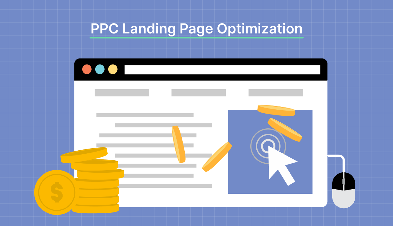
Key Takeaways:
1. Ensure Ad-to-Page Relevance – Align landing page messaging and keywords closely with your PPC ad copy to boost Quality Score and conversions.
2. Optimise for User Experience – Focus on fast load speeds, mobile responsiveness, and intuitive layout to reduce bounce rates and increase engagement.
3. Use Clear CTAs and Trust Signals – Guide users with strong calls-to-action and build credibility using testimonials, badges, or guarantees.
4. Test and Iterate Continuously – Run A/B tests on elements like headlines, visuals, and CTAs to identify what drives better performance and lower cost-per-click.
You don’t need more clicks.
You need better results from the ones you already paid for.
If your landing page doesn’t align with user intent, load instantly, and guide action clearly, ad spend goes to waste. In 2025, the difference between a decent pay-per-click (PPC) campaign and a high-performing one comes down to optimization.
This guide will walk you through PPC landing page optimization. You’ll learn best practices, common mistakes to avoid, and how tools like Swipe Pages can help you stay ahead.
What Is a PPC Landing Page?
A PPC landing page is a standalone web page designed to convert visitors who arrive via paid advertising campaigns, such as Google Ads, Bing Ads, or social media ads.
It eliminates distractions and guides the visitor toward a specific action, such as filling out a form, downloading a resource, making a purchase, or scheduling a demo. This is achieved through persuasive copywriting, compelling visuals, and clear calls to action (CTAs).
What’s more, a well-optimized PPC landing page removes navigation menus and unnecessary links to keep the user focused.
If an ad promises “30% off running shoes,” the landing page must reflect that exact offer and reinforce the messaging. This consistency boosts user trust and improves the Quality Score in Google Ads, lowering cost-per-click (CPC) and increasing ad performance.
9 Proven PPC Landing Page Optimization Best Practices
PPC landing pages either convert or waste your budget. These best practices show you how to fix that.
1. Keep Ad and Landing Page Messaging Aligned
When users click on a PPC ad, they expect to land on a page that directly reflects what was promised—whether it’s a discount, feature, or solution.
If your headline, offer, or visuals differ slightly from the ad, it creates cognitive dissonance and increases bounce rates. For example, if your ad promises a discount or a free trial, the landing page must immediately reinforce this offer to prevent confusion.
For example, the image below is a comparison ad from AppSumo showing SellerPic and Canva Pro side by side. It focuses on price: SellerPic costs a one-time fee of $69, while Canva Pro costs $120 annually.

Caption: Seller Pic vs. Canva comparison ad
The ad keeps things simple and clear, making it easy to see that SellerPic is the more affordable option. A direct comparison like this grabs attention and quickly gets the message across.
2. Set a Clear and Single Conversion Goal
A PPC landing page must be laser-focused on one conversion objective. Multiple CTAs or conflicting offers confuse users and reduce the likelihood of conversion. The entire layout, copy, CTA, and design should drive the visitor toward that goal.
For example, if your goal is to get demo requests, your CTA, form, and testimonials should all support that objective. Avoid distractions like additional menus or unrelated links.
Take Swipe Pages, for instance.
Their landing page has a single, clear goal: get users to try Swipe Genie. Everything on the page—from the headline and subtext to the prominent purple CTA—drives toward that one action. There are no distractions, no secondary offers, and no competing buttons.

Caption: Swipe Pages as an example of a laser-focused landing page
| If you’re just getting started, it’s essential to understand what is a landing page and how it compares in structure and purpose to a full website—landing page vs website. |
3. Craft Compelling and Relevant Headlines
Your headline is the first thing visitors notice, so it needs to communicate value, relevance, and clarity immediately.
A strong PPC landing page headline mirrors the user’s intent and matches the ad promise, creating an instant connection. Use power words, address pain points, or highlight benefits.
For instance, instead of a generic “Welcome,” use “Boost Your Team’s Productivity by 40% with Our Tool.” Your headline should also be scannable, emotionally resonant, and tailored to the audience’s expectations from the ad.
The image below shows an old ad for Swanson’s “3 Course” frozen TV dinner. The ad features a tray with separate sections for the main dish, sides, and dessert. The headline above the image says, “Everything from soup to dessert,” highlighting that the meal has everything.

Caption: Swanson-“3-Course”-TV-dinner ad
The headline clearly shows how convenient it is to have a full meal, reinforcing Swanson’s promise of an all-in-one dining experience.
4. Use Visuals That Drive Action
Visuals are a powerful tool on PPC landing pages, influencing user behavior and boosting engagement. Properly chosen images, videos, or infographics can significantly enhance a landing page’s effectiveness by driving action and illustrating the offer’s benefits.
However, visuals must align with the brand and message of the campaign. A cluttered or irrelevant image can distract from the core message.
Here’s an example of a clear and neat Instagram ad from Branch Basics, showing their best-selling products in a kit. It includes laundry detergent, reusable glass bottles, oxygen boost, dishwasher tablets, and a concentrate, with a “Save 20%” badge. The layout is clean and easy to understand.

Caption: Branch Basic’s best-sellers ad
The ad clearly showcases the company’s main products, making it easy for customers to understand what’s being offered.
| For SaaS marketers aiming to boost conversions, leveraging landing page copywriting, ai landing page optimization, and landing page optimization tips can lead to significant performance gains. |
5. A/B Test Every Element for Continuous Improvement
A/B testing helps determine what works best by comparing two or more page versions.
For PPC landing pages, start with what affects relevance and Quality Score: headline-message match, form length, and CTA clarity. For example, test whether a headline that mirrors the ad copy (“Build Pages Without Code”) performs better than a feature-led one (“Launch Pages in 60 Seconds”).
You could also compare a multi-field form vs. an email-only form when driving demo requests. Focus on conversion friction points, not cosmetics—because the ad budget’s already spent.
Swipe Pages enables you to run A/B tests through its user-friendly interface.

Caption: A/B testing in Swipe Pages
Once you have two versions ready, Swipe Pages splits traffic between them, tracking key landing page metrics like conversion rates and engagement. The dashboard then gives you detailed insights to show which version works best.
6. Understand and Segment Your Audience for Personalization
Every click comes from a specific intent, not a generic audience.
Segment your traffic based on keyword themes, campaign types, or audience behavior, and create landing pages that speak directly to each segment. A user from a competitor comparison ad needs proof points and differentiators, while someone from a branded search is likely closer to conversion and needs reassurance.
Personalization here means adjusting structure, copy, and CTAs to match intent, not running one page for everyone.
ClickUp targets the high-intent search “Asana vs ClickUp” with a tightly focused ad and landing page combo. The ad headline speaks directly to comparison shoppers without overselling.

Caption: The ad targets users searching for a direct ClickUp vs Asana comparison
Once clicked, the landing page mirrors that intent with a clear headline, minimal distractions, and a visual that reinforces third-party credibility.

Caption: ClickUp keeps the landing page focused on the Asana comparison
There is no feature dump, no competing CTAs—just one message carried from ad to page with consistency. This is how you reduce friction.
7. Design CTAs That Demand Action
Your CTA is the tipping point between a visitor and a lead or customer.
Great CTAs are clear, specific, and urgent. Instead of a simple “Submit,” use benefit-driven prompts like “Get Your Free Demo Now” or “Unlock 30-Day Access.” Use action verbs, highlight what users gain, and make buttons stand out visually with contrasting colors.
Semrush gets the essentials right: the CTA uses benefit-driven language and stands out sharply against the background. The deep purple layout creates natural focus around the bright orange button, guiding the eye without distraction.
Visually and contextually, the page makes the next step unmistakable.

Caption: Semrush uses bold color contrast and smart spacing to draw attention
Additionally, the CTA should be prominently placed on the page, preferably above the fold, and repeated at strategic points.
8. Simplify Forms to Reduce Friction
The longer or more complex your form, the more likely users are to abandon it.
Only ask for essential information that matches the user’s intent and stage in the buyer’s journey. For early-stage leads, their name and email address may suffice.

Caption: Swipe Pages’ sign up form
Progressive profiling can help collect more details later. Use autofill, clear error messages, and a logical layout to make the process smooth and intuitive.
| Dive deeper into landing page design, experiment with landing page split testing, and explore landing page examples and landing page best practices to maximize the impact of your landing page builder and track key landing page metrics with the help of landing page optimization tools. |
9. Optimize Page Load Speed
Page speed directly impacts your ad spend. If your landing page loads slowly, users drop off before they see your offer and you still pay for the click.
Optimizing for speed means stripping out anything that slows the experience down: oversized images, bloated code, unnecessary animations, and third-party scripts that do not serve the goal.
Focus on the essentials.
Compress assets, preload key content, and serve mobile-first experiences. Your page should load fast enough that users engage before they think about leaving.

Caption: Swipe Pages uses a global CDN for landing pages
If you are looking for a tool built for speed, Swipe Pages is engineered for performance.
The platform includes a high-performance content delivery network (CDN) with 36 PoPs globally, which means every page and asset is delivered from a server close to the visitor. Less distance = faster load times.
It runs over 20 backend optimizations automatically—including lazy loading, image compression, and code minification—and supports AMP to deliver near-instant load times on mobile.
For PPC, this technical edge translates directly into better return on investment (ROI).
Common PPC Landing Page Mistakes to Avoid
To help you get better results, here are some common PPC landing page mistakes to watch out for and how to avoid them.
1. Using One Landing Page for Multiple Campaigns
Using a single landing page for multiple PPC campaigns dilutes relevance and harms conversion rates. Each campaign likely targets different keywords, audience segments, and buyer intents.
A generic landing page can’t speak directly to each user’s needs or align with their search queries, which results in poor quality scores, lower ad ranks, and wasted ad spending.
Instead, create dedicated and highly-targeted landing pages tailored to each campaign’s message and offer.
2. Confusing Visitors With Too Many CTAs
Overloading your landing page with multiple CTAs confuses users and hinders decision-making. When visitors encounter several competing options—like “Download Now,” “Book a Demo,” and “Subscribe”—they often choose none.
Each landing page should focus on a single, clear goal that matches the PPC ad’s intent.
3. Neglecting to Run A/B Tests
Failing to A/B test your PPC landing pages means leaving potential performance gains on the table. Even small changes in headlines, images, CTA buttons, or form lengths can significantly impact conversion rates.
Without testing, you rely on assumptions instead of data, limiting optimization opportunities.
Landing page split testing allows you to make informed decisions by comparing variations and identifying what resonates best with your target audience.
Conclusion: How Swipe Pages Enhances PPC Landing Page Optimization
Swipe Pages streamlines PPC landing page optimization by combining cutting-edge technology with intuitive, user-focused design. Its drag-and-drop builder and a rich library of over 150 conversion-optimized templates empower marketers to quickly create professional, fully responsive landing pages—no coding required.
The tool’s seamless integrations with Zapier, HubSpot, Google Analytics, Mailchimp, and Stripe ensure smooth tracking, automation, and payment processing. Plus, its funnel builder guides visitors through multi-step journeys designed to maximize conversions.
And with Swipe Genie, the platform’s AI-powered copy assistant, you can generate persuasive, conversion-focused landing page copy in seconds.
To top it off, Swipe Pages supports dynamic text replacement (DTR), allowing you to tailor headlines based on the ad a user clicked, making each landing page feel more relevant and improving Quality Scores.
Try Swipe Pages for free today (no credit card required!).
PPC Landing Page Optimization FAQs
1. How does PPC landing page optimization improve ad ROI?
A well-optimized landing page provides a seamless user experience, fast loading times, clear calls-to-action, and targeted messaging. This increases conversion rates, as visitors find exactly what they’re looking for, leading to more successful outcomes from paid ads. Optimizing for mobile users and A/B testing further fine-tunes performance, driving a higher return on investment.
2. What is the ideal load time for a PPC landing page?
The ideal load time for a PPC landing page is under three seconds. Faster pages reduce bounce rates, improve user experience, and boost conversions. Google prioritizes speed in its ad rankings, so keeping load time low pleases users and enhances your Quality Score and overall ad performance.
3. How often should I A/B test PPC landing pages?
Depending on traffic volume, you should A/B test PPC landing pages continuously, ideally every 2-4 weeks. Regular testing helps identify what resonates best with users, from headlines to CTAs. Over time, this iterative process improves conversion rates, informs design decisions, and ensures your landing page remains optimized for performance.
4. Why is PPC landing page optimization important?
It improves your conversion rates from paid traffic, reduces your cost-per-click (CPC), and increases Quality Score—leading to more efficient and profitable ad campaigns.