Key Takeaways
1. Single Product Focus with Clear Conversion Goals Product landing pages are standalone webpages designed specifically to promote one product or product line, with the primary objective of converting visitors into customers through targeted messaging and prominent call-to-action buttons.
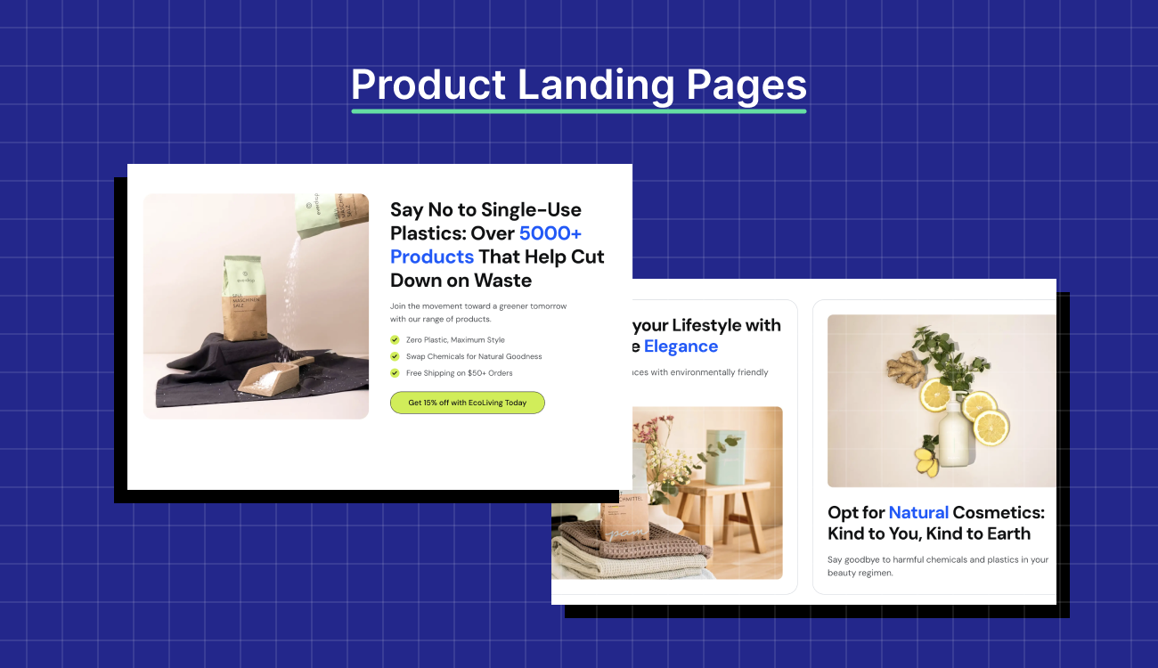
2. Essential Design Elements for High Performance Successful product landing pages require compelling headlines, high-quality product visuals, social proof (testimonials/reviews), clear pricing information, and mobile optimization to maximize conversion rates and user engagement.
3. Strategic Content Structure for Customer Decision-Making Effective landing pages highlight unique selling points, demonstrate how the product solves customer problems, include target audience identification, and provide easy access to technical specifications when relevant.
4. Technical Optimization for Discovery and Performance Product landing pages must incorporate SEO best practices with relevant keyword optimization, fast loading speeds, intuitive navigation, and responsive design to drive organic traffic and deliver smooth user experiences across all devices.
Think of a product landing page as a well-trained salesperson who speaks to just one customer, about one product, with one clear goal: conversion with no distractions.
But to actually make that happen, the page needs to meet the click with the right energy. That means skipping the fluff, loading fast, and instantly answering: “Is this what I was looking for?”
In this blog post, we’ll break down what makes a product landing page effective, using examples and optimization tactics tailored to achieve results.
What is a Product Landing Page?
A product landing page is an independent web page designed to drive action for a specific product. Its goal is to convert visitors into customers, whether you’re promoting a physical product, a SaaS application, or a digital download.
You won’t find any diversion like navigation menus or multiple product links here. Every part of the page is focused on one product and one clear CTA.
So, why do product landing pages work so well?
They give your visitors exactly what they came for by:
- Matching your ad or email message
- Keeping attention locked on one offer
- Pushing for one action (buy, sign up, book)
- Maximizing ROI from paid traffic
Well-built product landing pages don’t try to say more. They say the right thing at the right time and remove anything that gets in the way. That’s why they’re such a smart play for paid traffic; they give every click a clear path forward.
Why Product Landing Pages Drive More Conversions
Paid campaigns drive targeted traffic, and every visitor counts. Product landing pages convert better because they are designed with a clear call to action (CTA).
Here’s why they work:
- One Goal, Zero Distractions: The entire page focuses on a single CTA, with no additional links or unrelated content. This focus ensures that visitors aren’t pulled in different directions and leads them to take action more effectively.

Source: ChatGPT
Product landing page design with a clear focus on a single CTA
- Tight Message Match: Ad copy and landing page content align perfectly, assuring users that what they clicked on is exactly what they’ll find. This consistency builds trust and reduces bounce rates.
- Stronger Visual Hierarchy: The layout emphasizes the product image, core benefits, and CTA in a logical, scannable order. Supporting elements like icons or badges are placed intentionally to draw the eye without disrupting flow.
- More Relevant Social Proof: Every review, rating, or customer quote on the page is chosen to validate the product being promoted, not the brand as a whole. This keeps the social proof believable, relatable, and conversion-focused.
- Conversion-Driven Layout: The structure of the page follows a clear persuasion flow—from problem and product promise to trust signals and offer reinforcement. Each section builds on the last, guiding the visitor toward the decision without distraction.
6 Key Elements of a High-Converting Product Landing Page
Bringing traffic to a single product landing page is just the start. What matters next is how well that page guides the visitor toward the CTA.
Here’s what separates high-converting product landing pages from the rest:
- A Bold, Benefit-Driven Headline
Your headline is the hook. It needs to answer the question quickly: “What’s in it for me?”
Focus on the outcome and the benefit for the user, not the feature. For example, instead of saying “All-in-One CRM,” say “Close Deals 3x Faster Without Switching Tabs.”

Sinch’s PPC ad in search results
Keep it short and punchy. If your headline can stand alone in a search ad, it’s probably strong enough here, too.

Sinch’s Email API PPC product landing page
| 💡 Pro Tip: If you’re running ads for multiple audience types, use dynamic text replacement to match the visitor’s search query. It instantly increases message relevance. |
- High-Quality Product Imagery or Video
Visuals are often the first thing people process, even before reading.
For physical products, use clean, high-resolution photos from multiple angles or in real-world settings.
If it’s a digital product or SaaS, a 30-60 second demo or animation can show how it works. Focus on the outcome the user cares about—what changes for them after using the product. Avoid long intros or feature tours that delay the value.
Optimize all media for fast loading without compromising clarity, especially on mobile devices.
| 💡 Pro Tip: Consider adding a hover-to-zoom feature for product images. It allows visitors to inspect details without leaving the page or clicking around, improving user experience. |
- Clear Description of Product Benefits
Every feature should connect to a benefit. Tell your visitor how it makes their life easier, saves them time, or solves their problem.
Rather than dumping everything in text, break it down:
- Use short paragraphs or bullet lists
- Lead with the strongest benefit
- Keep the tone user-focused

Sinch’s Email API features
- Social Proof and Customer Testimonials
New visitors don’t know you yet, so let your past happy customers speak on your behalf.

Brevo’s product landing page with logos for social proof
Showcase reviews, star ratings, or quotes from real users. If possible, include video testimonials and recognizable brand logos to establish trust and credibility quickly.
| 💡 Pro Tip: Place your strongest testimonial right before or near the CTA. It’s a powerful nudge at the moment of decision. |
- Compelling CTA and Pricing Options
Your CTA should be impossible to miss and even harder to ignore.
Use action words like “Start Free,” “Get My Free Demo,” or “Buy Now” that speak directly to the user’s intent.

Odoo’s CRM product landing page with a clear CTA
Also, try using fun, non-traditional action words like “Let’s Go!”, “Get Yours Before It’s Gone!”, “Jump In” or “I’m In!” creates a sense of excitement. The playful tone can capture attention and encourage users to click.
- Trust Builders
No matter how interested someone is, a little doubt can kill conversions.
Build trust by including:
- Secure payment or SSL badges
- Money-back guarantees or free trials
- Clear return or cancellation policies
- Chat or customer support options
These small additions can make a significant difference, especially for first-time buyers or ad traffic that’s never interacted with your brand before.
| 💡 Pro Tip: Consider adding a short FAQ section to address common concerns and remove the final bits of hesitation. |
Together, these elements create a smooth, convincing flow that moves the visitor from “just looking” to “I’m in.”
If you’re just getting started, it’s essential to understand what is a landing page and how it compares in structure and purpose to a full website—landing page vs website.
For SaaS marketers aiming to boost conversions, leveraging landing page copywriting, ai landing page optimization, and landing page optimization tips can lead to significant performance gains.
Product Landing Page vs. Product Page: What’s the Difference?
One drives intent. The other assumes it. If you are running paid traffic, the difference between product pages and product landing pages is the split between bounce and buy.
Below is a clear breakdown of how these two differ and why that difference matters for landing page optimization.
| Aspect | Product Landing Page | Product Page |
| Purpose | Designed to convert visitors with a single, focused goal, usually tied to a paid campaign or product launch | Focused on informing and supporting browsing, ideal for comparison and decision-making |
| Traffic Source | Driven by paid ads and targeted campaigns, matching the ad’s message to guide visitors to action | Fueled by organic search, site visitors, and returning customers, typically in the research phase |
| Navigation | Minimal or no navigation to keep users focused on the CTA | Full site navigation, which allows users to explore other product categories and related items |
| Content Focus | One product, one CTA, designed to prompt immediate action | Provides detailed information on the product, including multiple variants, specs, and features |
| Design | Simplified and conversion-optimized layout, leading back to the CTA | A detailed layout with product information, menus, related items, and additional links |
| Message Match | Aligned with the ad’s messaging to ensure users feel they’ve landed in the right place | General product description with the focus on branding and company values |
| User Intent | Visitors are ready to take action through purchase, sign up or engage with the product in some way | Users are researching and comparing options (decision-making phase), but are not ready to commit yet |
But how does understanding this difference help you optimize campaigns?
Well, directing paid traffic to product landing pages eliminates distractions, aligns messaging, and creates a clear path to conversion. This results in improved performance and a higher return on investment (ROI).
Product pages, on the other hand, support longer-term engagement and brand loyalty by helping users explore and compare.
Knowing when to use each page type allows you to optimize your funnel and maximize your ad spend.
Types of Product Landing Pages
Different campaigns call for different landing page styles. The structure you choose should reflect how much context your audience needs before they convert.
Single Product Landing Pages
When your offer is focused, this is the format that gets out of its own way. It highlights one product with a single, clear CTA and no competing elements. These pages are ideal for campaigns with high intent, like a search ad targeting users looking for a specific item.
For example, if you’re promoting a limited-edition running shoe, the page should lead with urgency, include key specs, user reviews, and end with a strong CTA like “Reserve Your Pair.”
Multi-Variant Product Landing Pages
This structure works when your product has multiple versions, but you still want to keep everything on a single product landing page. It’s especially effective for SaaS tools with tiered pricing or physical products with size and color variations.

Flo’s mattress options on their product landing page
For example, a landing page for a mattress brand might compare its “Essential,” “Plus,” and “Premium” versions in a simple visual layout, followed by a consistent call-to-action (CTA) like “Choose Your Size.”
Physical vs. Digital Product Landing Pages
The way people evaluate physical and digital products is different, and the landing page should reflect that.
Physical products rely more on visuals, reviews, and tangible benefits. You’re helping users picture the product in their lives; think high-resolution images, lifestyle shots, and guarantee messaging for something like a kitchen appliance.
Digital products, on the other hand, need to build trust fast and show outcomes. A SaaS product landing page might open with a short demo, highlight integrations, and emphasize time-saving results like “Organize your inbox in one click.”
Product Landing Page Examples That Convert
Looking at real examples can help you understand what works and why. These three high-converting landing pages stand out because they focus on clear messaging, aligned user intent, and smart design choices that drive conversions.
Here’s a breakdown of what each product landing page does well and what you can learn from it.
Example 1: Miro

Miro’s page showcases collaboration through visuals and features a standout CTA
Miro’s landing page is a strong example of how to communicate value and keep visitors engaged quickly. The page centers on collaboration, a key benefit their audience is searching for and uses visuals and CTAs that reinforce this focus.
- What works: The headline immediately highlights collaboration as the product’s core benefit.
- Visuals: Clean, engaging screenshots show the tool in action, helping visitors quickly understand its use.
- CTA: The call to action stands out, encouraging users to “Sign up free,” reducing friction for first-time users.
Example 2: ClickUp

ClickUp leads with a strong value proposition and a compelling CTA
ClickUp’s landing page is a masterclass in clarity and conversion. It grabs attention with a bold value proposition, removes friction with a prominent CTA, and delivers instant trust signals.
- Focused offer: The headline clearly positions ClickUp as an all-in-one productivity tool, addressing a broad range of work needs in one sentence.
- CTA: “Get Started. It’s FREE” is bold, colorful, and immediate, lowering barriers to entry and encouraging clicks right away.
- Simple design: A clean layout with minimal distractions keeps visitors’ focus on the message and action.
Example 3: Headshot Pro

HeadshotPro highlights credibility and ease with a fast workflow
HeadshotPro’s landing page utilizes targeted messaging and visual proof to instantly connect with its audience. It focuses on solving one clear problem: professional LinkedIn photos, and shows exactly how it delivers.
- Hook: The headline addresses a specific need, speaking directly to users who want a professional LinkedIn photo without having to book a photoshoot.
- Visual proof: Before-and-after images and clean sample headshots build credibility and show real results.
- Simple process: A three-step visual explains how it works, making the experience feel fast and easy.
- Action-focused CTA: “Get your professional LinkedIn photo” tells users exactly what to expect, encouraging them to take the next step.
If you’re just getting started, it’s essential to understand what is a landing page and how it compares in structure and purpose to a full website—landing page vs website.
How to Create a Product Landing Page with Swipe Pages
Creating a high-converting product landing page doesn’t have to be complex or time-consuming. With Swipe Pages, you get a powerful, user-friendly tool that enables marketers to create fast-loading and campaign-optimized pages.
Here’s how to quickly build, launch, and start converting with your product landing page using this landing page builder.
Step #1: Click “Create New Page” to Get Started

Start by clicking “Create New Page” to launch your product landing page setup
From your Swipe Pages dashboard, go to the Landing Pages tab and click Create New Page.
Step #2: Name Your Page for Easy Tracking

Give your page a clear name so you can easily track different product campaigns
Give your page a clear, product-focused name. This is helpful if you’re A/B testing different offers, features, or audiences.
You can always rename it later, but starting with a descriptive title keeps campaigns organized.
Step #3: Select the Right Page Type for Your Campaign

Select the appropriate landing page format based on the source of your traffic
Choose a format that best fits how you’re promoting your product:
- Smart Page: Perfect for multi-device campaigns and showcasing product features, testimonials, or comparisons.
- AMP Page: Great for fast-loading, Google Ads-focused product pages that reduce bounce rates.
- Mobile Slide: Ideal for product promotions via social media, especially Instagram or Facebook stories.
Each option is optimized for different traffic sources and user experiences.
| ✅ All Swipe Pages formats are designed to load fast, score high on Core Web Vitals, and adapt automatically to screen sizes. This means better ad relevance and higher Quality Scores, especially for mobile-heavy campaigns. |
Step #4: Choose a Product-Focused Template

Pick a product-optimized template to design your landing page in minutes
Swipe Pages offers 150+ templates for high-converting product pages, whether you’re selling SaaS, courses, physical goods, or services. Pick one that aligns with your product type, or start from scratch to build your layout.
Click Use Template to enter Swipe Pages’ drag-and-drop landing page builder, where you can add product images, testimonials, feature blocks, and CTAs.
| ✅ Swipe Pages delivers every page via a global CDN with over 36 Points of Presence (PoPs), compresses images, minifies code, and handles performance optimization automatically on publish. That means your product page loads in 1-2 seconds, no matter where your audience is. |
Best Practices for Product Landing Page Design
Product landing page design often goes beyond visuals and focuses on the strategic choices that guide visitors to your conversion goal. Since you already know the basics, here are some advanced tips and insights to optimize your landing pages.
Keep It Focused: One Product, One Goal
Your landing page should have a single, clear purpose. It must focus on selling a product, getting a signup, or scheduling a demo, with every element supporting that goal.
Trying to promote multiple products or goals simultaneously dilutes your message and confuses visitors, which in turn lowers conversions.
| 🧠 Expert Advice: Use heatmaps and session recordings to identify which areas users engage with the most, then refine those areas to increase landing page conversions. |
If you have multiple offers, create separate landing pages for each. This keeps messaging tight and removes distractions.
Above-the-Fold Strategy
The content visible without scrolling is known as “above the fold”. It is your visitors’ first impression. It needs to capture attention fast and clearly communicate your product’s biggest benefit.
If visitors don’t understand what you offer or what to do next immediately, they’re more likely to bounce.
| 🧠 Expert Advice: Utilize user flow analysis to observe how visitors engage with the above-the-fold content. If engagement is low, consider adjusting your headline or CTA to make the value clearer immediately. |
CTA Placement and Consistency
The CTA is your gateway to conversion. It should stand out and be readily visible, preferably multiple times on longer pages.
Add secondary CTAs after key value sections—like feature highlights, social proof, or pricing—to catch those who need more information before clicking. Avoid placing CTAs too close together; each should follow a logical decision point.
Consistency in CTA wording and design helps visitors recognize the next step without second-guessing. Use a consistent shape, size, and color across the page, and avoid changing the language unless it signals a different action.
Testing different CTA copies, such as “Get Started,” “Claim Your Offer,” or “Unlock My Deal”. This helps you determine what resonates best with your audience. Also, consider the CTA options mentioned earlier in this blog post for more variety.
| 🧠 Expert Advice: Use contrasting colors for your CTA buttons to make them stand out, but maintain consistency with your brand’s style to build trust. |
Mobile-First Optimization
With over half of web traffic coming from mobile, your landing page must deliver an optimized mobile experience.
This means fast loading, readable text, and buttons that are easy to tap. If mobile visitors have trouble navigating your page, your conversion rates will suffer.
| 🧠 Expert Advice: Consider using lazy loading for images and other elements to optimize your product landing page’s performance on mobile. |
Mastering these best practices will help you build product landing pages that look professional and consistently drive the results you need from your paid campaigns.
How to Analyze Your Product Landing Page Performance
Your job isn’t done once your product landing page is live. Tracking your performance closely is essential to improving your campaigns.
Here are some straightforward approaches to analyze your landing page effectively.
Set Clear Goals and KPIs
Before diving into the data, determine what success means for your page. Most marketers focus on these landing page metrics:
- Conversion rate
- Bounce rate
- Average time on page
- Click-through rate (CTR) on your CTAs
| Why it Matters: Clear goals help you focus on metrics that impact your bottom line, avoiding distractions from irrelevant data. |
For SaaS marketers aiming to boost conversions, leveraging landing page copywriting, ai landing page optimization, and landing page optimization tips can lead to significant performance gains.
Leverage Analytics Tools
Utilize tools like Google Analytics, Hotjar, or Microsoft Clarity to gain insight into how visitors interact with your page. Watch for:
- Where users drop off
- Which sections get the most attention
- How far visitors scroll
| Why it Matters: Understanding visitor behavior reveals challenges and highlights what is working well. |
Keep an Eye on Traffic Sources
Look closely at where your visitors come from. It can be from paid ads, email campaigns, organic search, or social media. Use UTM parameters for precise tracking of each campaign and channel.
| Why it Matters: Traffic quality varies depending on the source. If one source has low conversions, it may indicate a mismatch in the message or a targeting issue. |
Run A/B Tests
Test different headlines, images, CTAs, or layouts to find the best-performing variations. Additionally, test one element at a time to gain a clear understanding of what drives performance changes.
| Why it Matters: Continuous testing enables you to optimize your page based on data, rather than relying on assumptions. |
| ✅ Swipe Pages lets you launch A/B tests right inside the platform, with full control over how traffic is split between variants. You can test entire layouts, not just headlines or buttons, and monitor real-time performance with built-in analytics. |
Dive deeper into landing page design, experiment with landing page split testing, and explore landing page examples and landing page best practices to maximize the impact of your landing page builder and track key landing page metrics with the help of landing page optimization tools.
Build Product Pages That Convert With Swipe Pages
A high-converting product landing page does not need to be over-designed or overcomplicated. It needs to match intent, remove distractions, and guide the user toward one clear action.
From the headline to the CTA, every element should earn its place.
Swipe Pages combines everything you need for high-performance landing pages: speed, simplicity, and affordability.
It’s a powerful landing page builder designed for PPC teams and marketers to quickly build, launch, and optimize landing pages with no coding required.
Running A/B tests, optimizing for mobile, and matching your ad messaging is easy with Swipe Pages. It has everything you need to increase conversions and maximize your ROI.
Don’t lose your valuable clicks; start turning visitors into customers today.
Try Swipe Pages free for 14 days (no credit required) and see how quickly you can create product landing pages that convert.
Dive deeper into landing page design, experiment with landing page split testing, and explore landing page examples and landing page best practices to maximize the impact of your landing page builder and track key landing page metrics with the help of landing page optimization tools.
FAQs
1. What is a product landing page?
A product landing page is a standalone web page focused on converting visitors for a specific product or offer, with a clear call to action (CTA) and no distractions.
2. How is a product landing page different from a product page?
A product landing page is designed for a single goal, usually tied to a paid campaign, while a product page is part of your main website. The product page also offers detailed information about the specific product and supports browsing.
3. What should be included in a product landing page to boost conversions?
To boost conversions, include a compelling headline, high-quality visuals, a clear call to action, social proof (such as reviews and ratings), and a simplified layout that focuses on one product and its offer.