Are your conversion rates not measuring up, even with a surge in website traffic? – your landing page might just be the reason why!
Creating an effective lead generation landing page is a mix of art and science. It’s crucial for turning visitors into leads, then prospects, and finally customers.
Studies consistently show that sending traffic to specific landing pages (not just the homepage) leads to better lead capture.
Plus, these pages are great for collecting prospect data and understanding your potential customers.
So, your lead generation landing page is a key player in your sales process. Stay with me to find out which strategies are effective, which ones aren’t, and see examples from successful brands that have nailed lead generation.
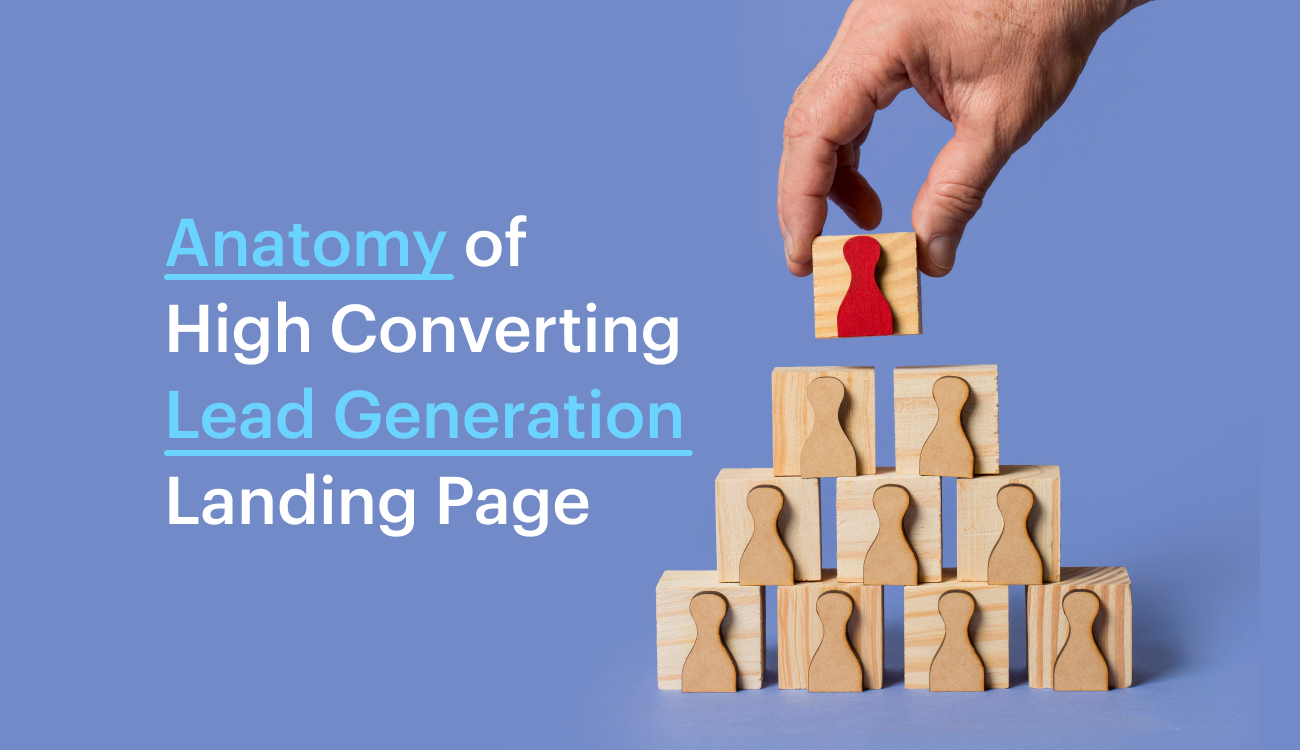
What Are Lead Generation Landing Pages?
Landing pages are where users land after clicking an ad or post.
Unlike regular pages, lead generation landing pages are tailored to collect key prospect info, like name and email, at the start of the conversion funnel.
This data helps qualify leads and guides them towards making a purchase.
Why Do You Need One?
A lead generation landing page is your digital conversation starter. It’s all about connecting with folks who are genuinely interested in what you offer.
Skip the small talk with just anyone – a top-notch lead capture landing page targets those who matter.
By pre-qualifying your leads, you save time and zero in on customers who are ready to convert.
How To Create A Lead Generation Landing Page
Now that you understand what a lead gen page is and why it’s important, let’s dive into what makes a good one.
To truly understand what a lead gen landing page is, it’s crucial to get the hang of the wire-frames and the blocks they usually include while building the page.
Knowing these elements is key to understanding the page’s structure. Why? Well…
1. Wire-frames provide a clear visual structure, ensuring a straightforward understanding of the page layout.
2. Blocks emphasize essential elements, guiding visitors’ attention to key information for lead generation.
3. Blocks emphasize essential elements, guiding visitors’ attention to key information for lead generation.
4. Wire-frames facilitate quick communication of design ideas and functionality without distractions.
5. Allows for easy iteration and refinement of the page layout before investing in detailed design and development.
6. Helps prioritize user experience by mapping out the user journey and optimizing the lead generation process.
Now that you understand why wire-frames and blocks matter, let’s dive into the crucial details of how to get them onto your page and what they must contain to effectively generate leads.
1. The Introduction:
The introduction on a lead generation landing page is incredibly important because it sets the tone for the entire user experience.
It has to quickly grab their attention and show them why your product is worth checking out.
If it’s engaging and speaks to what they’re looking for, they’re more likely to stick around and share their info.
Keep these in mind when you start:
✅Do This
1. Clearly state the value your product or service offers.
2. Craft a compelling headline that grabs attention.
3. Keep the text brief, focusing on key benefits.
4. Use visuals that resonate with your audience and complement your message.
5. Place a clear and visible CTA for user action.
❌Don’t Do This
1. Steer clear of industry jargon that may confuse visitors.
2. Don’t overload the introduction with excessive details.
3. Ensure clarity; avoid vague or confusing language.
4. Don’t use visuals that don’t align with your message.
5. Avoid burying the call-to-action; make it easily accessible.
Here’s how to do it for your page:
Start by putting extra effort into your headline and call-to-action (CTA) because that’s where visitors first land!
Craft a headline that instantly tells visitors what they’ll get from your product or offer.
Keep it short, to the point, and interesting to grab their attention right away.
Your headline should clearly convey the unique benefit or value of your product or service in a way that makes visitors want to learn more.
This is the first thing they see, so make it compelling enough to make them stay on your page and explore further.
For example:

This headline, description, and call-to-action (CTA) work together seamlessly to create an effective lead generation landing page introduction.
The headline immediately grabs attention and communicates the key benefits of the martial arts training program. It’s motivational and sets the tone for personal growth.
Did you know?
Over 90% of visitors who reported reading headlines also mentioned they read CTA copy.
The description provides more details, emphasizing the safety and comprehensiveness of the programs, along with the expertise of the instructors.
This builds credibility and addresses potential concerns that visitors might have making the introductory section stronger.
Finally, the CTA, is a powerful prompt that encourages immediate action.
Now, the CTA button – it’s a big deal. Instead of using plain and generic buttons like ‘Sign up Now’ or ‘Buy Now,’ go for ones that really talk to your visitor.
If you’ve got special offers, let the button shout about them. Also, try to address any doubts they might have and show them the value they’re getting.
Good examples are buttons like ‘Start 14-day Free Trial’ or ‘Get 20% off your first order.’ They’re way more inviting.
So, when you’re working on your lead gen page, make sure your CTA button promotes an offer, conveys value and persuades the user to take action.
Did you know?
A compelling CTA can increase conversion rates by more than 120%.
Let’s consider the example from above. Offering a free lesson is a strong incentive for potential leads to take the first step, experiencing the program firsthand.
It aligns with the promise of unleashing potential and building confidence, making it a compelling and cohesive message for a lead generation landing page.
2. The Key Features / Benefits:
In a world where attention spans are limited, this section acts as a concise and compelling summary, capturing the essence of what makes the offering valuable.
The key features or benefits section on a lead generation landing page is crucial for helping visitors quickly understand what they stand to gain.
This section highlights the unique selling points of a product or service, addressing the needs and desires of potential customers.
By presenting key features or benefits prominently, a landing page effectively communicates the value proposition, making it easier for visitors to make informed decisions.
Consider these while building your key features / benefits section:
✅Do This
1. Highlight the most important features/benefits.
2. Use clear and concise language.
3. Incorporate visual elements for better understanding.
4. Prioritize customer-centric language.
5. Provide social proof with testimonials or reviews.
❌Don’t Do This
1. Avoid overloading information; stick to the most impactful points.
2. Don’t use vague statements; be specific about benefits.
3. Steer clear of technical jargon; aim for simplicity.
4. Ensure mobile optimization for easy reading on all devices.
5. Avoid lack of focus; each point should contribute to the overall message.
Here’s how to do it for your page:
In this section, begin by identifying a pain point relevant to your target audience.
Then, use compelling language to describe how your product or service effectively addresses and resolves that pain point.
Utilize strong action verbs and emotional triggers to create a connection with the audience.
For example:

This key feature description stands out as it concisely communicates the unique advantages of MartialMastery Academy.
It starts by addressing the desire to enhance fighting skills, followed by clear benefits like developing strength, gaining confidence, learning from expert instructors, and ensuring a safe environment.
The mention of competitive pricing adds further appeal. The call-to-action, strategically placed at the end, creates a sense of urgency with a limited-time offer for a free first lesson.
This succinct and compelling content motivates visitors to kick start their martial arts journey, making it effective for a lead generation landing page.

The benefit section on the other hand here uses clear language to highlight the benefits of martial arts training.
The description talks about learning defensive skills, getting fit, and using mindfulness techniques. Paired with high-quality images, it gives a vivid picture of what the experience is like.
Whether it’s conquering challenges, building a community, or improving physical and mental well-being, the content is engaging and relatable.
This combination of straightforward text and compelling images is likely to capture the interest of visitors and encourage them to take the next steps.
3. The Content Block:
The content on a lead generation landing page is crucial for delivering key information about the product or service in a focused manner.
It serves as the linchpin in capturing visitor attention, presenting unique selling points, and persuading them to take the desired action.
By effectively communicating the value proposition and addressing pain points, well-crafted content plays a pivotal role in converting casual visitors into valuable leads, establishing trust and credibility in a competitive online landscape.
Keep these in mind when you start:
✅Do This
1. Clearly communicate unique value.
2. Focus on benefits for the audience.
3. Use persuasive and engaging language.
4. Include a strong (CTA).
5. Keep content concise.
❌Don’t Do This
1. Steer clear of confusing jargon.
2. Don’t overwhelm with excessive information.
3. Skip generic phrases; be specific.
4. Ensure mobile optimization.
5. Include visually appealing elements.
Here’s how to do it for your page:
The content block should use persuasive language to effectively communicate the unique selling points and competitive advantages.
It goes beyond the basic features and benefits, diving deeper into the added value that the audience can derive.
To create an engaging copy, it’s crucial to ensure that the heading, value proposition, and details about benefits and features are distinct from any earlier sections on the landing page.
This involves understanding the specific context of the business, utilizing a unique perspective, and crafting original content that resonates with the target audience.
The goal is to provide a compelling and informative narrative that reinforces the overall value proposition and encourages the visitor to take the desired action.
Did you know?
80% of users are more likely to read content that is combined with bold, attention-getting imagery.
For example:

The heading, “Begin Your Journey to Martial Mastery Now,” sets a positive and motivational tone, immediately capturing the reader’s attention.
The content block goes on to describe the additional benefits and values, emphasizing the transformative experience that martial arts can bring to one’s life.
The use of persuasive language encourages the reader to take action, and the mention of a “Free First Lesson” serves as a strong call-to-action (CTA) with a clear value proposition.
The content assures the reader that no payment is required for the first class, addressing potential concerns and removing barriers to entry.
Importantly, this example maintains uniqueness by focusing on the journey to martial mastery, ensuring that the heading, value, benefits, and features stand out from earlier sections on the landing page.
Overall, it effectively follows the recommended approach of crafting original, persuasive, and distinct content to drive engagement and encourage conversions.
4. Case Study:
A Case Study holds significant importance on a lead generation landing page as it serves as a powerful tool to build trust, credibility, and provide tangible evidence of the product or service’s effectiveness.
By showcasing real-world examples of successful implementations or satisfied customers, a Case Study offers potential leads concrete evidence of the value and benefits they can expect.
Case Studies serve as compelling stories that resonate with the target audience, addressing potential objections and reinforcing the value proposition.
Including a Case Study on a lead generation landing page can significantly enhance the persuasive power of the content, influencing visitors to take the next step in the conversion process.
Keep these in mind when you start:
✅Do This
1. Show real-world results.
2. Use compelling storytelling.
3. Highlight specific outcomes.
4. Reinforce value proposition.
❌Don’t Do This
1. Being overly technical.
2. Neglecting visuals.
3. Exaggerating results.
4. Forgetting to include context.
Here’s how to do it for your page:
For a Case Study block focus on presenting a detailed and compelling narrative that demonstrates how the product or service has positively transformed a customer’s life.
The heading should follow a formula that piques interest, such as ‘How a (Customer) achieved (Desirable Outcome) in (Timeframe).’
This formula serves as a guide to structure unique headings that capture attention.
The content of the case study should delve into specific results, detailing the challenges faced by the customer and showcasing the ultimate positive outcome.
The aim is to provide a transparent and relatable story that highlights the practical impact of the product or service, addressing potential concerns and building credibility with potential leads.
Did you know?
73% of B2B marketers found that case studies were the most effective content marketing strategy in terms of driving leads and sales.
For example:

The heading, “How Sarah Became an Envied Competitor in Just 6 Months,” follows the suggested formula, generating interest!
The content then describes specific results: Sarah gained unmatched confidence and mastered complex techniques in a record-breaking timeframe.
By using simple language and highlighting tangible outcomes, the Case Study becomes relatable for potential leads.
The call-to-action, reinforces the narrative and encourages visitors to envision their own positive transformation.
This example effectively combines a compelling story with specific results, showing what a good case study should look like on a lead generation page.
5. Reviews/Testimonials:
Reviews and testimonials hold paramount importance on a lead generation landing page as they serve as authentic endorsements from real customers.
These testimonials provide social proof, offering potential leads insights into the experiences of others who have engaged with the product or service.
Positive reviews build trust and credibility, alleviating concerns and uncertainties that potential customers may have.
They act as powerful persuasion tools, influencing the decision-making process by showcasing the practical benefits and positive outcomes others have enjoyed.
Furthermore, reviews create a sense of community and reliability, demonstrating that the offering has been tried, tested, and positively received by individuals similar to the prospective leads.
In a competitive landscape, genuine reviews contribute significantly to building a positive perception, ultimately boosting the likelihood of converting visitors into valuable leads.
Consider these while building your review/testimonial section:
✅Do This
1. Include diverse testimonials.
2. Use authentic language.
3. Incorporate specific results.
4. Include multimedia for engagement.
5. Regularly update content.
❌Don’t Do This
1. Excessive editing; keep them authentic.
2. Only positive reviews; mix in constructive feedback.
3. Neglecting mobile optimization.
4. Avoid overly generic statements.
5. Include attribution for added authenticity.
Here’s how to do it for your page:
In this block, the focus is on presenting realistic and emotionally impactful testimonials that effectively communicate the value and satisfaction customers have derived from the product or service.
The aim is to showcase a diverse range of reviews that address various aspects of the offering, emphasizing different value propositions.
The Main Heading module should convey how customers, sharing the same persona as potential leads, achieved desirable outcomes or results.
Including quantifiable data, such as timeframes or the number of customers, adds a layer of trust and authority to the testimonials.
This approach creates a compelling narrative that resonates with potential leads, building credibility and influencing their decision-making process by showcasing real-world success stories related to their specific needs or goals.
For example:

While a combination of a rating star, textual review, and the name with designation is a solid and common presentation for a review, its effectiveness lies in its simplicity and clarity.
It provides a quick snapshot of both the overall satisfaction level and specific feedback from a customer, enhancing transparency and trust.
However, it’s considered slightly mainstream and common because multiple landing pages employ this format.
To stand out, businesses might consider incorporating more personalized elements or multimedia, such as customer photos, video testimonials, or unique formatting styles.
This can add a distinctive touch and make the reviews more engaging and memorable for potential leads, contributing to a more impactful overall presentation on a lead generation landing page.
Did you know?
36% of the top landing pages have testimonials.
For example:

This comprehensive presentation of a review/testimonial is impactful because it combines multiple elements to create a compelling and authentic narrative.
The rating star offers a quick visual summary of satisfaction, while the textual review provides specific feedback in the customer’s own words.
Including the customer’s name and designation adds authenticity, and a high-quality image further personalizes the testimonial.
Presenting the review as a quote enhances readability and emphasizes key points.
Adding a brand plug that explicitly mentions how the customer achieved results because of the brand creates a powerful association between the positive outcomes and the product or service.
This multi-faceted approach provides a well-rounded and convincing endorsement, catering to both visual and textual preferences, making it highly effective on a lead generation landing page.
6. The FAQ’s:
The FAQ section is important because it directly addresses potential concerns and uncertainties that visitors may have.
By providing clear and concise answers to frequently asked questions, this section serves as a valuable resource to streamline the decision-making process for potential leads.
It instills confidence by pre-emptively addressing common queries about the product or service, helping visitors understand its features, benefits, and usage.
A well-crafted FAQ section not only saves time for both the business and the visitor but also acts as a trust-building tool, demonstrating transparency and a commitment to customer satisfaction.
Keep these in mind when you start:
✅Do This
1. Provide clear and concise answers.
2. Address common concerns and uncertainties.
3. Organize FAQs logically for easy navigation.
4. Update the FAQ section regularly.
5. Use plain language; avoid unnecessary jargon.
❌Don’t Do This
1. Overloading with information; stick to key FAQs.
2. Neglecting mobile optimization.
3. Using vague or unclear language.
4. Forgetting to include important questions.
5. Ignoring user feedback; consider user-generated FAQs.
Here’s how to do it for your page:
In the FAQ block focus on addressing 3-4 common questions related to the lead magnet.
The answers provided should be clear and concise, offering valuable information that directly speaks to concerns or objections the target audience might have.
This section serves to proactively resolve potential uncertainties and reinforce the value of the lead magnet, streamlining the decision-making process for potential leads.
By strategically selecting and addressing key questions, the FAQ block acts as a valuable tool to enhance transparency, build trust, and increase the likelihood of converting visitors into leads by providing the information they need to feel confident in taking the next step.
Did you know?
Addressing buyer concerns increases conversions by 80%.
For example:

A simplistic design for the FAQ section, featuring straightforward questions and clear, concise answers ensures that potential leads receive essential information without feeling overwhelmed.
The simplicity facilitates easy navigation, allowing visitors to quickly find the answers they are seeking.
This straightforward approach not only respects the user’s time but also directly addresses concerns or objections the target audience might have, fostering a sense of transparency and trust.
In essence, a simplistic design for the FAQ section is in line with the goal of providing valuable information in a user-friendly manner, ultimately contributing to a positive user experience and supporting the lead generation process.
7. The CTA Block:
The Call-to-Action (CTA) block represents the ultimate guide for visitors, directing them towards the desired action.
This block serves as a final nudge that transforms interest into action, making it an indispensable component of an effective lead generation landing page.
The CTA is the linchpin that transforms casual visitors into engaged leads, guiding them through the conversion funnel.
But, the main relevance of a well-crafted CTA lies in its ability to be clear, compelling, and aligned with the overall messaging, enticing visitors to take action confidently.
Keep these in mind when you start:
✅Do This
1. Make the CTA clear and concise.
2. Use action-oriented language.
3. Ensure it stands out visually.
4. Align the CTA with the overall messaging.
5. Test different CTA variations for effectiveness.
❌Don’t Do This
1. Using vague or confusing language.
2. Over complicating the design.
3. Neglecting mobile optimization.
4. Having too many CTAs that compete for attention.
5. Failing to convey a sense of urgency or value.
Here’s how to do it for your page:
In this block the content should address any remaining objections, emphasizing the unique benefits and value they’ll receive.
Ensuring the heading, value, benefits, and features are distinct from earlier blocks maintains freshness and engagement.
Creating a sense of urgency or exclusivity, if appropriate, adds a compelling element.
The CTA button should be distinct and persuasive, promoting any available offers and removing objections while clearly conveying the value proposition.
The goal is to make the CTA block a powerful and convincing endpoint that propels visitors toward conversion with a compelling call-to-action and an irresistible offer.
For example:

This CTA “Start Your Martial Arts Journey Today,” is action-oriented and encourages the target audience to initiate their journey.
The use of “Hurry” adds a sense of urgency, creating a feeling of exclusivity by mentioning that the “free first lesson offer ends soon.”
This sense of urgency can motivate visitors to take immediate action. The CTA effectively removes potential objections by highlighting the free offer and conveys the value of starting the martial arts journey promptly.
Overall, successfully incorporates persuasive language, urgency, and a clear call-to-action, making it an effective element for encouraging conversions on the landing page.
Similarly,

In this example the copy is concise, action-oriented, and motivates the target audience to take the desired action.
It adheres to the recommendation of using a unique and compelling offer to convey value, making it more likely to capture the attention and interest of potential leads.
The use of the word “Free” adds an element of exclusivity, creating a sense of urgency to seize the opportunity.
Additionally, it avoids generic language and directly addresses a potential objection by offering a no-cost entry point to encourage visitors to take the next step in the conversion process.
Did you know?
Personalized CTAs perform 202% better.
Now that you’re armed with this newfound knowledge, it’s time to put it into action.
Since you know creating effective lead generation pages doesn’t have to be rocket science. If it still feels that way, explore our template library boasting over 1000+ ready-to-use customizable Landing Page templates.
Why? because Swipe Pages might just be the solution you’re seeking, and the best part is, you don’t have to worry about following to best practices because all our templates have already got that covered.
Start crafting your lead generation pages today with a worry-free 14-day trial.
Let’s make it happen!