Guess what? 40% of people who attend webinars end up becoming potential customers. Now that’s a big deal!
Webinars are awesome for getting new leads and connecting with the people you want to reach.
Plus, they make you look like an expert and build trust with your audience.
Now, if you want to host a successful webinar, the first thing you need is a cool-looking landing page to get people to sign up.
In this guide, we’ll show you examples of great webinar landing pages to give you ideas, and the best part is, you can easily make your own using the templates from Swipe Pages.
Ready? Let’s get right to it!
why does your webinar even need its own landing page?
The main reason for a great landing page is to make your webinar stand out online.
People spend a lot of time on webinars, and there’s a ton of other stuff like workshops and classes competing for their attention. So, you really need to show them why your webinar is worth their time.
It’s not easy to get people to sign up for your event when there’s so much happening online. And making sure they actually show up is even tougher.
To do that, you’ve got to build trust and prove you know your stuff before asking for their time. That’s where a good landing page comes in handy.
Think of a webinar landing page like a important first step for your online event. It’s the first thing people see, and it’s crucial for making them interested enough to sign up.
It’s a bit like a movie trailer – if it looks exciting, more people will want to be a part of it.
So, these pages help you get more visitors to join your webinar, learn interesting things, and maybe even become your customers.
What Does Your Page Need?
Creating a great landing page for your webinar is super important. It’s the online spot where people can get all the info they need and decide if they want to join in.
So, what should be on this page to make it really effective?
From telling people about your event and using cool videos to making them feel like they need to sign up ASAP, there’s a bunch of things that can make your landing page awesome.
Let’s explore the important elements that turn your landing page into a registration magnet.
We’ll break down the simple steps to make sure your page not only tells people what’s happening but also makes them excited to join in.
✅What Works on Webinar Landing Pages?
- Clear Information: Ensure that the date, time, and place of the event are clearly mentioned to provide potential attendees with essential details.
- Video Usage: Incorporate a video to add authenticity, build trust, and establish a connection with the audience before the event. This approach is likely to increase attendance.
- Countdown Timers: Utilize countdown timers to create a sense of urgency among potential attendees. Implement scarcity tactics, such as restricting the number of participants, and exclusivity to boost registrations.
- Charging a Fee: Charge a small fee for the webinar, particularly if you have a solid following and influence over your audience. This strategy ensures that you attract qualified leads who are genuinely interested in the event, potentially increasing attendance and covering costs.
- Thank You Page: Direct users to a thank you page after they sign up, emphasizing the value of the event once again. This step reinforces their commitment and sets the stage for a positive experience.
- Event Overview: Provide a section that outlines what will be covered during the event and how it will benefit the audience. Clearly communicate the value proposition.
- Creative Naming: Avoid using the term “Webinar” and opt for titles like Workshop, Masterclass, or Mini Course. This shift in language emphasizes the transfer of knowledge and can make the event more appealing.
- Quantified Value: Use quantifiable value propositions in headlines and calls-to-action. For instance, highlight the expertise by stating something like “500 hours of experimentation on ChatGPT condensed into a 2 Hour Masterclass.”
- Social Proof: Include testimonials and case studies to showcase the positive experiences of previous participants. This helps build trust and credibility.
- Transformational Elements: Illustrate before-and-after states to convey the potential transformation that attendees can experience through participating in the event.
- FAQs: Address concerns and objections by including a frequently asked questions (FAQs) section. This provides clarity and reassurance to potential attendees.
- Speaker Information: Provide detailed information about the person giving the webinar, including links to social media profiles, awards, experience, and achievements. Position the speaker as a thought leader and subject matter expert.
❌What Doesn’t Work and How to Improve?
- Lack of Clear Information: Failing to clearly mention the date, time, and place of the event can lead to confusion and decrease attendance.
- Absence of Video: Neglecting to use a video may result in a lack of authenticity and a missed opportunity to establish a connection with the audience.
- Ignoring Urgency Tactics: Not implementing countdown timers and scarcity tactics may result in lower registration numbers as potential attendees may not feel a sense of urgency.
- Free Webinars Without Qualification: Hosting free webinars without charging a fee may attract a larger audience, but it might not guarantee the presence of serious and qualified leads.
- Neglecting Thank You Page: Failing to direct users to a thank you page can diminish the impact of the signup process and miss the chance to reiterate the value of the event.
- Lack of Event Overview: Not providing a clear overview of what will be covered and the benefits may result in lower interest and registration rates.
- Generic Naming: Using generic terms like “Webinar” might not capture the audience’s attention as effectively as more specific and appealing titles.
- Vague Value Propositions: Unclear or non-quantifiable value propositions in headlines and calls-to-action may not effectively communicate the unique benefits of the event.
- Absence of Social Proof: Not including testimonials and case studies may reduce the perceived credibility of the event.
- Neglecting Transformational Elements: Failing to showcase the potential transformation attendees can experience may result in a lack of motivation for registration.
- Inadequate FAQs: Not addressing common concerns and objections through FAQs may leave potential attendees uncertain and hesitant to register.
- Limited Speaker Information: Providing insufficient information about the speaker may hinder the establishment of trust and credibility, potentially leading to lower attendance.
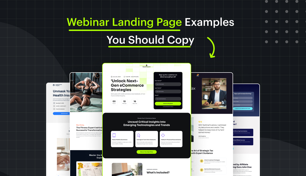
We’ve put together a list of pages for you to check out, providing a clearer picture of all the positive aspects these pages meet based off our do list. Take a look:
1. Fit 30 Challenge
Take a few seconds to look at the picture below. Now, tell me what first grabs your attention here?

Let me point out your thoughts. First, the headline grabs you: “Unlock a Healthier You in 30 Days.” It’s like saying, “Hey, get super healthy in just a month!”
Then, they add some excitement with “Become Part of the Fit30 Challenge Launch Webinar.” It’s like joining a fun challenge party.
Now, they tell you when it’s happening: Aug 17, 2023, 7 – 8 PM. No secrets, just straight-up info.
And look at the countdown – 63 days, 11 hours, 56 minutes, and 00 seconds. It’s like a ticking clock saying, “Get ready for something awesome – tick-tock!”
Then, there’s a big button that says “Secure My Spot in the Challenge.” Makes you feel special, right?
And they throw in “Limited Spots” and “Special Discounted Rates.” It’s like saying, “Be one of the lucky few, and oh, did we mention discounts?” It’s like a cool invite to a health adventure.
In short, this page is like a fun ticket to a health party. It’s not just a signup; it’s an exciting journey waiting for you. And this page has well played to portrait just that.

Further in, it tells you exactly what you’re getting.
A “Structured Fitness Plan” for the next 30 days to make exercising easy. No more guesswork!
Then, you get “Expert Guidance” from fitness pros, so you’re not just working out; you’re learning smart tips.
The big button shouts “Register Now & Transform.” It’s a clear CTA button to evoke actions.
And then, they introduce Shelly, the fitness expert. It’s like saying, “Meet the brains behind all these successful transformations.”
In simple words, this page further in keeps the visitor engaged making them feel, who would want to miss that?
Let’s say, even this far in they still have the slightest doubt and they’re thinking, “Hmm, I’m not sure about these workouts.” Boom!
They got a FAQ section, answering all their questions about the exercises, routines, anything they’re unsure about.

And, if they’re wondering, “Did this actually work for anyone else?” Bam! They hit you with reviews – real people saying, “Yep, it worked for me!”
Towards the end, there’s a small form inviting you, like a friend saying, “Let’s not wait! Start your journey to a healthier you right here.”
It’s like having someone friendly encouraging you to join in and get healthier. And that’s what makes this page a great example.
2. Healthinsure Insights

This webinar landing page right from the start hooks you with the headline, “Unmask Your Health Insurance,” making you curious about what secrets your health coverage holds.
Next, the description, “Learn the Intricacies of Your Coverage. Witness the meticulous processes powering your health insurance,” sets clear expectations about the valuable content that will be covered.
It communicates that participants will gain insights into the finer details of their health coverage and understand the inner workings of the processes involved.
The inclusion of the specific date (December 16, 2023) and time (4:00 PM – 6:00 PM EST) provides essential information for potential attendees.
Knowing the duration of the live session (2 hours) allows individuals to plan their schedules accordingly.
The “Register Now” call-to-action button is strategically placed, encouraging immediate action.
It simplifies the process for interested participants to secure their spot, fostering a sense of urgency and making it easy for them to take the next step.
The attention-grabbing language, clear expectations about the content, important logistical details, and a straightforward call-to-action, creating a compelling invitation for individuals to register and attend the webinar.

Moving further in this section of the webinar page lays out what participants will learn in a clear and direct way like creating a road map for the upcoming webinar, making it easy for attendees to understand what to expect.
By breaking down the learning into modules, it provides a structured approach, ensuring that each part of the session has a specific focus.
The inclusion of a straightforward “Register Now!” at the end is effective because it serves as a clear and immediate call to action.
It invites people to sign up for the session without any ambiguity, emphasizing the urgency to secure a spot for the webinar scheduled on December 16, from 4:00 PM to 6:00 PM (EST).
This simplicity and clarity make it easy for potential participants to take the next step and engage with the valuable content about understanding health insurance.

Furthermore one section introduces the speaker, Dr. Julia Stenton, as a trusted authority in the health insurance industry.
Describing her as a veteran with a rich career at top insurance companies establishes credibility, and her current leadership in multiple policy clarity initiatives emphasizes practical expertise.
The mention of 15+ years of experience, 5+ leadership positions, and having enlightened over 1000 individuals solidifies her as a seasoned professional.
This builds confidence in her ability to guide participants in understanding health insurance, making her a reliable and knowledgeable speaker for the webinar.
3. Tax Smart
Numbers, like stats, years of experience, and achievements, act as trust signals for visitors.
When people see quantifiable evidence on a webinar landing page, it adds credibility and authenticity.

These numbers create a sense of transparency and assurance, showing potential attendees that the webinar has substance and real value.
It’s like saying, “Look, we have a proven track record,” which significantly influences visitors to feel confident and motivated to sign up for the webinar, knowing they’re investing their time in something worthwhile.
Similarly, video testimonials and reviews with pictures and text serve as powerful tools to influence visitors to sign up for a webinar. How?
By providing authentic and relatable experiences!


When potential attendees see real people, hear their voices, and witness their expressions in video testimonials, it creates a genuine connection and trust.
The combination of visuals (pictures) and written feedback reinforces the credibility of the testimonials, making them more impactful.
This firsthand evidence of others benefiting from the webinar builds confidence and addresses any hesitations or doubts the visitors may have, ultimately motivating them to take the next step and sign up for the webinar.
The personal touch of video and the visual appeal of pictures enhance the persuasive impact of testimonials, making them a compelling factor in the decision-making process.
Tax Smart made a clever move by using short forms to get people to sign up for their webinar.

These forms ask for just the important info, making signing up quick and easy.
When forms are short, more people are likely to share their info because it feels like less work.
Short forms are also less daunting, making the whole experience better and increasing the chances that visitors will actually sign up.
Plus, a quick and simple registration process matches how people behave online, making them more likely to take action.
Tax Smart also played right using Swipe Pages as their trusted builder to create their webinar landing page, with over 1000+ templates to choose from Swipe Pages preps your page to be up and running in seconds. Give it a try today!
4. Ecom TechX
In the ecommerce world, being clear and to the point is super important. People don’t have a lot of time, so you need to grab their attention fast.
Making sure your messages, product info, and buttons are easy to understand is crucial for conversion.

Clear messages, straightforward details, and a simple invite make it easy for them to decide to join.
Being precise not only gets them interested but also makes the whole webinar experience better.
Ecom did a great job being precise by having this section on their webinar landing page. The “Webinar Agenda” is like a quick guide telling you exactly what you’ll learn.
Each point is super clear and to the point. It’s like a menu of what’s on offer, making it easy for visitors to know what they’ll gain from the webinar.
And that final call-to-action, “Secure My Seat,” is straightforward and prompts them to take action. Overall, making this page a good example.
Another great section in this page further in is the testimonials. Ecom didn’t just use written reviews; they also included videos where people talk about their experiences.

This combo makes the testimonials more interesting. They even added ratings, names, and job titles, making everything seem more real and trustworthy.
It’s like saying, “Look, real people liked it, and here’s why.” making the webinar seem reliable and more likely to be something people want to check out. Definitely a smart move!
Towards the end, Ecom gives the page a thought-provoking angle.

This headline is like a battle cry, instantly capturing attention and creating a sense of urgency.
By emphasizing the transformation of online stores and mentioning limited spots, it adds a feeling of exclusivity.
The use of “Hesitate not” is like a friendly push, encouraging immediate action. The call-to-action button, “Claim My Spot Now,” is bold and reinforces the idea that this opportunity is valuable.
Additionally, the assurance of a “Secure Booking, No Credit Cards Required” adds a layer of trust, making it easy and risk-free for visitors to take the next step.
5. People Group
Grabbing attention from the very beginning for a webinar landing page is crucial. The heading is like the first impression – it needs to be interesting and clear.
Visitors decide in just a few seconds whether to stay or leave. If the heading is catchy and directly speaks to their interests, they’re more likely to keep reading and sign up.

This example sets the tone for the entire webinar, making them excited about what’s to come.
The heading and description in this example are attention-grabbing because they immediately highlight a valuable outcome: “Succeed in Business with Proven Negotiation Techniques.”
It speaks directly to the visitor’s desire for success. The use of “Proven Negotiation Techniques” implies that what they’re about to learn is effective and reliable.
The description further captures attention by promising concrete benefits: “Unlock Winning Strategies” and “Learn from real case studies of successful business deals and partnerships.”
The language suggests practical insights and real-world examples, making it clear that participants will gain actionable knowledge.
Together, the heading and description create a compelling narrative, promising valuable and proven techniques for business success.
This approach is likely to resonate with individuals seeking actionable insights in the realm of business negotiation.
Further down, Introducing the speaker with a high-quality image, a clear heading, and an experience description works like a charm for a webinar landing page.

The image grabs attention visually, putting a face to the name and making it more personal.
The heading acts like a spotlight, quickly telling visitors who the speaker is.
The experience description gives a sneak peek into the speaker’s background, building trust and credibility.
It’s like saying, “Hey, meet this expert who knows their stuff!” This combination creates a strong, positive impression, encouraging visitors to feel more connected and interested in what the speaker has to share during the webinar.

Ending a webinar landing page with a short form and a thought-provoking description is a smart move. Why?
The form is like the last step to secure a spot in the webinar.
The description, “Don’t miss out on transforming your negotiation skills,” is like a final nudge, making visitors think about the valuable knowledge they might gain.
The powerful call-to-action, “Reserve My Spot,” is straightforward and prompts immediate action.
It creates a sense of urgency, encouraging visitors to take that last crucial step to ensure they don’t miss out on enhancing their negotiation skills.
This combination of a compelling description and a clear call-to-action at the end motivates visitors to act quickly and secure their place in the webinar.
And that wraps it up – you’ve got 5 awesome examples to guide you in creating your own webinar landing page templates!
To make things easy, Swipe Pages offers over 1000+ templates ready for you to use and personalize.
And guess what? You can try them all out for free with Swipe’s 14-day trial. So, go ahead and start crafting your standout webinar landing page now!