Loading...
Loading...
Software-as-a-Service landing pages designed to convert visitors into trial signups and paid subscribers through clear value propositions, feature showcases, and social proof.
21 examples in this category

Recently Added

Recently Added

Recently Added

Recently Added

Recently Added

Recently Added

Recently Added

Recently Added

Recently Added
Recently Added
Recently Added
Recently Added
Recently Added
Recently Added
Recently Added
Recently Added
Recently Added
Recently Added
Recently Added
Recently Added
Recently Added
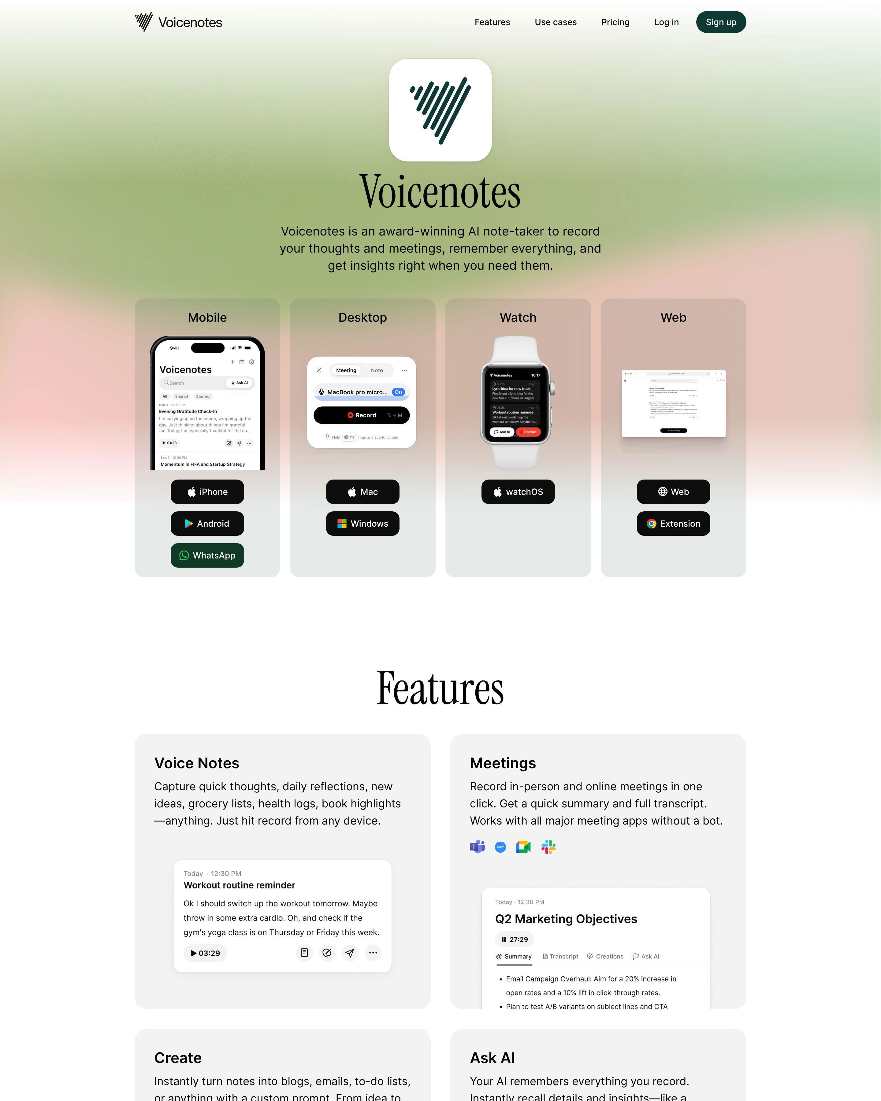
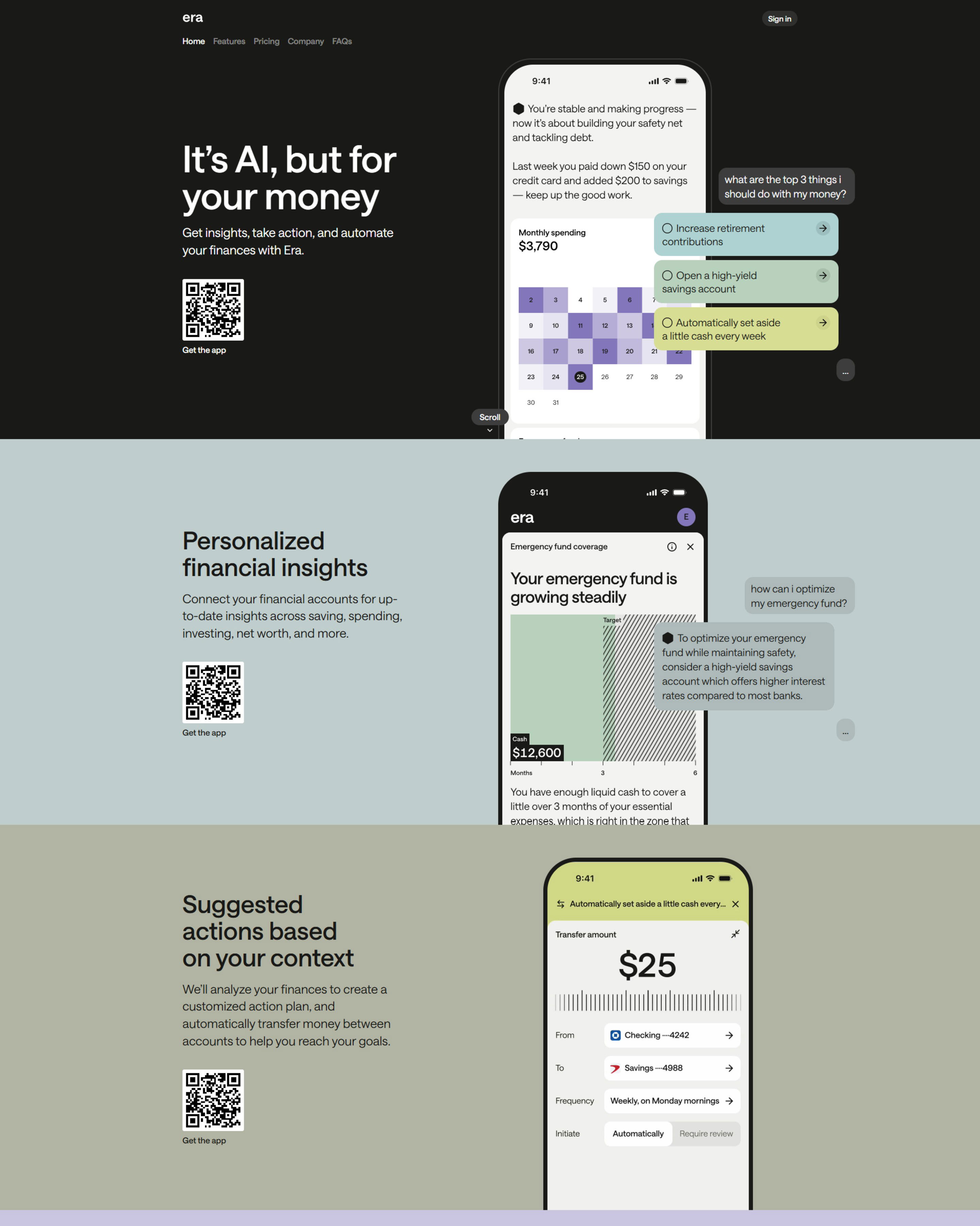
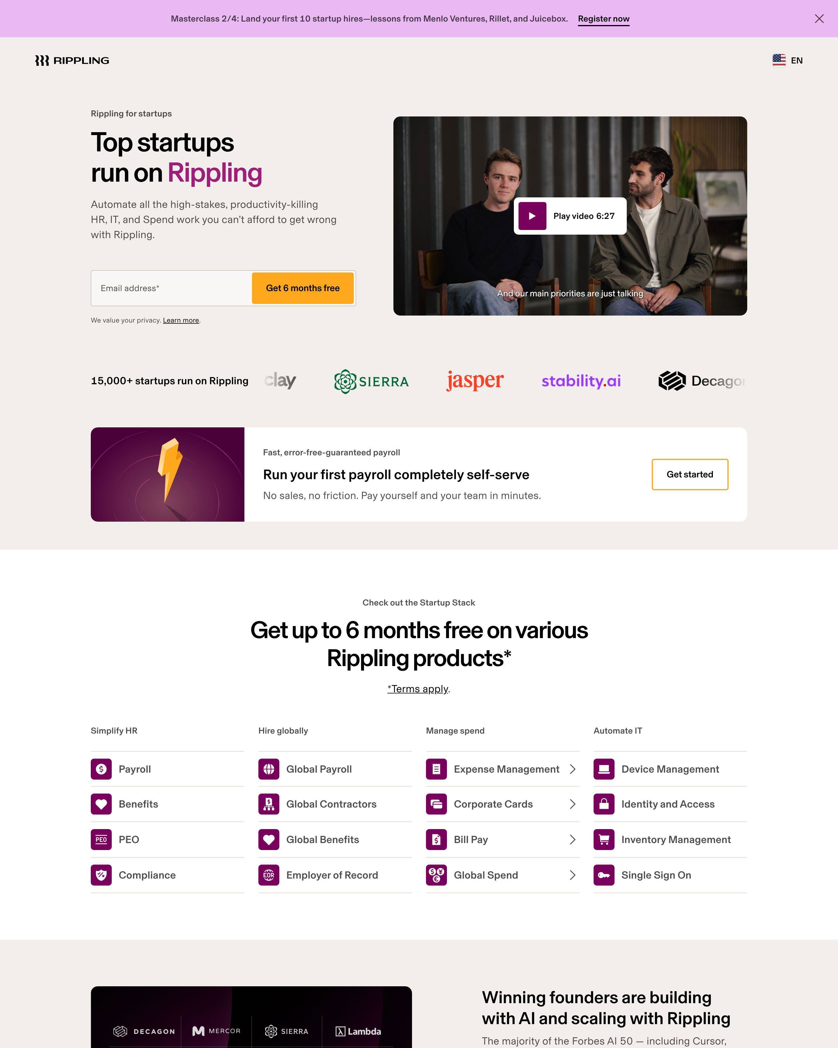
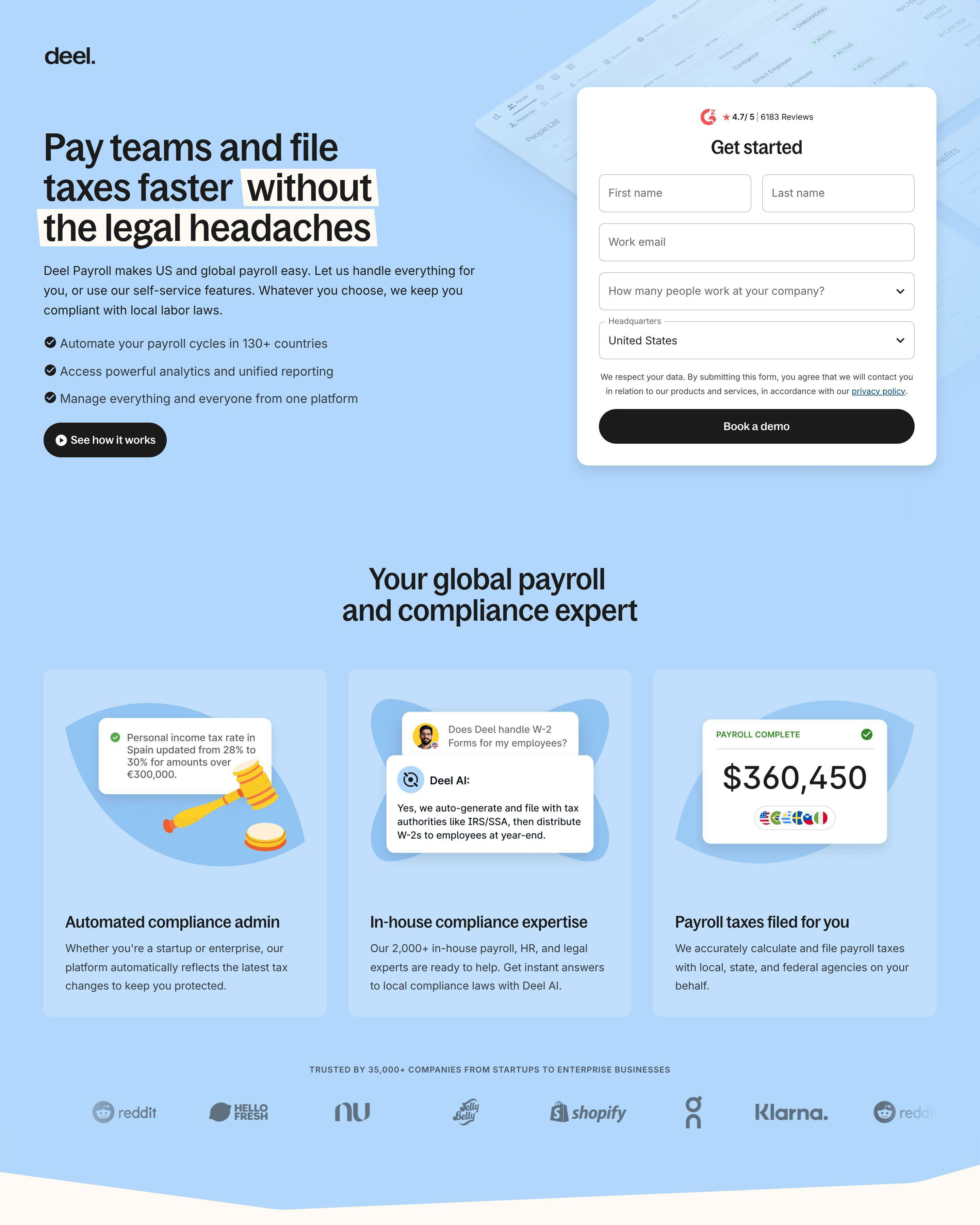
SaaS landing pages sell outcomes, not products. Your visitors want to know how their work life improves after signing up. They want fewer headaches, faster results, happier teams.
The pages in this collection share a common DNA. They lead with transformation. Shopify's signup page shows you building "your business" before it mentions features. ActiveCampaign promises to "automate your marketing in a few simple clicks" right in the headline. Freshdesk talks about "delighting customers with effortless service" first.
Notice what these pages avoid: feature lists above the fold, technical jargon, multiple competing CTAs. The best SaaS pages pick one action and make it obvious. Betterstack keeps their uptime monitoring page focused on a single promise: "the most reliable uptime monitoring." No distractions.
See our expert picks: Best Landing Page Examples of 2026 →
Pattern 1: Single-Field Signups
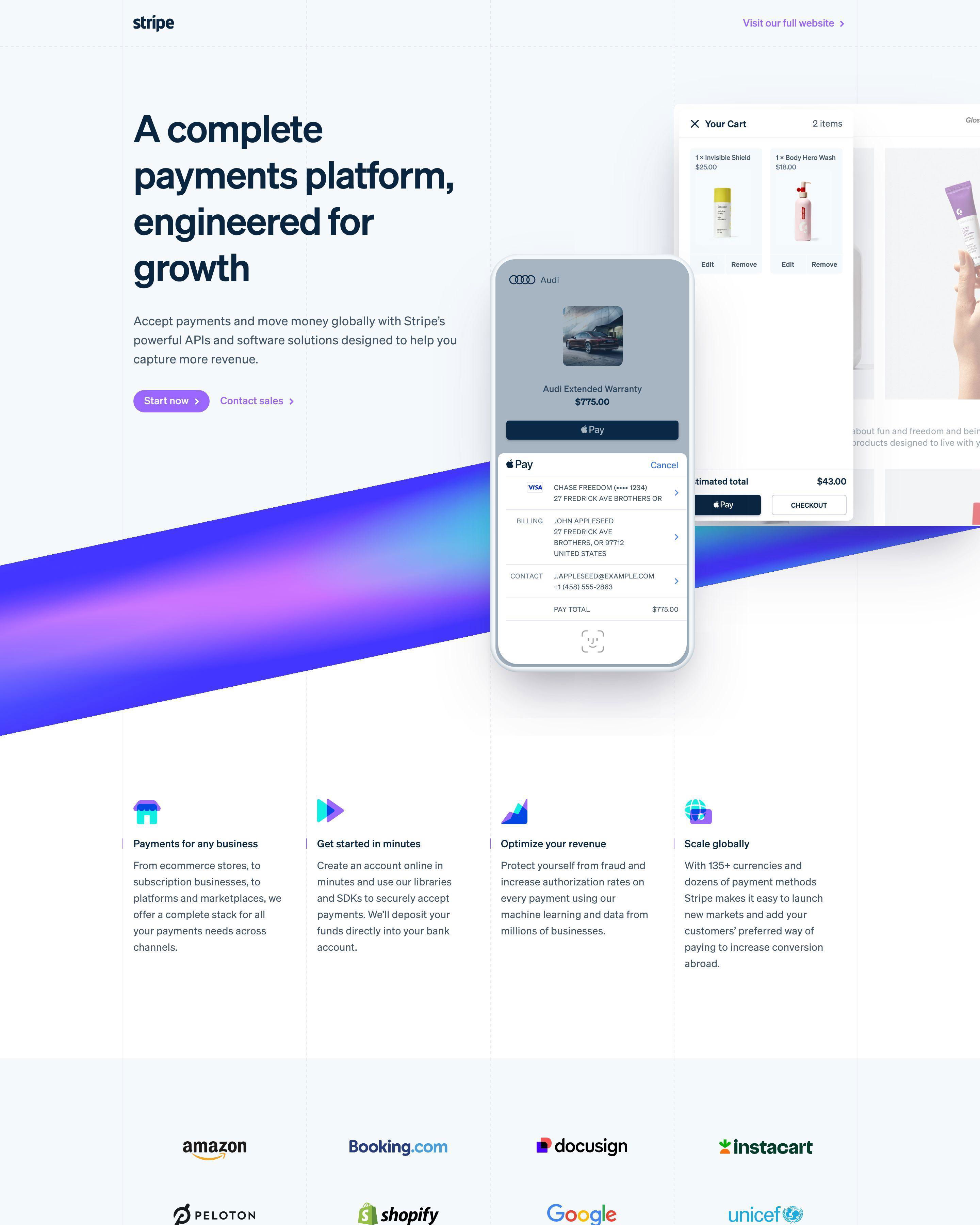
Shopify asks for one thing: your email. No company name, no phone number, no dropdown menus. Every field you add costs conversions. Woodpecker follows the same approach with their cold email automation page. The message is clear: start now, figure out details later.
Pattern 2: Logo Walls Above the Fold
Monday.com puts recognizable enterprise logos right under their headline. Visitors see Canva, Coca-Cola, and similar brands immediately. This builds instant credibility. ActiveCampaign does the same with their "top-performing G2 leader in every category" badge. Enterprise buyers need proof fast.
Pattern 3: Competitor Positioning
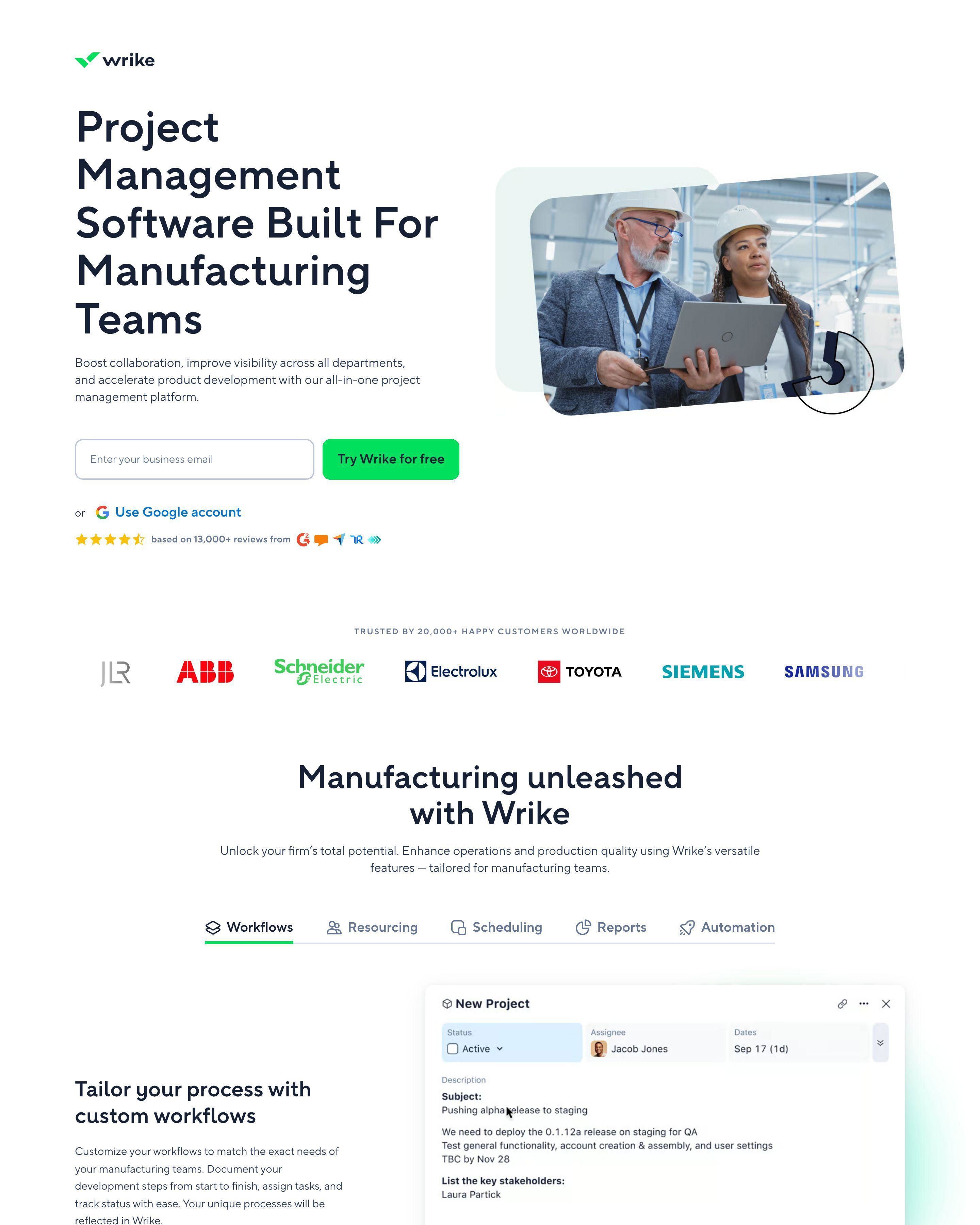
Gleap built their entire page around being "a fairly-priced alternative to Intercom in 2025." Wrike targets users actively comparing project management tools. These pages capture high-intent traffic from users who are ready to switch. If you are not ranking for comparison searches, you are giving those leads to competitors.
What makes a good SaaS landing page?
Clear value proposition within 5 seconds. Free trial with minimal friction. Trust signals above the fold. Freshdesk demonstrates this by leading with "Delight your customers with effortless customer service" rather than listing help desk features. The page speaks to outcomes before diving into how.
What conversion rate should a SaaS landing page achieve?
Cold traffic converts at 3-5%. Retargeting campaigns hit 8-12%. Comparison pages targeting "[Product] vs [Competitor]" searches often exceed 15% because the visitor is already in decision mode. Your rate depends on traffic source, offer type, and how well your page matches visitor intent.
How long should a SaaS landing page be?
Match length to complexity and price point. Woodpecker keeps their cold email page short because the product is straightforward and the barrier is low. Enterprise tools like Monday.com need more content to address objections and justify the buying process. Simple rule: longer sales cycles need longer pages.
What is the most important element on a SaaS landing page?
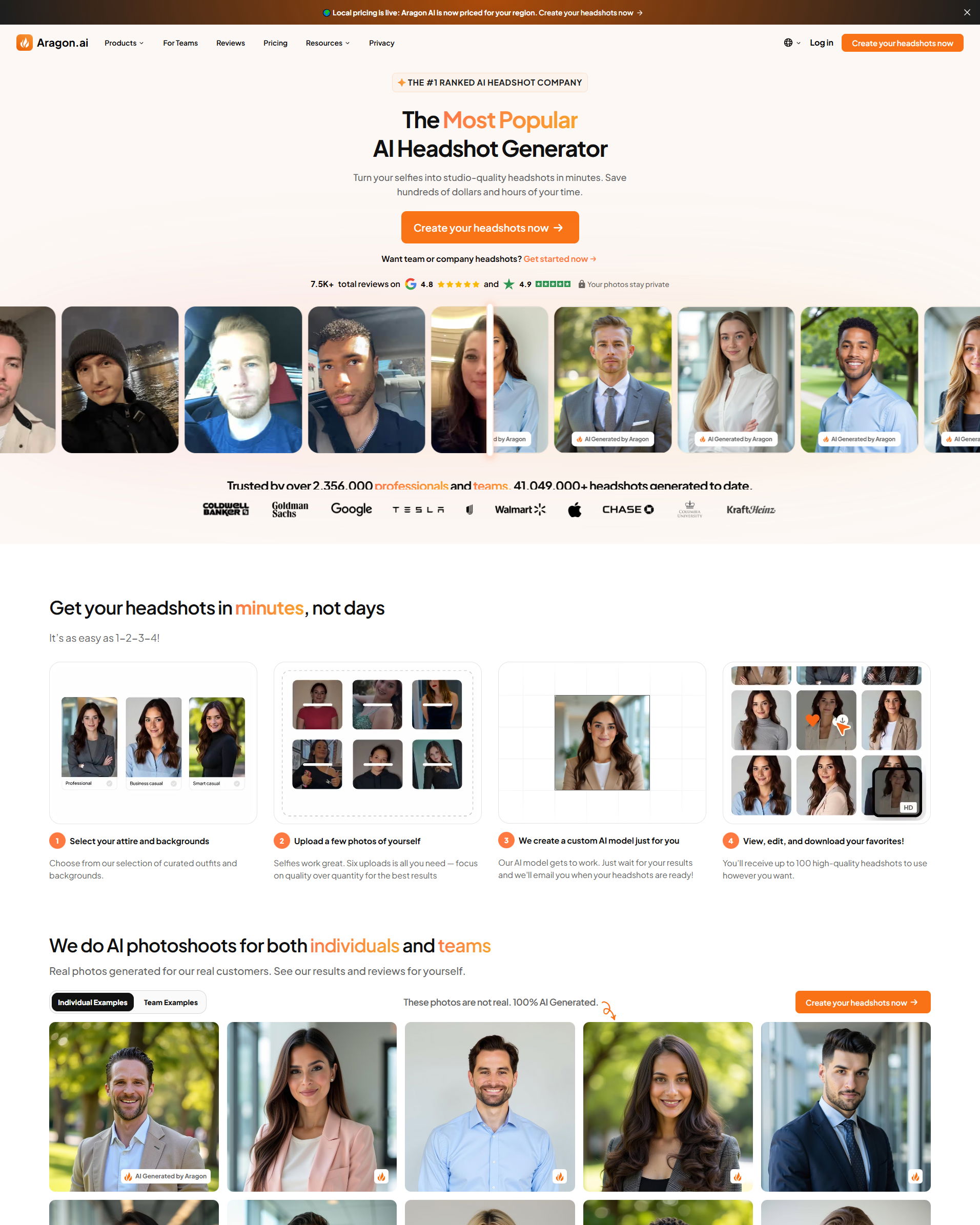
Your headline and primary CTA. You have about 5 seconds before visitors decide to stay or leave. ActiveCampaign nails this with a clear value prop and immediate "Get started" button. Aragon AI captures attention with "The Most Popular AI Headshot Generator" and shows results instantly.