

AI Finance Landing Page Example
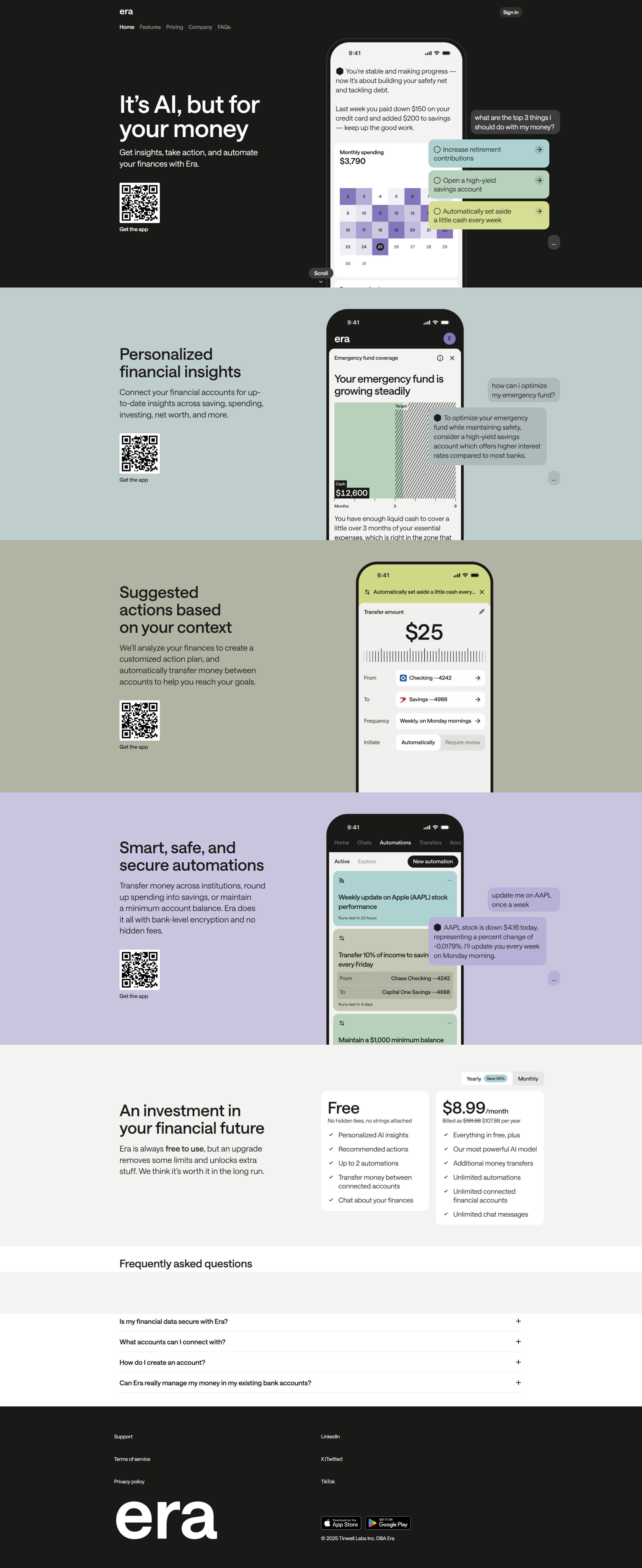
The landing page is for promoting an AI-powered financial management tool called "Era". The primary business goal is to drive app downloads/installs.
Check out our curated database of landing page examples to see what is working right now.
To create a high-converting page like this, use Swipe Pages, a leading landing page builder and funnel platform for conversion focussed marketers
Key Insights
What Works Well
- Clear Value Proposition: The headline "It's AI, but for your money" immediately communicates the core offering, reinforced by "Get insights, take action, and automate your finances with Era."
- Prominent CTA: On desktop, a QR code with "Get the app" is prominently displayed next to the value proposition. On mobile, a clear "Get the app" button is at the top right, and the QR code is replaced by the visual app content.
- Trust Signals: The clean, modern design and "Era" branding contribute to a professional appearance.
- Mobile Responsiveness: The layout adapts well from desktop to mobile, with key information remaining visible and accessible. The "Get the app" CTA transitions from a QR code to a direct button.
- Supporting Content: The app screenshot visually demonstrates the product's functionality, showing monthly spending, progress towards financial goals, and actionable suggestions.
Opportunities for Improvement
- Social Proof: There are no visible testimonials, user ratings, press mentions, or customer logos to build social proof and trust.
- Objection Handling: No FAQs or brief explanations are present to address potential user concerns about data security, privacy, or how the AI works.
- Visuals: While the app screenshot is good, incorporating a short explainer video or more detailed screenshots of different features could further clarify the product's benefits and usage.
- CTA Optimization: On desktop, while the QR code is clear, a traditional button CTA in the hero section could offer an alternative for users who prefer not to use a QR scanner. On mobile, a sticky "Get the app" button could improve conversion by always being accessible as the user scrolls.
Layout Differences: Desktop vs Mobile
- Desktop: Features a two-column layout in the hero section, with the value proposition and QR code on the left and a larger app screenshot on the right. A "Sign In" button is in the top right.
- Mobile: Adopts a single-column, stacked layout. The headline and descriptive text are followed by the app screenshot. The main CTA is a "Get the app" button in the top right, and the QR code is absent. The menu navigation is concise, likely collapsing into a hamburger menu if scrolled.
Summary
The page effectively communicates its core value proposition for AI-powered financial management and has a clear call to action to download the app, with good mobile responsiveness. Key optimization areas include integrating social proof elements, addressing potential user objections with brief FAQs, enhancing visual content with videos or more feature-specific screenshots, and refining CTA placement for both desktop and mobile to maximize app downloads.


