

Healthcare RCM Landing Page Example
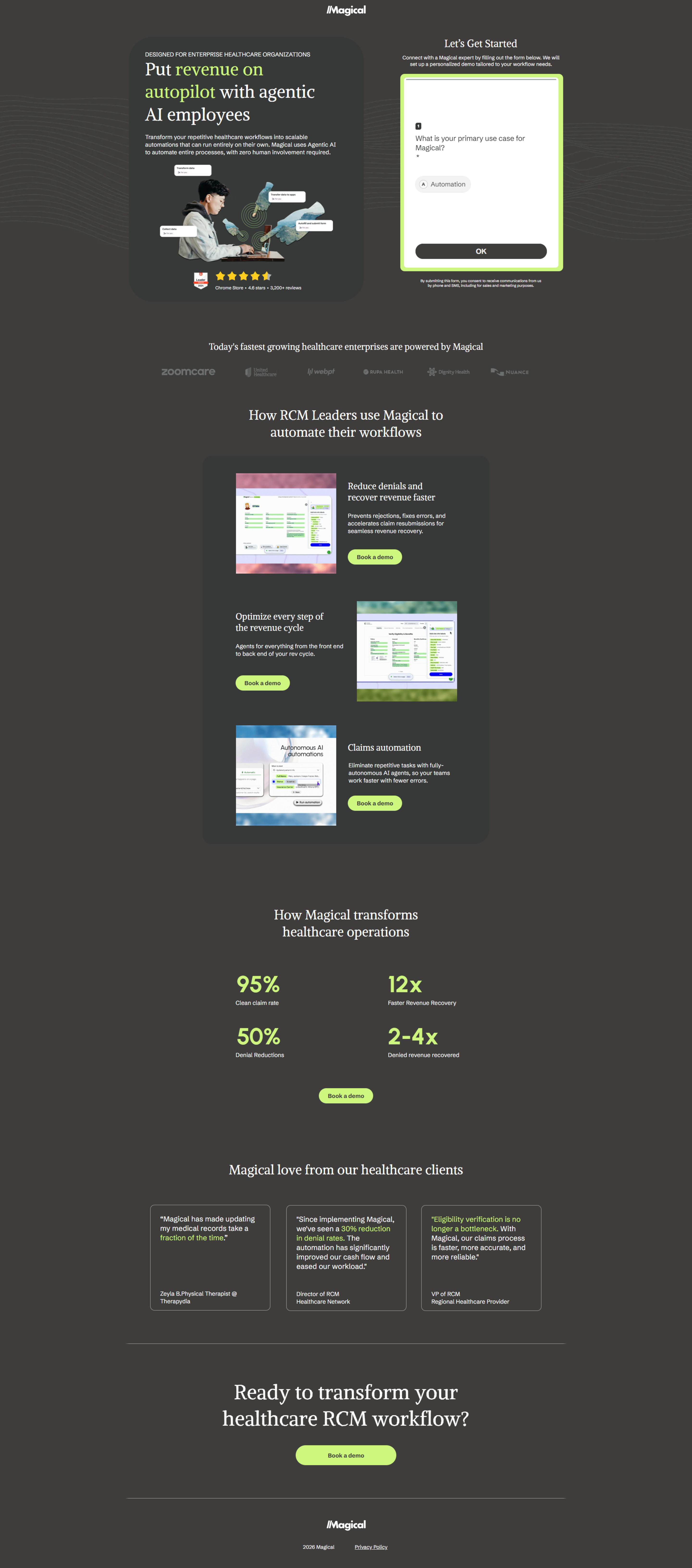
The landing page is for Magical, an AI-powered solution designed to automate Revenue Cycle Management (RCM) for enterprise healthcare organizations. The primary business goal is to generate leads by encouraging users to book a demo of their product.
Check out our curated database of landing page examples to see what is working right now.
To create a high-converting page like this, use Swipe Pages, a leading landing page builder and funnel platform for conversion focussed marketers
Key Insights
What Works Well
- Clear Value Proposition: The headline "Put revenue on autopilot with agentic AI employees" clearly states the primary benefit and innovative approach.
- Prominent CTA: "Book a demo" buttons are strategically placed above the fold, near key feature explanations, and at the bottom of the page, making it easy for users to take the desired action.
- Trust Signals: Prominent display of 4.8 stars from 2,000+ reviews from the Google Chrome store and logos of recognized healthcare organizations (zoomcare, webpt, BUKA HEALTH, Dignity Health, TRUANCE) build credibility.
- Mobile Responsiveness: The mobile layout effectively adapts content, stacking elements like headlines, feature descriptions, and statistics, maintaining readability and navigation across devices.
- Supporting Content: The page uses a mix of textual explanations, visual examples of the product in action, and impactful statistics (95% Clean Claim Rate, 12x Faster Revenue Recovery) to support the value proposition.
Opportunities for Improvement
- Social Proof: While customer testimonials are present, adding a specific section with more varied social proof like case studies, client success stories, or even a short video testimonial could further enhance trust.
- Objection Handling: The page could benefit from a mini-FAQ section near the bottom or before the final CTA to address common concerns or questions healthcare organizations might have about AI implementation or data security.
- Visuals: The product screenshots provided are small and don't clearly show the user interface. Larger, more detailed screenshots or a short demo video could give a clearer picture of the product's functionality and user experience.
- CTA Optimization: While CTAs are prominent, a sticky "Book a demo" button on mobile might improve conversion by keeping the action visible as users scroll. Additionally, secondary CTAs (e.g., "Learn More About RCM AI") could cater to users not yet ready for a demo.
Layout Differences: Desktop vs Mobile
- Desktop: The desktop version features a wider layout, allowing for side-by-side elements, such as the hero section's visual next to the headline, and feature descriptions with their accompanying images. Key statistics are presented in a two-column grid.
- Mobile: The mobile version reorganizes content into a single-column, stacked layout to optimize for smaller screens. Headlines, sub-headlines, feature descriptions with images, statistics, and testimonials are all presented vertically, ensuring readability and ease of navigation without horizontal scrolling. Essential elements like CTAs and headlines maintain their prominence by adapting their size and positioning.
Summary
The page effectively communicates Magical's value proposition of automating healthcare RCM with AI, supported by strong trust signals and multiple clear calls to action. Its mobile responsiveness is also a strength. Key areas for optimization include enhancing social proof with more diverse content, addressing potential objections through an FAQ, improving the clarity and size of product visuals, and exploring a sticky CTA for mobile to further boost conversion rates.


