The formula for a good landing page is simple. But ecommerce pages have to work harder than most.
You’re not selling software with a free trial. You’re asking someone to pull out their credit card for a physical product they can’t touch, taste, or try. The page has to do all the convincing on its own.
The 12 pages in this list sell compression socks, protein powder, dog food, and even lawn care subscriptions. They come from very different industries. But they all share a few things in common. They make the price feel like a steal. They answer objections before you can ask them. And they use visuals to prove what words alone can’t.
Let’s break down what makes them convert.
Key Takeaways:
Price Reframing Changes Everything – The best ecommerce pages never show just the total cost. Huel turns a $45 subscription into “$2.65 a day.” ButcherBox breaks down $169 into “$5.63 per meal.” Hollow Socks says “Get 6 pairs for the price of 3” instead of “50% off.” Same math, completely different feeling.
Visual Proof Beats Written Claims – Ecommerce pages lean heavily on comparison visuals. Hollow Socks uses side-by-side photos with red X marks and green checkmarks. Truvani shows their clean ingredient label next to a competitor’s gum-filled list. Spot & Tango uses a simple bar graph to show their price vs. others. When you can see the difference, you don’t need to be convinced.
Listicle Headlines Feel Like Content, Not Ads – Several top pages use editorial-style headlines. Miracle Made opens with “6 Reasons Americans are Switching to these NASA-Inspired Sheets.” Jinx uses “7 Reasons Dog Parents Are Switching to Jinx Kibble.” These headlines create curiosity. They don’t feel like you’re being sold to.
Objection Handling Is Built Into the Page – Great ecommerce pages address concerns before you have them. Daily Harvest leads with “No subscription required” because they know people fear commitment. They also turn a weakness into strength with “Frozen for a Reason” — explaining that freezing locks in nutrients. The best pages answer “but what about…” before you can ask.
Elements of High-Converting Ecommerce Landing Page :
Before diving into the list, here are the elements that separate ecommerce pages that convert from those that don’t:
- Break down price into smaller units – A $45/month subscription sounds expensive. “$2.65 a day” sounds like nothing. Huel and ButcherBox both use this tactic. Find the smallest defensible unit for your price and lead with that.
- Use side-by-side visual comparisons – Words like “better quality” are vague. Hollow Socks shows a photo of a sock sliding down vs. one that “stays up all day.” Truvani puts their ingredient list next to a competitor’s. Let the visual do the arguing.
- Make headlines feel like articles, not ads – “6 Reasons Americans are Switching” works better than “Buy Our Sheets.” Miracle Made and Jinx both use this listicle approach. It pulls people in with curiosity instead of pushing with a sales pitch.
- Show the product in use – Oura Ring displays the actual app interface so you see exactly what you’re getting. ButcherBox shows real customer photos of meals being cooked. People buy outcomes, not products. Show them the outcome.
- Address the “what if” objections directly – Daily Harvest knows people worry about subscription traps, so they say “No subscription required” upfront. Spot & Tango literally crosses out common complaints like “Packed Freezer” and “Messy Packaging.” Call out the fear, then eliminate it.
- Stack value with bundles and bonuses – Truvani doesn’t just sell protein powder. They add a free stainless steel shaker and a free frother. The price drops from $119.96 to $39.99. The deal becomes impossible to ignore.
- Use specific numbers, not vague claims – “High quality” means nothing. “99.6% Heart Rate Accuracy” (Oura Ring) means something. “42 lbs lost in 12 months” (Hers) is proof. “Up to 3x Less Laundry” (Miracle Made) is specific enough to believe. Always choose the number over the adjective.
1. Huel Promotion

Caption: Huel’s landing page promotes their Black Edition meal replacement. It features a “Subscribe & Save” offer that lowers the cost to $45.00. The layout highlights benefits like 40g of protein and 27 vitamins. It also includes strong social proof from customers called “Hueligans.”
Industry & Purpose: This is a direct-response page for the nutrition and wellness industry. It’s meant to convert weight-conscious browsers into monthly subscribers.
What Works: Here’s what I love: the headline is bold and specific. “This is a meal. Not a protein shake.” It immediately separates the product from generic gym supplements. You know exactly what you are buying.
The “3 reasons” section hits hard on psychology. It calls out specific frustrations like “Every meal feels like a math problem.” The crossed-out calorie app visual proves they understand your struggle. It makes the product feel like a relief.
I also like the price anchoring in the subheadline. They frame the cost as “$2.65 a day” instead of a lump sum. This makes a $45.00 subscription feel like pocket change. It removes the sticker shock.
What can be Improved ( In bullet Points )
- The flavor selector hides options inside a simple dropdown. Showing visual thumbnails of all 10 flavors would make them more appealing.
- The FAQ section sits at the very bottom of the page. Important questions about “GLP-1 medication” should appear higher to address current trends.
Why it inspires: Huel sells a solution to a specific problem rather than just a bag of powder. They validate your past failures with dieting before asking for the sale. This builds trust before you ever reach the checkout button.
2. Hers Weight Loss Plan Quiz

Caption: The Hers landing page features an interactive quiz right at the top. It lists clear pricing for treatments like Compounded GLP-1. The page also builds trust with real before-and-after customer photos.
Industry & Purpose: This is a lead capture page for the telehealth and wellness industry. It’s meant to convert potential patients into paying subscribers.
What Works: Here’s what I love: the hero section does not waste time. It immediately asks, “Why do you want to lose weight?” This interactive approach engages you faster than a static headline. It makes the service feel personalized from the very first click.
The pricing transparency is excellent. You see “Starting at $199/mo” clearly listed for the Compounded GLP-1. Most medical sites hide costs behind a consultation wall. Hers puts the numbers upfront. This removes financial anxiety before you commit.
The social proof section is incredibly specific. Look at the card for Lyssaun. It highlights “42 lbs lost in 12 months” with side-by-side photos. This is not just a generic review. It is visual proof that the program delivers actual results.
What can be Improved:
- The legal text under the medication cards is very dense. It makes that section look cluttered and hard to scan.
- The FAQ section sits at the very bottom. Moving important questions about insurance higher up could reduce hesitation.
Why it inspires: Hers proves that medical pages do not need to look sterile or scary. The design feels warm and approachable. The quiz effectively replaces a boring signup form. It keeps the user active while gathering important data.
3. Oura Health Ring

Caption: Oura Ring’s product page showcases the Generation 3 smart ring. It uses a sleek dark design to highlight app screens and hardware details. The page features user testimonials and specific stats like “99.6% Heart Rate Accuracy.”
Industry & Purpose: This is a product launch page for the wearable technology industry. It’s meant to convert health-conscious consumers into hardware buyers.
What Works: Here’s what I love: the social proof feels real. You see a quote from “AJ M.” saying the ring “cured my insomnia.” It isn’t just a generic five-star review. It tells a specific story about solving a real problem.
The technical breakdown builds massive trust. They don’t just say “accurate.” They show an exploded view of the ring with “7 Precise Temperature Sensors.” They list “99.6% Heart Rate Accuracy.” You immediately understand why this is a premium product.
I also like how they show the app interface. You see exactly what the “Readiness” score looks like on a phone screen. It answers the question of “how will I actually use this?” before you buy. The “24/7 Heart Rate Monitoring” section makes the daily value clear.
What can be Improved:
- There is no price visible anywhere on this long page. You have to click “Shop Now” just to see the cost. This creates unnecessary friction for interested buyers.
- The “Shop Now” buttons are small and use a ghost button style. A solid, contrasting color would make the main call to action stand out more against the dark background.
Why it inspires: Oura proves that high-tech products can still look elegant. They balance complex engineering claims with beautiful lifestyle photography. The specific accuracy percentages make the product feel like a medical tool rather than a toy.
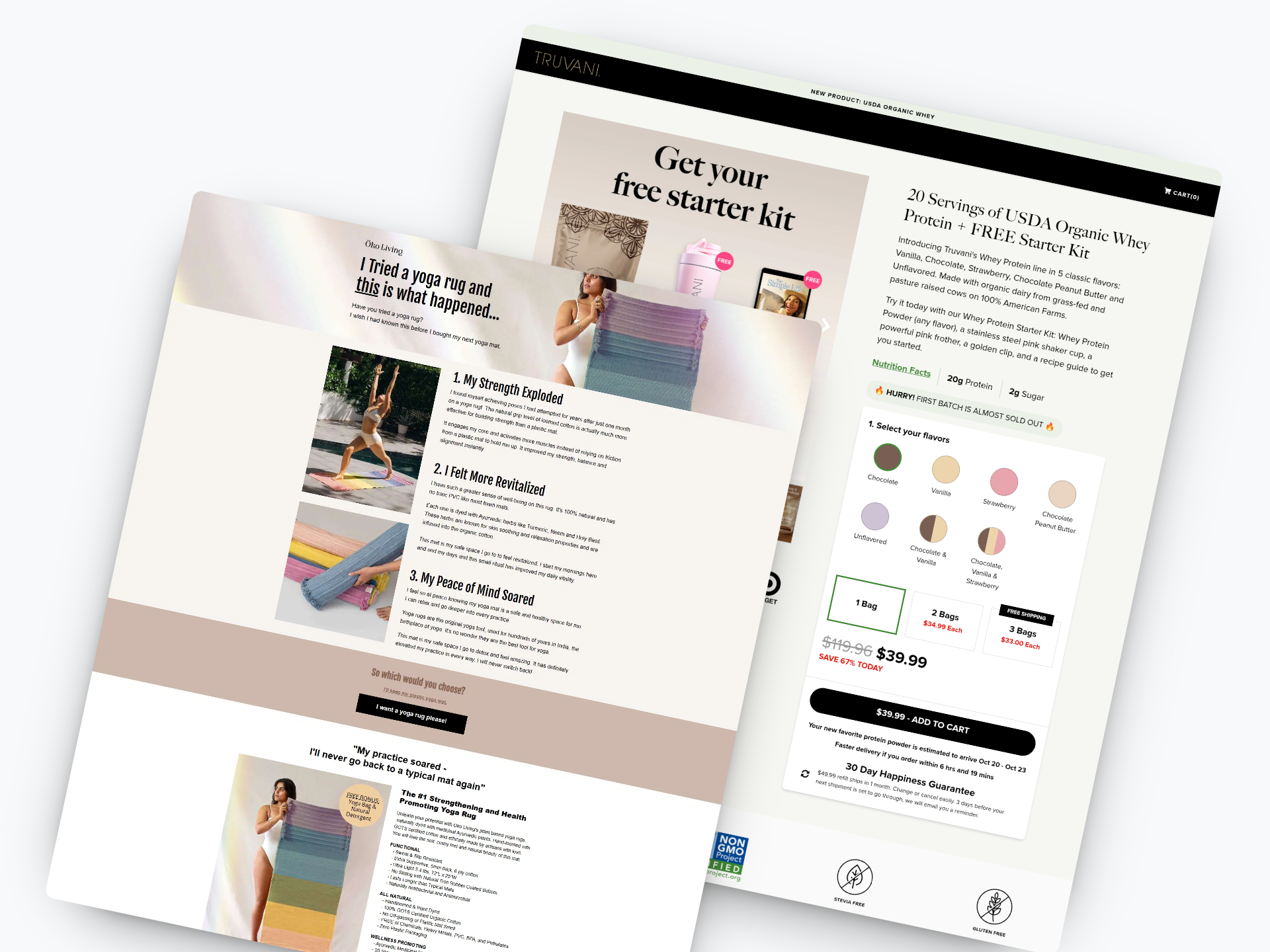
4. Truvani Whey Protein Starter Kit

Caption: Truvani promotes a Whey Protein Starter Kit for just $39.99. The page highlights a massive 67% discount on the total value. It builds trust with retail logos like Sprouts and Target. You can also see a clear ingredient comparison chart.
Industry & Purpose: This is a promotional sales page for the health and supplement industry. It’s meant to convert health-conscious shoppers into first-time bundle buyers.
What Works: Here’s what I love: the offer is irresistible. They stack value by giving you a “FREE Stainless Steel Shaker” and “FREE Pink Frother.” You feel like you are winning. The price drop from $119.96 to $39.99 seals the deal.
The “Farm-To-Shaker Cup” section handles objections perfectly. People hate bad-tasting protein. So they promise it tastes like “The Bottom Of The Ice Cream Bowl!” That specific description makes you hungry. It is much better than just saying “great taste.”
I also appreciate the visual ingredient comparison. They show their clean label next to “SOME OTHER WHEY PROTEIN POWDERS.” The competitor list is full of gums and “Natural Flavors.” It makes the choice obvious.
What can be Improved:
- The flavor selection buttons are quite small. They might be hard to tap accurately on a mobile screen. Larger images or swatches would improve the user experience.
- The urgency banner says “HURRY! FIRST BATCH IS ALMOST SOLD OUT.” This can feel fake if it never changes. A real-time counter showing the number of kits left would build more trust.
- The “Nutritional Facts” label in the comparison section is tiny. You have to squint to read the numbers. Breaking out the key stats like “20g Protein” into larger text would help scanners.
Why it inspires: Truvani masters the art of the bundle. They take a single product and wrap it in gifts to increase perceived value. The specific comparison against “gum-filled” competitors makes the buying decision feel logical.
5. Hollow Socks

Caption: This landing page uses a “10 Reasons” listicle format to sell compression socks. It features side-by-side comparison photos to highlight problems with generic brands. The bottom section promotes a “Buy 3, Get 3 Free” Prime Time Sale offer.
Industry & Purpose: This is an advertorial-style landing page for the apparel and wellness industry. It’s meant to convert skeptical readers into first-time buyers.
What Works: Here’s what I love: the “HOLLOW ALPACA VS. REGULAR COMPRESSION SOCKS” table is excellent. It immediately frames the competition as inferior. Regular socks “often trap heat,” while theirs offer “thermoregulating + breathable zones.”
The side-by-side photos are powerful visual cues. One side shows a red X with “PAINFUL” or “SLIDES DOWN.” The other side shows a green check with “COMFORTABLE” or “STAYS UP ALL DAY.” You instantly understand the benefit without reading.
The offer phrasing is very smart. It says “GET 6 PAIRS FOR THE PRICE OF 3.” This sounds much better than just saying 50% off. It feels like you are getting a massive amount of value for free.
What can be Improved:
- The countdown timer at the top starts at over 13 hours. That is too long to create real urgency. A shorter timer often drives faster action.
- “Jake R.” is listed as the author, but we don’t know who he is. Adding a title like “Avid Runner” or “Nurse” would add more trust to his opinion.
- The paragraph text under point 1 is a bit dense on mobile. Breaking that text into two smaller chunks would make it easier to scan on phones.
Why it inspires: This page proves that education sells effectively. It doesn’t just ask you to buy immediately. It teaches you why the product is better point by point. The “Buy 3, Get 3” framing turns a standard discount into an irresistible bulk deal.
To create a high-converting page like one of these examples, use Swipe Pages, a leading landing page builder and funnel platform for conversion focussed marketers.
6. Miraclebrand

Caption: Miracle Made uses a “listicle” format to sell their silver-infused bedding. The headline highlights “6 Reasons” to switch to their brand. The layout alternates between benefit-driven text and lifestyle photos. It ends with a strong urgency offer for “UP TO 46% OFF.”
Industry & Purpose: This is an advertorial-style sales page for the home goods industry. It’s meant to convert cold traffic browsing the web into direct buyers.
What Works: Here’s what I love: the headline feels like a news article. “6 Reasons Americans are Switching to these NASA-Inspired Sheets” grabs your attention. It creates curiosity rather than looking like a standard ad.
The specific benefits hit hard. They don’t just say “clean sheets.” They say “Up to 3x Less Laundry.” That connects immediately with anyone who hates doing chores. It solves a real problem.
I also like the “Sell-Out Risk: High” tag near the checkout button. It pairs well with the “46% OFF” offer. It gives you a logical reason to buy right now instead of waiting.
What can be Improved:
- The “3x FREE” gold badge on the final product image is confusing. It doesn’t say what items you get for free. Naming the bonus items would increase the perceived value.
- The “Winter Clearance Sale” bar at the top mentions a timer. However, the timer is quite small. Making the countdown larger would increase the sense of urgency.
Why it inspires: Miracle Made turns a boring product into something exciting. They use the “NASA-Inspired” angle to make sheets feel high-tech. The list format keeps people scrolling until they hit the offer.
7. Oko Living’s Artisan Rug

Caption: Oko Living uses a storytelling approach to sell organic yoga rugs. The page highlights benefits like increased strength and peace of mind. It features close-up photos of natural materials like turmeric and neem.
Industry & Purpose: This is a direct-response product page for the wellness and yoga industry. It’s meant to convert practitioners using plastic mats into buyers of organic yoga rugs.
What Works
Here’s what I love: the headline feels personal. “I Tried a yoga rug and this is what happened…” sounds like a friend sharing a discovery. It grabs attention without screaming “buy now.” This narrative style keeps you scrolling to find out the result.
The “So which would you choose?” section is brilliant psychology. It forces a choice between the status quo and an upgrade. The text link “I’ll keep my plastic yoga mat” makes the old option feel inferior. The main button “I want a yoga rug please!” feels like the smart choice.
I also appreciate the specific ingredient transparency. They don’t just say “herbal dyes.” They show photos of Neem, Turmeric, and Holy Basil. This visual proof backs up their “Wellness Promoting” claim. It makes the high price point feel justified.
What can be Improved
- The text block under “The #1 Strengthening…” is very dense. Increasing the line height or adding icons would make those key features easier to scan.
- The text link “I’ll keep my plastic yoga mat” is quite small. On mobile devices, this might be hard to read or tap accurately.
- The “Unique Features” icons are a bit faint. The line drawings for “Hand Grip Ribs” and “No-Slip Rubber Bottom” could use more contrast to stand out.
Why it inspires
Öko Living sells an experience rather than just a product. They focus on how the user feels (“Revitalized,” “Peace of Mind”) instead of just specifications. This emotional connection makes the product feel essential rather than optional.
8. Jinx Kibble

Caption: Jinx uses a listicle format to explain why dog owners should switch to their food. It highlights benefits like “Longer Lifespans” and “Natural Ingredients” with bright photos. The page uses real veterinarian profiles to build trust with new visitors. It ends with a strong “Upgrade Mealtime Now!” call to action.
Industry & Purpose: This is a product education page for the pet food industry. It’s meant to convert concerned dog owners into new customers.
What Works: Here’s what I love: the headline acts like a magazine article. “7 Reasons Dog Parents Are Switching to Jinx Kibble” makes you want to read. It doesn’t feel like a hard sales pitch.
The ingredient photo for point #2 is brilliant. You see real salmon and sweet potatoes clearly. It proves their claim of “Natural Ingredients” instantly. You don’t have to guess what’s inside.
Authority plays a huge role here. Seeing Dr. Melissa Brookshire and Dr. Loree Desai in the “Nutritionist Formulated” section builds trust. You know real experts created this food.
The “Rated 5 Stars on DogFoodAdvisor” badge in the hero is smart. It answers the safety question immediately. It comforts the user before they even start scrolling.
What can be Improved:
- The “Learn More” button in the hero is too passive. A direct “Shop Now” or specific offer would drive more clicks.
- The text block under reason #4 is too dense. It needs bold text or bullet points to make it easier to read.
- The mobile view pushes the vet photos into a vertical stack that takes up too much space. A horizontal slider would work better there.
Why it inspires: Jinx turns a standard product pitch into an engaging story. They use the list format to guide you through a logical argument. The mix of cute dog photos and serious vet credentials creates a perfect balance.
9. Harvest Box

Caption: Daily Harvest’s homepage features vibrant food photography and a “Healthy Habits, Delivered” headline. A prominent center pop-up offers “15% OFF YOUR FIRST PURCHASE” to capture emails immediately. The layout highlights key products like “The Smoothie Sampler” with clear subscription savings.
Industry & Purpose: This is a product sales page for the direct-to-consumer food industry. It’s meant to convert health-conscious shoppers into recurring subscribers.
What Works: Here’s what I love: the discount math is undeniable. The “Smoothie Sampler” card shows exactly what you save. You see “$62.99” crossed out next to “$53.55” for subscribers. It makes the monthly commitment feel like a smart financial choice.
The “No subscription required” text in the hero is crucial. Many people fear getting trapped in a recurring plan. Daily Harvest addresses that fear before you even scroll. It lowers the barrier to entry immediately.
They also lean hard into the “Frozen for a Reason” section. They don’t just say frozen is easier. They claim “Nutrients are locked in” and “Flavor stays at its peak.” This turns a potential negative into a scientific benefit.
What can be Improved:
- The “Enjoy 15% OFF” pop-up blocks the main “BUILD YOUR BOX” button on load. It forces users to close a window before they even see the product.
- The review text under “94 Million Smoothies Sold” is quite small on the pink background. Older demographics might struggle to read the specific praise from “Jane C.” or “Cary H.”
Why it inspires: Daily Harvest turns specific objections into selling points. They handle the “frozen food is bad” myth by explaining how freezing locks in nutrients. The “HSA/FSA Eligible” banner also unlocks a budget that many customers forget they have.
10. ButcherBox’s Meat Subscription

Caption: ButcherBox’s landing page highlights high-quality meat with appetizing photography. It breaks down the subscription process into three simple steps. The pricing section clearly lists costs like “$5.63 per meal” and box weights. Trust elements include “AS SEEN ON” logos and photos from real customers.
Industry & Purpose: This is a subscription service page for the direct-to-consumer food industry. It’s meant to convert health-conscious home cooks into monthly subscribers.
What Works: Here’s what I love: the pricing breakdown is incredibly persuasive. Seeing “$5.63 per meal” anchors the value instantly. It makes the total monthly price of $169 feel much more reasonable. You stop worrying about the big number.
The box selection area is also very smart. I really like how they tag the Custom Box as “TOP CHOICE.” It acts as a guide for indecisive visitors. The tabbed design on desktop keeps the page clean while organizing complex options.
Finally, the social proof section hits the mark. Showing real photos from handles like “@BABYFOODANDWINE” builds authentic trust. It proves real people are actually cooking and enjoying this food. It is much better than generic text testimonials.
What can be Improved:
- The “AS SEEN ON” logos are buried in the footer. Moving logos like Food & Wine higher up would build trust sooner.
- The hero headline “MEAT, THE WAY IT’S SUPPOSED TO BE” is a bit vague. A sub-headline about specific benefits or sourcing standards would help new visitors understand the value faster.
Why it inspires: ButcherBox simplifies a complex subscription model brilliantly. They break down bulk pricing into a “per meal” cost to reduce sticker shock. The page balances appetizing visuals with hard numbers effectively.
11. Spot & Tango’s Fresh Petfood

Caption: Spot & Tango’s landing page leads with a strong 40% savings claim. It uses a bar graph to visually compare their price against competitors. The page highlights benefits like “Human-Grade Recipes” and “Formulated by Vets.” It ends with a risk-free trial offer and customer testimonials.
Industry & Purpose: This is a direct-response landing page for the pet food industry. It’s meant to convert dog owners looking for healthier food into trial subscribers.
What Works: Here’s what I love: the headline hits your wallet immediately. “Fresh For 40% Less Than Other Brands” is a powerful hook. It doesn’t use vague terms like “affordable.” It gives you a specific percentage right away.
The visual comparison graph is brilliant. It shows “Their Price $$$” versus “Our Price $” in a simple drawing. You don’t need to read a paragraph to understand the value. The text explains why it’s cheaper too. They save on shipping dry ice.
I also really like how they tackle objections. The section “The Benefits of Fresh. The Convenience of Dry” lists common annoyances. Then it literally crosses them out in red ink. “Packed Freezer” and “Messy Packaging” get struck through. It instantly positions the product as the solution.
What can be Improved:
- The Call to Action (CTA) buttons change text too often. They switch between “Save On Fresh Today” and “Start My Plan.” Sticking to one clear command usually converts better.
- The “3,143,592 bowls licked clean” header is fun but slightly hard to read. The orange text on a white background lacks contrast. A darker shade would make that impressive number pop.
Why it inspires: Spot & Tango proves you can compete on price without looking cheap. The hand-drawn graph makes a complex pricing model easy to understand in seconds. It respects the user’s intelligence while solving their budget concerns.
12. Sunday Smart Lawn

Caption : Sunday’s landing page explains five reasons why their lawn care is superior. It uses bright photos of their natural products and a soil test kit. Each section has a clear headline and a bright orange button.
Industry & Purpose : This is a direct-to-consumer sales page for the lawn care industry. It’s meant to convert homeowners into subscribers for customized lawn treatment plans.
What Works : Here’s what I love: the page doesn’t hide the price. “Annual plans start at $109” is listed right in the middle. It tells you exactly what you need to pay to upgrade your lawn.
The proof is very specific. They show a “Before” and “After” photo from “Aurora, Colorado” that looks authentic. Seeing a brown yard turn lush and green is a powerful motivator for any homeowner.
The convenience factor is a huge win. It says it “takes about 15 minutes to spray our fertilizer on your lawn.” This targets busy people who want a nice yard without spending all weekend working on it.
I also like the focus on safe ingredients. They mention “seaweed, molasses, and soy protein” as part of the formula. This makes the “free from harsh chemicals” claim feel much more believable.
What can be Improved :
- The “Try Sunday Today” button appears six different times on this one page. Repeating the exact same phrase over and over feels a bit repetitive. They could try different button text to keep the visitor interested.
- Some of the text sections are quite long. The first section about pesticides has a lot of small text. Breaking that into two smaller paragraphs would help people scan the page faster on their phones.
Why it inspires : Sunday makes a complex chore feel like a simple 15-minute task. They use “satellite and lawn data” to take the guesswork out of gardening. It shows that science can make everyday life much easier.
Final Thoughts :
The ecommerce pages that convert best aren’t trying to be clever. They’re trying to be clear.
They show you exactly what you’re getting. They reframe the price so it feels like a steal. They handle your objections before you even think to ask. And they use images to prove what copy alone can’t.
The 12 pages above do exactly that. Study them. Borrow what works. Want more inspiration beyond ecommerce? Check out our full list of 40 best landing page examples across industries.