

Meat Subscription Landing Page Example
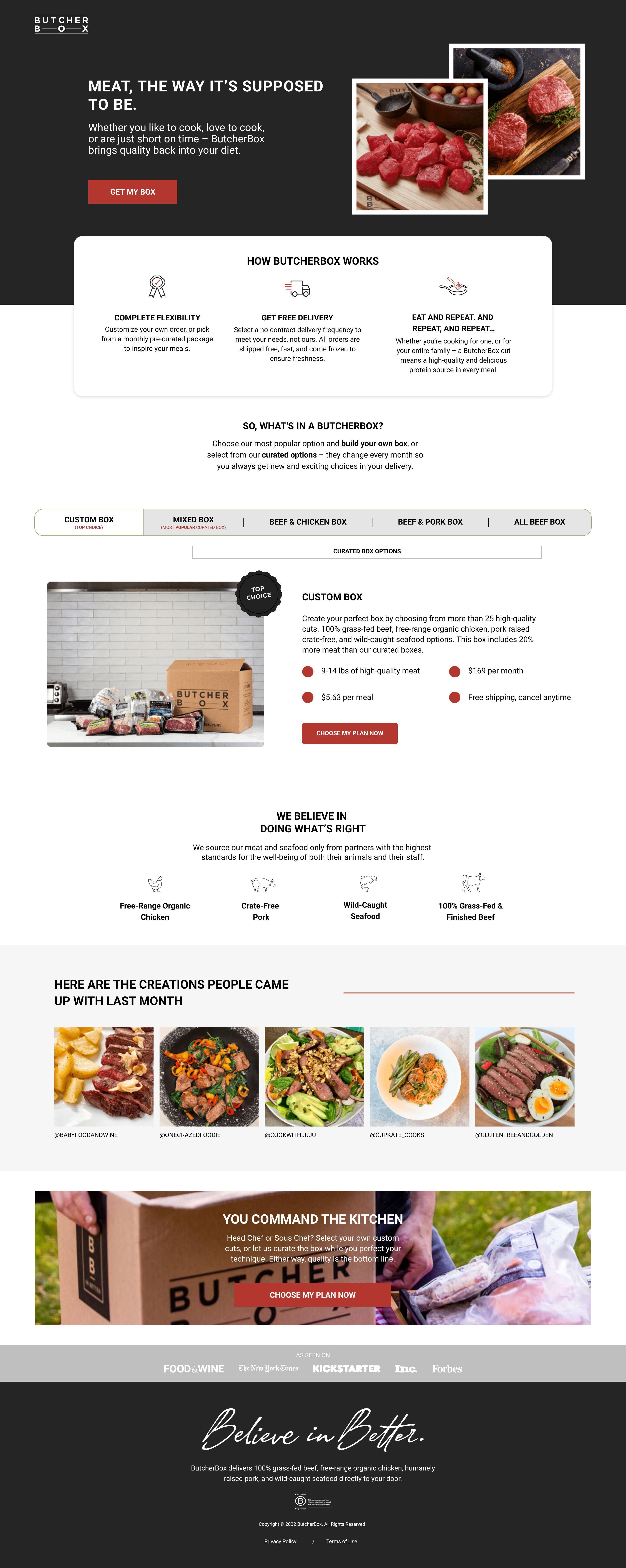
The landing page is for ButcherBox, a subscription service that delivers high-quality meat. The primary business goal is to encourage users to sign up for a recurring meat delivery plan.
Check out our curated database of landing page examples to see what is working right now.
To create a high-converting page like this, use Swipe Pages, a leading landing page builder and funnel platform for conversion focussed marketers
Key Insights
What Works Well
- Clear Value Proposition: The headline "MEAT, THE WAY IT'S SUPPOSED TO BE." immediately communicates the core offering, supported by the description of delivering high-quality meat to your door.
- Prominent CTA: The "GET MY BOX" button is highly visible at the top of the desktop page and early on mobile, using a contrasting color to stand out. A secondary "CHOOSE MY PLAN NOW" button appears further down.
- Trust Signals: The page effectively uses "AS SEEN ON" logos (Food+Wine, New York Times, etc.) at the bottom. It also features a "WE BELIEVE IN DOING WHAT'S RIGHT" section detailing ethical sourcing (Free-Range Organic Chicken, Wild-Caught Seafood, etc.).
- Mobile Responsiveness: The mobile layout maintains readability and navigability, stacking content vertically, adapting images, and presenting information clearly for a smaller screen.
- Supporting Content: The "HOW BUTCHERBOX WORKS" section clearly outlines the three-step process. Detailed descriptions of box options (custom, mixed, specific meat types) are provided, allowing users to understand their choices.
Opportunities for Improvement
- Social Proof: While media mentions are present, adding direct customer testimonials or star ratings near the top or relevant sections could further build trust and encourage conversion.
- Objection Handling: A dedicated mini-FAQ section could address common questions about flexibility, cancellation, or delivery beyond the brief mentions, making information more accessible.
- Visuals: While current visuals are good, incorporating a short video explaining the service, showing the unboxing experience, or highlighting the ethical sourcing could enhance engagement and transparency.
- CTA Optimization: For mobile, a sticky "GET MY BOX" or "CHOOSE MY PLAN NOW" button could improve conversion rates as users scroll through the detailed content. On desktop, making the different box options more easily comparable without requiring tab clicks might streamline the decision process.
Layout Differences: Desktop vs Mobile
- Desktop: Features a wider layout with some content arranged side-by-side (e.g., "HOW BUTCHERBOX WORKS" steps). Box options are presented in horizontal tabs, with the "CUSTOM BOX" expanded by default.
- Mobile: Adapts to a single-column, vertically stacked layout, ensuring all content is easily viewable by scrolling. Box options are converted into collapsible accordions, saving vertical space but requiring taps to reveal details. "AS SEEN ON" logos are also stacked vertically.
Summary
The ButcherBox landing page effectively communicates its value proposition and guides users toward conversion with clear CTAs and strong trust signals. Key strengths include excellent mobile responsiveness and detailed product information. Opportunities for improvement lie in enhancing social proof with direct testimonials, providing a dedicated objection-handling section, potentially adding video content, and optimizing CTA placement for continuous visibility on mobile devices.


