Struggling to make a sales page that really resonates with your audience? You’re not alone – it can be a real challenge.
Did you know?
48% of landing pages contain more than one offer, but including more than one offer can decrease conversion rates by 266%.
Well, this blog will be your guide on how to avoid reducing the conversion rates on your sales page.
In this blog, we’re dishing out some seriously impressive sales page examples that have left a lasting impression.
From catchy headlines to persuasive content, these pages are designed to grab your potential customers’ attention and keep them interested right up to that final call to action.
Did you know?
Over 90% of visitors who reported reading headlines also mentioned they read CTA copy.
Whether you’re a seasoned pro or just starting in the marketing game, there’s something here for everyone.
By the time you’re done reading, you’ll have a bunch of fresh ideas and strategies to create your own super effective sales pages.
Before we dive in, just pause for a moment and think about what makes you want to buy something from a company.
Recall a brand that convinced you to click that “buy” button. Finished Thinking?
Now, let’s talk about your thoughts.
According to human psychology, when we decide to buy something, it’s often because our brains are wired in a certain way.

First off, there’s this thing called “emotional connection” – we tend to buy stuff that makes us feel good or solves a problem.
Then, there’s the “social proof” factor – if we see others loving a product, we’re more likely to want it too. It’s like saying, “If they like it, maybe I will too!”
And of course, there’s the “urgency” element – when we feel like we might miss out or there’s a limited-time offer, our brains go, “Oh, I better get this now!”
In simple terms, it’s a mix of emotions, seeing others like it, and feeling like we need to act fast. That’s the psychology behind why we decide to buy things.
And that’s precisely what your sales page should do – it should mirror this and use human psychology to show off your brand, convincing the audience that they really need what you’re offering.
When you’re making a cool sales page, it’s totally fine to make mistakes – we all do!
But, to make things easier for you, we’re sharing stuff that we’ve learned works (yay!) and things that, well, don’t.
We’ve built a bunch of landing pages over the years, so we’ve got some tricks up our sleeves to help you out. Let’s dive into what works and what doesn’t!
✅What Does Works?
- Clear Value Proposition: Clearly communicate what your product or service offers and why it’s valuable.
- Compelling Headlines: Grab attention with captivating headlines that address customer pain points or offer solutions.
- Persuasive Copy: Use persuasive language that focuses on benefits, not just features, and creates a sense of urgency.
- Visual Appeal: Incorporate high-quality images, graphics, and videos to make the page visually appealing.
- Testimonials and Reviews: Showcase positive customer testimonials and reviews to build trust.
- Strong Call-to-Action (CTA): Use a clear and compelling CTA that guides visitors towards the desired action.
❌What Does Not Work?
- Complex Jargon: Avoid using confusing industry jargon. Simplify language to make it accessible to a broader audience.
- Overwhelming Content: Don’t overload the page with excessive information. Focus on key messages and benefits.
- Unclear Navigation: Ensure easy navigation. If visitors can’t find what they need, they’re likely to leave. Improve the page layout for better user experience.
- Lack of Trust Indicators: If your page lacks trust signals like security badges or recognizable brand logos, add them to enhance credibility.
- Weak Visuals: Grainy or irrelevant visuals can deter visitors. Opt for high-quality, relevant images to enhance the page’s visual appeal.
- Boring Headlines: If headlines are dull, spice them up with language that resonates emotionally or hints at a solution to a problem.
How do we know the do’s work? Take a look at these pages:
1. Lomi:

This landing page captures attention by leading with an irresistible offer of “FREE Express Shipping to US & Canada.” The word “FREE” acts as a powerful trigger, appealing to our inherent attraction to complimentary offerings.
As humans, the allure of receiving something without having to pay resonates strongly, prompting immediate interest in what the page has to offer.
Further enhancing this initial appeal, the landing page strategically bolsters its credibility by showcasing the impressive statistic that “Over 100,000” units of the product have been sold globally.
Numbers provide a tangible measure of success, and in this context, they act as compelling social proof.
Additionally, the landing page introduces other appealing features such as a “1 Year Happiness Guarantee,” repeated emphasis on “FREE Express Shipping,” and a commitment to being “Carbon Neutral Guaranteed,” showcasing the product’s environmental consciousness.
With the added benefits of reducing household waste, minimizing carbon footprint, and eliminating kitchen odors, the page encourages visitors to “Get Lomi Today,” backed by “Over 2,800 Reviews” attesting to the product’s greatness.

The “Composters Compared” section is super helpful because it makes choosing way easier.
It puts the Lomi side by side with other composters, showing the differences in a simple way.
Like, the Lomi fits on your kitchen counter, while others need to be outside. The Lomi turns your food scraps into good dirt in just 24 hours, but some others take 4-8 weeks.
Comparisons are effective decision-making tools because they simplify complex information, enabling consumers to weigh the pros and cons of each option in a straightforward manner.
By offering a quick and comprehensive overview, the section adds clarity to the decision-making process and reinforces the value proposition of the Lomi, encouraging users to take action with the conclusive “Get Lomi Now Today” call-to-action.

The “Our Goal” section is a brilliant addition to the sales page as it not only showcases the company’s larger mission but also encourages the audience to resonate with a broader purpose.
By expressing the goals the company establishes a meaningful connection with its audience, appealing to the shared desire for environmental responsibility.
The statistics provided underscore the tangible impact that users can contribute to by choosing this product.
This section also communicates the company’s commitment to making a substantial positive difference and also invites the audience to be a part of a larger movement towards sustainability.
By aligning the product with a purpose beyond personal use, the sales page creates a narrative that resonates with consumers who are increasingly seeking products with a positive environmental impact.
This approach goes beyond just selling a product; it invites customers to invest in a brand that shares their values and contributes to a larger, more sustainable future.
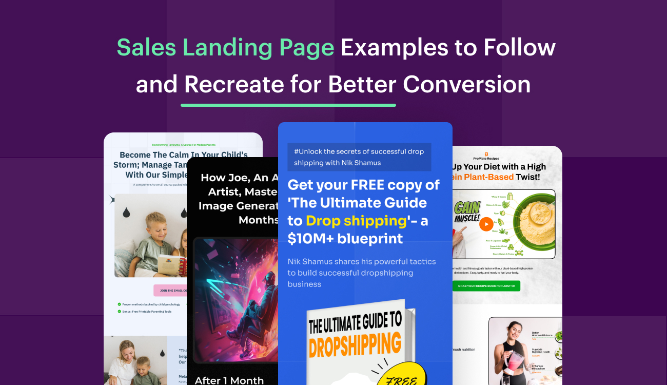
2. Ruben Hassid:

The hero section of this sales landing page stands out for a few key reasons. Firstly, it features a distinct and high-quality image of the author’s book, sporting an attention grabbing low price tag of just $1!
This immediately captures the reader’s interest. The headline is straightforward and direct, accompanied by a display of logos from reputable brands under the “Trusted By” section, adding a significant dose of trust and credibility.
The page explicitly communicates the value users will receive, emphasizing a substantial count of 47,500+ successful students who have already taken advantage of the offering.
Overall, the landing page projects an image of providing an irresistible package for potential students, making the decision to engage with the content or author a compelling one.

The author block on a sales page is crucial as it adds a personal touch and credibility to the content, establishing a connection between the creator and the audience.
In this example, the author provides a succinct and engaging self-introduction, sharing their journey from early automation experiments to becoming a prominent figure in the AI space.
The high-quality image accompanying the description enhances the author’s visibility and professionalism.
By showcasing notable achievements the author builds trust and establishes expertise in the field.
The inclusion of a light-hearted note about not being an AI (unless we’re in the Matrix) adds a touch of humor, making the author more relatable.

This CTA (Call to Action) section has a language that is inviting and encourages the audience to dive deeper creating a sense of exploration and curiosity.
The promise of a comprehensive 2-hour crash course that uncovers hidden features and delves into real-world applications and case studies adds significant value.
The clarity in stating the price upfront avoids any ambiguity and allows potential customers to make an informed decision.
The inclusion of the number of students who have already joined (550+ students and counting) serves as social proof, indicating the course’s popularity and credibility further.
3. Mini Workshop Magic:

What makes Mini Workshop Magic’s sales page work so well is their simple and powerful “How to” headline.
It clearly says how they fixed a problem and became a solution. The page also shares a story about starting small, which helps people trust them.
They use a video to grab attention and a bold button that says, “Get it now” for a lower price, making it feel urgent.
The page is super clear about what Mini Workshop Magic is, so any questions you have get answered right away.
Putting all these things together – a strong headline, a good story, a video, and a clear button – makes their sales page really effective.
If you want to know more about headlines that convert check this out.


This section gives a clear and interesting overview of why this is valuable for you.
It makes the Mini Workshop Magic easy to understand by breaking it into simple steps, showing you the real benefits you’ll get.
The guide not only tells you the important steps for a successful workshop but also says you’ll see results within a week, making it fast.
They throw in useful bonuses like the Best-Selling Workshop Topic Cheat Sheet and the 7-Day Step-By-Step Launch Checklist, making the deal even better.
They give specific info, like building a waitlist in less than 24 hours and getting paid before making content, making it urgent and a time-saver.
Lastly, they say, “Get Instant access for just 17 dollars,” making it easy for you to decide because it’s a good deal.
4. Justin Welsh:

In the hero section right at the top, it says you can “Get Instant Access for $150,” so you know what it costs right away.
It introduces “The Content Operating System,” and how it’s all about making your content creation better and faster.
They repeat the “Get Instant Access for $150” to make sure you don’t miss it.
There’s even a yellow five-star icon showing a super high rating of 4.96 out of 5 from over 7,000 students, which is impressive and makes you feel confident about jumping in.
It’s a clear, straightforward offer with a good rating, and that’s why it’s in this list!

One thing to definitely take note of as you scroll through this page is the abundance of reviews and testimonials; you’ll find a bunch below every section.
This is a great addition because these reviews act like little success stories from people who have already tried whatever the page is offering.
It’s like hearing from a friend who’s been there and done that. The reviews give you a real feel for what others experienced, how they liked it, and whether it worked for them.
It adds a layer of trust and authenticity, making the product or service more relatable.
Plus, seeing positive feedback from a variety of people can be super convincing, almost like a virtual thumbs-up from a whole community saying, “Hey, this is worth checking out!”
It’s like having a conversation with those who’ve already taken the plunge, and their thoughts can be a big help in making up your mind.


This breakdown of what’s included in the course is a fantastic addition it gives you a clear roadmap of what you’re signing up for, section by section.
It’s like having a sneak peek into the kitchen to see all the ingredients before deciding if you want the dish.
Each part is outlined with specific steps, making it easy to understand what skills and knowledge you’ll gain.
It covers the entire content creation process, from generating ideas and writing a top-notch newsletter to promoting it and even multiplying its impact across different platforms.
This comprehensive coverage ensures that you’re not just learning one thing but gaining a full set of skills for effective content creation.
Lastly, by providing this detailed breakdown, the page is transparent about what value you’re getting for your $150 investment, making the decision to enroll more informed and straightforward.
5. Creatorpreneur:

This Creatorpreneur sales page is great because it’s clear and gets the message across.
The headline, “Scale up your creative side-hustle to the next level,” tells you what you’ll get.
The simple call-to-action makes it easy to know what to do. Adding a video is smart – it gives more info and makes it feel personal.
As you read on, hooks like “The Secret To £100k a Year” make you curious and want to learn more about Creatorpreneur.
By showing how the course helps creators with their challenges, Creatorpreneur makes a strong case for signing up.
This sales page works well because it’s clear, uses videos, and talks about what creators need. It keeps the audience interested!

This section really understands what creators go through.
It talks about the tough parts of being a creator, like turning passion projects into chores, slow growth, not enough time, and inconsistent income.
These are things that many creators can relate to and feel.
The paragraph doesn’t just grab attention; it connects with the audience by talking about shared experiences.
It also brings up worries about audience interest and algorithm changes, making it feel urgent and real.
But it’s not all negative; it ends on a positive note, talking about the good parts of being a creator, like working on what you love, growing steadily, and making a decent income.
This builds up to introducing a product or solution that can help with these challenges, making it a convincing and relatable sales pitch.

The “100% Satisfaction Guarantee” makes customers feel secure about buying. It lowers the risk of purchasing something.
Saying it’s an “absolute no-brainer” means the seller is really sure the course is valuable.
To get the refund, customers just need to follow some simple rules, like watching lessons and doing tasks.
They have a whole 60 days to ask for a refund, showing the seller really cares about customer happiness.
Offering a full refund shows the seller believes in their product and wants customers to trust them.
When you create a sales landing page, just remember, it’s all about selling more. It’s a page that convinces people to buy what you’re offering.
A good sales page is clear, simple, and has all the important info about your brand in one spot.
Look at these examples for ideas, and make a sales page that your audience will love.
If you want to see how Swipe Pages can help you make awesome landing pages, sign up for free and see for yourself!