Most landing page advice is written for SaaS companies and ecommerce brands. But if you’re a local business a law firm, a med spa, a martial arts gym, a plumber, a roofing contractor you’re playing a different game entirely.
Your visitors aren’t comparison shopping across twelve tabs. They’re searching from a neighborhood. They need someone nearby. They want to trust you. And they want to know that taking the next step won’t cost them anything they’re not ready to give.
The 7 landing pages in this list come from real local businesses across the U.S. a personal injury law firm, a med spa in Tennessee, a martial arts gym in Baltimore, HVAC and plumbing contractors in California and Arizona, a national roofing company, and a dental implant practice in Beverly Hills. Each one does something worth stealing.
We broke each one down to pull out the local business landing page best practices that actually move the needle. Here’s what makes them work.
Key Takeaways:
Trust Signals Do More Work Than Headlines – Local business visitors aren’t comparing features. They’re asking: “Can I trust this person in my home, with my health, with my case?” Phend Plumbing shows their BBB A+ rating and family-owned history since 2010. The Marr Law Firm leads with a free, no-obligation case review. VIO Med Spa stacks a 5.0 rating from 100+ patients in the hero. Before you optimize your headline, make sure your trust signals are doing their job.
One Offer. One Page. One Button. – The best local business landing pages remove every exit. No navigation bars. No links to About or Blog. Crazy 88 MMA has one goal: get the 7-day trial form filled. Best Choice Roofing has one CTA: “Get Free Inspection.” MR Dental Aesthetics has one action: schedule a consultation. When you give visitors options, they leave. Give them one path.
Location Is Your Conversion Lever – Local businesses convert because they’re close. The best pages make that proximity impossible to ignore. Big Wave Heating & Air lists every Orange County city they serve. Phend Plumbing names Gilbert, Mesa, Chandler, Scottsdale, and Phoenix above the fold. VIO Med Spa puts the Hendersonville address and hours directly in the hero. When someone sees their city on the page, the decision gets easier.
Urgency and Friction Removal Close the Lead – Local business leads go cold fast. The highest-converting pages remove every barrier between interest and action. Crazy 88 MMA offers a 7-day free trial with zero commitment. Best Choice Roofing offers a free inspection with zero obligation. VIO Med Spa attaches a $150-off filler offer to a free consultation. The pattern is clear: eliminate risk first, ask for commitment second.
Trust signals and a low-friction CTA are most of the work. You can build a lead generation landing page by describing the service in one prompt, and the AI will place the phone number, reviews, and booking form where buyers expect them.
Key Elements of High-Converting Landing Pages for Local Businesses
Before diving into our list, here are the elements that separate local business landing pages that convert from those that just get traffic:
Show your location above the fold – Phone number, city name, or physical address should appear before the scroll. Local visitors trust local businesses, but only if they can confirm you’re actually local. Big Wave Heating & Air lists every city in Orange County they serve. Phend Plumbing names Gilbert, Mesa, Chandler, Scottsdale, and Phoenix right above the fold.
Lead with the specific offer, not the business – “Free Roof Inspection” converts better than “Best Choice Roofing — Serving 24 States.” Lead with what the visitor gets, not who you are. Your brand name matters less than the outcome you’re offering on the first visit.
Reduce the ask to its smallest possible unit – The more commitment a CTA requires, the lower your conversion rate. “Get a Free Estimate” beats “Call Us Today.” “Claim Your 7-Day Trial” beats “Join Now.” Each of these phrases reduces the psychological commitment before the form is filled.
Stack credibility in the first scroll – Certifications, years in business, number of clients served, dollar amounts recovered — stack these early. Phend Plumbing shows BBB A+ and 15+ years in business. VIO Med Spa shows a 5.0/5.0 rating from 100+ patients in the hero. The Marr Law Firm leads with case results and contingency-fee framing. Credibility stated early reduces skepticism throughout.
Use a real phone number — not just a form – Local buyers want options. Some will fill the form. Others want to call now. Both groups should be served. Big Wave Heating & Air shows their phone number prominently in the header. Phend Plumbing puts a local Arizona number (480.388.6093) above the fold. Phone numbers also add legitimacy — a real number signals a real business.
Make the next step feel small and reversible – “Schedule a consultation” feels bigger than “tell us about your project.” “Book a free trial” feels smaller than “join the gym.” Language that implies low commitment and no lock-in increases form completion rates. Crazy 88 MMA’s “7-day free trial” framing removes the final hesitation.
Match page design to the service’s trust level – High-ticket or intimate services (law, medical, HVAC repair) need clean, professional design with real photos of actual people or credentials. Lower-stakes services (gym trials, free estimates) can be more direct and action-forward. The design should reinforce how much the visitor needs to trust you before they convert.
1. MR Dental Aesthetics Dental Implant

Caption : MR Dental Aesthetics uses a clean hero section for their Beverly Hills practice. The page highlights “30+ Years” of experience right at the top. It features a video overview and a clear “Schedule Now” button. You can also see real patient reviews and five-star ratings.
Industry & Purpose : This is a lead generation page for a dental clinic. It is meant to convert local patients into booked consultation appointments.
What Works : Here’s what I love: the page builds trust immediately. That header about “30+ Years of Expert Dental Implants” is perfect. It positions Dr. Rashti as a seasoned pro before you even scroll.
The “Real Client Before & Afters” section is pure gold. People want to see the end result of a smile makeover. These photos prove the quality of the work. They make the service feel real and worth the investment.
I also like the honesty in the contact form area. It says “We do not accept Medi-Cal or Medicare.” This filters out leads that are not a good fit. It saves the staff and the patient a lot of time.
The “10,000 patients” stat is another huge trust builder. It makes you feel like you are in safe hands. Most people are scared of dental surgery. Specific numbers like this help calm those fears.
What can be Improved :
- The lead form is a bit long. It asks “How did you hear about us?” and for extra questions. Removing these fields would likely get more people to click submit.
- The “SCHEDULE NOW” button color is very dark. It blends into the background images too much. A brighter color like blue or gold would grab more attention.
- The client reviews are very long. Most people skim landing pages quickly. Shortening these or highlighting one key sentence in bold would help readers.
Why it inspires : This page understands the patient’s psychology. It doesn’t just sell surgery. It sells the “Confidence of a Radiant Smile.” It balances emotional hooks with hard evidence and authority.
2. The Marr Law Firm – Injury Advocacy

Caption : Marr Law Firm uses a professional dark blue design for their landing page. The main headline asks a direct question to the visitor about their injury. A lead form is placed prominently on the right side for easy access. It also includes a clear phone number for people who need to call right away.
Industry & Purpose : This is a lead generation page for a personal injury law firm. It’s meant to convert accident victims into free consultation leads.
What Works : Here’s what I love: the hero section removes financial fear instantly. It clearly states “No Fee Until We Win” right above the signup form. This tells the client they have nothing to lose by reaching out. It is a powerful way to build trust very fast.
The page makes help feel accessible to everyone. You see “Available 24/7” and “Hablamos Español” right at the top header. This shows they are ready to help anyone at any time of day. It makes a formal law firm feel much more approachable for a regular person.
The testimonial section uses a real name and a Google logo. It quotes Pandora Theofanidis saying the firm is an “indispensable partner.” Using third-party proof like Google stars helps verify their claim of “+10 YEARS OF EXPERIENCE.”
What can be Improved :
- The “See Our Reviews” button in the hero is very tiny. It sits in the bottom left corner where eyes rarely look. Moving it near the main headline would boost its impact.
- The “Get Your Free Consultation” button color is a light gold. It blends in with the white form background. A higher contrast color like a bright orange or solid yellow would make the action pop.
Why it inspires : This page works because it focuses on immediate answers for the user. It doesn’t just list legal services. It addresses the “emotional toll” of an injury. That empathy makes a big difference when someone is in a high-stress situation.
3. 88 Crazy MMA Training

Caption : Crazy 88 MMA uses a bold red and white design to attract new students. The page features a clear “7 Days Unlimited Classes” offer right at the top. It highlights specific programs like BJJ and Muay Thai with real action photos. Each section includes a testimonial to show that regular people can succeed here.
Industry & Purpose : This is a lead generation page for a martial arts and fitness gym. It is meant to convert local residents into free trial members.
What Works : Here’s what I love: the hero section doesn’t waste time. “Train Like A Pro, Get in the Best Shape of Your Life” tells you the benefit immediately. The signup form is right there with a clear “7 Days Unlimited Classes” promise. You don’t have to hunt for the offer.
The social proof is very strong on this page. They mention “10,000+ Students Trained” and a “4.7 Google Rating” near the bottom. These numbers build massive trust for a local business. I also like how they include specific quotes like “The instruction is so solid” from actual members.
The FAQ section handles the biggest fear for beginners. It asks “Do I need to be in shape before I start?” and answers with “Absolutely not.” This directly addresses why people hesitate to join a martial arts gym. It makes the brand feel welcoming rather than intimidating.
What can be Improved :
- The red “TRY US FREE FOR 7 DAYS” button in the hero sits right next to a white box with the same text. This looks a bit messy. Removing the extra button would make the main form stand out more.
- The “Start Training This Week” section has five steps with a lot of text. Most people scroll past long paragraphs. Using shorter bullet points would make the process feel much easier to follow.
- The locations at the bottom are just listed as addresses. Adding “Get Directions” links or a small map would help local users. It makes it easier for them to see which gym is closest to their home.
Why it inspires : Crazy 88 makes combat sports feel accessible to everyone. They use phrases like “ego-free community” to lower the barrier to entry. The page is a great example of how to use specific program details and real student stories to sell a service.
Streamline your marketing strategy with Swipe Pages, a robust landing page builder, that lets you launch effective sales funnels without needing a developer.
4. Best Choice Roofing Business

Caption : This landing page for Best Choice Roofing focuses on getting free inspections. It highlights a low starting price of $119 per month. The page uses several trust badges to show they are a “Top 100” contractor. A simple form on the right side captures lead information quickly.
Industry & Purpose : This is a lead generation landing page for the roofing industry. It’s meant to convert homeowners into leads for free roof inspections.
What Works : Here’s what I love: the hero section handles the biggest worry immediately. It mentions “0% Financing For 12 Months” and “Payments as low as $119/Month.” These specific numbers make a big project feel affordable.
The form is positioned perfectly on the right. It asks for an “Address” and “Zip Code” right away. This is smart because roofing is a local service. People expect to give their location to get an accurate estimate.
The trust signals are very strong. Seeing “GOOGLE GUARANTEED” with five stars helps lower the fear of getting a bad contractor. I also like the “Our Process” section. It breaks down the experience into four simple steps so the customer knows what happens next.
What can be Improved :
- The form has five fields plus a consent checkbox. That is a lot of work for a “free” offer. They should try using a multi-step form to make it feel shorter.
- The video section is a bit hidden. It is a great “Why Should I Get A Roof Inspection?” video but it sits below the process steps. Moving it higher could help educate users who are on the fence.
Why it inspires : This page shows how to sell a high-ticket service by focusing on finance and trust. It doesn’t just say they are good. It uses specific badges and clear pricing to prove it. The “What Your Neighbors Are Saying” section feels local and real.
5. Phend Emergency Plumbing

Caption : Phend Plumbing uses a dramatic hero image to show a common household emergency. The page features a bright red form to capture free estimate requests. It highlights “Emergency Plumbing” with a promise of “Same Day Service.” A clear phone number is also visible for those who need to call right away.
Industry & Purpose : This is a lead generation page for a local plumbing business. It’s meant to convert homeowners with urgent leaks into service appointments.
What Works : Here’s what I love: the hero section addresses the user’s panic immediately. “Emergency Plumbing” is the first thing you see in big letters. This tells the visitor they are in the right place. The image of the leaking ceiling creates an instant emotional connection.
The trust bar is excellent. It features the “Google Guaranteed” badge and a “BBB A+ rating.” These logos help lower the guard of a new visitor. They also mention “Over 10 Years” of experience to build local authority.
The “Phend Plumbing Facts” section uses real numbers. “5,900+ HAPPY CUSTOMERS” is a very strong social proof point. It shows they are a busy and successful company. Phrases like “1,500+ WATER HEATERS INSTALLED” prove they have specific technical expertise.
What can be Improved :
- The “Book Now” buttons under the service descriptions just scroll back to the main form. This can be confusing for users who expect an online calendar.
- The list of service areas is a dense block of text. Names like “Gilbert” and “Mesa” are hard to scan quickly. A simple bulleted list would help customers find their city much faster.
Why it inspires : This page focuses on speed and trust. It promises “Free Estimates & No Service Fee” to remove the fear of high costs. The design is simple but gives the customer exactly what they need during a crisis.
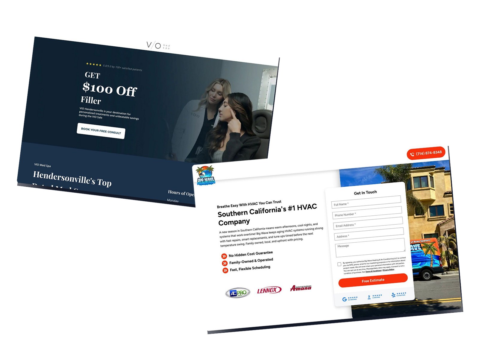
6. Big Wave HVAC Service

Caption: Big Wave Heating & Air Conditioning uses a clean layout for Southern California homeowners. The page highlights a “Free Estimate” offer through a prominent lead form. It features real photos of technicians and branded service vans. Trust is built using logos like Lennox and 5-star Google ratings.
Industry & Purpose: This is a lead generation landing page for a residential HVAC service provider. It is meant to convert local homeowners into leads for repair or installation estimates.
What Works: Here’s what I love: the hero section is very clear about the location. It specifically targets Southern California residents. The “No Hidden Cost Guarantee” is a great way to handle price anxiety early on. You know what you will pay before the work starts.
The social proof is excellent. You see 5-star ratings from Google and the Better Business Bureau right under the form. This makes users feel safe before they type their name. The branded van photos also show this is a real local business.
I also like the “From Call To Comfort” section. It breaks the service down into four simple steps. Step 1 says a “real person always answers.” That is a huge selling point for someone in an HVAC emergency.
What can be Improved:
- The “Get In Touch” button appears many times but the hero button says “Free Estimate.” Consistency helps people know what to expect next. Using “Get My Free Estimate” on every button might improve the click rate.
- The map section is a bit static. It lists cities in small text at the bottom. Making these city names bold or larger would help users find their location faster.
Why it inspires: This page wins because it focuses on reliability. It does not just promise good service. It shows the people and the exact steps of the process.
The “No Hidden Cost Guarantee” is the star here. It addresses the biggest fear people have when hiring a contractor. That builds immediate trust with the customer.
7. MedSpa Sale

Caption: VIO Med Spa uses a clean layout to promote a $100 discount on filler. The hero section shows a professional consultation in progress. It includes a map and office hours to help local customers. A prominent button invites users to book a free consultation.
Industry & Purpose: This is a lead generation page for a medical spa. It’s meant to convert local residents into booking a free consultation.
What Works: Here’s what I love: the hero section does not waste time. “GET $100 Off Filler” is the first thing you see in giant letters. It immediately gives the visitor a reason to stay on the page.
The trust signals are placed perfectly. Right above the main headline, it says “5.0/5.0 by 100+ satisfied patients.” This builds instant credibility before you even read the offer. I also love that the office hours and map are near the top. Most local businesses hide this info at the bottom.
The “3 simple steps” section makes the process feel easy. It starts with a “30 Sec Quiz” instead of a long medical form. This lowers the barrier to entry for someone who is just curious.
What can be Improved:
- The call to action buttons use different colors. The white button at the top stands out well. However, the dark blue buttons further down blend into the background too much.
- The “About VIO MedSpa” section is a bit text-heavy. The font is small and the paragraph is dense. Breaking those three sentences into smaller bullet points would improve readability.
Why it inspires: VIO Med Spa wins by being transparent. They show the physical office and the staff right on the page. This removes the “mystery” of going to a medical clinic for the first time. The specific $100 offer gives people a concrete reason to act now rather than later.
Need the page live this week? An AI landing page builder can write a working version from your brief on the same day you describe it.
Final Thoughts
Local business landing pages don’t need to be clever. They need to be trusted.
Your visitor is looking for someone nearby who can solve a specific problem. They want to know you’re real, you’re qualified, and taking the next step won’t trap them into something they’re not ready for.
The pages that convert do three things consistently: they remove doubt with trust signals, they remove friction with low-commitment CTAs, and they remove distance by showing exactly where you are.
If your local business page isn’t converting, check those three things first. Make yourself trustworthy. Make the ask easy. And make it clear you’re right around the corner.
Want more inspiration? Check out our full list of [40 best landing page examples](https://swipepages.com/blog/landing-page-examples/) across industries.