

Amazon Masterclass Landing Page Example
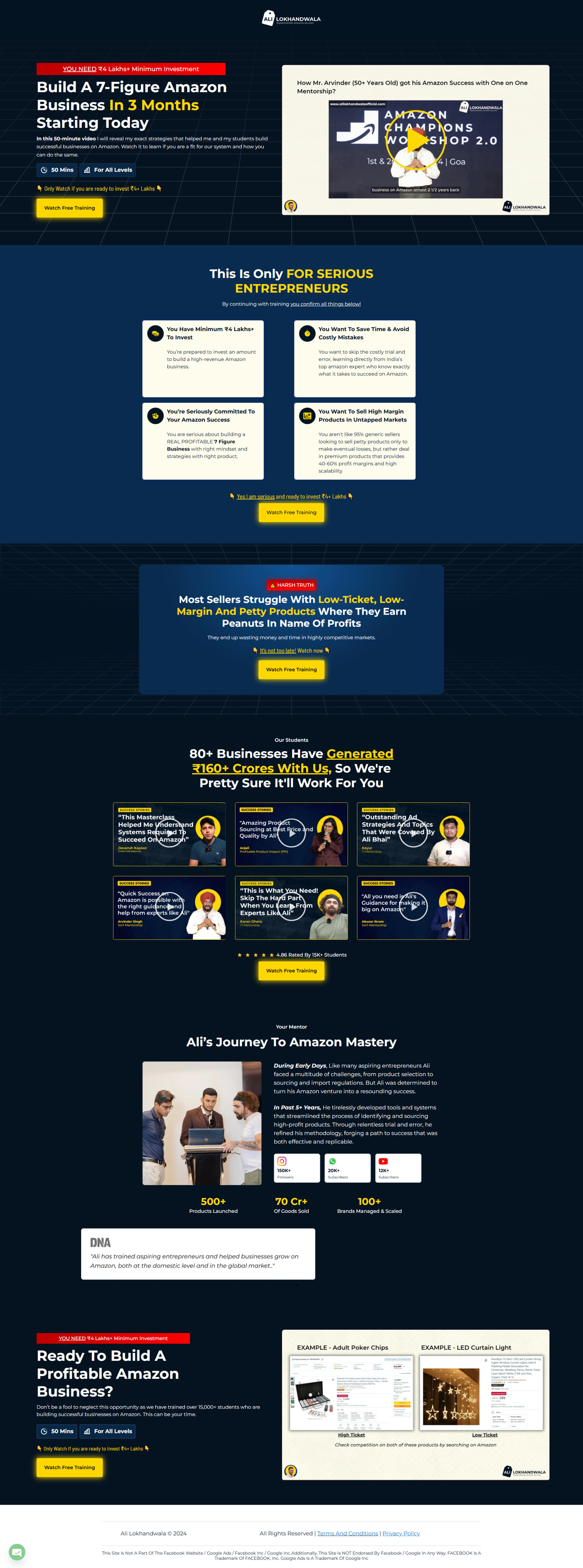
The landing page serves as a qualification and lead generation page for a free 50-minute training video on building a high-revenue Amazon business. Its primary business goal is to attract serious entrepreneurs with capital and persuade them to watch the video, which likely functions as a sales funnel for a high-ticket mentorship program
Check out our curated database of landing page examples to see what is working right now.
To create a high-converting page like this, use Swipe Pages, a leading landing page builder and funnel platform for conversion focussed marketers
Key Insights
What Works Well
- Clear Value Proposition: The headline delivers a strong, specific promise—building a "7-Figure Amazon Business In 3 Months"—which immediately targets the user's desire for rapid financial growth.
- Prominent CTA: The yellow "Watch Free Training" buttons contrast sharply against the dark blue background, drawing the eye effectively on both desktop and mobile.
- Trust Signals: The page utilizes strong authority markers, including specific revenue numbers (₹160+ Crores), a high volume of students (15K+), and video testimonials from diverse demographics.
- Mobile Responsiveness: The mobile version adapts the content into a readable single-column layout and utilizes a sticky bottom CTA button to ensure the conversion action is always available.
- Supporting Content: The visual comparison between "High Ticket" (Poker Chips) and "Low Ticket" (LED Lights) products effectively educates the user on the strategy before they even watch the video.
Opportunities for Improvement
- Objection Handling: The prominent "You Need ₹4 Lakhs+ Minimum Investment" warning at the very top is a strong filter but might be too aggressive for cold traffic; moving this qualification slightly down after value has been established could reduce immediate bounce rates.
- Social Proof: While student success stories are present, adding recognizable media logos or third-party verification badges (like Trustpilot) could validate the high revenue claims further.
- Visuals: The "DNA" text section is visually disconnected and plain compared to the high-quality graphical elements elsewhere; incorporating a photo of the mentor here would humanize the brand story.
- CTA Optimization: The CTA buttons are clear but could be enhanced with urgency triggers or micro-copy like "Instant Access" or "No Registration Fees" to reduce friction.
Layout Differences: Desktop vs Mobile
- Desktop: Features a multi-column layout for testimonials and product comparisons, allowing users to scan multiple data points horizontally. The video player is central and static.
- Mobile: Content is stacked vertically for linear scrolling. A key difference is the "Watch FREE Training" sticky bar fixed at the bottom of the screen, which is not present in the desktop view.
Summary
The page effectively uses high-authority revenue claims and educational comparisons to filter and attract high-intent leads. To further optimize, the aggressive financial qualification could be introduced later in the scroll, and more diverse trust signals could be added to support the bold income claims.


