

Roofing Estimate Landing Page Example
The landing page is for Best Choice Roofing, a roofing contractor service. The primary business goal is lead generation through a free roof inspection request form and phone calls.
Check out our curated database of landing page examples to see what is working right now.
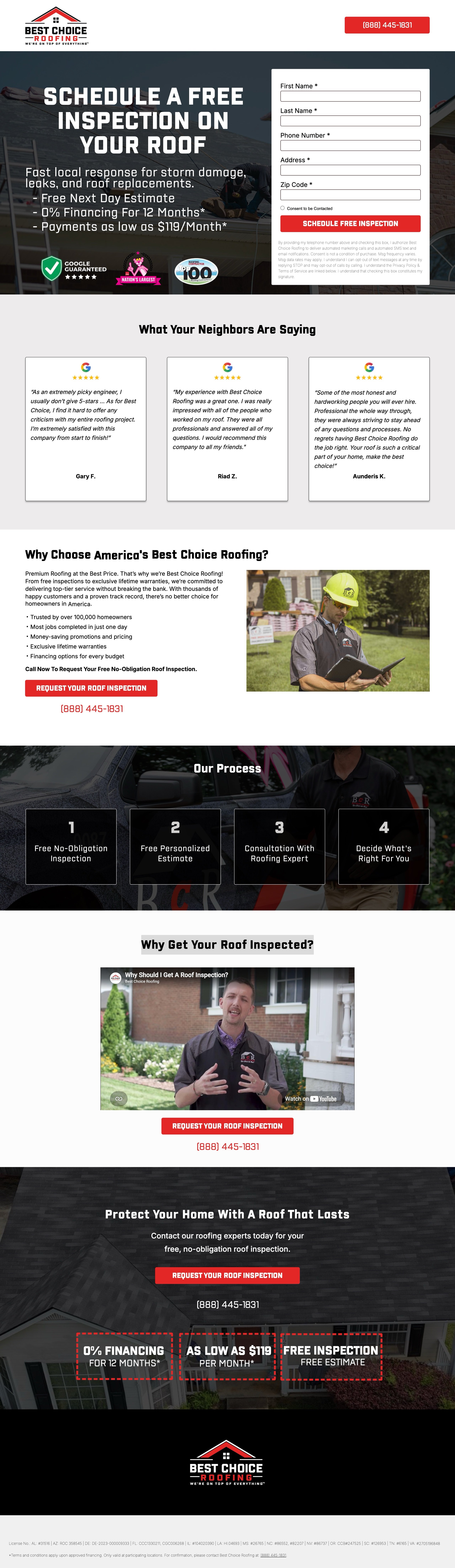
To create a high-converting page like this, use Swipe Pages, a leading landing page builder and funnel platform for conversion focussed marketers
Key Insights
What Works Well
- Clear Value Proposition: The hero section immediately highlights a free inspection, 0% financing, and a low monthly payment of $119, addressing the biggest customer concern: cost.
- Prominent CTA: The use of high-contrast red buttons for both the form submission and the phone number ensures the primary actions are impossible to miss.
- Trust Signals: High-authority badges like "Google Guaranteed," industry rankings, and the list of professional license numbers at the bottom establish significant credibility.
- Mobile Responsiveness: The mobile layout effectively stacks elements, keeping the headline legible and adding a sticky phone number button at the bottom for easy accessibility.
- Supporting Content: The "Our Process" section provides a clear four-step roadmap that reduces user anxiety by explaining exactly what to expect after signing up.
Opportunities for Improvement
- Social Proof: While reviews are included, adding a cumulative star rating (e.g., "4.9/5 from 1,000+ neighbors") near the hero section would strengthen immediate trust.
- Objection Handling: A small FAQ section addressing common insurance questions or timeframes for repairs could help convert hesitant users who are unsure about the next steps.
- Visuals: On the mobile version, there is a labeling error in the "Our Process" section where Step 2 repeats the text from Step 1 instead of showing "Free Personalized Estimate."
- CTA Optimization: The form could be shortened or split into multi-step to look less intimidating, and the "Consent to be Contacted" text could be slightly simplified to reduce friction.
Layout Differences: Desktop vs Mobile
- Desktop: Utilizes a side-by-side hero layout where the lead form sits directly next to the value proposition, allowing for immediate conversion without scrolling.
- Mobile: Elements are stacked vertically, prioritizing the headline and trust badges before the form, and features a fixed bottom call button for better mobile usability.
Summary
The page is a highly effective lead generation tool that leverages strong financial incentives and authoritative trust signals to drive conversions. The most impactful optimizations would be correcting the content error in the mobile process section and adding a brief FAQ to handle common customer objections.


