

Data Master Landing Page Example
The landing page is for Boston University's Online Master of Science in Data Science program. The primary business goal is lead generation through a "Request Information" form submission.
Check out our curated database of landing page examples to see what is working right now.
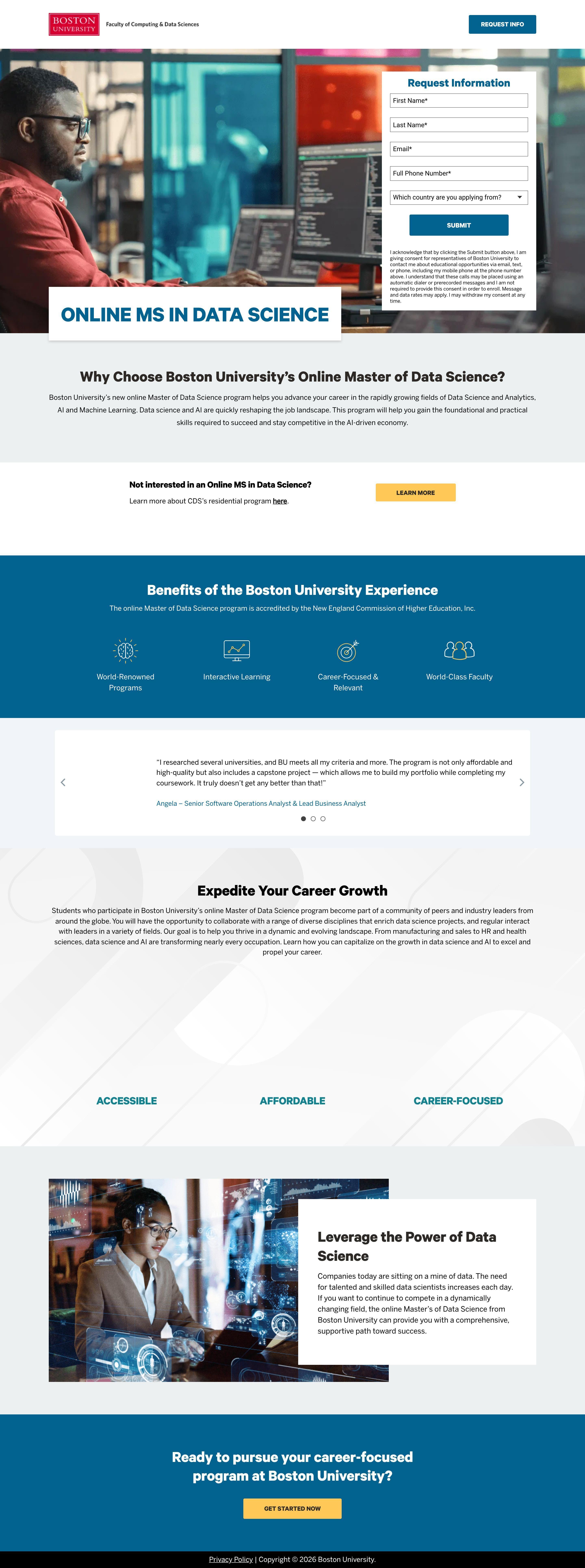
To create a high-converting page like this, use Swipe Pages, a leading landing page builder and funnel platform for conversion focussed marketers
Key Insights
What Works Well
- Clear Value Proposition: The main headline "ONLINE MS IN DATA SCIENCE" immediately communicates the core offering. Further down, the "Why Choose Boston University's Online Master of Data Science?" section elaborates on the program's benefits and target audience.
- Prominent CTA: The "Request Information" form is prominently placed in the hero section on both desktop and mobile, ensuring visitors immediately see the primary call to action. A secondary "GET STARTED NOW" button in the footer reinforces the action.
- Trust Signals: The Boston University logo is visible at the top, immediately establishing institutional credibility. The mention of accreditation ("accredited by the New England Commission of Higher Education") and a testimonial from a "Senior Software Operations Analyst" further build trust.
- Mobile Responsiveness: The page adapts well to mobile, with elements stacking vertically for readability. The form remains accessible, and the footer CTA becomes full-width, enhancing tapability.
- Supporting Content: The page provides comprehensive information about the program, including benefits, career growth potential, and details about the university experience, which supports the value proposition.
Opportunities for Improvement
- Social Proof: While one testimonial is present, adding more diverse testimonials (e.g., from different career stages, industries, or locations) or integrating logos of companies where alumni work could significantly boost social proof. Displaying statistics like the number of graduates or career outcomes would also be beneficial.
- Objection Handling: There are no explicit FAQs or objection-handling sections. Potential students might have questions about program duration, prerequisites, cost, or time commitment. A short "FAQs" section could address these common concerns upfront, reducing friction.
- Visuals: The primary hero image is generic. Adding program-specific visuals like screenshots of the online learning platform, a short introductory video about the program or faculty, or images of diverse students could make the page more engaging and convey the online learning experience better.
- CTA Optimization: The "Request Information" form could benefit from more specific micro-copy on the submit button (e.g., "Get Program Details" or "Download Brochure"). A sticky "Request Info" button on mobile, once the hero section is scrolled past, could maintain CTA visibility. The secondary CTA in the footer could also be more prominent or a different color to stand out more.
Layout Differences: Desktop vs Mobile
- Desktop: The desktop version features a wider layout, allowing the "Request Information" form to sit alongside the hero image, providing an immediate conversion opportunity. Content sections generally use multi-column layouts where appropriate (e.g., the benefits and career-focused sections).
- Mobile: The mobile layout prioritizes vertical stacking, ensuring all content remains readable on smaller screens. The hero form is placed immediately below the main headline, maintaining its prominence. Multi-column sections transform into single-column lists, and buttons like the footer CTA expand to full width, optimizing for touch interaction.
Summary
The landing page effectively communicates its purpose as an online MS in Data Science program and clearly aims for lead generation through its well-placed inquiry form. Its strengths lie in a clear value proposition, visible trust signals, and good mobile responsiveness. Key opportunities for improvement include enhancing social proof with more diverse testimonials or statistics, proactively addressing potential student objections with an FAQ section, using more program-specific visuals, and optimizing CTA micro-copy and placement for continued visibility.


