

Danube - Property Page Landing Page Example
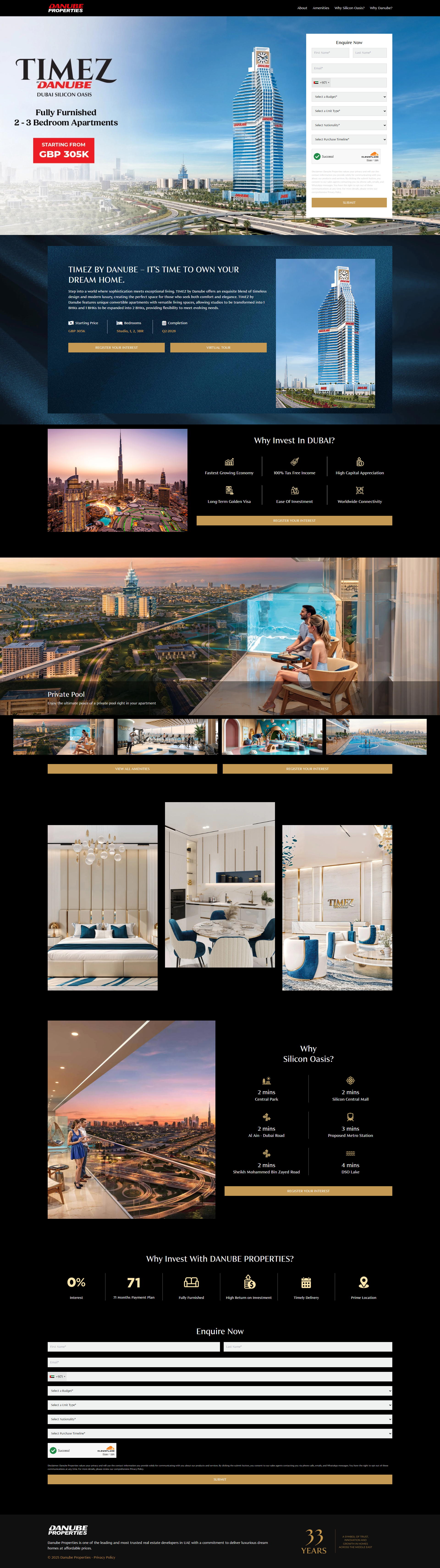
The landing page is for the 'TIMEZ BY DANUBE' real estate project in Dubai Silicon Oasis. The primary business goal is to generate leads by encouraging prospective buyers to submit their contact details through the enquiry form.
Check out our curated database of landing page examples to see what is working right now.
To create a high-converting page like this, use Swipe Pages, a leading landing page builder and funnel platform for conversion focussed marketers
Key Insights
What Works Well
- Clear Value Proposition: The offer of a '1BHK for the price of a Studio' is a compelling financial hook that is prominently displayed in the hero section.
- Prominent CTA: The gold-colored buttons for 'SUBMIT' and 'REGISTER YOUR INTEREST' provide high contrast against the dark background, making the action steps very clear.
- Trust Signals: Inclusion of the '30 Years of Trust' badge and the developer's reputation as a top-tier firm in the UAE builds immediate credibility.
- Mobile Responsiveness: Key elements like the enquiry form and property highlights are stacked effectively, ensuring a smooth experience for users on mobile devices.
- Supporting Content: Detailed location maps and investment benefits, such as the 0% interest and 71-month payment plan, provide comprehensive information to help the user make an informed decision.
Opportunities for Improvement
- Social Proof: Adding customer testimonials or logos of completed flagship projects would help reassure potential investors about the quality of the final product.
- Objection Handling: A small FAQ section addressing common questions about mortgage eligibility for expats or handover timelines would reduce friction in the lead form process.
- Visuals: While the renders are high quality, adding a video walkthrough or an interactive floor plan for the 'convertible' unit feature would make the offer more tangible.
- CTA Optimization: Replacing generic labels like 'SUBMIT' with more enticing copy such as 'Download Brochure' or 'Get Payment Plan' could increase engagement rates.
Layout Differences: Desktop vs Mobile
- Desktop: The layout uses a horizontal split in the hero section with the form on the right and value props on the left, providing a balanced visual flow.
- Mobile: Navigation is condensed into a hamburger menu, and all content sections are stacked vertically, prioritizing the lead form early in the user journey.
Summary
The landing page does an excellent job of highlighting its unique financial offer and investment benefits through high-impact visuals. To maximize conversions, the page could benefit from adding more human-centric social proof and interactive visual elements that showcase the specific layout flexibility mentioned in the headline.


