

Antiworkaholic Masterclass Landing Page Example
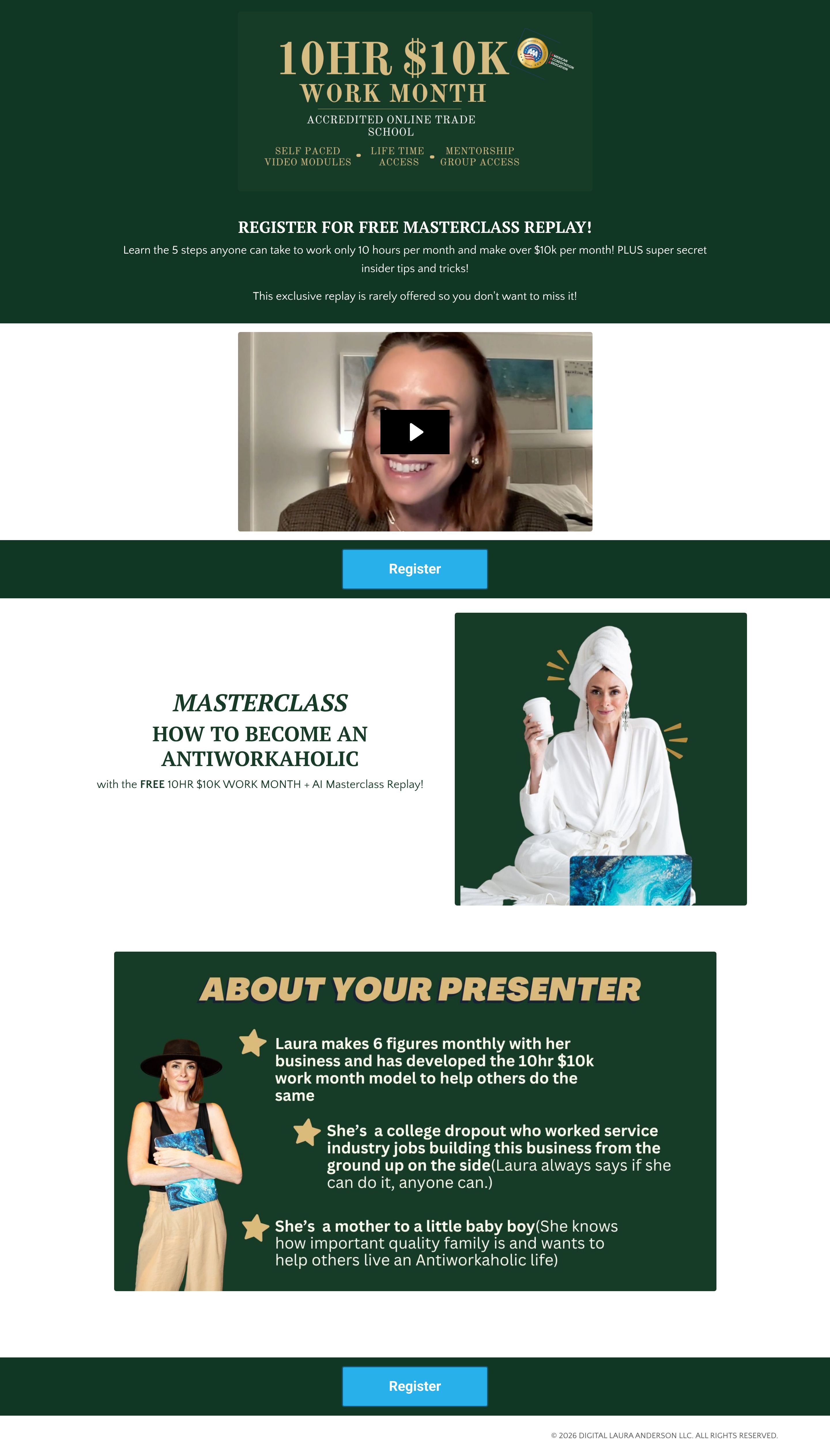
The landing page is for promoting a free masterclass replay titled "10HR $10K WORK MONTH" that teaches how to become an antiworkaholic. The primary business goal is lead generation, specifically to encourage users to register for the free masterclass replay.
Check out our curated database of landing page examples to see what is working right now.
To create a high-converting page like this, use Swipe Pages, a leading landing page builder and funnel platform for conversion focussed marketers
Key Insights
What Works Well
- Clear Value Proposition: The main headline "10HR $10K WORK MONTH" and the supporting text "Learn the 5 steps anyone can take to work only 10 hours per month and make over $10K per month!" clearly state the benefit and ambition of the masterclass.
- Prominent CTA: The "Register" call-to-action buttons are clearly visible and strategically placed multiple times throughout the page (above the fold, after the video, and at the bottom), making it easy for users to convert.
- Trust Signals: The mention of "ACCREDITED ONLINE TRADE SCHOOL" near the main headline and the presenter's bio stating "Laura makes 6 figures monthly" serve as trust signals, indicating credibility and expertise.
- Mobile Responsiveness: The mobile layout effectively stacks content vertically, ensuring readability and easy navigation, with key elements like headlines and CTAs maintaining their prominence.
- Supporting Content: The embedded video provides an engaging way to deliver more information, and the "ABOUT YOUR PRESENTER" section offers valuable insights into the presenter's background and success, building rapport and credibility.
Opportunities for Improvement
- Social Proof: While the presenter's success is mentioned, adding more explicit social proof such as testimonials from past participants or a number of people who have already registered could further enhance credibility and encourage sign-ups.
- Objection Handling: Incorporating a small FAQ section could address potential user objections or questions regarding the feasibility of "10HR $10K WORK MONTH" or the legitimacy of the masterclass.
- Visuals: The video thumbnail is a generic play button over a still image; a more engaging, custom thumbnail with the presenter or a strong visual related to the topic could increase click-through rates for the video.
- CTA Optimization: The "Register" buttons are effective but could be enhanced by making the final CTA sticky on mobile devices for continuous visibility or by introducing a secondary, less committal CTA (e.g., "Learn More About the Masterclass") higher on the page for users not yet ready to register.
Layout Differences: Desktop vs Mobile
- Desktop: The desktop version utilizes a wider screen area, allowing for side-by-side presentation of elements such as the "MASTERCLASS" description and an accompanying image. The overall layout is more spread out.
- Mobile: The mobile version adapts by vertically stacking content blocks to ensure optimal readability and usability on smaller screens. Essential elements like the main headline, description, video, and "Register" CTAs remain prominent and easily accessible without excessive scrolling or pinching.
Summary
The landing page effectively communicates its core value proposition and provides clear calls to action for a free masterclass replay. The strengths lie in its clear messaging, repeated prominent CTAs, and a well-adapted mobile experience. Key opportunities for improvement include integrating more explicit social proof, addressing potential user objections with an FAQ, optimizing video visuals, and enhancing CTA visibility, especially on mobile, to further boost conversion rates.


