

Money Mastery Landing Page Example
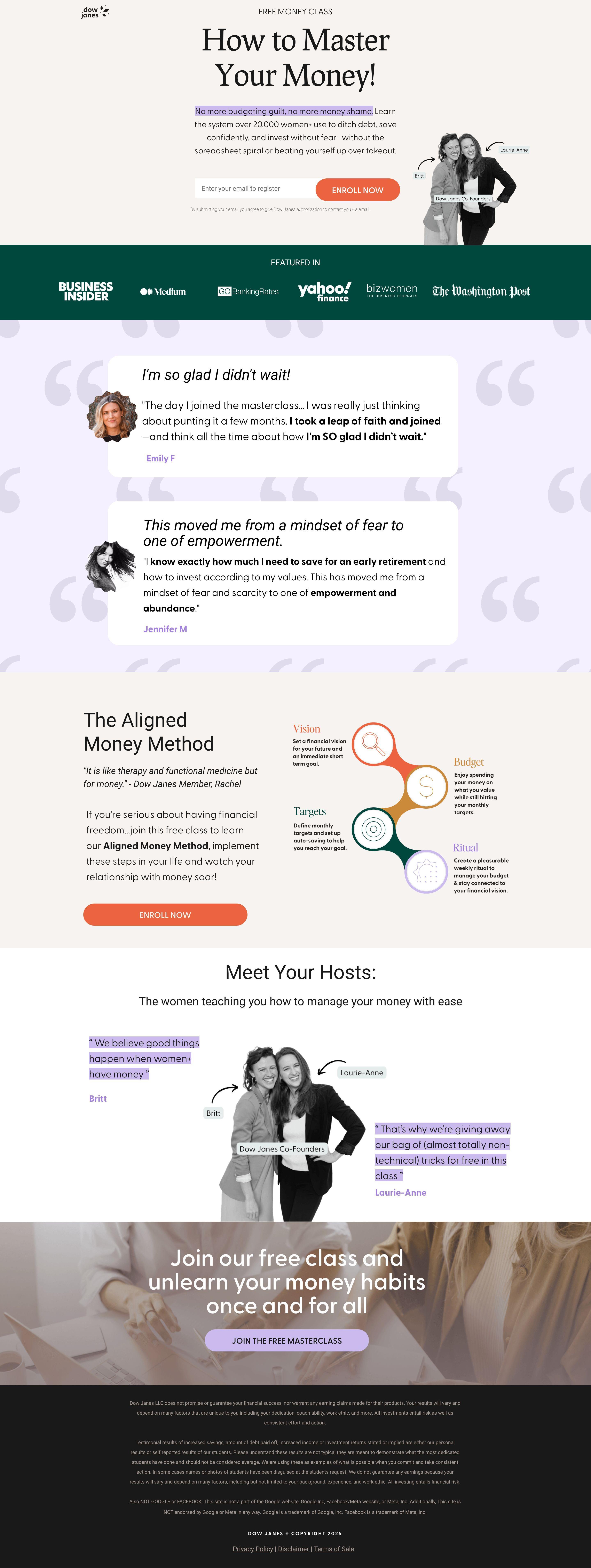
The landing page is for promoting a free online class aimed at helping individuals master their money. The primary business goal is lead generation through email sign-ups for this free class.
Check out our curated database of landing page examples to see what is working right now.
To create a high-converting page like this, use Swipe Pages, a leading landing page builder and funnel platform for conversion focussed marketers
Key Insights
What Works Well
- Clear Value Proposition: The headline "How to Master Your Money!" and subtitle "No more budgeting guilt, no more money shame" immediately communicate the core benefit. The "FREE MONEY CLASS" label is also very clear.
- Prominent CTA: The "ENROLL NOW" buttons are strategically placed above the fold, mid-page, and at the bottom, making them highly visible and accessible.
- Trust Signals: The "FEATURED IN" section with reputable media logos (Business Insider, Yahoo, The Washington Post) and multiple testimonials with photos and names build credibility. The "Meet Your Hosts" section introduces the founders, adding a personal touch and expertise.
- Mobile Responsiveness: The mobile layout effectively re-stacks content into a single column, maintaining readability and CTA prominence without losing essential information.
- Supporting Content: The "The Aligned Money Method" section visually explains the class's framework with clear icons and text for "Vision," "Budget," "Targets," and "Ritual," providing insight into what will be learned.
Opportunities for Improvement
- Social Proof: While testimonials are present, adding quantitative social proof such as the number of students who have taken the class or specific success metrics could further boost confidence.
- Objection Handling: Implementing a small FAQ section could proactively address common questions or concerns, such as the class duration, specific topics covered, or whether it's truly free.
- Visuals: While images of the hosts are good, incorporating a short introductory video from the hosts or a brief preview of the class content could enhance engagement and provide a more dynamic experience.
- CTA Optimization: Consider making the "ENROLL NOW" button sticky on mobile devices for continuous visibility. Adding more specific microcopy to the CTA, like "Enroll Now for Your Free Class" or "Get Instant Access," might further incentivize clicks.
Layout Differences: Desktop vs Mobile
- Desktop: Features a wider layout with some sections presenting content side-by-side, such as the hero section with text on the left and host photos on the right, and the "Aligned Money Method" explanation with text and icons in a multi-column grid.
- Mobile: Adapts to a single-column layout where all content is stacked vertically. Headings, body text, and images scale down appropriately for smaller screens. Essential elements like the main headline and CTAs maintain their prominence and readability by occupying full width. The "Featured In" logos are presented in a more compact grid.
Summary
The page effectively communicates its free money class offering and uses strong trust signals to build credibility. Its main strengths lie in its clear value proposition, prominent calls to action, and good mobile responsiveness. Key areas for optimization include enhancing social proof with quantitative data, adding an objection-handling section (FAQ), considering a video for visual engagement, and potentially refining CTA microcopy or making them sticky on mobile for improved conversion.


