

Mystery Soak Landing Page Example
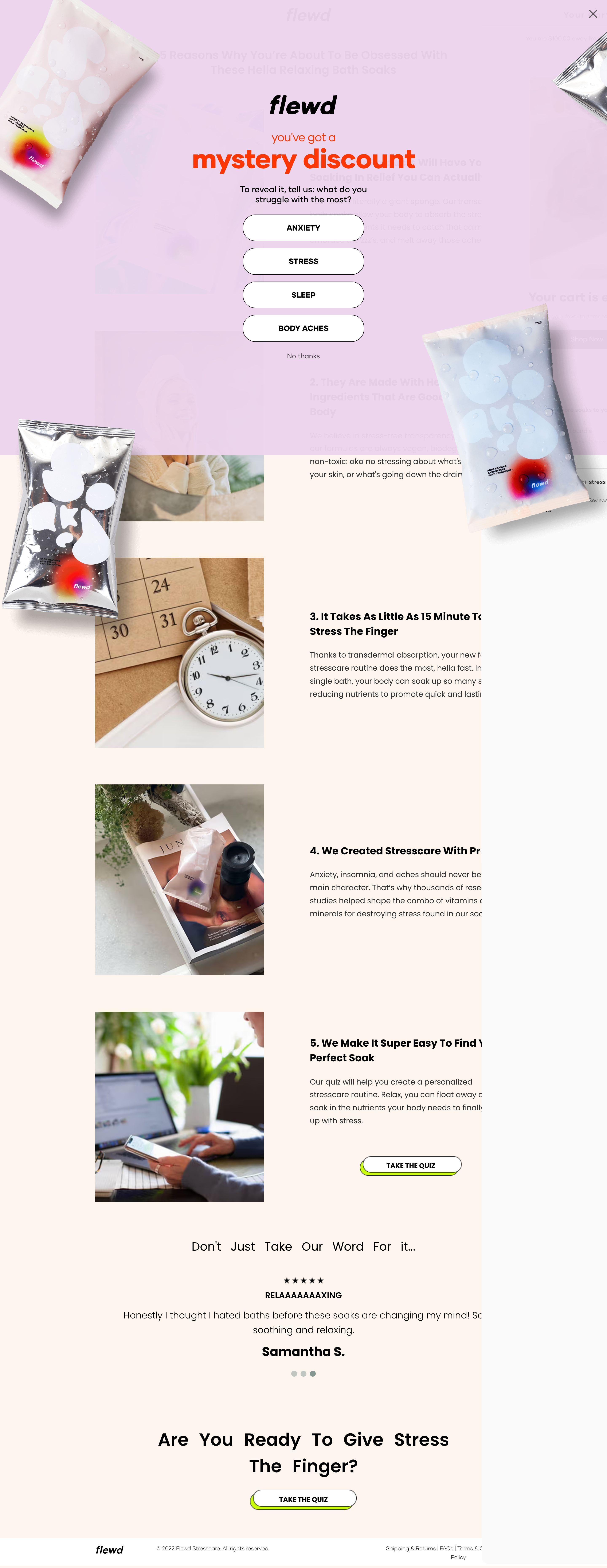
The landing page is for flewd, a brand offering stresscare products, specifically bath soaks. The primary business goal is to engage users with a "mystery discount" to encourage interaction (revealing struggles) and ultimately drive product sales.
Check out our curated database of landing page examples to see what is working right now.
To create a high-converting page like this, use Swipe Pages, a leading landing page builder and funnel platform for conversion focussed marketers
Key Insights
What Works Well
- Clear Value Proposition: The "mystery discount" immediately captures user attention and offers an incentive. The product is positioned as a "stresscare routine" through visual cues and mentions like "These help with relaxing with Soaks".
- Prominent CTA: The "Take the Quiz" buttons are strategically placed on the desktop view to encourage engagement and unlock the discount. The "Shop Now" button on the mobile cart screen is clear.
- Trust Signals: Customer reviews, like the "Relaxing Rating" with stars and a testimonial from "Samantha S.", are visible towards the bottom of the desktop page, building credibility.
- Mobile Responsiveness: The interactive "mystery discount" pop-up appears well-adapted for mobile screens, ensuring a good initial user experience.
- Supporting Content: Numbered sections (2. They Are Made With ... , 3. It Takes As Little As ..., 4. We Created Stresscare..., 5. We Make It Super Easy...) clearly explain product benefits, ingredients, and ease of use, providing essential information.
Opportunities for Improvement
- Social Proof: While one testimonial is present, incorporating more social proof elements like additional customer reviews, ratings, or user-generated content could further enhance trust and appeal.
- Objection Handling: Adding a small FAQ section or concise answers to potential objections regarding product efficacy, ingredients, or usage could preemptively address user concerns.
- Visuals: The page features several product shots and content explaining the benefits. Including short video demonstrations of the product's use or lifestyle imagery could create a more dynamic and engaging experience.
- CTA Optimization: After the initial "mystery discount" interaction, clearer next steps or more prominent direct purchase CTAs could be beneficial. A sticky "Add to Cart" or "Shop Now" button on mobile might improve conversion once a user has engaged with the product information.
Layout Differences: Desktop vs Mobile
- Desktop: The desktop view presents the "mystery discount" as an overlay on top of the main landing page content, which includes detailed product information, benefits, and a customer review towards the bottom. The cart is not immediately visible.
- Mobile: The mobile view initially prioritizes the "mystery discount" pop-up. After interaction or dismissal, a "Your cart is empty!" section appears with cross-sell suggestions ("add more soaks to your bag") and a "Shop Now" button, suggesting a more direct funnel toward purchase or upsell after the initial engagement. Key informational sections visible on desktop would require scrolling on mobile.
Summary
The flewd landing page effectively uses an interactive "mystery discount" to draw users into a stresscare product. Its strengths lie in clear engagement CTAs and foundational trust signals. Key areas for optimization include expanding social proof, proactively addressing potential customer objections, enhancing visual content with more dynamic media, and streamlining the path to purchase through refined CTA placements and flow, especially between the initial discount interaction and the shopping cart experience.


