

Foam Business Landing Page Example
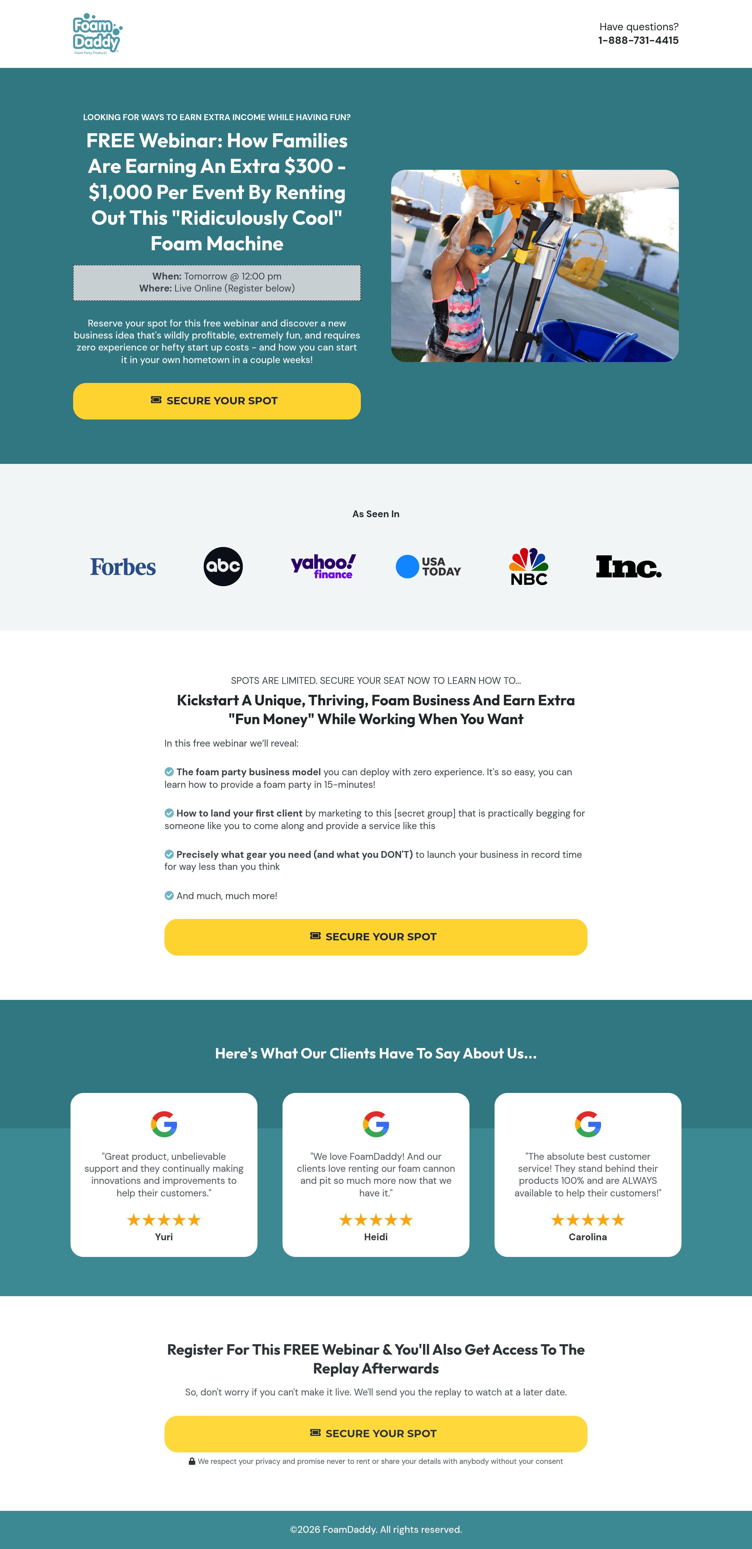
The landing page is for a free webinar hosted by "Foam Daddy" that teaches families how to start a profitable foam party rental business. The primary business goal is to generate leads by getting users to register for the "Free Webinar" to learn about this income opportunity.
Check out our curated database of landing page examples to see what is working right now.
To create a high-converting page like this, use Swipe Pages, a leading landing page builder and funnel platform for conversion focussed marketers
Key Insights
What Works Well
- Clear Value Proposition: The headline is extremely specific, promising an exact monetary benefit ("$300 - $1,000 Per Event") and describing the nature of the work ("Rent Out This Ridiculously Cool Foam Machine").
- Prominent CTA: The "SECURE YOUR SPOT" buttons use a bright yellow color that contrasts sharply with the teal background, making them highly visible and actionable.
- Trust Signals: The inclusion of major media logos (Forbes, ABC, Yahoo, NBC) and Google Reviews helps establish credibility for a niche business opportunity.
- Mobile Responsiveness: The content adapts well; on mobile, the headline and CTA are prioritized at the very top before the image, ensuring the hook is visible without scrolling.
- Supporting Content: The "What you will learn" section uses clear checkmark bullet points to outline the curriculum, effectively setting expectations for the user.
Opportunities for Improvement
- Social Proof: The current testimonials praise the product quality and customer service ("Great product," "Best customer service"), but they do not validate the business opportunity or the specific earnings claimed in the headline. Including success stories of families actually making $1,000/event would be far more persuasive.
- Objection Handling: A mini-FAQ section is missing. Users likely have questions about startup costs, insurance, or saturation in their area that, if unanswered, might prevent signups.
- Visuals: While the photo of the child is good, a video background or GIF showing the foam machine in action would better demonstrate the "fun" and "ridiculously cool" factor mentioned in the copy.
- CTA Optimization: The text "When: Tomorrow @ 12:00 pm" is relative and potentially confusing depending on when the user visits. Adding a countdown timer or "Instant Watch" option could reduce friction.
Layout Differences: Desktop vs Mobile
- Desktop: The hero section uses a two-column layout with the copy on the left and the image on the right. Trust logos are arranged in a single horizontal line.
- Mobile: The layout shifts to a single column stack. Crucially, the text and CTA appear above the hero image to ensure the primary conversion path is immediately accessible. Trust logos wrap into a grid format.
Summary
The page excels at presenting a high-yield business opportunity with a very strong, specific headline and high-contrast design. However, it could significantly improve conversion by aligning the testimonials with the "business success" promise rather than just product quality, and by adding dynamic visuals to showcase the product in action.


