

German Language Course Landing Page Example
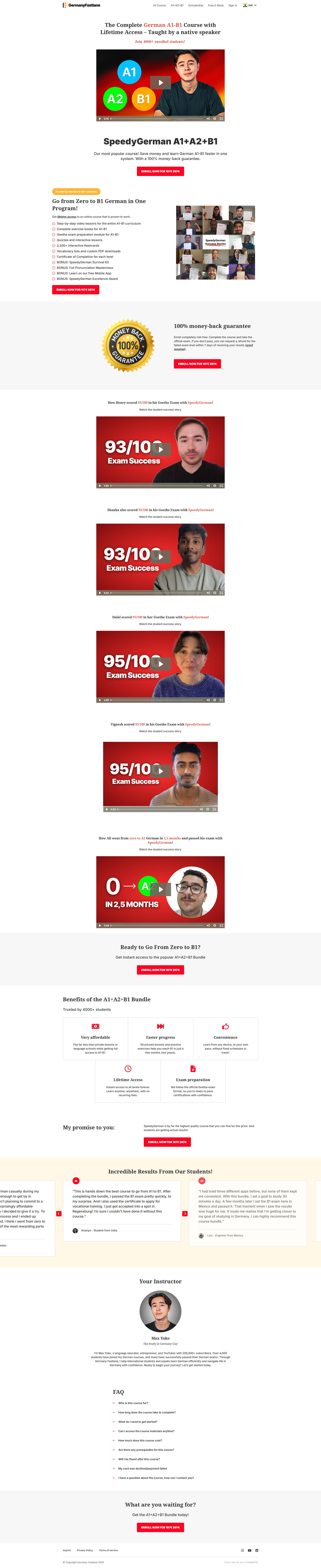
The landing page is for an online German language course covering levels A1 to B1. The primary business goal is to drive enrollments for the 'SpeedyGerman A1+A2+B1' course bundle by highlighting its value, success stories, and money-back guarantee.
Check out our curated database of landing page examples to see what is working right now.
To create a high-converting page like this, use Swipe Pages, a leading landing page builder and funnel platform for conversion focussed marketers
Key Insights
What Works Well
- Clear Value Proposition: The headline clearly identifies the target levels (A1-B1), the benefit of lifetime access, and the credibility of learning from a native speaker.
- Prominent CTA: Red 'Enroll Now' buttons are used consistently throughout the page and provide a high-contrast visual cue against the white and grey background.
- Trust Signals: The page features a money-back guarantee seal, mentions 4000+ enrolled students, and includes specific score-based success stories (e.g., 93/100) to build authority.
- Mobile Responsiveness: The mobile layout correctly stacks columns into a single-column view, ensuring that text remains legible and the instructional videos are centered.
- Supporting Content: The course breakdown is comprehensive, detailing specific modules, bonuses like the survival kit, and a pronunciation masterclass, which increases the perceived value of the bundle.
Opportunities for Improvement
- Social Proof: While the success stories are powerful, integrating verified third-party review widgets (like Trustpilot or Google) would enhance the credibility of the testimonials.
- Objection Handling: The FAQ section is at the very bottom; surfacing answers to common questions about time commitment or prerequisites closer to the pricing table could reduce friction.
- Visuals: The price display in the CTA buttons (187€ 297€) is confusing because it lacks a strikethrough for the original price, making the discount less obvious at a glance.
- CTA Optimization: Implementing a sticky CTA button at the bottom of the mobile screen would allow users to enroll at any point during their long scroll through the content.
Layout Differences: Desktop vs Mobile
- Desktop: Utilizes a wide layout with multi-column sections for benefits and a horizontal grid for the student success collage.
- Mobile: Transitions to a vertical stack for all elements, collapses the navigation into a hamburger menu, and optimizes image sizes for portrait viewing on mobile devices.
Summary
The page effectively leverages strong social proof through video testimonials and a clear, feature-rich course breakdown. To further improve conversion rates, the page should clarify its pricing visuals with strikethroughs and adopt a sticky mobile CTA to capture users as they consume the long-form sales content.


