

Emergency HVAC Landing Page Example
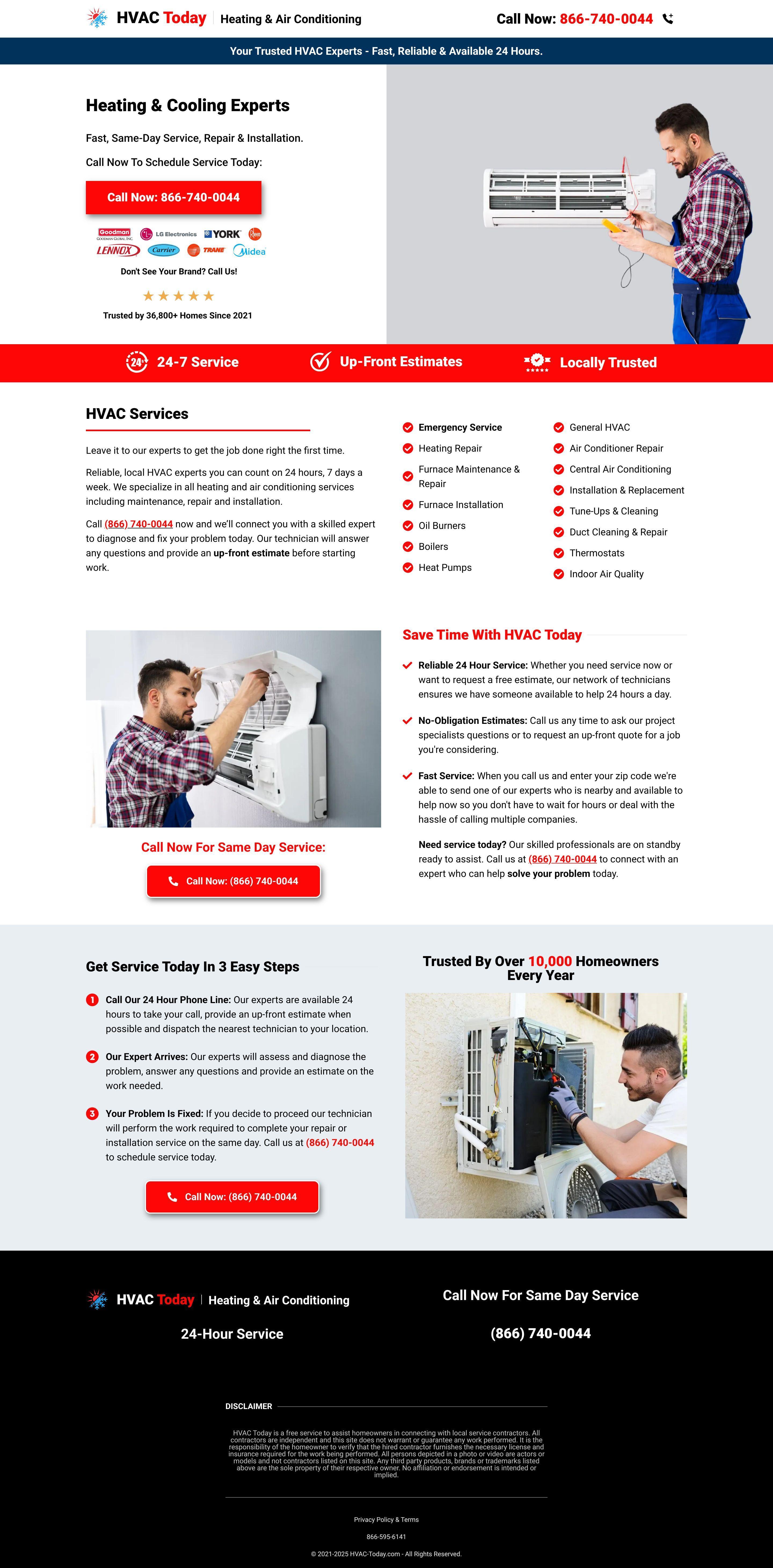
The landing page is for an HVAC service provider named HVAC Today. The primary business goal is to generate immediate leads via phone calls for heating, ventilation, and air conditioning repair, maintenance, and installation services.
Check out our curated database of landing page examples to see what is working right now.
To create a high-converting page like this, use Swipe Pages, a leading landing page builder and funnel platform for conversion focussed marketers
Key Insights
What Works Well
- Clear Value Proposition: The page immediately communicates speed and reliability with headlines like "Fast, Same-Day Service" and "Available 24 Hours."
- Prominent CTA: High-contrast red buttons and large phone numbers are strategically repeated throughout the scroll to ensure the primary conversion action is always visible.
- Trust Signals: The inclusion of well-known brand logos (Trane, Carrier, Lennox) and the claim of being "Trusted by 36,800+ Homes" establishes immediate industry authority.
- Mobile Responsiveness: The mobile version is optimized with large touch targets, a simplified 2x2 grid for key service features, and a clear vertical hierarchy.
- Supporting Content: A categorized list of services and common problems helps users identify their specific needs and confirms the company's expertise.
Opportunities for Improvement
- Social Proof: While the page mentions a large number of homes served, adding specific customer testimonials or star-rated reviews would significantly enhance emotional trust.
- Objection Handling: Including a brief FAQ section or clear information regarding service areas and warranty guarantees would help overcome common user hesitations.
- Visuals: Replacing standard stock imagery with authentic photos of actual technicians, branded vehicles, or real work sites would create a stronger local connection.
- CTA Optimization: Incorporating a secondary, low-friction lead capture option like a "Request a Callback" form would cater to users who cannot or prefer not to make a phone call immediately.
Layout Differences: Desktop vs Mobile
- Desktop: Utilizes a horizontal layout in the hero section with a technician image balanced against the primary messaging and CTA. Navigation is minimal, keeping the focus on the phone number.
- Mobile: Elements are stacked vertically for better readability. Feature icons are condensed into a grid, and the phone number is prioritized at the top and bottom of the screen for quick access.
Summary
The landing page is highly effective at driving urgent leads through its focus on 24/7 availability and prominent call-to-action elements. By integrating authentic social proof and a non-phone contact option, the page could further increase conversion rates across diverse user preferences.


