

Lewis Howes - Book Promotion Landing Page Example
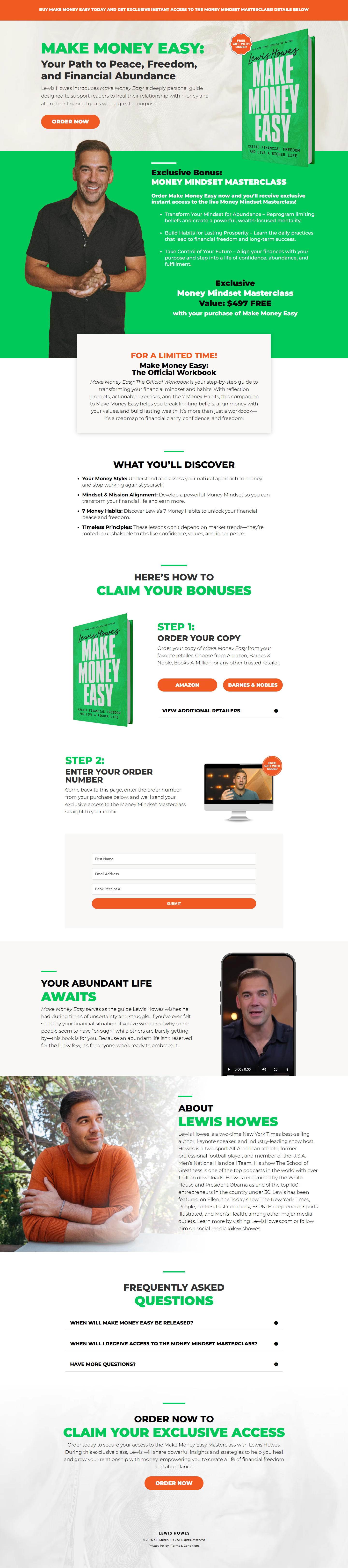
The landing page is for promoting a book titled 'MAKE MONEY EASY' and an accompanying 'MONEY MINDSET Masterclass'. The primary business goal is lead generation through the free offer of the book and Masterclass, aiming to convert visitors into subscribers or customers.
Check out our curated database of landing page examples to see what is working right now.
To create a high-converting page like this, use Swipe Pages, a leading landing page builder and funnel platform for conversion focussed marketers
Key Insights
What Works Well
- Clear Value Proposition: The headline “MAKE MONEY EASY! And Find Financial Abundance, Freedom, And Peace With This Free Book And Masterclass” clearly states the core benefit and offer.
- Prominent CTA: The “ORDER NOW” buttons are strategically placed above the fold and throughout the page, using a contrasting orange color to stand out.
- Trust Signals: The inclusion of Chris Howes, an expert in finance and entrepreneurship, acts as a trust signal. The mention of “New York Times Best-Selling Author” further enhances credibility.
- Mobile Responsiveness: The page elements appear to adapt well to the mobile screen, maintaining readability and functionality.
- Supporting Content: Bullet points detailing “WHAT YOU’LL DISCOVER” provide clear benefits and act as supporting content to encourage sign-ups.
Opportunities for Improvement
- Social Proof: There is no visible social proof like testimonials, star ratings, or endorsements from recognizable publications (beyond just stating the author is a NYT best-seller) to build further trust and overcome skepticism.
- Objection Handling: While some questions are anticipated, there isn't a strong section to address common objections or FAQs related to the free offer or the product itself (e.g., “Is it really free?”, “What’s the catch?”).
- Visuals: The desktop main visual of the man could be more dynamic or directly tie into the concept of making money easy. The mobile version crops him awkwardly. The placeholder for the "Abundant Life" app could be an actual screenshot or video.
- CTA Optimization: While prominent, the CTAs could benefit from more action-oriented or benefit-driven microcopy (e.g., “Get Your Free Book Now” instead of just “ORDER NOW”). A sticky CTA on mobile could improve conversion for long scrolls.
Layout Differences: Desktop vs Mobile
- Desktop: The desktop layout features a wider design, allowing for side-by-side placement of text and images, such as the initial headline and book cover with the author’s image below it. The form fields are presented horizontally.
- Mobile: The mobile layout is vertically stacked, prioritizing single-column readability. Images and text blocks are rearranged to fit the narrower screen. Essential elements like CTAs and headlines remain prominent at the top, but some images are cropped.
Summary
The page effectively communicates its core offer of a free book and masterclass to generate leads. Its strengths lie in the clear value proposition, prominent calls to action, and good mobile responsiveness. Key areas for improvement include integrating more robust social proof, clearly addressing potential visitor objections, enhancing visuals for greater impact, and optimizing CTA microcopy for even higher conversion rates.


