

Freezone Setup Landing Page Example
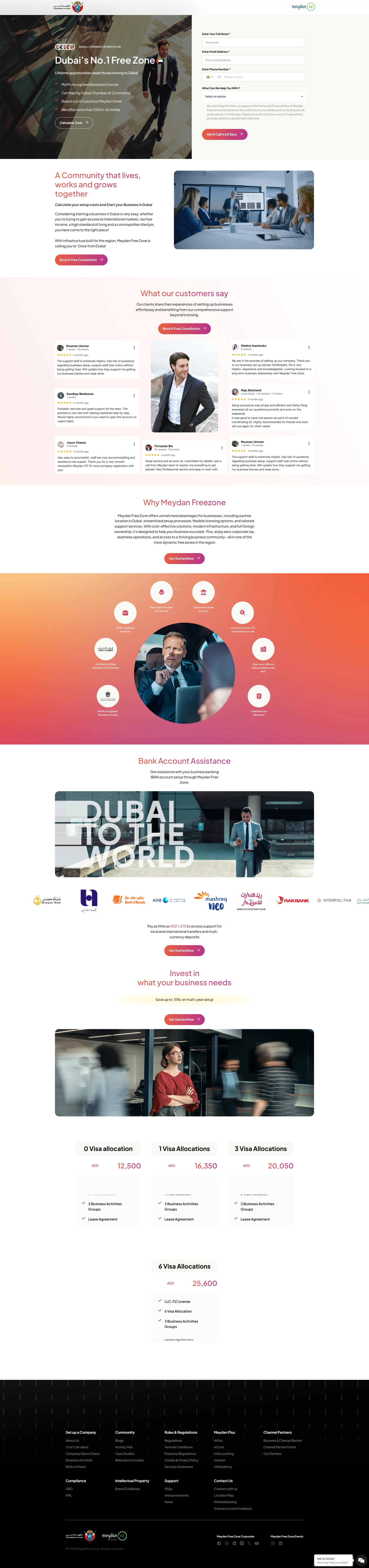
The landing page is for business setup services in the Meydan Free Zone, Dubai. The primary business goal is to generate leads through inquiry forms and consultations, and ultimately drive business license sales.
Check out our curated database of landing page examples to see what is working right now.
To create a high-converting page like this, use Swipe Pages, a leading landing page builder and funnel platform for conversion focussed marketers
Key Insights
What Works Well
- Clear Value Proposition: High-impact headline "Dubai's No.1 Free Zone" immediately establishes authority and clearly communicates the core offer.
- Prominent CTA: The "Get A Call In 60 Secs" button creates a sense of immediate value and provides a low barrier to entry for potential leads.
- Trust Signals: Prominent display of government logos and the "30000+ Companies Opened" statistic builds instant credibility and social proof.
- Mobile Responsiveness: The mobile layout transitions smoothly with appropriately sized touch targets and highly readable typography for smaller screens.
- Supporting Content: The inclusion of bank account assistance details and clear pricing tiers for visa allocations addresses key logistical pain points for entrepreneurs.
Opportunities for Improvement
- Social Proof: While Google reviews are present, adding video testimonials from successful business owners could further validate the "No.1" claim.
- Objection Handling: Adding a dedicated FAQ section directly on the page would help pre-empt common concerns regarding tax, ownership rights, and setup timelines.
- Visuals: The circular "Why Meydan Freezone" diagram is visually interesting but may be harder to scan quickly compared to a simple icon grid layout.
- CTA Optimization: Implementing a sticky CTA button on the mobile view would ensure the primary conversion action is always accessible as the user scrolls through long content sections.
Layout Differences: Desktop vs Mobile
- Desktop: Features a split-screen hero layout with the lead form adjacent to the main value proposition, and presents pricing packages in a horizontal grid.
- Mobile: Reorganizes the hero into a stacked layout for vertical readability, uses vertical blocks for pricing packages, and collapses footer links into accordions to save space.
Summary
The page effectively utilizes trust markers and low-friction lead capture forms to convert visitors. The most impactful optimizations would involve adding a direct FAQ section to handle objections on-page and making the mobile experience even more conversion-focused with sticky action elements.


