

Academy Goals Landing Page Example
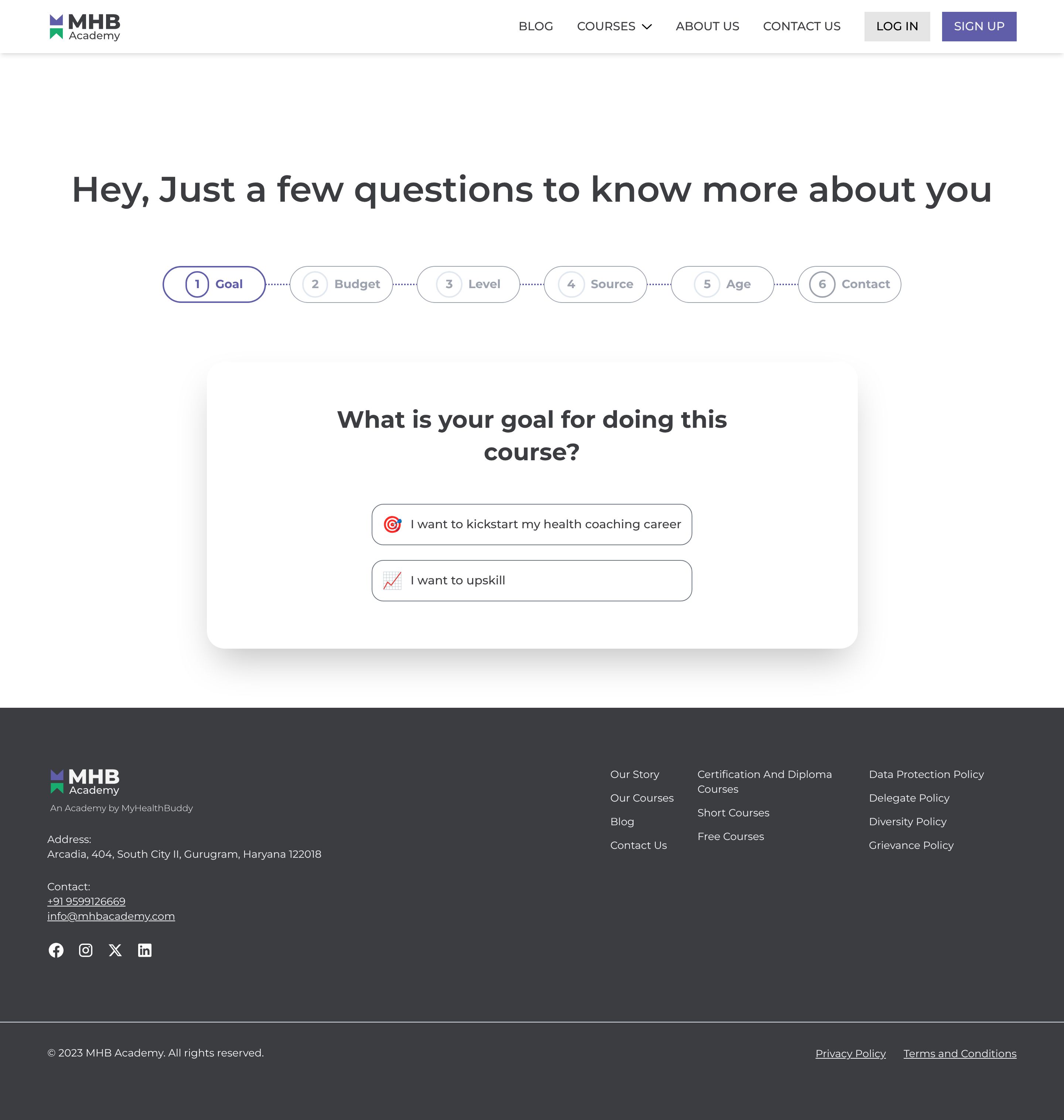
The landing page is for gathering information about a user's goals for undertaking a course with MHB Academy. The primary business goal is lead generation, specifically to qualify potential students interested in health coaching or upskilling through the academy's programs.
Check out our curated database of landing page examples to see what is working right now.
To create a high-converting page like this, use Swipe Pages, a leading landing page builder and funnel platform for conversion focussed marketers
Key Insights
What Works Well
- Clear Value Proposition: The page immediately asks "What is your goal for doing this course?", directly addressing potential student intent. The provided options ("I want to kickstart my health coaching career" and "I want to upskill") are specific and clear, helping users self-identify their primary motivation.
- Prominent CTA: The two interactive options presented as choices serve as clear calls to action, guiding the user to select their goal and progress through the questionnaire. They are centrally located and easy to identify.
- Trust Signals: The "MHB Academy" logo is prominently displayed in the header and footer. The footer also includes a physical address, contact number, email, and links to social media profiles (Facebook, Instagram, X, LinkedIn), which collectively enhance credibility and provide avenues for further inquiry.
- Mobile Responsiveness: The core content of the questionnaire (headline, question, and options) adapts well to the mobile screen, maintaining readability and usability. The footer also transforms into a stacked layout, preserving all information.
- Supporting Content: The numbered progress indicator (1 Goal, 2 Budget, 3 Level, etc.) at the top clearly communicates the multi-step nature of the questionnaire, setting user expectations and potentially reducing abandonment by showing how many steps remain.
Opportunities for Improvement
- Social Proof: There are no visible testimonials, student success stories, industry partner logos, or statistics (e.g., "1000+ students trained") on the page to build trust and encourage conversion by showcasing the academy's reputation and impact.
- Objection Handling: The page lacks a visible mini-FAQ section or brief explanations that could address common concerns or questions a prospective student might have before committing to answering the questionnaire, such as "Why are you asking these questions?" or "What happens after I complete this?".
- Visuals: The page is quite text-heavy. Incorporating relevant images or icons alongside the goal options or as part of the overall design could make the page more visually engaging and help users process information more quickly.
- CTA Optimization: While the options serve as CTAs, the next step or a "Next" button is not explicitly visible in the current view after a selection. Making the progression clearer, perhaps with an activated "Next" button or an automatic advance after selection, could improve flow. A sticky progress bar for the questionnaire on mobile could also enhance user experience.
Layout Differences: Desktop vs Mobile
- Desktop: The desktop version features a full navigation bar at the top with clear links (Blog, Courses, About Us, Contact Us, Log In, Sign Up). The questionnaire progress steps are laid out horizontally and fully visible. The footer is presented in a multi-column, organized format.
- Mobile: On mobile, the navigation bar collapses into a hamburger menu, optimizing screen space. The questionnaire progress steps are still horizontal but appear truncated beyond "Budget" due to smaller screen real estate, though the current step ("Goal") is clearly highlighted. The main question and options maintain their central position and readability. The footer content stacks vertically for better mobile display.
Summary
The page effectively initiates the lead generation process by clearly asking for the user's course goals and providing distinct options. It demonstrates good mobile responsiveness for its core interactive elements. Key opportunities for optimization include integrating social proof and objection-handling content, enhancing visual engagement, and ensuring a seamless, clear progression mechanism within the multi-step questionnaire to improve conversion rates and overall user experience.


