

AI Strategy Course Landing Page Example
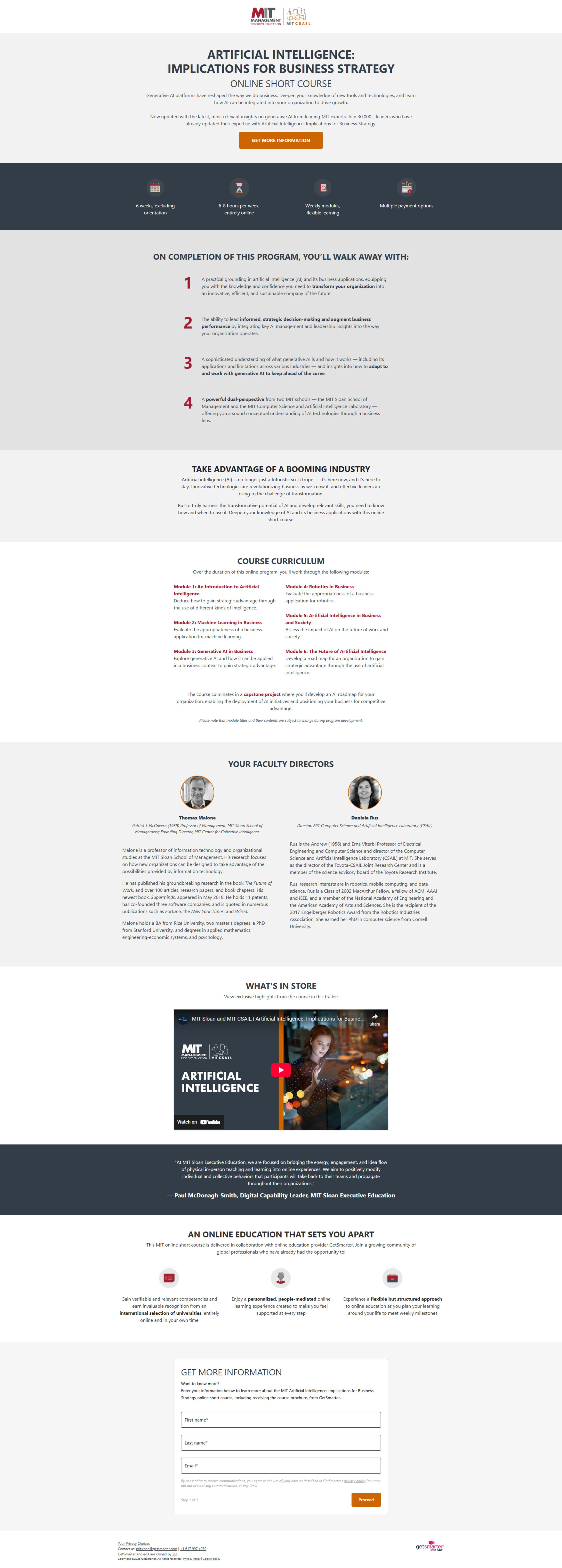
The landing page is for promoting an online short course on Artificial Intelligence: Implications for Business Strategy, offered by MIT Sloan Executive Education. The primary business goal is lead generation, specifically capturing contact information from interested individuals for course enrollment.
Check out our curated database of landing page examples to see what is working right now.
To create a high-converting page like this, use Swipe Pages, a leading landing page builder and funnel platform for conversion focussed marketers
Key Insights
What Works Well
- Clear Value Proposition: The headline "ARTIFICIAL INTELLIGENCE: IMPLICATIONS FOR BUSINESS STRATEGY" and sub-headline "ONLINE SHORT COURSE" clearly state the course topic and format. The introductory paragraph further emphasizes learning how to use AI for strategic advantage.
- Prominent CTA: A clear "GET MORE INFORMATION" button is strategically placed above the fold on both desktop and mobile, making it easy for users to take the desired action immediately.
- Trust Signals: The MIT Sloan Executive Education branding and logos are prominently displayed at the top, immediately establishing credibility. Mentions of "Join 50,000+ leaders" and detailed profiles of "Faculty Directors" further enhance trust.
- Mobile Responsiveness: The mobile layout appears well-adapted, with content stacking vertically, readable text, and the main CTA remaining prominent at the top. Key information points like "6 weeks" and "6-8 hours per week" are also clearly visible.
- Supporting Content: The page effectively uses various sections like "ON COMPLETION OF THIS PROGRAM, YOU'LL WALK AWAY WITH:" and "COURSE CURRICULUM" to provide detailed information about the course benefits and content, helping to inform potential leads.
Opportunities for Improvement
- Social Proof: While faculty directors are shown, adding testimonials or success stories from past participants of the specific AI course could further enhance social proof and demonstrate tangible outcomes.
- Objection Handling: The page could benefit from a mini-FAQ section to address common questions about time commitment, prerequisites, or target audience, potentially reducing friction for hesitant users.
- Visuals: The page is quite text-heavy. Incorporating more visual elements such as a short introductory video about the course, infographics explaining key concepts, or screenshots of the learning platform could increase engagement. The "WHAT'S IN STORE" section mentions a trailer, but it's not directly embedded or a prominent visual.
- CTA Optimization: While the "GET MORE INFORMATION" CTA is prominent, a secondary, softer CTA (e.g., "Download Brochure" or "Watch Course Preview") earlier in the page could appeal to users not yet ready to commit to providing all their information. The final form CTA button uses "REQUEST INFORMATION," which is consistent but perhaps could be more action-oriented like "Enroll Now" or "Get Course Details" if the intent is closer to enrollment than just information. A sticky CTA button on mobile as the user scrolls could also improve conversion rates.
Layout Differences: Desktop vs Mobile
- Desktop: The desktop version presents key information (program highlights like duration and weekly hours) in a horizontal layout near the top. The "ON COMPLETION" section uses a numbered vertical list with clear separation. The "COURSE CURRICULUM" uses a two-column layout for module descriptions.
- Mobile: The mobile version effectively adapts by stacking content vertically. The program highlights are transformed into a vertical list for better readability. The "ON COMPLETION" list maintains its numbered format but occupies the full width. The "COURSE CURRICULUM" also becomes a single-column layout, ensuring text is readable without horizontal scrolling. Essential elements like the main CTA and the lead generation form are present and easily accessible on both devices.
Summary
The landing page effectively communicates the value of an MIT AI strategy course through clear branding, a strong value proposition, and detailed content. Its primary strength lies in establishing trust and providing comprehensive information. Key areas for optimization include enhancing social proof with participant testimonials, introducing objection handling through an FAQ, integrating more engaging visuals like an embedded course video, and exploring secondary CTA options or a sticky CTA on mobile to further improve conversion efficiency.


