

Efficiency Audit Landing Page Example
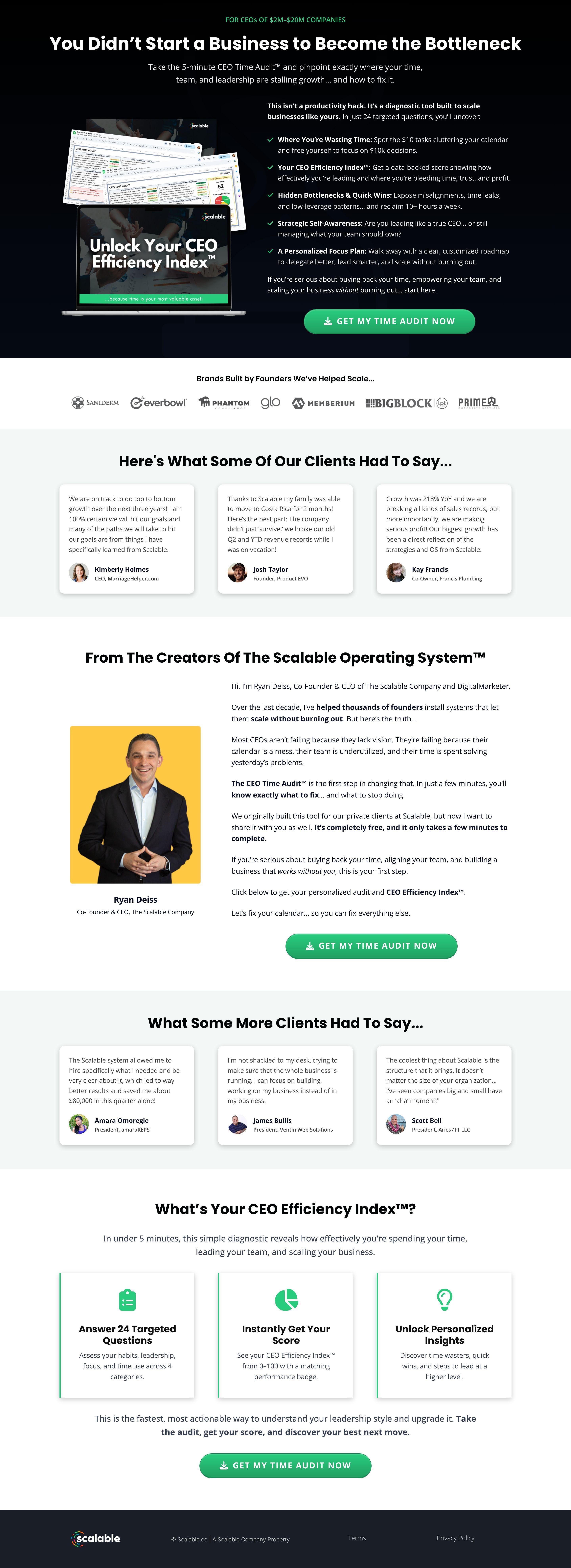
The landing page is for a CEO Time Audit diagnostic tool. The primary business goal is to generate leads by offering a free assessment that identifies leadership bottlenecks and provides an efficiency index score for executives of mid-sized companies.
Check out our curated database of landing page examples to see what is working right now.
To create a high-converting page like this, use Swipe Pages, a leading landing page builder and funnel platform for conversion focussed marketers
Key Insights
What Works Well
- Clear Value Proposition: The headline "You Didn't Start a Business to Become the Bottleneck" directly targets a common psychological pain point for founders, instantly creating relevance.
- Prominent CTA: The "GET MY TIME AUDIT NOW" button uses a high-contrast green color and includes a download/action icon, making it the most visible element on the page.
- Trust Signals: The page features an extensive logo cloud of recognizable brands and high-quality testimonials from specific CEOs, establishing high professional authority.
- Mobile Responsiveness: The transition from desktop to mobile is seamless, with text size optimized for readability and images stacked logically to maintain the narrative flow.
- Supporting Content: The "What You'll Uncover" section uses clear bullet points with specific benefits, such as "spotting $10 tasks" and "reclaiming 10+ hours a week," making the value tangible.
Opportunities for Improvement
- Social Proof: Adding a counter of how many CEOs have already completed the audit (e.g., "Join 5,000+ founders") would leverage the principle of consensus to increase conversions.
- Objection Handling: Since the audit likely asks for sensitive business data, a small note or FAQ about data privacy and "No credit card required" would reduce friction.
- Visuals: The current hero image shows a complex spreadsheet view which might look like "more work." Swapping this for a cleaner, high-level dashboard visualization of the results could be more enticing.
- CTA Optimization: Adding a secondary, low-friction CTA at the very bottom of the page or implementing a sticky header/footer CTA for mobile users would capture more leads as they scroll.
Layout Differences: Desktop vs Mobile
- Desktop: Utilizes a two-column hero layout and a horizontal logo bar. Testimonials are displayed in a three-column grid, allowing for quick scanning across the screen.
- Mobile: Elements are reordered into a single vertical column. The laptop mockup is centered above the body text, and the multi-column testimonial grids are converted into a vertical stack for easier scrolling.
Summary
The landing page excels at targeting a specific high-value persona with a compelling "pain-point" headline and strong authority markers. Its most impactful areas for optimization include addressing data privacy concerns and simplifying the visual representation of the tool to make it appear effortless rather than a complex task.


