

Injury Advocacy Landing Page Example
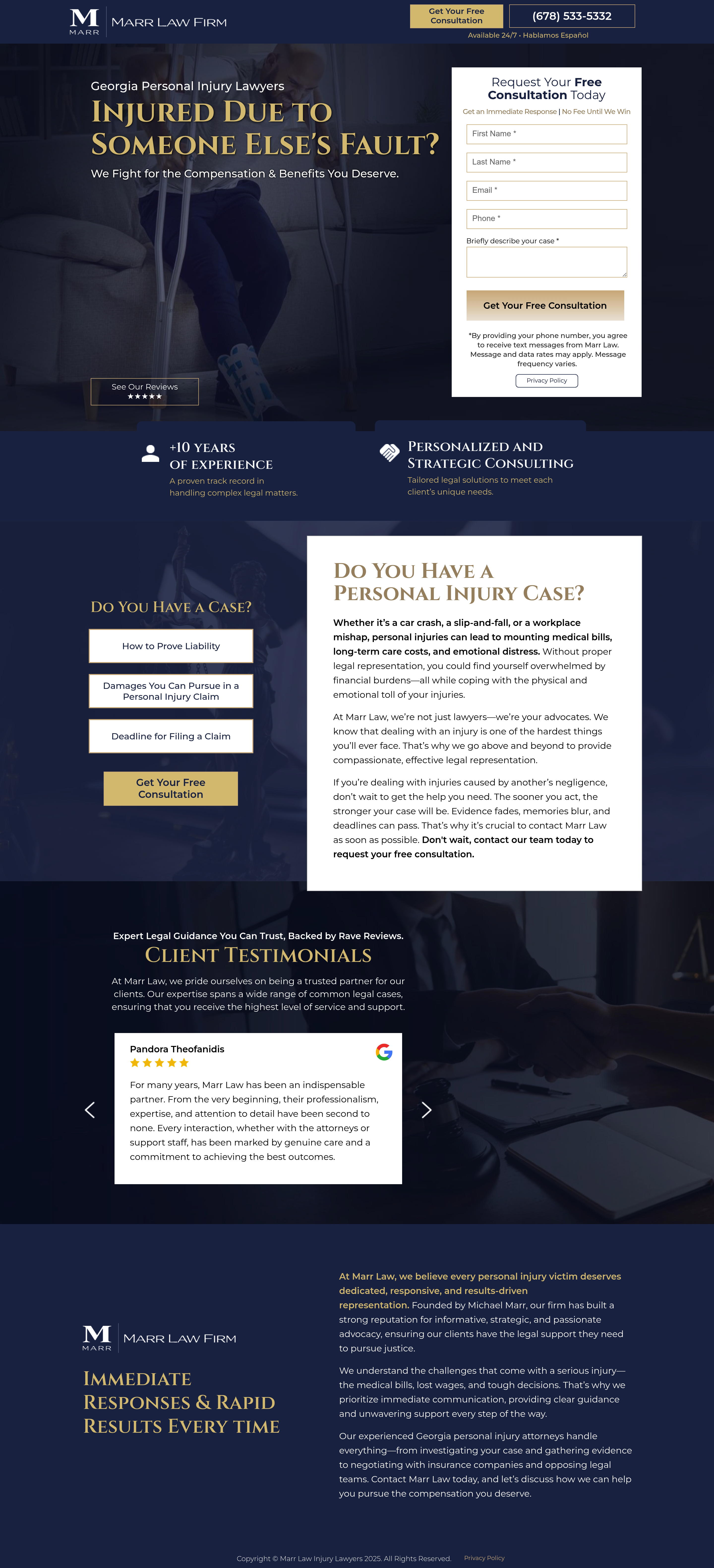
The landing page is for Georgia-based personal injury legal services provided by Marr Law Firm. The primary business goal is to generate leads by encouraging prospective clients to request a free consultation through an online form or a direct phone call.
Check out our curated database of landing page examples to see what is working right now.
To create a high-converting page like this, use Swipe Pages, a leading landing page builder and funnel platform for conversion focussed marketers
Key Insights
What Works Well
- Clear Value Proposition: The main headline "Injured Due to Someone Else's Fault?" identifies the target audience immediately and is followed by a clear promise of advocacy.
- Prominent CTA: Both the phone number and the "Get Your Free Consultation" buttons are high-contrast and placed strategically throughout the user journey.
- Trust Signals: The firm highlights "+10 Years of Experience" and displays a 5-star Google review rating to build credibility with new visitors.
- Mobile Responsiveness: The mobile layout correctly prioritizes the phone number for quick dialing and features a professional headshot of the lawyer to build immediate personal trust.
- Supporting Content: Risk-reversal messaging like "No Fee Until We Win" is placed right above the form to reduce friction and encourage submissions.
Opportunities for Improvement
- Social Proof: While one testimonial is shown, including a scrolling gallery of multiple reviews or specific case settlement amounts (e.g., "$250,000 Recovered") would significantly boost authority.
- Objection Handling: Adding a brief FAQ section below the case types to address common legal concerns could help convert users who are unsure if they have a valid claim.
- Visuals: The desktop hero image of a man on crutches is somewhat dark; replacing it with the high-quality attorney photo used on mobile would create a stronger professional connection on desktop.
- CTA Optimization: Implementing a sticky header or footer button on mobile would ensure that the phone number and consultation request are always accessible as the user scrolls through the long content.
Layout Differences: Desktop vs Mobile
- Desktop: Utilizes a classic horizontal split in the hero section with a dark, atmospheric background image, placing the form on the right and the headline on the left.
- Mobile: Switches to a vertical stack that features a professional photo of the attorney in the header, emphasizes the click-to-call phone number, and adapts all content blocks for easy vertical scrolling.
Summary
The page effectively leverages risk-reversal and clear headings to drive consultation requests for personal injury cases. The conversion rate could be further enhanced by incorporating specific monetary win data and ensuring the CTA remains visible at all times via a sticky element.


