

Tax Resolution Landing Page Example
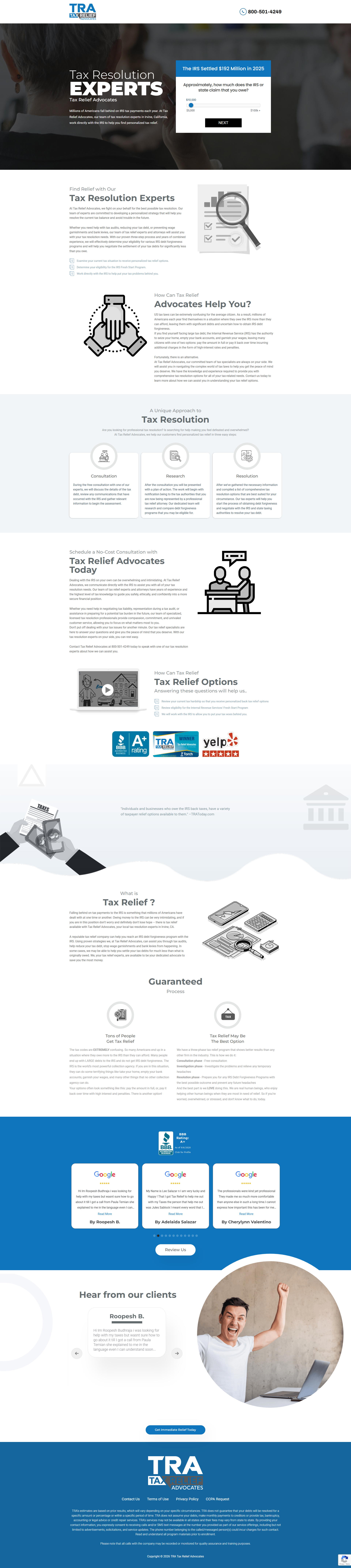
The landing page is for a tax resolution service called Tax Relief Advocates. The primary business goal is lead generation, specifically encouraging visitors to use the debt estimation tool to qualify for IRS tax debt forgiveness or settlement programs.
Check out our curated database of landing page examples to see what is working right now.
To create a high-converting page like this, use Swipe Pages, a leading landing page builder and funnel platform for conversion focussed marketers
Key Insights
What Works Well
- Clear Value Proposition: The headline "Tax Resolution EXPERTS" is large, bold, and immediately tells the user what the service provides.
- Prominent CTA: The interactive slider for selecting tax debt amount is a low-friction entry point that engages the user immediately.
- Trust Signals: High-authority badges like the BBB A+ rating, Torch Awards for Ethics, and Yelp 5-star ratings are prominently displayed to build credibility.
- Mobile Responsiveness: The mobile layout is well-optimized, placing the lead generation tool at the top of the viewport for immediate engagement.
- Supporting Content: The page clearly outlines a simple three-step process (Consultation, Research, Resolution), making the complex tax resolution process seem manageable for the user.
Opportunities for Improvement
- Social Proof: While reviews are present at the bottom, moving a short customer quote or a "satisfied customers" counter closer to the hero section would increase initial trust.
- Objection Handling: The page would benefit from a dedicated FAQ section to address common concerns such as the cost of the service and the impact on credit scores.
- Visuals: The background images are somewhat generic and desaturated; using more vibrant, high-quality images of real team members could make the brand feel more personable.
- CTA Optimization: Changing the generic "NEXT" button text to something more benefit-oriented, like "Get My Free Analysis" or "See Settlement Options," could improve click-through rates.
Layout Differences: Desktop vs Mobile
- Desktop: The hero section uses a split-screen layout with the value proposition on the left and the interactive form on the right. Content sections generally use multi-column layouts.
- Mobile: Elements are stacked vertically. The lead-gen slider is prioritized at the top of the mobile view to ensure conversion remains the primary focus. Icons and text are scaled for readability on smaller screens.
Summary
The landing page effectively utilizes a low-friction lead magnet and strong trust indicators to drive conversions. To further optimize, the brand should bring its social proof higher up the page and refine its call-to-action language to be more specific to the user's end benefit.


