

Thyroid Webinar Landing Page Example
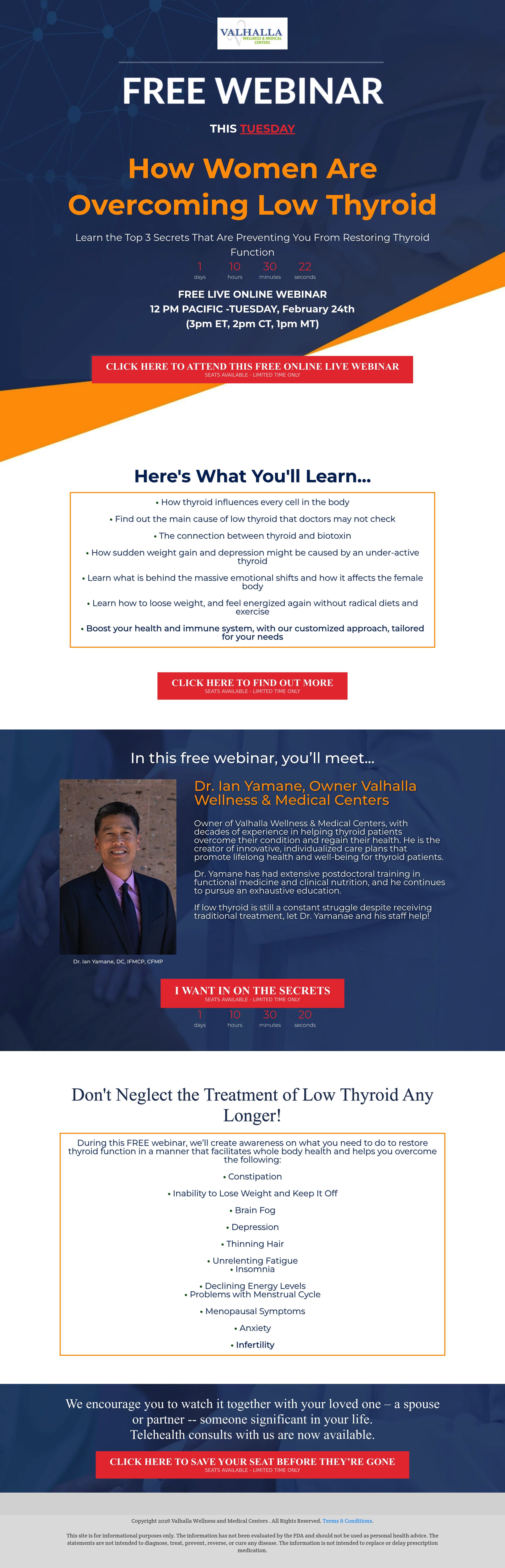
The landing page is for a free online webinar titled "How Women Are Overcoming Low Thyroid," hosted by Valhalla Wellness & Medical Centers. The primary business goal is lead generation through webinar registration.
Check out our curated database of landing page examples to see what is working right now.
To create a high-converting page like this, use Swipe Pages, a leading landing page builder and funnel platform for conversion focussed marketers
Key Insights
What Works Well
- Clear Value Proposition: The headline explicitly targets women with thyroid issues, promising a solution to a specific health problem.
- Prominent CTA: Multiple red buttons stand out sharply against the blue and white background, making the conversion path obvious.
- Trust Signals: Dr. Ian Yamane is featured with his photo and credentials, establishing medical authority and personal connection.
- Mobile Responsiveness: The layout adapts well to mobile screens, maintaining legibility and preserving the countdown timers.
- Supporting Content: The bulleted list of symptoms (e.g., fatigue, weight gain) effectively validates the user's pain points.
Opportunities for Improvement
- Social Proof: The page lacks testimonials or success stories from previous attendees or patients, which are crucial for medical credibility.
- Supporting Content: The copy contains a typo ("loose weight" instead of "lose"), which negatively impacts the professional perception of a medical page.
- CTA Optimization: The button copy is wordy ("Click Here to Attend This Free Online Live Webinar"); shorter, benefit-driven text like "Reserve My Seat" would be more impactful.
- Objection Handling: There is no FAQ section to address common concerns such as whether a replay will be available or if insurance is needed.
Layout Differences: Desktop vs Mobile
- Desktop: The doctor's bio and photo are arranged side-by-side (photo left, text right), and the "What You'll Learn" section is a boxed element.
- Mobile: Elements are stacked vertically; notably, the doctor's photo appears below the bio text, pushing the personal connection further down the page.
Summary
The page succeeds in defining the problem and solution with strong authority signals. However, correcting the "loose weight" typo, modernizing the design, and adding social proof are key opportunities to boost trust and conversion rates.


