

Coaching For Entrepreneurs Landing Page Example
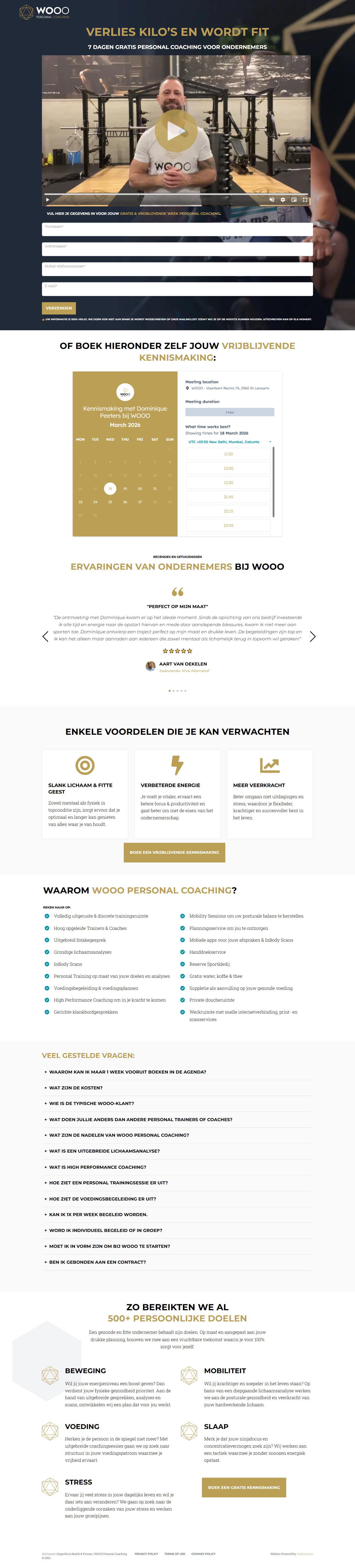
The landing page is for WOOO Personal Coaching, specifically targeting entrepreneurs. The primary business goal is to generate leads through a 7-day free coaching trial and introductory meeting bookings.
Check out our curated database of landing page examples to see what is working right now.
To create a high-converting page like this, use Swipe Pages, a leading landing page builder and funnel platform for conversion focussed marketers
Key Insights
What Works Well
- Clear Value Proposition: The headline directly identifies the target market (entrepreneurs) and offers a specific, time-bound benefit (7 days free).
- Prominent CTA: The lead capture form is positioned prominently at the top, followed by a secondary scheduling tool for direct bookings.
- Trust Signals: The site highlights over 500 goals reached and includes specific details about the coach to build personal authority.
- Mobile Responsiveness: Navigation and forms adapt well to a vertical stack, maintaining readability and interaction quality on mobile devices.
- Supporting Content: A breakdown of benefits like improved energy and resilience helps justify the investment of time for busy business owners.
Opportunities for Improvement
- Social Proof: Expanding the testimonial section to include video reviews or a carousel of diverse success stories would strengthen the evidence of results.
- Objection Handling: Explicitly stating "no hidden costs" or "cancel anytime" during the free trial near the CTA could alleviate user hesitation.
- Visuals: Incorporating high-quality photography of the actual training environment instead of text-heavy blocks would make the service feel more tangible.
- CTA Optimization: Replacing generic labels like "Verzenden" with action-oriented phrases such as "Reivindique sua semana grátis" ( Claim Your Free Week ) would increase the click-through rate.
Layout Differences: Desktop vs Mobile
- Desktop: Utilizes a grid layout for service benefits and a side-by-side view for the booking calendar, providing an efficient overview.
- Mobile: Transitions to a single-column flow, which is effective for the form but creates a very long page that requires persistent scrolling.
Summary
The page effectively leverages a niche focus on entrepreneurs and a strong lead magnet. Optimization efforts should focus on improving visual storytelling through facility imagery and making the CTA buttons more compelling and benefit-driven.


