

Business Writing Landing Page Example
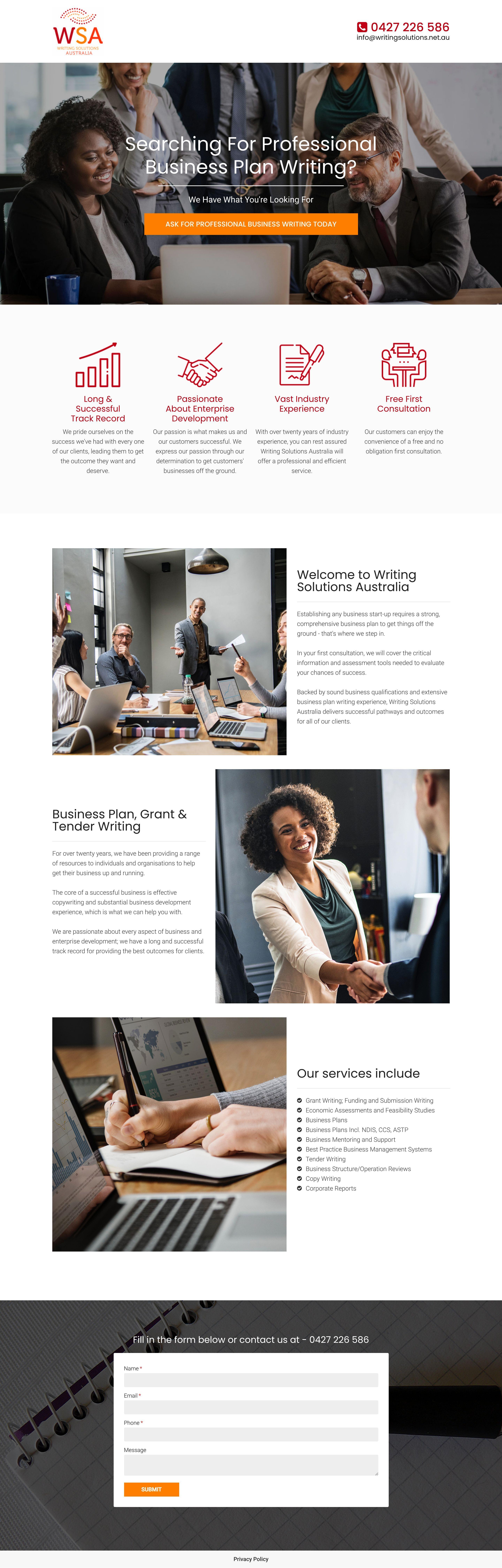
The landing page is for Writing Solutions Australia (WSA), a professional writing service provider. The primary business goal is to generate leads by encouraging potential clients to book a free first consultation for business plan, grant, or tender writing services.
Check out our curated database of landing page examples to see what is working right now.
To create a high-converting page like this, use Swipe Pages, a leading landing page builder and funnel platform for conversion focussed marketers
Key Insights
What Works Well
- Clear Value Proposition: The hero headline clearly identifies the specific service being offered, ensuring visitors immediately know they are in the right place for business plan writing.
- Prominent CTA: The orange call-to-action button in the hero section provides a high-contrast focal point that directs users toward the primary conversion goal.
- Trust Signals: Mentions of having "over twenty years of industry experience" and a "long & successful track record" help establish professional authority.
- Mobile Responsiveness: The mobile layout correctly stacks the desktop's multi-column elements into a vertical flow, maintaining readability and ease of navigation on smaller screens.
- Supporting Content: The bulleted list under "Our services include" provides a helpful breakdown of the company's full range of expertise, from grant writing to corporate reports.
Opportunities for Improvement
- Social Proof: The page lacks specific client testimonials or logos of companies served. Adding social proof would validate the claim of a "successful track record" and build more trust.
- Objection Handling: Including a brief FAQ section or clear information on data security and confidentiality would address common concerns for businesses sharing sensitive plans.
- Visuals: The use of generic stock photography could be improved by featuring real team members or showing blurred samples of successful project deliverables to increase authenticity.
- CTA Optimization: The main button text is quite long; using more concise, action-oriented language like "Get a Free Consultation" might improve click-through rates.
Layout Differences: Desktop vs Mobile
- Desktop: Utilizes a wide hero image and a four-column grid for the value-proposition icons, providing a comprehensive overview above the fold.
- Mobile: Elements are stacked vertically, with the header contact information and value-add icons appearing in a single column to ensure clear visibility and touch-friendly interactions.
Summary
The landing page does an excellent job of stating its niche and providing a clear path to contact. The most impactful area for optimization would be the inclusion of social proof and testimonials to back up its extensive industry experience.


