

Artisan Rug Landing Page Example
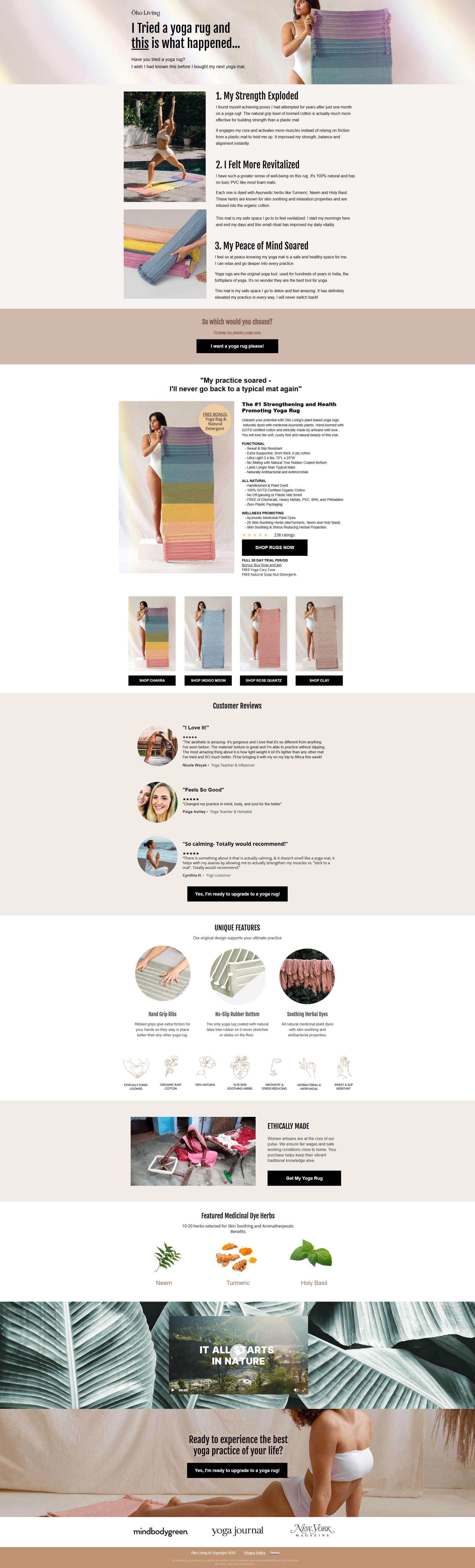
The landing page is a long-form sales page for a unique yoga rug. The primary business goal is to educate potential customers on the product's benefits over traditional yoga mats and drive direct sales through multiple 'Shop Now' calls-to-action.
Check out our curated database of landing page examples to see what is working right now.
To create a high-converting page like this, use Swipe Pages, a leading landing page builder and funnel platform for conversion focussed marketers
Key Insights
What Works Well
- Clear Value Proposition: The page opens with a compelling personal story and clearly positions the product as "The #1 Strengthening and Health Optimizing Yoga Mat Alternative," highlighting its unique benefits like improved strength and revitalization.
- Prominent CTA: Multiple, visually distinct call-to-action buttons like "I want a yoga rug please!", "SHOP NOW," and "Yes, I'm ready to upgrade..." are strategically placed throughout the page to guide the user towards making a purchase.
- Trust Signals: The inclusion of customer reviews and logos from reputable publications like "mindbodygreen," "Yoga Journal," and "New York Magazine" effectively builds credibility and trust with the visitor.
- Mobile Responsiveness: The mobile layout correctly stacks content into a single, easy-to-scroll column, ensuring that images are properly scaled and text remains legible on a smaller screen.
- Supporting Content: The page effectively uses sections like "UNIQUE FEATURES," "ETHICALLY MADE," and "Featured Medicinal Dye Herbs" to provide in-depth information and justify the product's value.
Opportunities for Improvement
- Social Proof: While text-based customer reviews are good, they could be enhanced by adding photos of the customers or star ratings to increase authenticity and impact.
- Objection Handling: A dedicated FAQ section could proactively address common customer questions regarding care instructions, durability, shipping, or the return policy, which would help alleviate purchasing friction.
- Visuals: The page relies exclusively on static images. Incorporating a short video demonstrating the yoga rug in use could better showcase its texture, grip, and performance during a yoga session.
- CTA Optimization: On the mobile version, implementing a sticky CTA button that remains visible at the bottom of the screen as the user scrolls could increase conversion opportunities by keeping the purchase action always accessible.
Layout Differences: Desktop vs Mobile
- Desktop: The desktop version utilizes a wider, centered layout with multi-column sections. For instance, the product color options, "UNIQUE FEATURES," and "Featured Medicinal Dye Herbs" are displayed in grids (2x2 or 3-column), allowing for easy side-by-side comparison.
- Mobile: The mobile version adapts to a single-column, vertical layout. The multi-column grids from the desktop view are stacked, requiring more scrolling but maintaining clarity and readability. CTAs become full-width, making them prominent and easy to tap.
Summary
The landing page does an excellent job of telling a persuasive story and highlighting the yoga rug's unique features and ethical production. Its greatest strengths are its clear value proposition and strong trust signals. The most impactful opportunities for improvement lie in adding more dynamic visuals like a product video and implementing a sticky CTA on mobile to capture conversions more effectively.


