The blueprint to create a landing page is everywhere. But creator landing pages play by different rules.
Your audience isn’t shopping for software or comparing SaaS tools. They are buying into a transformation. They are betting on themselves. And they need to believe two things, that you can actually help them, and that success is possible for someone like them.
The 12 landing pages in this list do both. They sell courses, workshops, coaching, and digital products. But more than that, they sell the dream in a way that feels achievable.
Let’s look at what makes them work.
Here you’ll find the 12 best landing pages for inspiration for creators, with our thoughts on what they did well.
Key Takeaways :
Specificity Beats Vague Promises – The best creator landing pages make concrete claims. Think Media promises “Predictable YouTube Growth” in a 5-week cohort. Antiworkaholic’s “10HR $10K WORK MONTH” headline works better than vague “financial freedom” messaging. When you put numbers and timelines together, the dream feels achievable.
Bold Disqualification Builds Trust – Top creators filter out the wrong people on purpose. Alex Hormozi explicitly states his workshop isn’t for businesses under $250k/year. Ali Lokhandwala demands ₹4 Lakhs+ minimum investment just to watch a video. This kind of honesty makes the offer feel more valuable to the right audience.
Proof Needs to Be Undeniable – Creator landing pages stack credibility in multiple ways. Triumph Coaching features a Zac Efron testimonial. Amy Porterfield leads with “helped 25,000+ people create profitable digital courses.” Ali Abdaal shows actual subscriber growth charts instead of just text quotes. When your proof is visual and specific, skepticism doesn’t stand a chance.
Systems Over Luck – High-converting creator pages reframe success as a process rather than a gamble. Ali Abdaal compares a YouTube channel to a McDonald’s franchise. Think Media promises a “Proven System” instead of viral luck. This shift from chance to methodology is what builds buyer confidence.
Key Elements of High-Converting Landing Pages for Creators :
Before diving into our list, here are the elements that separate creator landing pages that convert from those that don’t:
Break complex offers into digestible steps – Think Media’s Week 1 to Week 5 curriculum breakdown removes the mystery. Amy Porterfield’s 6-step roadmap turns “make a course” into manageable pieces like “Validate Your Course Topic.” Large transformations need to be broken into small, concrete steps.
Lead with a specific, benefit-driven headline – Vague headlines like “Grow Your Audience” don’t work. Compare that to Ecom Edge: “Build a ₹10L/month AI-powered ecommerce business in just 2 days.” It combines a specific outcome with a specific timeline. That’s what grabs attention.
Address the “will it work for me?” objection early – Think Media has an entire section showing their system works across niches like Fitness, Cooking, and Real Estate. Amy Porterfield’s “Whether You Have…” section tackles different starting points head-on. Don’t make visitors wonder if they qualify.
Use proof that matches your promise – If you promise revenue, show revenue numbers. StackOptimise displays “£1.1m revenue” and “£440k in pipeline” from students. Ali Abdaal shows growth charts instead of just testimonials. Match your proof format to your claim.
Disqualify the wrong buyers openly – Triumph Coaching’s “We’re Not A Fit If” section pushes away people seeking quick fixes without effort. This saves time for your sales team. And it makes serious buyers feel like they’re in the right place.
Sell the lifestyle, not just the product – Ecom Edge shows luxury cars and travel photos alongside revenue numbers. Antiworkaholic’s presenter appears in a bathrobe holding coffee. The imagery should visualize the transformation, not just describe it.
Make pricing work for you – Some pages show pricing upfront to filter buyers early. Alex Hormozi lists “$5k per seat” right in the FAQ. Others hide it to generate leads first. Either approach works. What doesn’t work is being ambiguous. Janel Loi’s Newsletter OS clearly shows $59 vs $129 tiers with a “No pesky subscriptions” note that sets it apart from typical SaaS pricing.
1. Ali Abdaal – YouTube Creator

Caption: This is a long-form sales page for Ali Abdaal’s Part-Time YouTuber Academy. It features a video introduction and clear pricing of $995. The design relies heavily on data graphs to prove student results. It also breaks down the course curriculum into specific modules.
Industry & Purpose: This is an educational sales page for the creator economy industry. It’s meant to convert aspiring YouTubers into enrolled students.
What Works: Here’s what I love: the headline immediately addresses the reader’s biggest fear. It promises success “Without Quitting Your Day Job.” This removes the risk for people with stable careers.
The proof section is outstanding. They don’t just use text quotes. They show actual growth charts for students like Izzy Sealey. Seeing a flat line turn into a steep curve makes the promise feel real.
I also appreciate the specific targeting. They break down success stories into Beginners, Intermediate, and Advanced levels. This answers the “will this work for me?” question for every type of visitor.
Finally, the “systems” angle is smart. The page compares a channel to a McDonald’s franchise. It shifts the focus from luck to a repeatable process. That makes the goal seem achievable.
What can be Improved ( In bullet Points )
- The block of text testimonials near the top is very dense. A slider or grid layout would make these stories easier to scan.
- The scholarship section sits at the very bottom. Mentioning this option earlier could keep price-sensitive visitors from leaving too soon.
Why it inspires: This page is a masterclass in selling a high-ticket item. It doesn’t rely on hype or flash. Instead, it uses logic, data, and systems to build an airtight argument for the purchase.
2. Alex Harmozi – Workshop Signup

Caption: This page promotes a 2-day scaling workshop in Las Vegas. It leads with a video of Alex Hormozi and a provocative question about business risks. The FAQ section openly lists the price at $5k per seat.
Industry & Purpose: This is an event registration page for the business coaching industry. It’s meant to convert high-revenue business owners into workshop attendees.
What Works: Here’s what I love: the headline doesn’t pull any punches. “Are you the biggest risk to your own business?” hits a nerve immediately. It forces the reader to self-reflect right away. This emotional hook is powerful.
The qualification process is incredibly smart. The FAQ explicitly states that businesses under $250k/yr are “not a fit (yet).” It also defines the sweet spot as “$1M-$100m/yr.” This saves everyone time and builds exclusivity.
I also appreciate the highlighted reviews. They didn’t just paste screenshots of Google Reviews. They used yellow highlights on key phrases like “Worth 10x the Investment.” This guides your eye to the exact benefit they want you to see.
The transparency on pricing is refreshing. They don’t hide the cost behind a sales call. It says “$5k per seat” clearly in the FAQ. They even justify the cost by explaining it keeps the “room quality high.”
What can be Improved:
- The text blocks in the FAQ section are quite dense. White text on a black background is hard to read in large chunks. Breaking these answers into shorter paragraphs would help.
- The mobile view requires a lot of scrolling to get through the “What you’ll get” section. Using a slider or carousel here would make the mobile experience much tighter.
Why it inspires: This page is a masterclass in disqualifying the wrong prospects. It boldly tells people “don’t do it” if they haven’t made money from free content first. This extreme honesty makes the offer feel much more valuable to the right people.
3. Think Media YouTube Cohort

Caption: This landing page sells the Video Ranking Academy course. It features a $1,297 offer for a 5-week live coaching cohort. The layout highlights instructor Sean Cannell and his 4.2 million subscribers. It uses red buttons and clear testimonials to drive signups.
Industry & Purpose: This is a course sales page for the online education industry. It’s meant to convert aspiring content creators into enrolled students.
What Works: Here’s what I love: the headline targets a specific pain point. “A Proven System for Predictable YouTube Growth” speaks directly to struggling creators. It promises stability rather than just viral luck.
The curriculum breakdown is incredibly clear. Under “Turn Knowledge Into Action,” it details exactly what happens from Week 1 to Week 5. Seeing specific topics like “Thumbnails and Packaging” removes the mystery of what you are buying.
I also like how they address skepticism with the “Works for YOUR Niche” section. It lists specific tags like “Fitness,” “Cooking,” and “Real Estate.” This immediately answers the common question of whether the system applies to unique topics.
What can be Improved:
- The “Total Value $8,976” strikethrough price feels a bit inflated compared to the actual $1,297 price. A more realistic comparison might build better trust.
- The blue “We’ve Helped Thousands Overcome These Exact Challenges” section is text-heavy. Using icons instead of just text would make those pain points easier to scan.
Why it inspires: This page expertly handles the “will it work for me” objection. It proves success across different niches instead of just making broad claims. The logical flow from pain points to a clear 5-week plan builds confidence step by step.
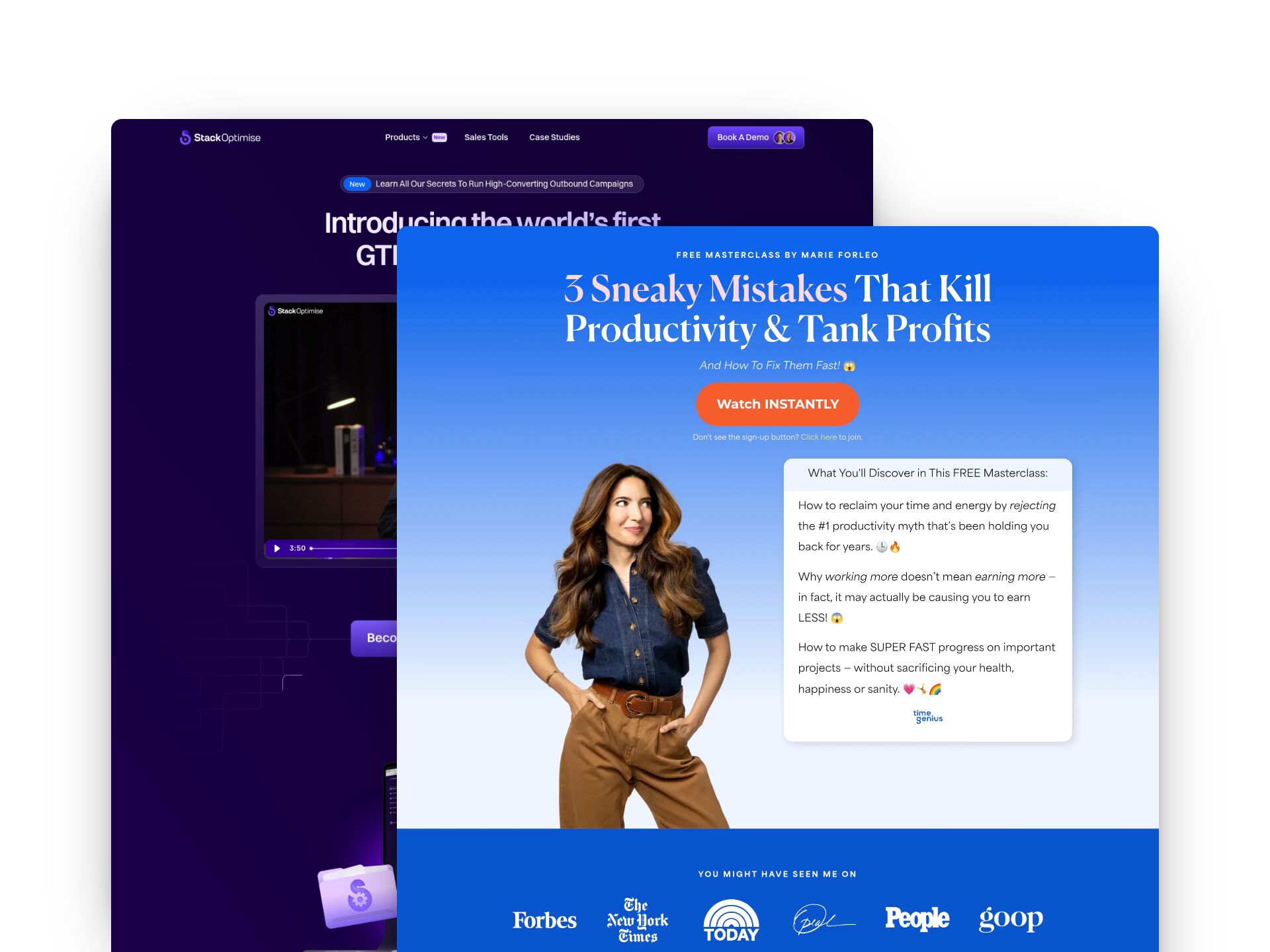
4. Marie Forleo – Masterclass

Caption: This landing page promotes a free masterclass by Marie Forleo. It features a headline about fixing “3 Sneaky Mistakes” that hurt productivity. The layout uses a blue gradient background with high-contrast orange buttons. It also highlights authority with logos from Forbes and Oprah.
Industry & Purpose: This is a lead generation page for the professional coaching industry. It’s meant to convert business owners into webinar viewers.
What Works: Here’s what I love: the headline attacks a specific pain point. “Kill Productivity & Tank Profits” uses strong, negative verbs. It makes you worry that you are losing money right now. That fear is a great motivator.
The “What You’ll Discover” card uses specific curiosity hooks. Phrases like “rejecting the #1 productivity myth” are very effective. You naturally want to know what that myth is. It creates an “open loop” in your brain that you must close.
The social proof bar at the bottom acts as an immediate trust anchor. Seeing “Oprah,” “Forbes,” and “The New York Times” stops you from questioning her expertise. It answers the question “Who is this person?” without using a single sentence of bio text.
What can be Improved:
- The masterclass lacks a time commitment label near the button. Users need to know if this video takes 15 minutes or 90 minutes before they click “Watch INSTANTLY.”
- The hero image is inconsistent across devices. The desktop version shows Marie in a denim shirt, but the mobile version shows a red top. This lack of visual continuity feels accidental.
Why it inspires: This page is a masterclass in copywriting efficiency. It focuses entirely on the cost of inaction rather than just benefits. It teaches us that showing people what they are losing is often more powerful than showing them what they might gain.
To create a high-converting page like one of these examples, use Swipe Pages, a leading landing page builder and funnel platform for conversion focussed marketers
5. Triumph Coaching

Caption: This landing page promises health transformation in “90 Days or Less.” It features Ben Greenfield as the primary expert authority. The layout uses high-contrast black and gold colors. It also includes celebrity endorsements like Zac Efron.
Industry & Purpose: This is a lead generation page for the high-performance health coaching industry. It’s meant to convert motivated individuals into strategy call leads.
What Works: Here’s what I love: the “Common Pitfalls” section creates immediate contrast. It pits “Generic, non-personalized advice” against their “Fully customized” approach. This clearly defines why your previous attempts might have failed.
The social proof is undeniable. You see a quote from Zac Efron right in the middle. He calls Ben a “wealth of knowledge.” Celebrity endorsements stop the scroll instantly.
I also really like the “We’re Not A Fit If” section. It pushes away people who “want quick results without effort.” This filters out bad leads before they even book a call. It saves the sales team time.
What can be Improved:
- The “Choose Your Level of Support” section is confusing. It lists three distinct tiers but offers no specific button to select one.
- The “4-Step TRIUMPH Transformation” uses an accordion menu. This hides valuable process details behind unnecessary clicks.
- The video thumbnail needs a play button overlay that stands out more. The current grey play icon blends too much into the image.
Why it inspires: Triumph Coaching builds massive authority without being shy. They list credentials like “NY Times Bestselling Author” next to a fit photo. It shows that they practice what they preach. This builds deep trust immediately.
6. Sara’s Workshops

Caption: This long sales page promotes a 2-day event called “The Weekend Workshop 2.0”. It uses a dark green theme with bright lime buttons to grab attention. The layout features many screenshots of student results. It ends with a detailed price stack offering the course for $42.
Industry & Purpose: This is an educational sales page for the digital marketing industry. It’s meant to convert aspiring entrepreneurs into paid workshop attendees.
What Works:
Here’s what I love: the page attacks common objections right away. The hero section promises a “Hands-Off” business for “9-to-5ers”. It immediately tells you this fits around your job. That speaks directly to the target audience’s biggest fear.
The comparison table is a smart move. It pits “This Is Not Your Typical ‘Online Course’” against the competition. It explains why pre-recorded courses fail. Then it highlights the benefit of “Live implementation”. This positions the offer as superior to standard video courses.
What can be Improved:
- The pricing is inconsistent across the page. Where Most of the places it says “$42” but in one place it “$37”. You must keep the numbers identical to avoid confusion.
- The instructor’s story section is too dense. The text under “I Know Exactly How You Feel” needs more paragraph breaks or bold text to be readable.
- The countdown timer appears multiple times. It can feel pushy rather than urgent. One well-placed timer usually works better than three.
Why it inspires:
This page does a great job of selling the timeline, not just the product. It promises a finished result in just one weekend. That removes the fear of starting a long, endless project. It makes the goal feel achievable quickly.
7. Amy Porterfield

Caption: This landing page promotes the Digital Course Academy experience. It highlights big numbers like a “$120 million business” to build authority. The layout features testimonials from successful students like Marguerite Davis. It uses clear “JOIN THE WAITLIST” buttons throughout the page.
Industry & Purpose: This is a lead generation page for the online education industry. It’s meant to convert aspiring course creators into waitlist subscribers.
What Works: Here’s what I love: the social proof is undeniable. Amy clearly states she has “helped 25,000+ people create profitable digital courses.” That specific number builds instant trust.
The “Whether You Have…” section is brilliant. It addresses specific user situations like “Zero ‘course’ or marketing experience.” Then it immediately proves success with a testimonial from Marguerite Davis. It kills objections instantly.
The visual hierarchy guides you perfectly. The 6-step roadmap breaks a huge task into manageable pieces. “Validate Your Course Topic” sounds much easier than just “Make a course.” It makes the process feel safe and organized.
What can be Improved:
- The “Earnings Disclaimer” block at the bottom is massive and dense. It distracts from the final call to action.
- The “6 PROVEN STEPS” section feels text-heavy on mobile. Icons or collapsible accordions would save scrolling time.
Why it inspires: Amy Porterfield masterfully uses her students’ success to sell her product. She doesn’t just say “it works.” She proves it with specific revenue numbers from people like Jessica Litman.
8. Stack Optimise

Caption: StackOptimise promotes their “world’s first GTM Engineer Course” on this landing page. The layout highlights a curriculum involving tools like Clay and Make.com. It features specific results such as “£1.1m revenue” and testimonials from industry leaders at Smartlead.ai.
Industry & Purpose: This is an educational sales page for the B2B sales and marketing industry. It’s meant to convert sales professionals and founders into paid course students.
What Works: Here’s what I love: the curriculum section is incredibly specific. It doesn’t just promise “better sales.” It explicitly lists tools like Clay, Smartlead, and Make.com. This tells advanced users that this course is technical and practical.
The social proof is overwhelming in a good way. You see founders from RB2B, Smartlead.ai, and UnlockClay giving detailed feedback. They aren’t anonymous. This builds huge credibility because these are recognizable names in the outbound space.
I also really appreciate the “And outbound results like…” section. It anchors the value with hard numbers. Seeing “Added £1.1m revenue” or “£440k in pipeline” makes the course feel like an investment rather than a cost.
What can be Improved:
- The pricing is completely missing from the landing page. Users must click the CTA to find the cost. This creates unnecessary friction for qualified buyers who want to know the commitment upfront.
- The dark purple background is constant throughout the entire page. Breaking this up with a lighter section would reduce eye strain. It would also help distinct sections stand out more clearly.
Why it inspires: StackOptimise proves that specificity sells better than hype. They don’t rely on vague promises of growth. Instead, they show exact revenue numbers and screenshots of real email replies to make the value undeniable.
9. Ali Lokhandwala’s Amazon Msterclass

Caption: Ali Lokhandwala’s landing page promotes a 50-minute video training for Amazon sellers. It boldly disqualifies viewers by demanding a minimum investment of ₹4 Lakhs+. The design uses dark blue backgrounds with high-contrast yellow buttons.
Industry & Purpose: This is a lead generation page for the e-commerce coaching industry. It’s meant to convert aspiring entrepreneurs with capital into masterclass attendees.
What Works
Here’s what I love: the qualification is aggressive but smart. The red banner screams “YOU NEED ₹4 Lakhs+ Minimum Investment”. It immediately filters out people who cannot afford the business model. This saves the sales team time later.
The headline makes a very concrete promise. It says “Build A 7-Figure Amazon Business In 3 Months”. It combines a specific revenue goal with a specific timeline. That clarity grabs attention fast.
The social proof section uses big and specific numbers. “80+ Businesses Have Generated ₹160+ Crores With Us” sounds impressive. The video testimonials below it add real faces to those claims. It builds heavy trust before you even click.
What can be Improved
- The “DNA” section at the bottom feels weak. The quote text is small and italicized. It is hard to read against the white background.
- The “Harsh Truth” section has too much centered text. The red text on the dark blue background vibrates a little. It strains the eyes during a quick scan.
Why it inspires
This page teaches the power of disqualification. It demands “₹4 Lakhs+ Minimum Investment” just to watch a video. That boldness instantly positions the offer as premium and serious.
10. Ecom Edge Workshop

Caption: This landing page promotes a free “2-Day Virtual Event” about AI ecommerce. It features a dark background with bright green CTA buttons like “Get My Free Ticket.” The design highlights big revenue numbers like “₹10L/month” in bold pink text. It also showcases the mentors with their sales figures.
Industry & Purpose: This is an event registration page for the ed-tech and ecommerce industry. It’s meant to convert aspiring entrepreneurs into attendees for a free virtual workshop.
What Works: Here’s what I love: the headline makes a massive promise immediately. “Build a ₹10L/month AI-powered ecommerce business” grabs your attention fast. It pairs that big goal with a short timeline of “just 2 days.” This combination creates immediate interest.
The “Meet Your Mentors” section establishes real authority. It doesn’t just list names. It attaches hard numbers to them. Seeing “₹90 Cr+ eCommerce Revenue” under Ishan Suri’s photo builds instant credibility. You feel like you are learning from experts.
I also like the “lifestyle” cards in the middle. They sell the result rather than the process. Photos of luxury cars and travel accompany text like “To Have Time Freedom.” It connects the technical skill of AI ecommerce to personal happiness.
What can be Improved:
- The “Seats Are Limited” section feels artificial for a virtual event. Users often see through false scarcity. Explaining why seats are limited would work better.
- The text “No showing your face” in the hero section is very small. This is a huge selling point for shy beginners. It deserves to be much larger and bolder.
Why it inspires: The page proves that specificity sells. It replaces vague promises with exact figures like “₹10L/month” and “₹2.3L in first month.” This makes the dream feel achievable and grounded in reality.
11. Janel Loi’s Newsletter System

Caption: The Newsletter OS landing page sells a comprehensive system for creators. It uses a “Made with love in Notion” badge to clearly define the platform. The layout features clear pricing tiers starting at $59. It backs up claims with logos from Mashable and Indie Hackers.
Industry & Purpose: This is a product sales page for the digital creator economy. It’s meant to convert aspiring newsletter writers into paying customers.
What Works: Here’s what I love: the hero section is direct. “Master the art of creating & running a newsletter” tells you exactly what you get. I really like the guarantee right below the buttons. “Guaranteed to help you build your newsletter, or I’ll refund you 100%!” removes the risk immediately.
The social proof is incredibly strong. You see logos like “Revue” and “Mashable” early on. Then there is a testimonial from Kieran Ball calling it a “cross between an e-book… and a wiki.” This specific praise explains the product format better than the copy does.
The “What’s Included?” section doesn’t hide anything. It shows actual screenshots of the “Curator” and “Weekly To-Do Lists” inside Notion. You can see exactly what the templates look like. This builds trust because you know what you are buying.
The pricing table is simple and effective. It contrasts a $59 self-serve option against a $129 consultation package. The text “No pesky subscriptions. One price for lifetime access” is a major selling point. It differentiates this from typical SaaS monthly fees.
What can be Improved:
- The “Get it Now” and “Learn More” buttons in the hero are very close in visual weight. The primary call to action should stand out more.
- The footer tries to sell a different product called “BrainPint”. This distracts users right after they see the refund policy. Keep the focus on the main product.
- The text inside the “What’s Included?” screenshots is quite small. Users might struggle to read the specific details of the templates on smaller screens.
Why it inspires: This page proves you don’t need fancy software to sell a digital product. It uses screenshots of the actual workspace to do the selling. The copy focuses entirely on saving time and removing stress.
12. Antiworkaholic Masterclass

Caption: This landing page promotes a “10HR $10K WORK MONTH” masterclass. It features a video introduction and a bright blue CTA button. The design uses a dark green background with gold text accents. It promises to teach a specific 5-step system.
Industry & Purpose: This is a webinar registration page for the online education industry. It’s meant to convert professionals looking for work-life balance into masterclass viewers.
What Works: Here’s what I love: the promise is incredibly specific. “10HR $10K WORK MONTH” hits hard immediately. It doesn’t use vague terms like “financial freedom.” You know exactly what the goal is.
The imagery matches the message perfectly. The photo of the presenter in a bathrobe holding coffee screams relaxation. It visualizes the “Antiworkaholic” concept without needing extra words. It makes the lifestyle feel attainable.
I also like the “About Your Presenter” section. It highlights relatable struggles like being a “college dropout.” It builds a connection before asking for the sale. This makes the presenter feel human and trustworthy.
What can be Improved:
- The CTA button just says “Register.” It should be more descriptive like “Watch Free Replay Now.”
- The phrase “super secret insider tips and tricks” hurts credibility. It sounds a bit childish compared to the “Accredited Online Trade School” badge.
- The video thumbnail lacks a title overlay. A text overlay explaining what the video covers would get more clicks.
Why it inspires: This page shows how to sell a specific lifestyle. The “Antiworkaholic” branding creates an immediate emotional connection. It proves that specific numbers in headlines grab attention faster than generic promises.
Final Thoughts:
Creator landing pages sell something different than most. They sell belief.
Your visitor needs to believe the transformation is real. They need to believe it’s possible for someone like them. And they need to believe you’re the one who can get them there.
If your page isn’t converting, check these three things first. Get specific. Show proof. And don’t be afraid to tell people who it’s not for. Want more inspiration? Check out our full list of 40 best landing page examples across industries.