Landing Page Builder

Create a Course Landing Page

Go from idea to a conversion-optimized course sales page in minutes — curriculum, instructor bio, student results, checkout, all generated by AI

No credit card required · 14-day free trial

Examples

Course landing pages built with one prompt

From cohort programs to self-paced courses, certifications, and creator masterclasses — see what the AI creates for real course creators.

Cohort Program

"Create a sales page for 'The Conversion Copy Cohort' by copywriter Dana Voss — an 8-week live cohort for freelance copywriters..."

Conversion Copy Cohort

Self-Paced Course

"Design a self-paced course landing page for 'SQL for Everyone' by data teacher Raj Menon — zero to querying in 14 days..."

SQL for Everyone

Certification Program

"Build a landing page for 'The UX Research Certification' by design educator Lina Park — 12-week cohort with certificate on completion..."

UX Research Certification

Creator Masterclass

"Create a masterclass sales page for 'The 100K Subscriber Blueprint' by creator coach Marcus Lane — from 0 to 100K subs in 18 months..."

100K Subscriber Blueprint

Mini-Course

"Design a short-form sales page for 'The 5-Day Macro Reset' by nutrition coach Zoe Alvarez — a $27 mini-course..."

5-Day Macro Reset

Course Waitlist

"Create a waitlist landing page for 'Prompt Engineering for Marketers' by AI educator Priya Shah — first 500 members get 40% off..."

Prompt Engineering Waitlist

Career Bootcamp

"Build a sales page for 'The Product Management Bootcamp' by The Product Lab — 8-week intensive with mentors from Google, Meta, Stripe..."

Product Management Bootcamp

Bundle Launch

"Design a launch sales page for 'The Creator Complete Bundle' by content strategist Yara Khan — three courses bundled for $297..."

Creator Complete Bundle

Build Your Course Landing Page

No Credit Card Required | Try for Free

How It Works

How to create a course landing page

01

Describe Your Course, Audience & Goal

Share your course topic, target student, format (cohort, self-paced, certification), and business goal — enrollments, waitlist signups, or application submissions. Paste your existing course page or upload your curriculum doc.

02

Match Your Brand Style

Pick a design preset or let the AI pull your brand identity automatically from your website — colors, fonts, instructor photography, logo.

03

Watch Swipe Pages AI Create Your Course Page

The AI builds the complete sales page — hero, curriculum breakdown, instructor bio, student results, pricing, checkout — structured to maximize enrollments.

04

Edit & Publish

Chat with the AI to swap instructor photos, adjust curriculum modules, change pricing, or A/B test a second headline. Hit publish — the page goes live on a global CDN in seconds, ready for your email launch sequence and paid campaigns.

Worth reading before you build

Why course creators need landing pages

important!

Course creators are one of the highest-leverage landing-page audiences in 2026 — and also one of the most under-served by generic website builders. Here's the data: according to First Page Sage's 2026 landing page conversion rate report, online course pages have a median conversion rate of 18.3%. That's nearly three times the 6.6% all-industry median and higher than almost any other category. The reason is simple: course buyers arrive with strong intent, the price point is moderate, and the purchase decision is mostly about trust in the instructor.

But that 18.3% median hides a massive range. Top-performing creator pages convert at 25-35%. The worst sit below 5%. The delta isn't about the product — it's about the page. Specifically, it's about how well the page sells the instructor, compresses the curriculum into a scannable pitch, and handles the trust objections that every course buyer walks in with.

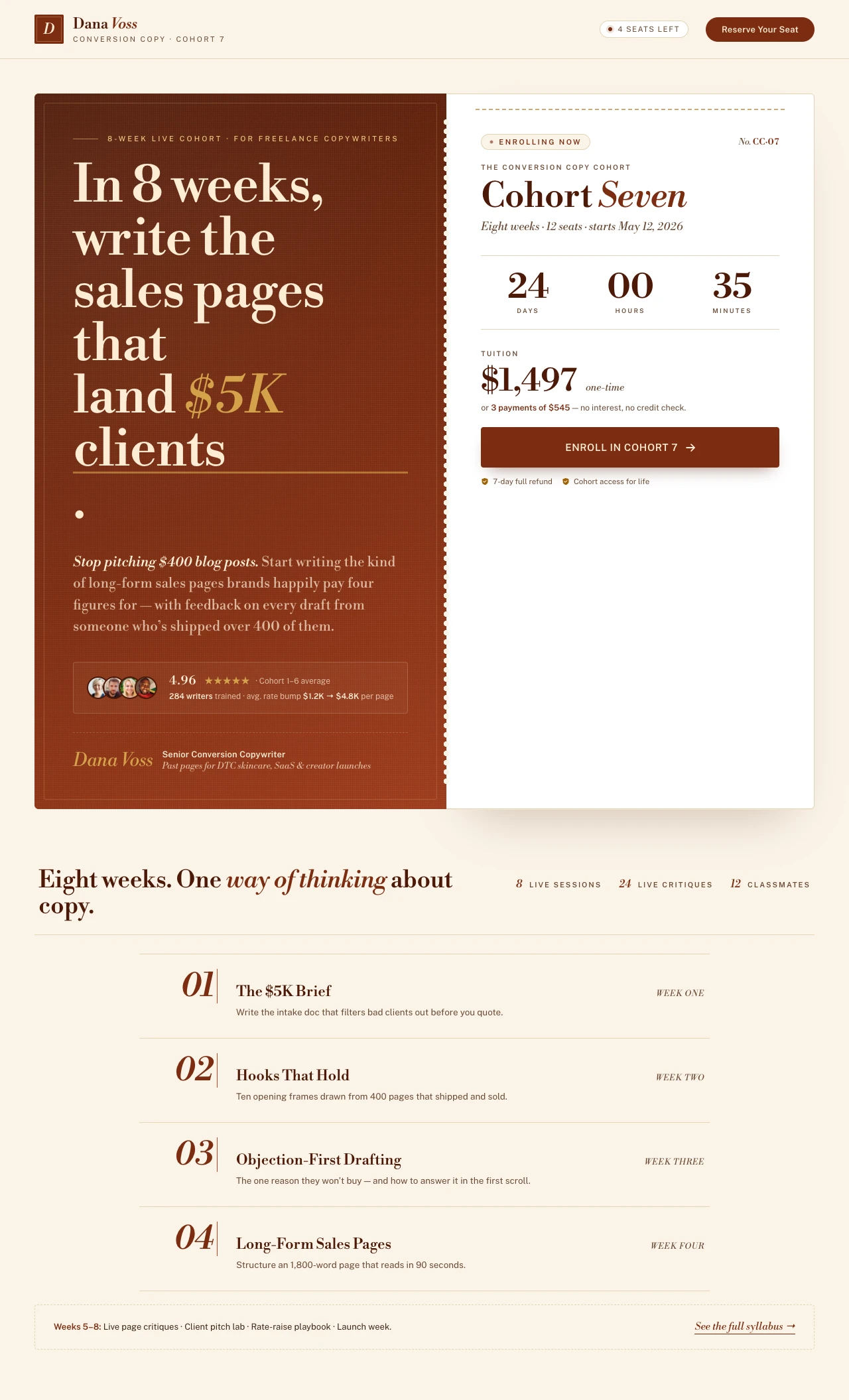
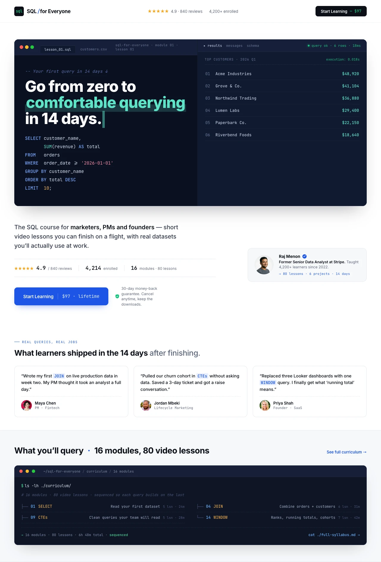
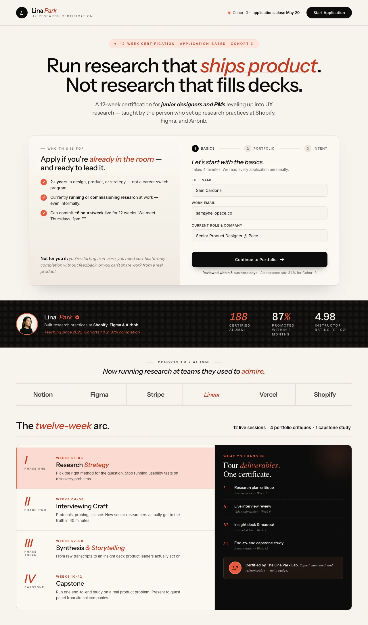
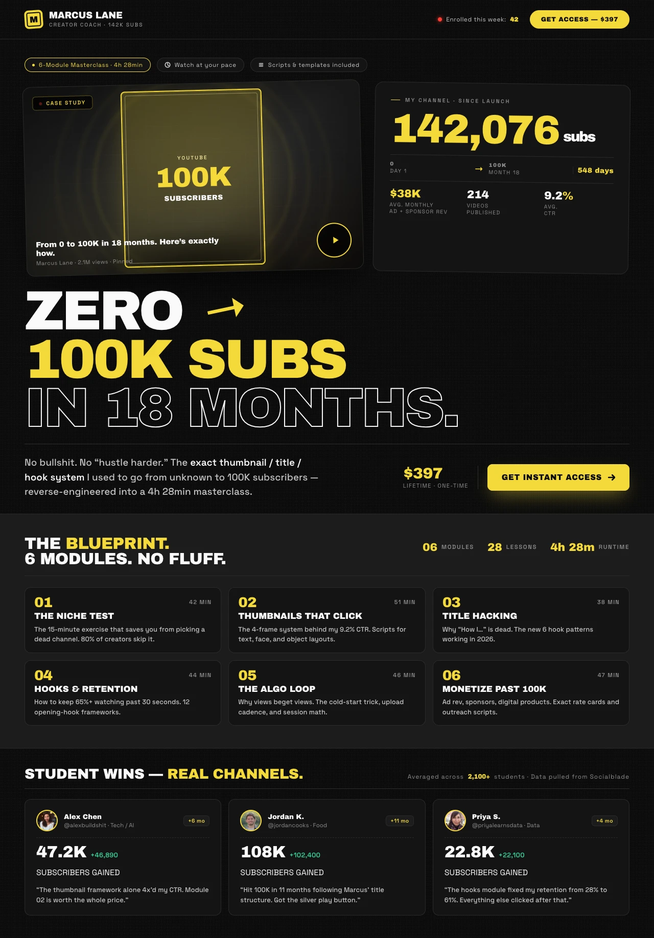
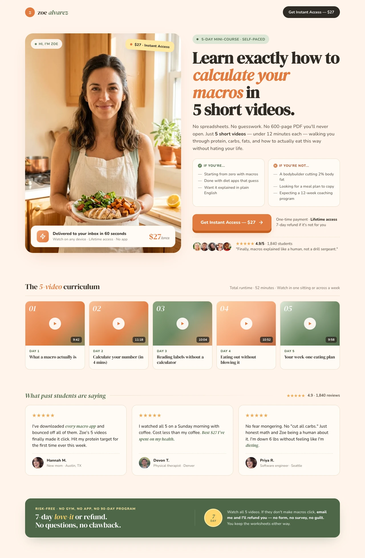
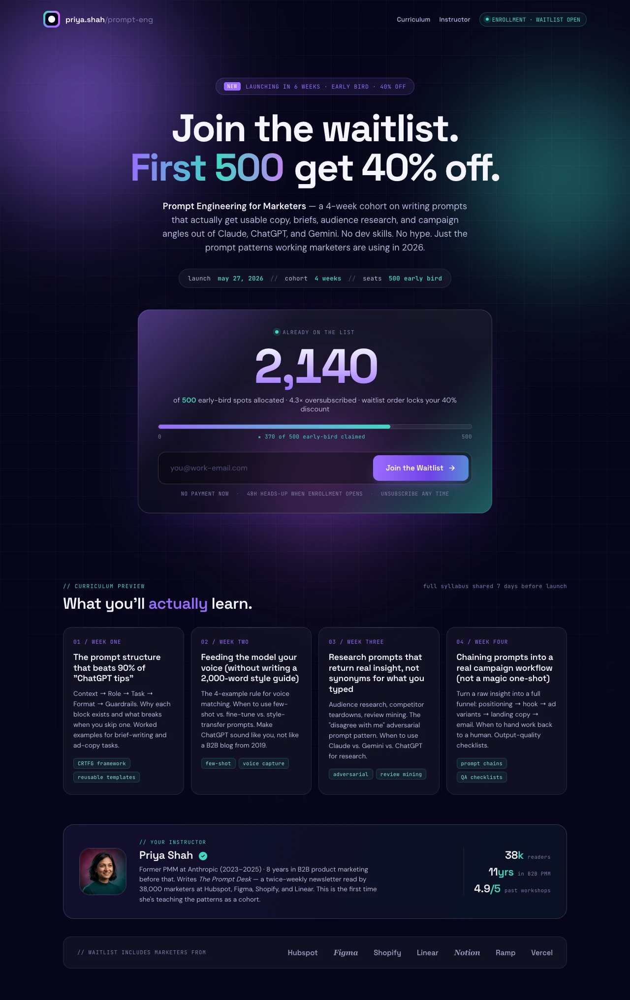
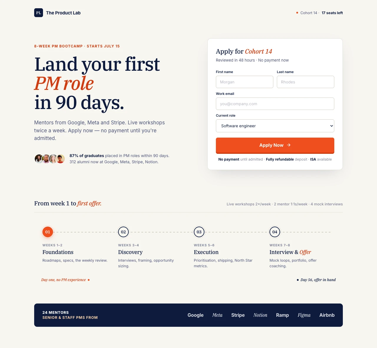
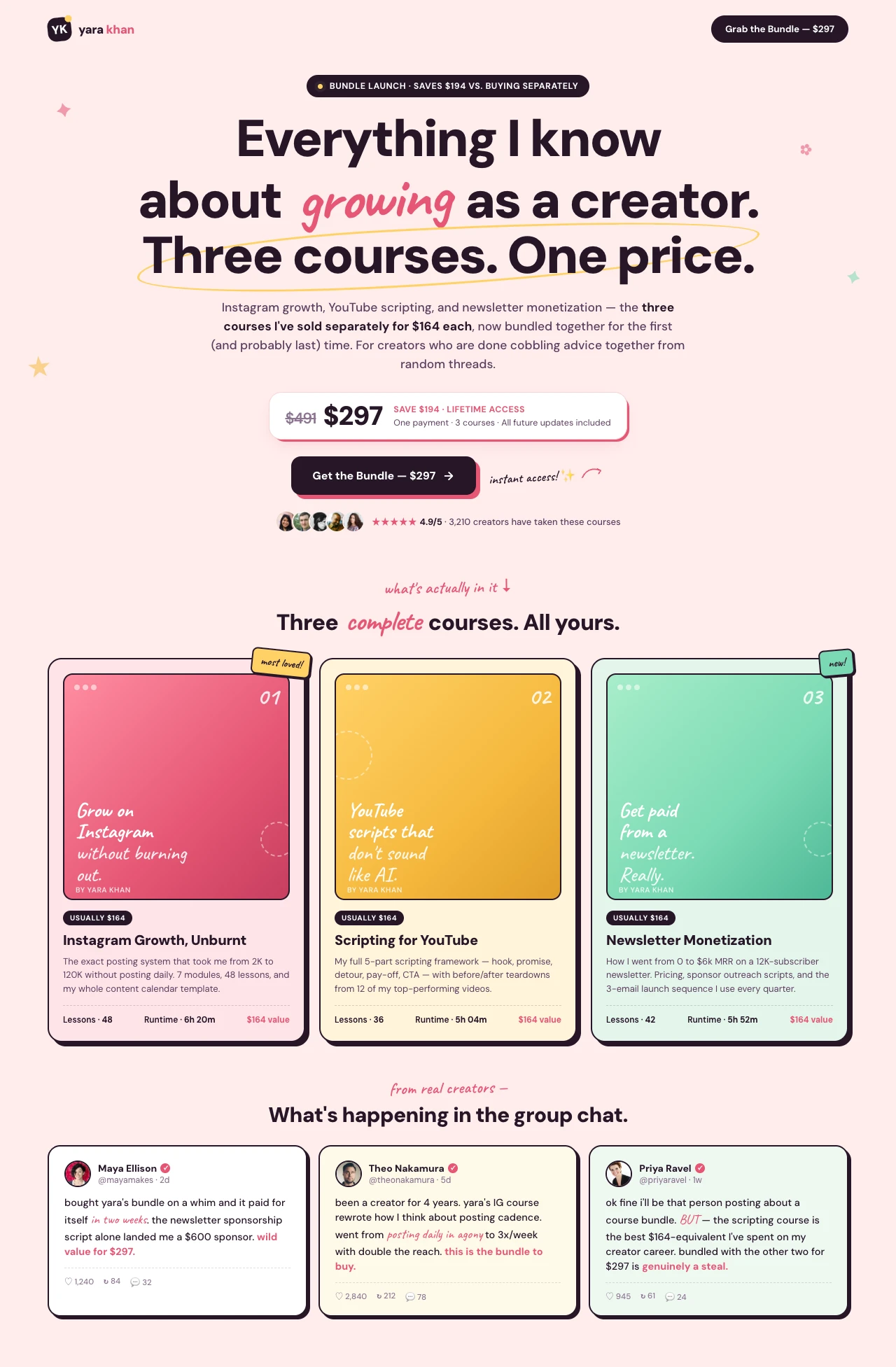
The trust problem is unique to courses. When someone buys a $297 mini-course or a $1,497 cohort program, they're not buying a thing — they're buying an outcome that depends entirely on whether the instructor can deliver. That's why every high-converting course page puts the instructor's face, credentials, and track record above the fold. It's why social proof on course pages isn't generic stars and logos — it's specific student outcomes with names, photos, and measurable transformations. Ali Abdaal's Part-Time YouTuber Academy leans hard on Ali's own numbers. Jenna Kutcher sells her email course by showing her own list growth. Marie Forleo's B-School uses 20 years of student-launch stories. The pattern repeats everywhere.

The Swipe Pages blog's 12 Best Landing Page Examples for Creators of 2026 analysis found four principles behind every top creator page: specificity beats vague promises, visual proof outperforms text testimonials, bold disqualification builds trust, and success should feel repeatable — "here's the system, not the luck." The most common mistake is the opposite: vague outcomes ("transform your life"), generic testimonials ("great course!"), universal framing ("for everyone"), and mystical claims ("find your purpose"). Those pages sit in the bottom quartile.

Education pages have another unique pattern worth knowing: they receive 6x more mobile traffic than desktop, but desktop still converts 17.6% better, according to industry benchmarks. This means most visitors discover a course on their phone — during a commute, while scrolling Instagram — but complete the purchase later on desktop, often after comparison-shopping. Your landing page needs to work on both: a frictionless mobile preview that sells the concept, a desktop checkout that closes the sale. The mobile page is the hook; the desktop page is the close.

For deeper breakdowns of what today's best course and creator pages get right, see 11 Best Education Landing Page Examples of 2026 featuring Harvard, MIT, IIT Madras, Simplilearn, and others — and the inspiration gallery's Growth School AI Marketing Mastermind, IIT Madras Agentic AI Program, and Prajakta Bhujbal's Style Masterclass for real-world examples.

Features

Everything course creators need. Nothing they don't.

Create a sales page for an 8-week cohort copywriting course

Every Course Page Type — One Prompt Away

Self-paced course sales pages, cohort program pages, masterclasses, certification programs, mini-courses, course waitlists — the AI creates any of these aligned to your brand in minutes.

Brand Match
Colors
Font Newsreader

Personalize by Audience Segment

Running the same course for beginners and intermediates? Create brand-consistent variants per segment without rebuilding from scratch.

Audit Complete

Idea: Change CTA text to "Start Free Trial" to lift conversions by ~12%.

Apply
Dismiss

CRO AI Agent

Analyzes your live course page and suggests data-backed tweaks — instructor photo, curriculum framing, pricing display — to lift enrollments.

1
Course selected
2
Enter details
3
Pay with Stripe
Total
3 × $545
$1,497
VISA MC PayPal Razorpay
Enroll Now

Stripe Checkout & Payment Plans

Sell directly from the page with Stripe, PayPal, or Razorpay. Offer one-time pricing, payment plans, or subscription access — no third-party cart needed.

Winner
14.2%
Variant A
vs
8.5%
Variant B

A/B Testing & Built-In Analytics

Server-side split testing with zero flicker. Test instructor photos, headline framing, curriculum depth, pricing layouts. Built-in analytics show statistical significance automatically.

99

Blazing Fast

Sub-second load times on a global CDN. Your course sales page handles traffic spikes from email launches and paid ad campaigns without degrading.

In 8 weeks, write $5K sales pages.
$1,497 · or 3 × $545
Enroll in Cohort 7

Mobile-First Sales Pages

Education pages get 6x mobile traffic. Swipe Pages serves a mobile-optimized experience with persistent CTAs and thumb-friendly checkouts by default.

SP

Email & CRM Integrations

ConvertKit, Mailchimp, ActiveCampaign, HubSpot, Zapier, and more. Enrollments flow directly into your onboarding sequence and student community without manual exports.

What's your goal?
Generate Leads
Sell Products

Multi-Step Application Forms

For cohort programs and certifications, build application forms that qualify students by goals, experience, and fit.

Startup
$29
Marketer
$69
/mo

Pricing That Makes Sense for Course Creators

Plans start at $29/mo. Launch your flagship course or 20 mini-courses — flat pricing, no per-student fees, no traffic overage bills when your launch performs.

Social Proof

Trusted by 7,000+ teams worldwide

4.8
★★★★★
G2
4.9
★★★★★
Capterra
300+ reviews
Course Results
★★★★★

"I have been able to create very highly converted landing pages for my courses, and feedbacks from users / students are simply unbelievable, thanks a lot to SwipePages."

Hoang P.

Director · G2

Coaching Programs
★★★★★

"Swipe pages allow us to generate high-conversion landing pages for our coaching programme."

David H.

Developer · G2

Speed
★★★★★

"Blindingly-fast landing pages. Very simple to use. Many things about it are intuitive or not hard to figure out."

G2 Reviewer

G2

Ease of Use
★★★★★

"Swipe Pages is seriously the easiest to use and most intuitive landing page builder on the market!"

G2 Reviewer

G2

A/B Testing
★★★★★

"Easy A&B test (more than 2 variants are possible). Built-in multi step forms."

Kaan A.

Director · Capterra

Launch Speed
★★★★★

"SwipePages makes it easy to go from idea to live landing page in under an hour. And now, for my lead magnets, I have a template I have customized for my brand and I can go from idea to leadgen landing page in 5-10 mins."

Bryan B.

Work Management Consultant · G2

Creator Tool
★★★★★

"It's my goto web platform. Everything just works."

Ryan J.

Capterra

Replaced Tools
★★★★★

"Since I started to SwipePages I literally built any website with it. For me it replaced things like Kartra and ClickFunnels."

Verified User

G2

Value
★★★★★

"Cost effective landing pages for any size company. Many of our clients were worried about paying $150 to $299 for CF. After we shift to SP, many of our clients were able to afford."

Verified User

G2

FAQ

Frequently asked questions

Course creators sit on one of the most favorable landing-page conversion profiles in all of marketing — and most of them leave that advantage on the table by using a generic website page or a template that wasn't built to sell a course.

The data is striking. First Page Sage's 2026 report on landing page conversion rates by industry puts the median online course page at 18.3%, nearly 3x the 6.6% all-industry median. Top-performing creator pages convert at 25-35%. A course priced at $297 that ships 100 visitors per day will earn radically different revenue at 5% conversion vs 25% — it's the difference between $450K and $2.2M annually on identical traffic. Nothing else you do as a course creator moves the number that much.

So why do most creator pages underperform? Because they treat the landing page as a brochure, not a sales page. A brochure lists features: "12 modules, 80 lessons, lifetime access, bonus Q&A." A sales page sells an outcome: "In 8 weeks, write the sales pages that land $5K clients." Brochures describe what's inside. Sales pages describe who the student will become after finishing. That framing shift alone can double conversion on the same course, same instructor, same price.

The other reason course pages underperform: they're built on tools that weren't designed for the checkout-plus-content hybrid a course page needs. A generic website builder handles the content but drops you into a clunky third-party cart. A generic cart tool handles the checkout but gives you a form, not a sales page. A purpose-built course landing page unifies both — the story, the curriculum, the instructor credibility, and the checkout, all on a single page that loads in under a second on mobile.

The best-performing creators — Ali Abdaal, Jenna Kutcher, Amy Porterfield, Marie Forleo, Alex Hormozi — don't sell from generic pages. They sell from dedicated landing pages tuned to each course, each launch, each audience. That's the pattern. That's where the conversion lift lives.

Every top-performing course landing page follows a near-identical skeleton. Skip any element and you'll see it in the enrollment rate within a week.

Hero with a specific, outcome-focused headline. Not "Master the art of copywriting" but "In 8 weeks, write sales pages that land $5K clients." The formula that runs through every top creator page is: specific audience + specific outcome + specific timeframe or mechanism. Vague benefits get ignored. Precision creates belief.

Instructor hero block with face, credentials, and track record. This is non-negotiable. Course buyers are buying trust in the instructor. A photo, a one-line credential ("Built a $1.4M email list from zero"), and a short bio establish why this specific person is worth the money. Stock photography kills trust. Anonymous "expert instructor" framing kills trust even faster.

Curriculum block — visual, scannable, outcome-framed. Break your curriculum into module cards, each with a 1-line outcome ("Module 3: Write the headline that stops the scroll"). Don't write a syllabus. Write a transformation ladder — each module moves the student one step closer to the promise. Harvard and IIT Madras both structure their pages this way, per the 11 Best Education Landing Pages of 2026 analysis.

Visual student proof — not text testimonials. Screenshots of student results. Before/after examples. Revenue milestones. LinkedIn DMs from grads announcing new jobs. Video clips of students talking about their transformation. Text testimonials ("Great course!") are worth almost nothing on a course page. Visual, specific, measurable proof is worth an order of magnitude more.

Transparent pricing with payment options. Course buyers want to see the number. "$1,497 one-time or 3 payments of $545" beats "Contact us for pricing" every time. If you offer payment plans, financing, or ISAs, show them near the primary pricing. The 11 Best Education Landing Pages of 2026 analysis specifically flagged transparent pricing as one of the core patterns.

Bold disqualification. The best course pages actively tell visitors who the course is NOT for. "This course is not for beginners. It assumes you've already written at least 3 sales pages." This feels counter-intuitive — you're turning people away — but it dramatically increases conversion from the right-fit buyer because it signals confidence and relevance.

Risk reversal. A 14-day or 30-day refund policy, an action-based guarantee ("complete the first module and if you don't feel the transformation starting, full refund"), or a satisfaction guarantee badge. Risk reversal isn't optional — it's the compound that removes the last friction before purchase.

Single CTA repeated at strategic points. "Enroll Now — $297" appears in the hero, after the curriculum, after the student proof, and in the footer. Not "Enroll" and also "Download Free Preview" and also "Book a Discovery Call." One path forward.

Mobile-optimized throughout. Education pages receive 6x more mobile traffic than desktop, but desktop still converts 17.6% better — meaning mobile is the discovery surface and desktop is the close. Your mobile page needs to sell the hook perfectly; your desktop page needs to close the sale. Both need to be flawless.

These aren't generic principles. They're specific, tested patterns that separate the top 10% of course pages from the rest.

Lead with outcome specificity, not curriculum. "Learn copywriting" is a topic. "In 8 weeks, write sales pages that land $5K clients" is an outcome. The Swipe Pages blog's creator landing page analysis found that every high-converting creator page leads with a specific, measurable outcome — often combining a timeframe with a dollar amount or a tangible deliverable. If you can't put a number or a timeline in your headline, dig for one before launching.

Show the instructor's track record, not their bio. A bio says "10 years of experience as a copywriter." A track record says "Written sales pages that generated $14.2M in documented revenue for 40+ clients." Swap every biographical statement for a measurable result. This single swap can move conversion by 5-10 percentage points.

Use visual student proof above the fold. Not testimonials — visual evidence. Revenue screenshots, job offer emails, before/after work samples, subscriber growth charts. The best course pages treat student proof as product proof: "Here's what this produces." Text-only testimonials have a trust ceiling you can't break through.

Offer payment plans, not discounts. Discounts train your audience to wait for the next launch. Payment plans ("3 × $545 instead of $1,497") expand buyer pool without eroding your pricing anchor. Most creators see a 20-30% lift in enrollments when they add a 3-pay option alongside the one-time price — without discounting the product.

Disqualify loudly. "This is NOT for beginners" or "This is NOT a certification — you won't get a piece of paper at the end, you'll get real skills" actually increases conversion from the right audience. Disqualification signals confidence and specificity — two things every great course page telegraphs.

Stack scarcity when it's real. Cohort programs have natural scarcity (enrollment closes, class starts, group size limited). Self-paced courses have weaker scarcity, so use price anchors instead ("$297 founder's launch price, going to $497 in 14 days"). Fake scarcity — a perpetual countdown that resets — destroys trust the moment a buyer notices.

Optimize mobile first, checkout on desktop. Education pages see 6x more mobile traffic, but 17.6% higher desktop conversion. Your mobile page is the discovery surface: it needs to hook, explain, and show credibility in 15 seconds of thumb-scrolling. Your desktop page is the close: longer, more detail, full curriculum, full checkout. Build both deliberately. Don't assume responsive design handles this — it doesn't.

Add a 90-second instructor intro video. Video above the fold lifts conversion by up to 86% — even more on course pages where trust is the biggest barrier. A short, unpolished instructor video saying "here's what you'll walk away with in 10 weeks" beats any block of text. Phone footage is fine. Authenticity wins.

Most course creators measure one number — enrollments. That's what you care about, but optimizing only on enrollments means you miss the leverage points upstream. Here's the full framework.

Primary KPI: Enrollment conversion rate. Visitors ÷ completed purchases. Benchmark: top creator pages run 18-35%. Below 10% means there's a structural problem — usually weak instructor credibility, vague outcomes, or hidden pricing. Before you A/B test the headline, fix those three.

Secondary KPIs. Add-to-cart rate: for pages with Stripe checkout, the percentage who click the primary CTA but don't complete purchase. Above 50% abandonment means your checkout flow has friction — usually too many fields, slow card processing, or surprise costs at the last step. Scroll-to-curriculum rate: are visitors getting past the hero and actually reading the curriculum? If 60%+ bounce before the curriculum section, your hero isn't selling the outcome. Time on page: course pages are long. Healthy pages see 90-180 second average time. Under 30 seconds means visitors aren't engaging. Over 4 minutes with low conversion means something about the close isn't landing. Cost per enrollment (CPE): ad spend ÷ enrollments. Top creators target a CPE of 20-30% of course price — a $297 course should have a CPE under $90 to be economically sustainable on paid ads.

What to A/B test (in order of impact). Headline outcome framing — single biggest lever. Test specific vs vague, question vs statement, timeframe vs no-timeframe. Instructor hero photo and credential — a different photo, a different one-line credential. Faces and stats move numbers. Pricing layout — one-time only vs with payment plan vs with annual anchor. Payment plans typically lift conversion 15-25%. Student proof format — text testimonials vs video testimonials vs screenshot evidence. Visual usually wins. CTA copy — "Enroll Now" vs "Get Instant Access" vs "Start Learning Today." Test 2-3 variants — expect 5-15% swings.

Analytics setup. GA4 with "enrollment" as a conversion event. Meta CAPI and Google Ads conversion tracking for closed-loop attribution. ConvertKit, ActiveCampaign, or your ESP for post-enrollment nurture. Hotjar or Clarity heatmaps on the curriculum and pricing sections. Email platform analytics tied back to landing page source via UTMs. Swipe Pages handles A/B testing and built-in analytics natively — no duct-taping three tools together with custom scripts.

Course creators need a very specific combination that most landing page builders don't deliver: fast, mobile-first sales pages with native checkout, built for personal-brand credibility, and priced for creators who aren't yet running a seven-figure business. Swipe Pages delivers exactly that.

AI that builds every course page type from a prompt. Self-paced courses, cohort programs, masterclasses, certifications, mini-courses, waitlists, bundle launches — describe your course, instructor, and audience, and the AI drafts the full sales page. Headline, instructor block, curriculum, student proof, pricing, checkout. Running a different version for beginners and advanced students? Generate brand-consistent variants for each audience in minutes.

Native Stripe, PayPal, and Razorpay checkout. Sell directly from the page — no redirecting to a clunky third-party cart, no losing visitors to the handoff. One-time pricing, payment plans, or subscription models. Checkout lives on the same fast, mobile-optimized page the visitor landed on.

Mobile-first sales pages — critical for creators. Education pages receive 6x more mobile traffic than desktop, per 2026 industry data. Swipe Pages ships mobile-optimized pages by default with persistent sticky CTAs, thumb-zone checkout forms, and swipe-friendly curriculum blocks. This isn't responsive design bolted on — it's how the pages are built from the ground up.

Sub-second load times on a global CDN. Your email launch goes out and 3,000 people click in 10 minutes. Cheap landing page tools choke. Swipe Pages doesn't. No traffic-based pricing, no degradation during launch spikes. Your best launch day doesn't trigger an overage bill.

A/B testing and analytics, natively. Server-side split testing with zero flicker. Test instructor photos, headline framing, pricing displays, curriculum depth — all inside Swipe Pages. Built-in analytics show statistical significance automatically. Course launches have short windows; you need to know which variant won before the window closes.

CRO AI agent for continuous optimization. Your first landing page is a hypothesis. The CRO AI agent analyzes live performance — scroll depth, CTA clicks, checkout abandonment — and suggests specific, data-backed tweaks. This is the conversion consultant course creators typically can't afford; you get it built-in.

Email and course platform integrations. ConvertKit, ActiveCampaign, Mailchimp, HubSpot, Zapier — enrollments flow directly into your onboarding sequence, your student community, and your sales CRM. No manual CSV exports between launch day and access delivery.

Pricing that makes sense for creators. Plans start at $29/mo with everything included — AI, A/B testing, analytics, native checkout, integrations, multi-step forms. No per-student fees. No traffic overage bills. The Marketer plan at $69/mo handles most creator launches comfortably; Agency at $149/mo covers 500K visitors if you're running multiple courses or creator brands. 14-day free trial, no credit card required.

7,000+ customers, 300+ reviews at 4.8-4.9 average. For course creators who need speed, mobile polish, and a page that actually sells — not just looks nice — this is the platform.

Start building your course landing page

Go from prompt to published course sales page in minutes. 14-day free trial, no credit card required.

No credit card required · Instant setup