Landing Page Builder

Create a Webinar Landing Page

Go from idea to a conversion-optimized webinar registration page in minutes — speaker bio, countdown, seat-reservation CTA, all generated by AI

No credit card required · 14-day free trial

Examples

Webinar landing pages built with one prompt

From live masterclasses to evergreen replay funnels — see what the AI creates for real webinar hosts.

Live Masterclass

"Create a webinar landing page for 'The 5-Email Sequence That Sold $2M in 90 Days,' a free live masterclass by email coach Maya Reeves..."

Email Marketing Masterclass

B2B Demand-Gen

"Design a webinar registration page for Meridian Analytics' 'Building a Revenue Attribution Stack That Actually Closes the Loop'..."

Enterprise Analytics Webinar

Virtual Summit

"Build a landing page for 'Evolve 2026,' a free one-day virtual summit on AI for growth teams with 12 speakers..."

AI Growth Summit

Paid Masterclass

"Design a sales page for Alex Merrick's paid masterclass, 'Productize Your Consulting in 30 Days' — $97 one-time..."

Consulting Masterclass

Training Series

"Create a webinar landing page for 'The 3-Day Home Strength Reset,' a free video training series by fitness creator Kai Lin..."

Home Fitness Training Series

On-Demand Replay

"Design an on-demand webinar replay landing page for Flowcast, a workflow automation SaaS: 'How TechNova Cut Onboarding From 4 Weeks to 3 Days'..."

SaaS Case Study Replay

Product Launch Webinar

"Create a webinar registration page for LedgerLoop's launch event, 'Meet Ledger 3.0 — Live Product Reveal'..."

SaaS Launch Webinar

Evergreen Auto-Webinar

"Design a just-in-time evergreen webinar registration page for 'The 4-Figure Freelance Formula' by career coach Priya Nair..."

Freelance Career Evergreen

Build Your Webinar Landing Page

No Credit Card Required | Try for Free

How It Works

How to create a webinar landing page

01

Describe Your Webinar, Audience & Goal

Share the webinar topic, speaker bio, target attendee, and whether you're running a live session, evergreen replay, or paid masterclass. Paste your past webinar page URL or upload a slide deck.

02

Match Your Brand Style

Pick a design preset or let the AI pull your brand identity automatically from your website — colors, fonts, logo, photography style.

03

Watch Swipe Pages AI Create Your Webinar Page

The AI builds the complete registration page — headline, speaker block, agenda bullets, countdown, form, trust signals — structured to maximize RSVPs.

04

Edit & Publish

Chat with the AI to swap speaker photos, adjust agenda points, change the countdown, or A/B test a second headline. Hit publish — live on a global CDN in seconds, ready to drop into your ad campaigns.

Worth reading before you build

Why webinar hosts need landing pages

important!

Here's an uncomfortable truth most webinar platforms won't tell you: the bundled registration page they ship with your Zoom, WebinarJam, or Demio account is leaking registrations. It wasn't designed by a conversion team. It's a form on a branded shell — and it's the single biggest reason your ad dollars aren't filling seats.

The math is brutal once you run it. Webinar registration pages have an average conversion rate of 20-40%, according to 2026 benchmarks from getContrast and Wave Connect, with top performers hitting 45-51%. The median across all landing-page types is 6.6%. A bundled registration page often sits in the middle of the pack — say, 18%. Move that to 35% and you've just doubled your registrants on the same ad spend.

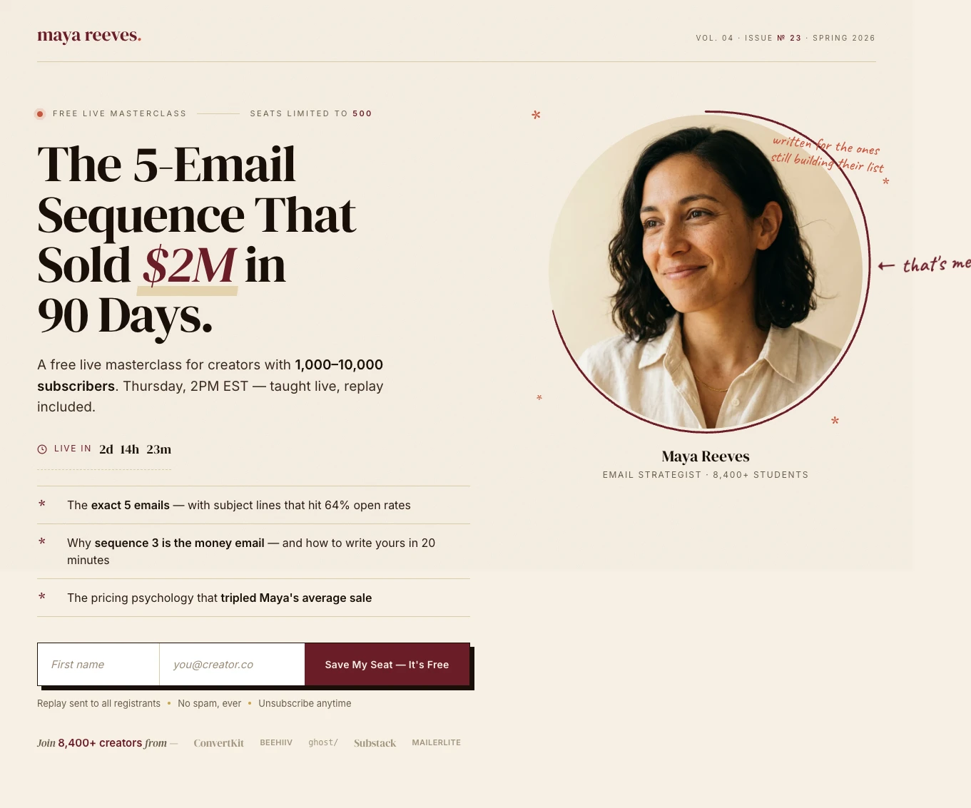
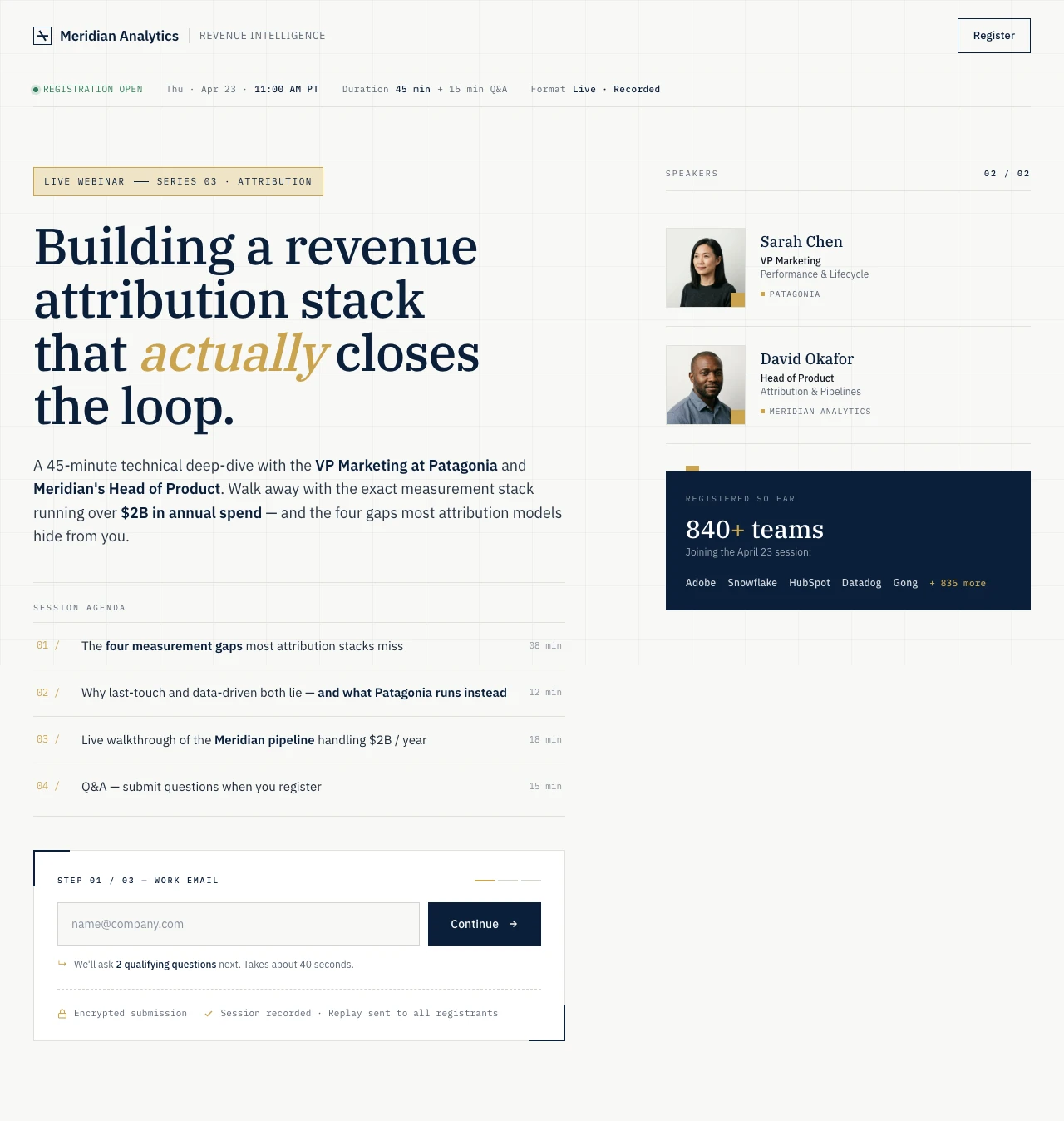
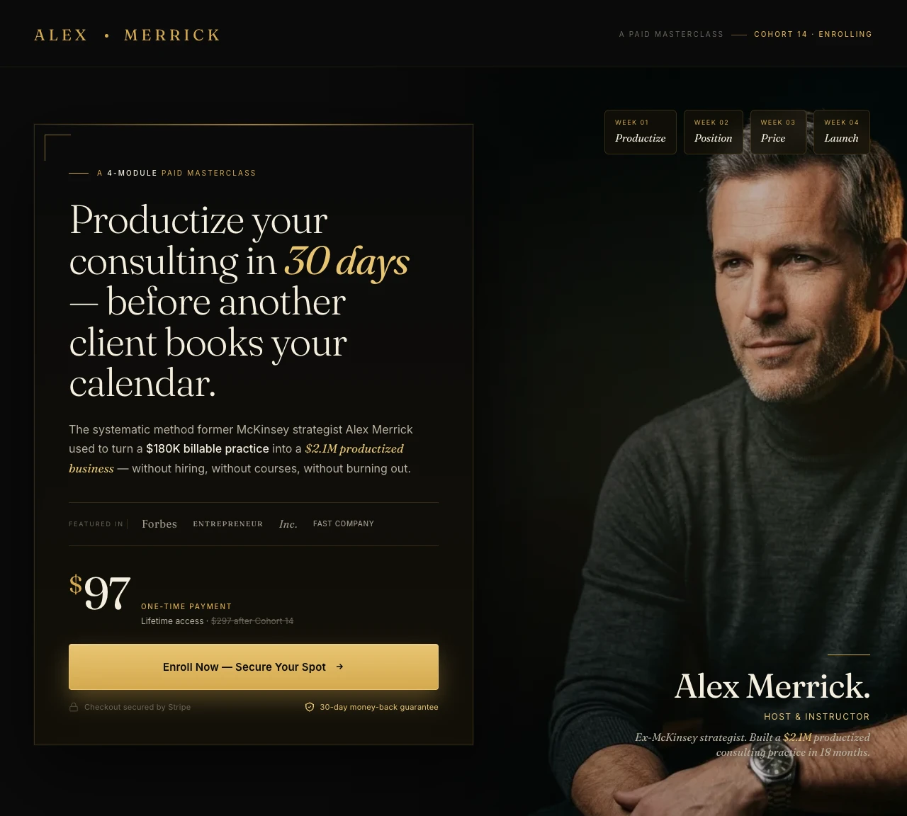
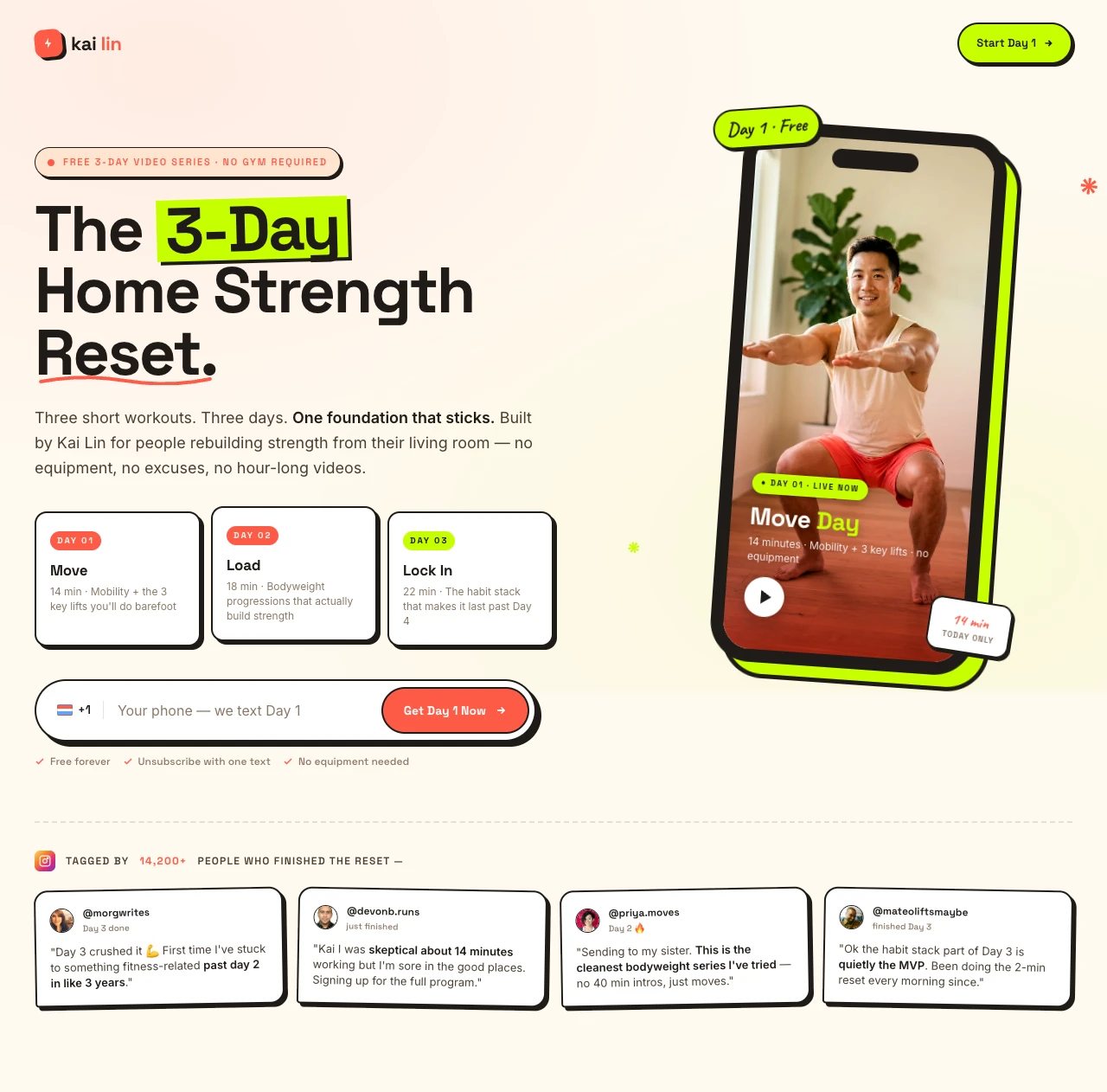
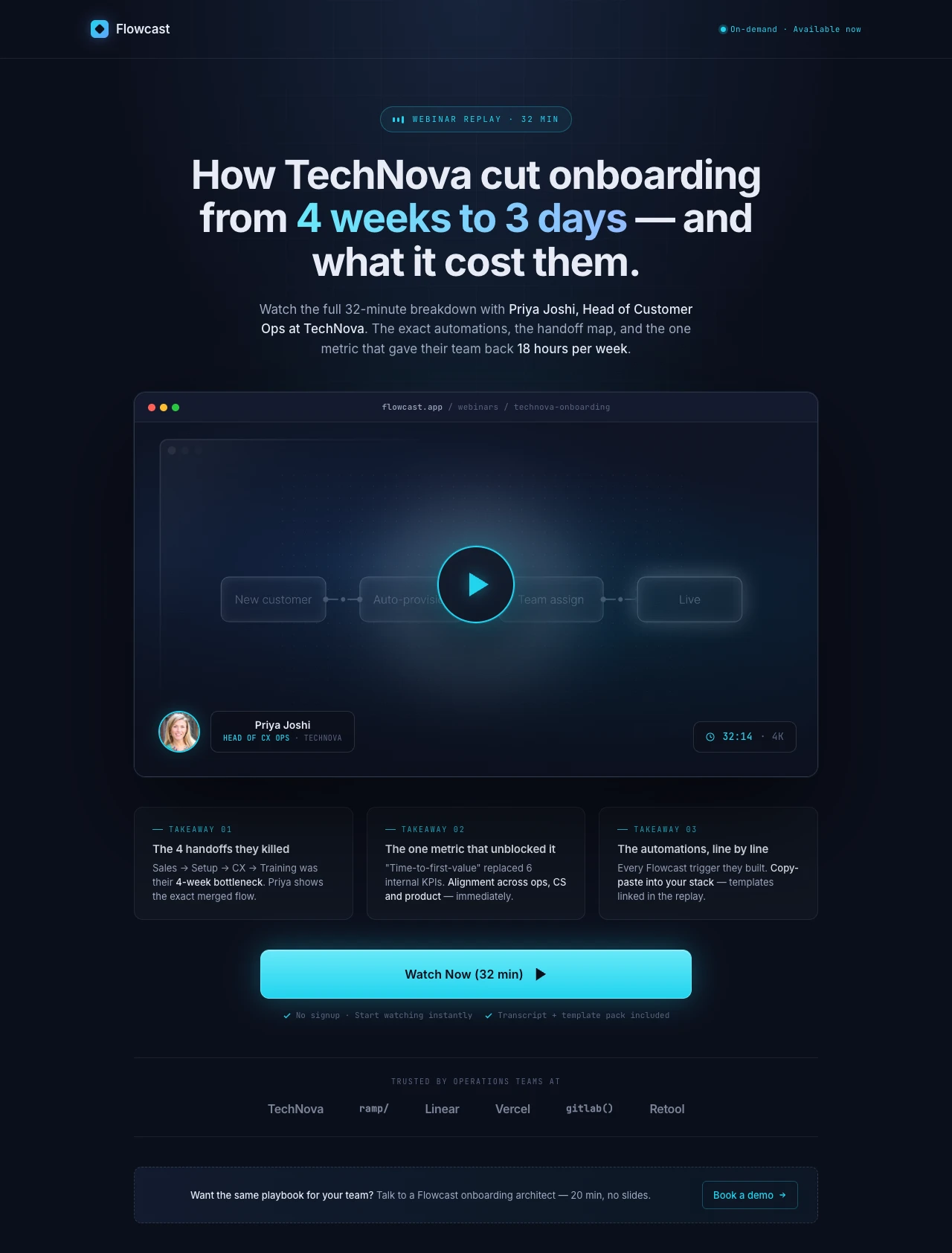
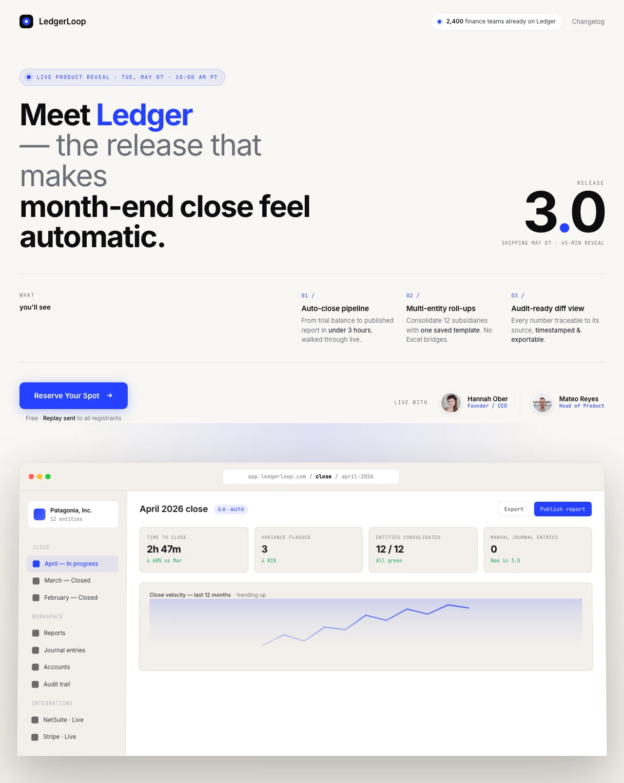
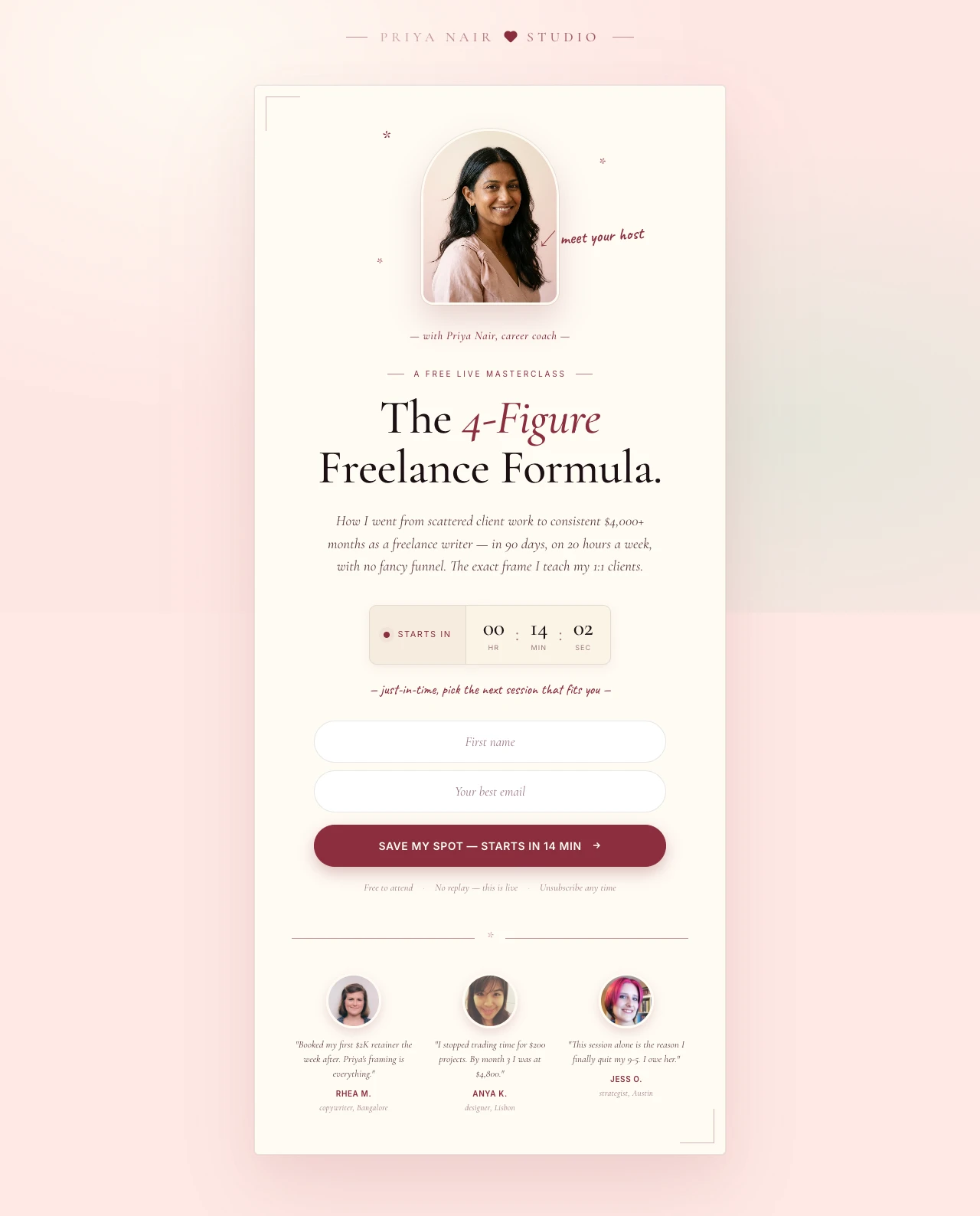
BigMarker's 2025-26 benchmark report found the average webinar now pulls 322 registrants per session, up 12% year over year. The demand is there. What's holding most hosts back is the conversion gap between "here's a form" and "here's a page that sells the seat." Strong pages open with a specific outcome headline ("Cut your reporting time by 4 hours a week"), show the speaker's face above the fold, list the three things the attendee will walk away with, and use a countdown that reflects actual scarcity — not a fake reset timer that erodes trust.

The other silent killer is mobile. 82.9% of landing page traffic now comes from mobile devices, according to Backlinko's 2026 landing page statistics, and over half of all webinar registrations start on a phone. A page that loads in 3+ seconds on cellular, or breaks when a tap target is too small, is losing registrants before the headline renders. Speed and mobile polish aren't extras — they are the page.

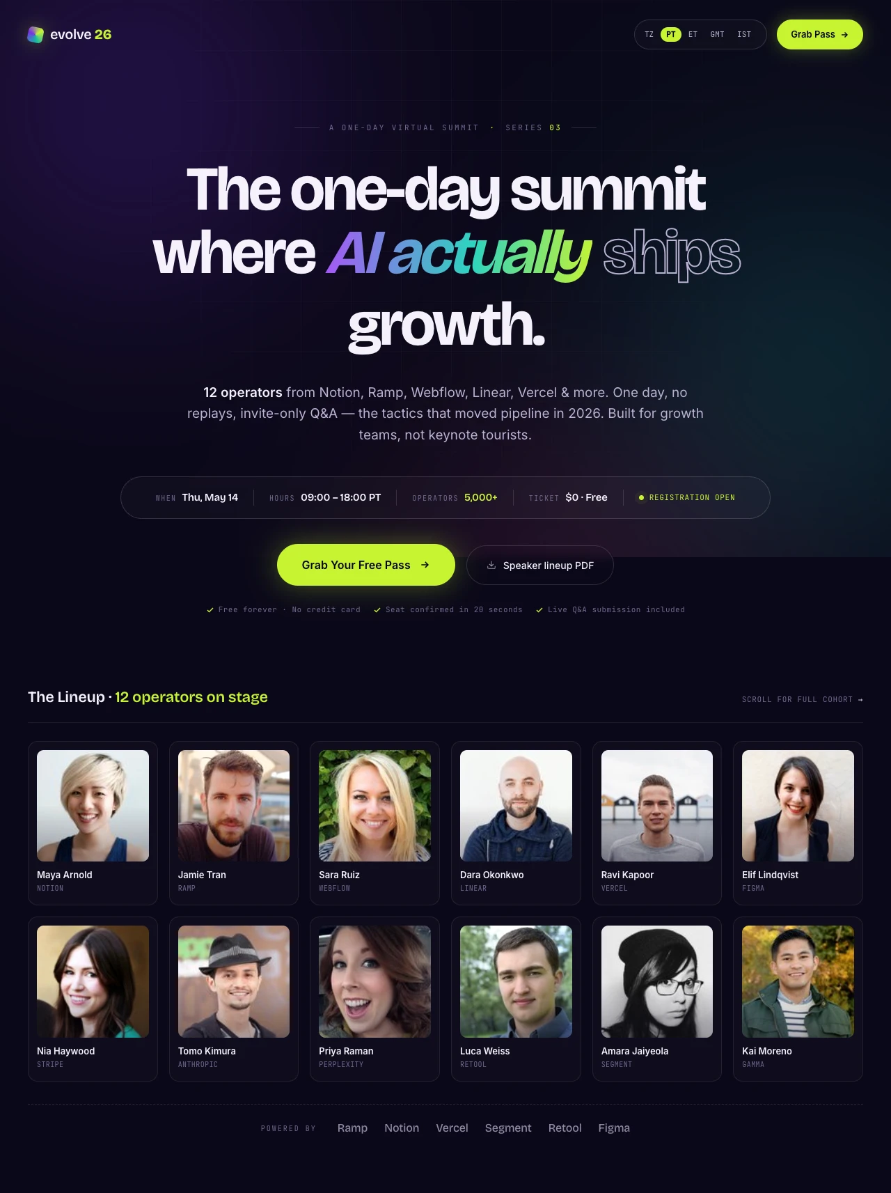
Look at how the best webinar and masterclass hosts do it. Jenna Kutcher's email-list workshop page sells a single outcome — "Go from zero subscribers to an email list that's ready to buy from you every time you send an email" — and funnels everything into one form. You can see it in the Swipe Pages inspiration gallery. Mindvalley's social media masterclass page uses a high-production speaker hero and a tight benefit list. AiSensy's Evolve summit page leads with the speaker grid and sponsor logos, which is the template for multi-speaker summits.

The pattern is always the same: a clear, specific promise; a credible host; proof the event is real; and a frictionless form. Bundled platform pages check maybe one of those four boxes. That's the gap a purpose-built webinar landing page closes — and it's where the ROI on your webinar ad spend actually lives. For a deeper breakdown, see 8 Best Webinar Landing Page Examples of 2026 on the Swipe Pages blog.

Features

Everything webinar hosts need. Nothing they don't.

Create a webinar page for my live masterclass

Every Webinar Page Type — One Prompt Away

Live webinar registration, on-demand replays, paid masterclasses, virtual summits, training series, evergreen auto-webinars — the AI creates any of these aligned to your brand in minutes.

Brand Match
Colors
Font Newsreader

Personalize by Audience Segment

Run the same webinar for beginners and advanced attendees? Generate brand-consistent variants for each segment in minutes.

Audit Complete

Idea: Change CTA text to "Start Free Trial" to lift conversions by ~12%.

Apply
Dismiss

CRO AI Agent

Analyzes your live registration page and suggests data-backed tweaks — headline, CTA copy, form fields — to lift RSVPs.

Competitor Search
G
G2 Reviews
S
SimilarWeb
Pricing Intel
$49 - $199

AI-Powered Research

Point the AI at a competitor summit or a past top-performing webinar page. It extracts the hooks, speaker framing, and social proof patterns that converted.

SP

Email & CRM Integrations

HubSpot, ActiveCampaign, Mailchimp, Zapier, and more. Registrants flow directly into your reminder sequence and post-webinar nurture flow — no manual exports.

Winner
14.2%
Variant A
vs
8.5%
Variant B

A/B Testing, Analytics & Attribution

Server-side split testing with zero flicker. Test speaker photos, headline framing, countdown urgency, CTA copy. GA4, GTM, Meta CAPI, and LinkedIn Insight Tag for full-funnel attribution from ad click to registration to attendance.

99

Blazing Fast

Sub-second load times on a global CDN. Your registration page doesn't buckle when the webinar invite email blasts at 10 AM.

Startup
$29
Marketer
$69
/mo

Pricing That Makes Sense for Webinar Hosts

Plans start at $29/mo. Run 10 webinars a month or one — flat pricing, no per-registration fees, no traffic overage bills when your ad campaign works.

What's your goal?
Generate Leads
Sell Products

Multi-Step Forms & Qualification

Build qualifying forms natively — by company size, role, or use case. Better attendee quality, better pipeline downstream.

Social Proof

Trusted by 7,000+ teams worldwide

4.8
★★★★★
G2
4.9
★★★★★
Capterra
300+ reviews
Webinars
★★★★★

"I have used it a couple of times to build landing pages for online events, and on both occasions, it was super easy to build an attractive landing page. It worked wonders for getting people to sign up for the webinars."

Rajesh K.

Chief Executive Officer · G2

Events
★★★★★

"Marketing pages are very easy to set up. Also, being in the events space, it's very easy to setup event landing pages using Swipe Pages."

Shade O.

Events Strategist · G2

Ad Pages
★★★★★

"We are creating landing pages for our clients, especially for like FB ads, webinar/seminar landing pages, and booking pages."

Fagun S.

Founder · G2

Speed
★★★★★

"The speed of the pages is unreal. Is there anything faster? Maybe, but not at this price point. It loads blazing fast, which is how landing pages should be."

Verified Reviewer

Editor In Chief · Capterra

Conversions
★★★★★

"The pages are stable and fast, helping increase my conversion rates when the user lands from my ads or other sources."

Victor R.

Sales & Partners Channels Manager · G2

A/B Testing
★★★★★

"It's a very powerful tool with custom blocks, and native integrations supporting even eCommerce. You can build a landing page very quickly and turn it on A/B test."

David K.

CEO · G2

Speed of Build
★★★★★

"The whole process of publishing a brand new landing page only takes 5-10 minutes top."

Kritcha B.

Owner · G2

Value
★★★★★

"The overall package, SwipePages is at the same level of leading landing page tools but at a fraction of their price."

Matthew S.

CEO · G2

Course Results
★★★★★

"I have been able to create very highly converted landing pages for my courses, and feedbacks from users / students are simply unbelievable, thanks a lot to SwipePages."

Hoang P.

Director · G2

FAQ

Frequently asked questions

A webinar landing page does one thing your Zoom, Demio, or WebinarJam default registration page cannot: it sells the seat. The bundled page your webinar platform ships with is a form on a branded shell. It was designed by engineers, not conversion marketers, and it's almost certainly leaking registrants you paid real money to acquire.

The math is what makes this worth fixing. 2026 benchmarks from getContrast and Wave Connect put the average webinar registration page conversion rate at 20-40%, with top performers hitting 45-51%. The median conversion rate across all landing-page categories is 6.6% — so webinars already over-index, but the gap between a typical platform page and a purpose-built one is still often 15-20 percentage points of upside. Move a page from 18% to 35% and you've doubled your registrants on the same ad spend. No additional campaign budget, no new creative — just a better page.

Beyond the raw conversion lift, a dedicated webinar landing page gives you control over everything the platform page hides: your headline, your speaker bio framing, your countdown urgency, your form field length, your trust signals, your mobile experience. You can A/B test the hook. You can match the page to the ad creative. You can add a segmentation question. You can strip the nav. You can drop in a 90-second speaker intro video — landing pages with video see up to an 86% conversion lift.

The best-performing webinar and masterclass hosts — Jenna Kutcher's list-growth workshop, Mindvalley's masterclasses, Alex Hormozi's scaling workshop — don't register attendees on default platform pages. They run them through purpose-built landing pages because that's where the ROI on their ad spend actually lives.

Strong webinar landing pages all have the same skeleton. Skip any one of these elements and you'll see the drop-off immediately.

Hero with a specific outcome headline. Not "Join our live webinar" but "How TechNova cut onboarding from 4 weeks to 3 days — live, Thursday 2 PM EST." The formula that shows up in every top page is: specific audience + specific outcome + specific mechanism or timeframe. Vague benefits get ignored. Precision earns the scroll.

Speaker block above the fold. Credibility is the single biggest registration lever. A photo of the speaker, one-line credentials ("Former Head of Growth at Webflow"), and a brief bio establish why this person is worth 45 minutes of calendar time. If you've got multiple speakers — summits especially — show them in a grid, not buried below the fold.

Three-bullet outcome list. What will the attendee walk away with? Not topics ("we'll discuss retention strategies") but outcomes ("the 3-step retention audit you can run tomorrow morning"). Three is the magic number — fewer feels thin, more dilutes the pitch.

Countdown and date/time clarity. Show the webinar time in the visitor's own time zone (auto-detect if possible). A real countdown reflecting actual scarcity builds urgency; a fake reset timer that always shows "5:00:00" kills trust the moment someone refreshes.

Social proof and past-attendee logos. Company logos from prior sessions ("Adobe, Snowflake, HubSpot and 840+ teams registered") or named testimonials from previous attendees. Review scores and speaker credentials work here too — the Swipe Pages blog breakdown of 8 best webinar landing pages of 2026 flags this as a conversion driver.

Short registration form. Email plus first name is enough for most top-of-funnel webinars. Adding company size, role, or phone number only makes sense for sales-led B2B webinars where you're pre-qualifying. For every additional field, expect a measurable drop in completion rate — progressive profiling (collecting more after the initial signup) is a better pattern.

Single CTA. "Save My Seat" or "Reserve Your Spot." Not "Save My Seat" and also "Watch Demo" and also "Download Guide." Every alternative exit is a lost registrant.

Replay promise for busy attendees. "Can't make it live? Register anyway — we'll send the replay." This single line catches the 30-40% of registrants who want the content but can't commit to the live slot.

The patterns that separate top-performing webinar pages from the rest are surprisingly consistent. These aren't "write a good headline" platitudes — they're specific, tested behaviors.

Lead with the outcome, not the topic. "5 Advanced Google Ads Tactics" is a topic. "How we cut CPA by 47% in 30 days — live walkthrough" is an outcome. The Swipe Pages blog analysis of 2026's best webinar pages found that every high-converting example leads with a specific transformation, not a subject line. If you can't put a number or a timeframe in the headline, dig for one before launching the page.

Put the speaker face above the fold. Every single one of the top webinar pages shows the speaker's photo in the hero. Not a stock image, not a logo — a real face. Credibility is the biggest lever on registration, and a face is the fastest credibility signal a visitor can process.

Strip the nav. Most webinar hosts drop their main website navigation on the registration page. Every nav link is a leak. Remove them. The logo should either be non-clickable or scroll to the top of the page — never out to the main website.

Match the page to the ad. If your Facebook ad promises "the 3-day email challenge," the page headline should say "the 3-day email challenge" — not "free masterclass." Message mismatch is the single biggest reason bounce rates spike above 70%. Your ad creative and your landing page should look like they were designed in the same hour.

Use a countdown that reflects real scarcity. Real countdowns work. Fake countdowns that reset on every visit get caught immediately and destroy trust. If your webinar is live on Thursday, the countdown ends Thursday — not in a perpetual 24-hour loop.

Optimize for mobile first. More than half of webinar registrations now start on a phone. Tap targets at 44px minimum, full-width CTAs, vertically stacked speaker blocks, form fields that don't trigger the wrong keyboard. Test on an actual phone, not just a responsive preview. Swipe Pages loads in under a second on mobile — which eliminates the speed gap that kills conversions on cellular.

Add a short video above the form. Landing pages with video see up to 86% higher conversion rates. A 30-second speaker intro — "Here's what you'll walk away with" — beats any block of copy. This is especially true for paid masterclasses, where the visitor needs to trust the speaker before handing over $97.

Embed the thank-you page in the flow. The thank-you page is your single highest-leverage show-up tactic. Add a "Add to Calendar" button, a one-click calendar invite, and a short video from the host saying "see you Thursday." Calendar adds are the strongest predictor of actual attendance — Dow Janes and Gene Wei's workshop pages both invest heavily in the post-registration confirmation flow.

Most webinar hosts measure one number — registrations. That's the tip of the iceberg. Here's the full framework the best webinar growth teams actually use.

Primary KPI: Registration conversion rate. Visitors ÷ registrations. Target 20-35% for warm traffic (email lists, retargeting), 10-20% for cold paid traffic. If you're below 10% on cold traffic, there's a structural problem — message mismatch, weak speaker credibility, or a buried CTA. Before you A/B test the headline, make sure the basics (speaker above fold, clear outcome, short form) are in place.

Show-up rate. Registrations ÷ live attendees. The 2026 average is 49% live attendance according to getContrast's benchmark data from 500K+ registrants. External marketing webinars run 35-45%; internal communications webinars hit 55-60%. If you're below 35%, your registration-to-show-up gap is where you're bleeding — usually a weak reminder sequence or a thank-you page that doesn't ask for a calendar add.

Cost per registrant. Ad spend ÷ registrations. This is the number that tells you whether your acquisition is working. A high CPR on a good show-up rate is fine; a low CPR on a 20% show-up rate means you're paying for no-shows.

Form abandonment. How many visitors start the form and don't finish. If it's above 30%, your form is asking for too much. Drop fields one at a time and retest.

Mobile vs desktop conversion. Mobile conversion should be within 20% of desktop. If the gap is wider, your mobile UX is broken — usually tap targets, font sizes, or form field types.

What to A/B test (in order of impact): headline framing first (specific outcome vs. broad benefit), then speaker photo and credentials, then CTA copy, then form length, then above-the-fold video vs. static hero. 86% average lift for pages that add a 30-second speaker intro video above the form.

Analytics setup: Meta CAPI, LinkedIn Insight Tag, and Google Ads conversion tracking for closed-loop attribution. GA4 with a custom "webinar_register" conversion event. Hotjar or Microsoft Clarity heatmaps to see where registration drop-off actually happens. A simple attribution tag in the form (utm_source, utm_campaign) so you know which audience converted best. Swipe Pages handles the server-side A/B testing and built-in analytics natively, so you can test and iterate in one place instead of stitching three tools together.

Webinar hosts need two things more than anything else: speed of creation and conversion lift. Swipe Pages is the only AI-native landing page builder that delivers both for webinar workflows specifically.

AI that builds every webinar page type from a prompt. Describe your webinar — topic, speaker, audience, goal — and the AI drafts the complete registration page in minutes. Headline, speaker block, agenda bullets, trust signals, countdown, form. Live webinar? Done. Paid masterclass with Stripe checkout? Done. 15 variants for different audience segments before your next reminder email? Done before lunch. Most webinar hosts need to run multiple events per month, each with its own promotion cycle — the AI turns that from a two-day design job into a 20-minute prompt-and-publish loop.

Built for the webinar funnel, not a generic landing page. Speaker photos above the fold, countdown timers that reflect real scarcity, multi-step qualification forms for B2B webinars, calendar-invite integration for thank-you pages, and native analytics that track the full funnel from ad click to registration to attendance. These aren't features bolted on — they're part of how the AI thinks about a webinar page.

Personalization at scale — the webinar host's edge. Running the same webinar for beginners and advanced attendees? Targeting different ICPs with the same content? Create brand-consistent variants for every audience in minutes. Better message matching means higher Quality Scores on paid ads, lower CPRs, and higher show-up rates.

CRO AI agent for continuous optimization. Your first registration page is a hypothesis. The CRO AI agent analyzes live performance — scroll depth, form abandonment, bounce rate, conversion patterns — and suggests specific, data-backed tweaks. Headline rewrites, CTA changes, form field adjustments. It's like having a CRO consultant on retainer, except it works every time you refresh the dashboard.

Sub-second load times on a global CDN. Your webinar invite email goes out at 10 AM and 3,000 people click in 30 seconds. Cheap landing page builders choke. Swipe Pages doesn't — sub-1-second loads, no traffic-based pricing, no degradation during spikes. Speed is the difference between capturing that registration burst and losing half of it to timeouts.

Native A/B testing with built-in analytics. Server-side split testing with zero flicker. Test the speaker photo, the headline, the countdown framing, the CTA copy — all from inside Swipe Pages, no third-party tool to bolt on. Built-in analytics show statistical significance automatically, so you know when to lock in the winner.

Email and CRM integrations that actually matter. HubSpot, ActiveCampaign, Mailchimp, Zapier, and more. Every registrant flows directly into your reminder sequence, your post-webinar nurture flow, and your sales CRM. No manual CSV exports, no broken handoffs to the sales team.

Pricing that makes sense for webinar workflows. Plans start at $29/mo with everything included — AI, A/B testing, analytics, multi-step forms, integrations. No per-registration fees. No traffic overage bills when your ad campaign performs. The Agency plan at $149/mo covers 500K visitors and unlimited domains, which is enough for any webinar operator running multiple events a month. 14-day free trial, no credit card required. For webinar hosts who need speed, scale, and conversion — not just a registration form — this is the platform.

Start building your webinar landing page

Go from prompt to live registration page in minutes. 14-day free trial, no credit card required.

No credit card required · Instant setup