Landing Page Builder

Create a Waitlist Landing Page

Build a high-converting waitlist landing page with AI. Single-field signup, position counter, referral loop — prompt to published in minutes.

No credit card required · 14-day free trial

Examples

Waitlist landing pages built with one prompt

Eight pre-launch shapes, one page each — because an iOS app waitlist and a DTC skincare drop don't share the same conversion flow. Every example below maps to a specific launch type, audience, and viral mechanic.

SaaS Pre-Launch

"Build a waitlist landing page for Threadwise, a Slack-style tool for async standup that I'm pre-launching to indie founders. Hero: founder personal-note format with my photo, headline 'Async standup that doesn't suck. Built by a 2-person remote team for the rest of us.' Single email field, position-in-line counter on the thank-you screen ('You're #347 in line'), refer-3-friends-skip-100-spots mechanic. Show '1,200+ founders already in line' as social proof. Dark UI, indigo accent, Geist sans throughout. No nav, no footer links — just the offer."

Indie SaaS Async Tool

iOS App Pre-Launch

"Waitlist landing page for FocusOS, an iOS productivity app launching on the App Store in 6 weeks. Hero: silent autoplay product demo (15-second loop showing the focus-session screen), headline 'A focus app that won't distract you with its own notifications.' iPhone mockup beside the headline. Email-only form below — no name, no anything else. Position counter and 'TestFlight invites going out 7 days before launch' framing. Bold sans typography, off-black background with neon-mint accent. Mobile-first; this page will be shared on Twitter and TikTok."

iOS Productivity App Beta

DTC Drop Waitlist

"Pre-launch waitlist for Dewdrop No.3, a limited-batch vitamin-C serum drop — 1,500 bottles only, shipping March 22. Hero: clean product hero photo on a soft-pink seamless backdrop, headline 'Only 1,500 jars in this batch. Notify me when the drop opens.' Email + SMS opt-in (single combined form), 'first 200 to sign up get 25% off' early-bird tier, milestone-reward referral ladder (3 friends = sample tube, 5 = free shipping, 10 = free second jar). Editorial aesthetic — warm cream background, deep terracotta CTA, Cormorant serif headline."

DTC Skincare Limited Drop

Course Pre-Enrollment

"Waitlist landing page for the next cohort of 'Designing for Founders' — a 6-week design fundamentals course for non-designer founders. Doors open July 15, capped at 200 students, founding-member pricing $397 (regular $597). Hero: instructor face photo + sample lesson screenshot, headline 'Design fundamentals, taught for founders who can't draw.' 4 past-cohort student outcomes. Email + 'how would you describe yourself' dropdown. Cohort-cap counter ('142 of 200 spots claimed'). Warm beige + ink-black palette, Newsreader serif heading."

Founder Design Cohort

Newsletter Pre-Launch

"Pre-launch waitlist for 'The Slow Hour,' a Sunday-only newsletter on slower internet, building habits, and shipping less. Hero: founder personal-note ('Hi, I'm Maya — I left product at a hyperscaler last year and I'm writing the newsletter I wish I'd had'), sample issue preview embedded. Single email field, 'Issue #1 ships May 5 — be on the list before it goes wide.' Show '2,400 readers ahead of issue #1' running counter. Cream paper-textured background, deep navy serif headline, no decoration. Tone: deliberate, slow."

Sunday-Only Newsletter

Indie Game Pre-Order

"Waitlist landing page for Lantern Hollow, an indie cozy-cottage exploration game launching on Steam in Q4. Hero: 30-second gameplay loop trailer (silent, autoplay, looped), headline 'A cozy game for the long evenings of November.' Two CTAs side-by-side: 'Add to Steam wishlist' (primary) + 'Email me on launch day' (secondary, single field). Show '8,400 wishlists collected' counter. Milestone-reward referral ladder (3 = wallpaper pack, 10 = soundtrack early access, 25 = name in credits). Hand-drawn aesthetic — soft moss-green palette, watercolor texture, Caveat for accent text."

Indie Cozy Game Pre-Order

Founding Member Cohort

"Pre-launch waitlist for The Operators' Room, a paid invite-only community for B2B SaaS operators — capped at 500 founding members at $40/mo grandfathered for life. Hero: hex-grid of 12 anonymized member silhouettes ('VP Ops at $50M ARR SaaS,' 'COO at Series-B fintech'), headline 'A room of 500 SaaS operators who actually run the company.' Application-style form (5 questions: company, role, ARR range, team size, what you'd want from the room). 'Founding cohort: 312 of 500 verified.' Charcoal background, warm-amber accent, Geist throughout."

Paid Operator Community

Beta Feature Waitlist

"Beta waitlist landing page for Helio Studio's new AI image-edit feature, opening to existing customers first. Hero: side-by-side before/after of one edit (no copy on the image), headline 'AI editing for the moments your shoot didn't quite catch.' 'Apply for early access' CTA (not 'sign up'), 4-field form (work email, company, current Helio plan, primary use case). Show 'Beta cohort 1 ships in 14 days' as soft scarcity. Existing customer logos as a quiet bottom strip. Off-white background, matte-black headline, gallery-clean layout."

AI Image-Edit Beta

Build Your Waitlist Landing Page

No Credit Card Required | Try for Free

How It Works

How to Create a Waitlist Landing Page

01

Pick the Launch Shape, Not the Template

A SaaS pre-launch and a DTC skincare drop look like the same page until you read the second paragraph. The viral mechanic differs (referral-jump-the-queue vs milestone reward), the form differs (single email vs email + SMS), the social proof differs (founder credibility vs limited inventory), and the urgency mechanic differs (cohort cap vs hard drop date). Pick the launch type first — SaaS pre-launch, app waitlist, DTC drop, course pre-enrollment, newsletter launch, founding-member cohort, indie game pre-order, beta waitlist — and the audience second. Those two choices decide everything: the hero shape, the mechanic, the form length, the language. Waitlist landing pages convert at 15-40%; the 5-15× lift over generic LPs comes from picking the right shape, not the prettiest template.

02

Feed the AI the Launch Brief

The product (one sentence — "async standup tool for indie founders," not a 4-paragraph mission statement). The audience and where they're arriving from (Twitter, IndieHackers, Reddit, paid Meta, existing email list, organic). The launch date (firm or "early Q3"). The viral mechanic (position counter, milestone-reward referral ladder, cohort cap, simple "be first to know"). The trust stack you have (founder credibility, existing customer logos, design partner names, even just "I left X to build this"). The destination after signup (your email tool — ConvertKit, Beehiiv, Mailchimp, Loops, plain Webhooks). Ten minutes of brief beats three days of revision after launch day arrives and the conversion rate is sub-5%.

03

Watch Swipe Pages AI Build Your Waitlist Landing Page

Paste the brief. The AI writes a one-promise headline tied to the launch (not "Coming Soon"), picks the layout the audience rewards (founder personal-note for indie SaaS, product-demo-loop for visual products, milestone ladder for DTC drops, application form for beta cohorts), calibrates the form to one field by default (email; every additional field measurably reduces signup rate), drops in the position counter and referral hook on the thank-you screen, generates a confirmation-email pattern your email tool can send, and ships mobile-first because most pre-launch traffic is social-driven and 60%+ mobile. Fifteen minutes from prompt to draft, fifteen more for your signup tool wiring and your specific copy adjustments.

04

Wire the Viral Loop and Test Before You Tweet

Waitlists with referral loops see 3-5× more total signups than static email-only forms. Roughly 30% of signups will refer at least one friend if the mechanic is visible and frictionless. Wire the share-to-skip-the-line link, the milestone tiers, the position counter on the thank-you screen — all of it before the launch tweet goes out, not after. Then run an A/B test: founder-personal-note hero vs feature-led hero, single email field vs email + name, "join the waitlist" vs "get early access" — server-side, zero mobile flicker, statistical significance baked in. The CRO agent watches the signup rate and flags drop-offs in real time. Robinhood collected 1M signups pre-launch with a position counter and referral mechanic; Harry's collected 100K in a single week with milestone tiers. Both built their viral loop before the launch announcement, not after.

Worth reading before your launch tweet ships

Why a Waitlist Landing Page Is the Highest-ROI Page You'll Ever Ship

Worth reading before your launch tweet ships.

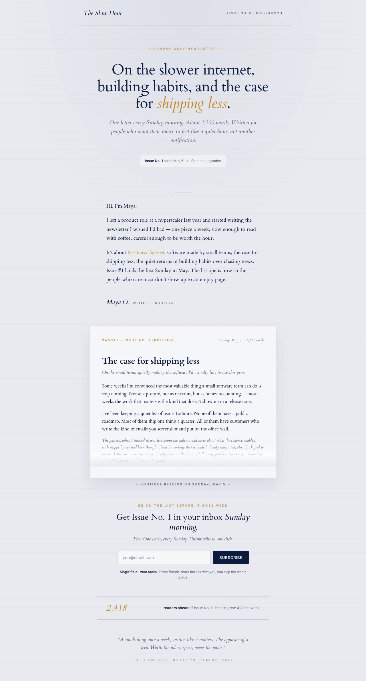
A waitlist landing page is the single highest-ROI page in marketing. It's the only page that converts intent into a list before the product exists, before the ad budget runs, and before the launch tweet goes out — and the list it builds tends to convert to paying customers at multiples no other channel matches. The math is unforgiving and well-documented.

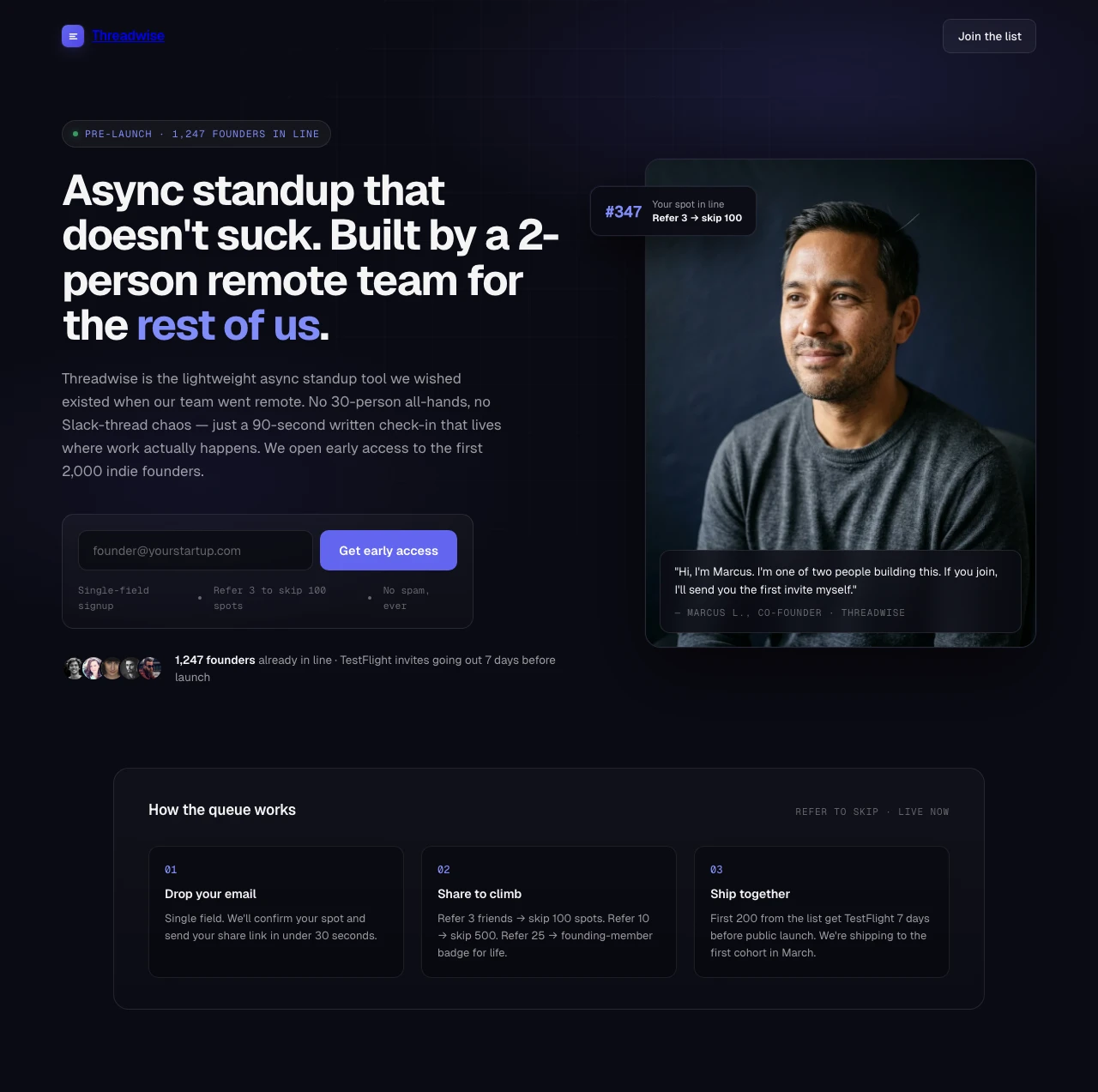
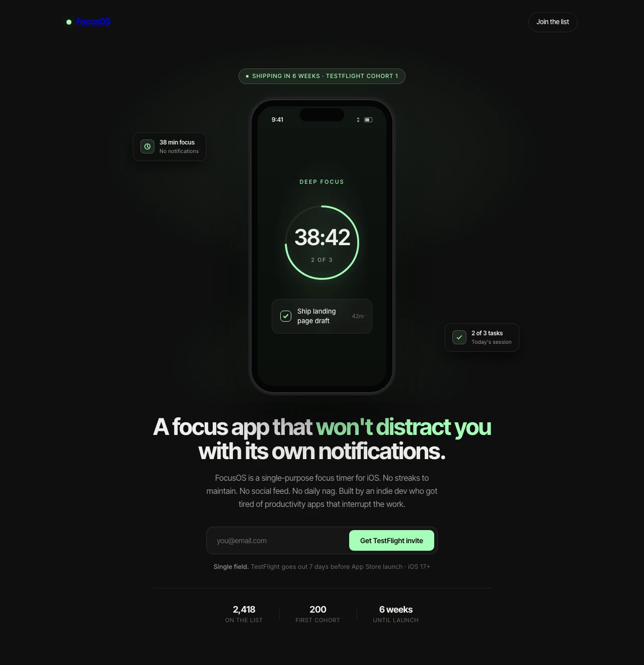
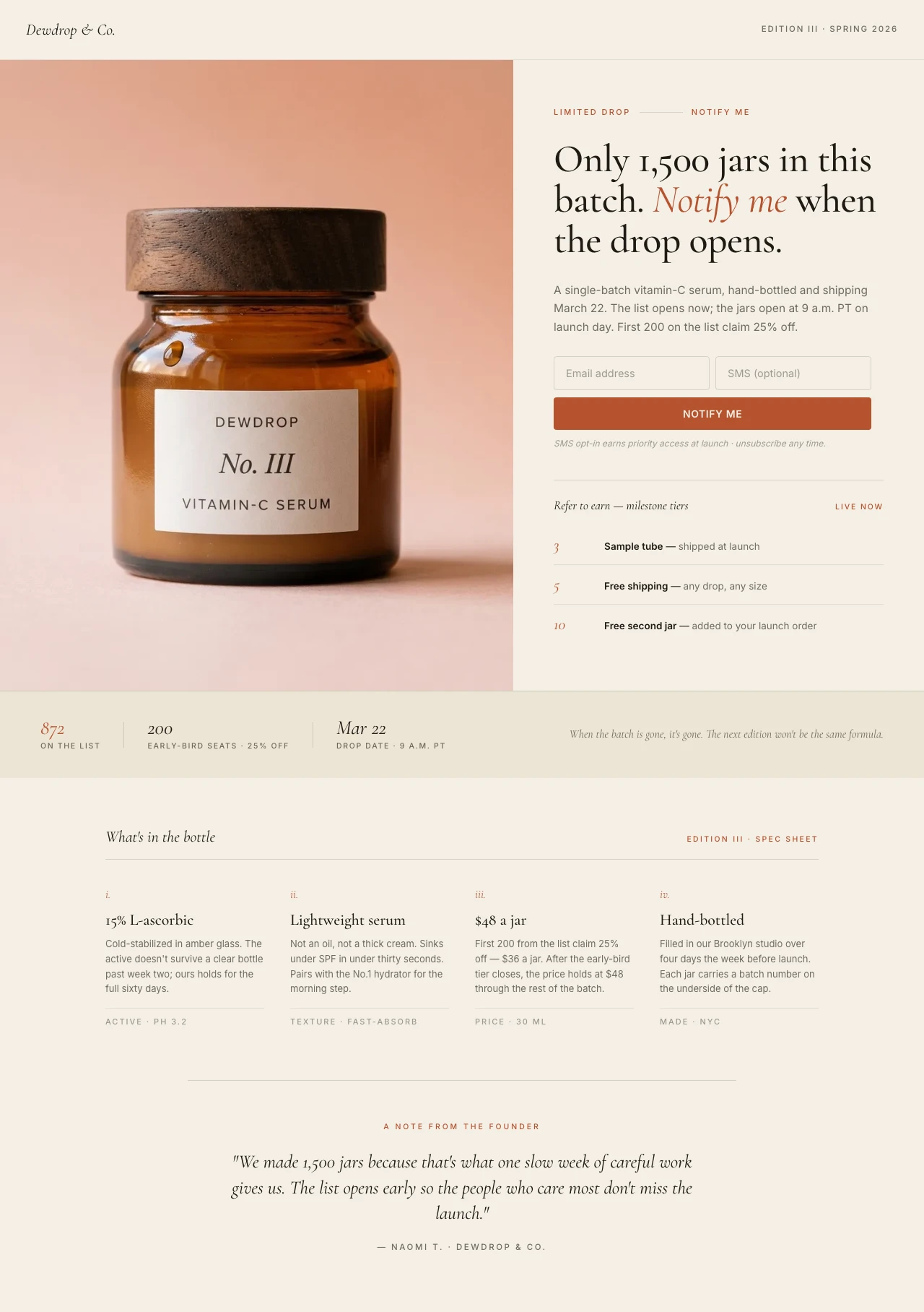
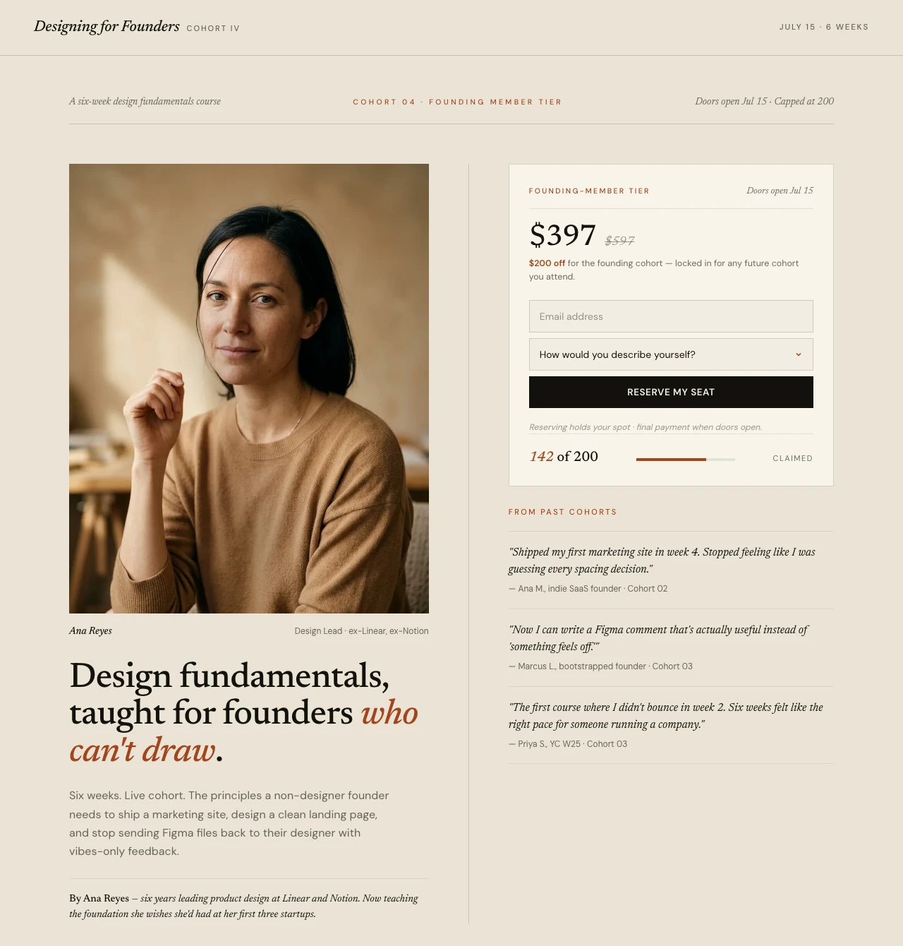
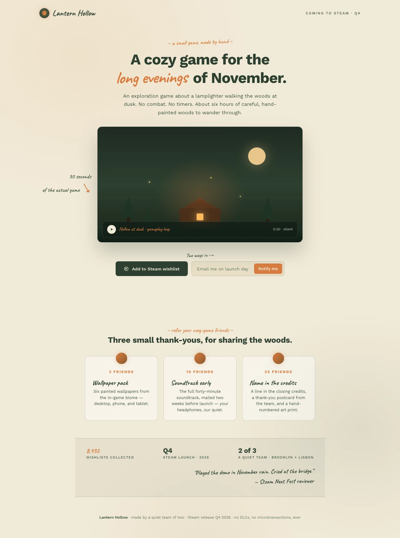
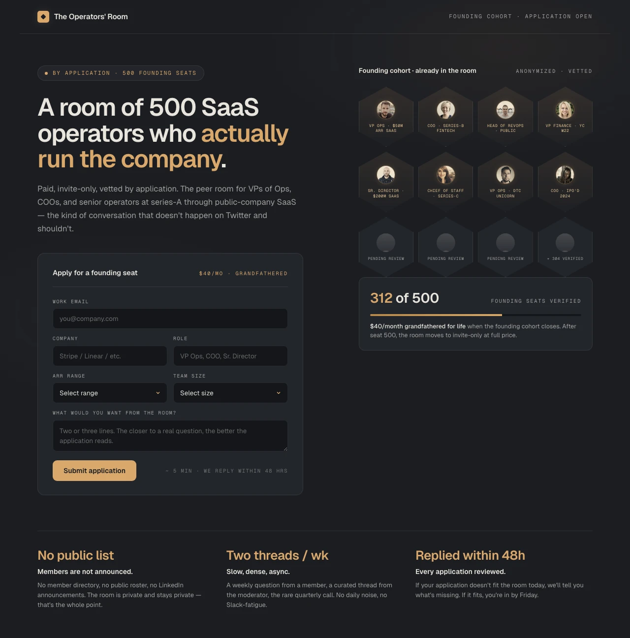
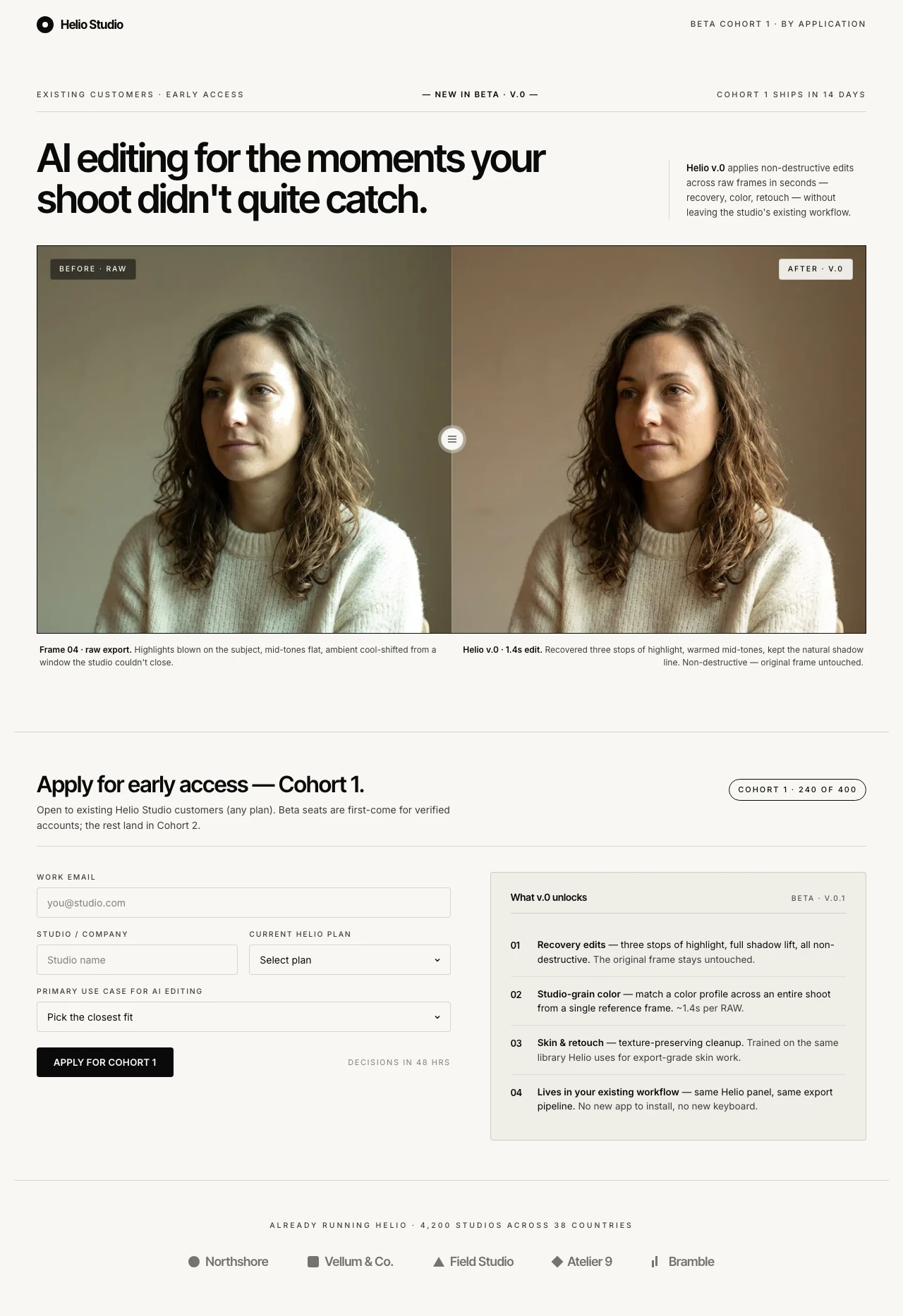
Well-optimized waitlist pages convert at 15-40% visitor-to-signup, with top performers hitting 25-85% (Waitlister 2026 optimization guide; GetWaitlist 2025 benchmarks; CraftUp anatomy report). The benchmark gap is the story. The SaaS landing-page median sits at 3.8%; the all-industry LP average is roughly 2.35% (Apexure 2026). A waitlist page lifts conversion 5-15× over a generic LP because three things compound: intent is pre-qualified (visitors typed "[product] waitlist" or arrived from a creator they already trust), the form is shorter (often a single email field), and the post-signup mechanic creates a viral coefficient (each signup brings in friends through referral, position-jumping, or share-tier rewards).

The canonical case studies are well-rehearsed for a reason. Robinhood collected approximately 1 million signups before public launch via a position-in-line counter and referral mechanic, with each user averaging three additional referrals (Viral Loops, Prefinery, Inside Viral Loops). Harry's collected 100,000 emails in a single week — 77% from referrals, 65,000 referrals from roughly 20,000 referrers, peak viral coefficient of 0.6 (every 10 signups generated 6 more) — built on a four-tier milestone reward ladder (5 referrals = free shave cream, 10 = razor, 25 = premium set, 50 = a year of free blades) (Tim Ferriss blog, Viral Loops, Referral Rock case studies). Superhuman built a 180,000-person waitlist for a $30/month email client by gating entry behind a Zoom interview — friction that increased perceived value rather than killing conversion. Dropbox's referral-driven waitlist took the company from 100K to 4M users in 15 months, permanently lifting signups by ~60%. These aren't outliers. They're the playbook.

The mechanic matters more than the design. B2B SaaS waitlists from cold traffic typically convert at 2-5%; warm traffic 6-12% (GetWaitlist 2025), but pages built with a viral loop see signup volumes 3-5× higher because each signup multiplies into ~1.5-3 additional signups via referral. Form-field pruning is the single highest-ROI optimization on a waitlist page — every field beyond email measurably reduces signup rate. Notion AI, Robinhood, and Superhuman all used single-field forms; you can ask for the rest after they're in. Pages with social proof — even "247 joined in the last 24 hours" or "Sarah from London just joined" tickers — outperform static "thousands of users" copy by roughly 40% (CraftUp / GetResponse data).

The Product Hunt math says the same thing in a different accent. Roughly 60% of #1-of-the-day Product Hunt launches drive their launch-day traffic from a pre-built waitlist; products with 1,000+ pre-launch subscribers are 3-5× more likely to reach top-5 of the day (Flowjam 2025 PH Launch Checklist; LaunchList 2026). Founders who skip the waitlist and "just launch" arrive at 6 AM PST with a Product Hunt page and no email list to mobilize — and watch their feature die on the second page. The waitlist isn't a nice-to-have for a major launch; it's the launch-day weapon.

There's a quieter benefit hiding behind the conversion-rate story: waitlist signups convert to paid customers at 5-15× the rate of generic newsletter subscribers (TwoCents Software SaaS waitlist strategy; Beyond Labs pre-launch playbook). This is because the referral loop self-selects for engaged users — people who care enough to refer a friend are people who'll buy. So the list isn't just larger than a cold list, it's qualitatively richer. A 3,000-person waitlist often outperforms a 30,000-person scraped email list at conversion time. Which is why the indie-hacker advice is consistent across r/SaaS, r/Entrepreneur, and IndieHackers: "If you can hit 500+ qualified signups in 4-8 weeks with modest promotion, you have demand. If you can't, the product probably doesn't have legs yet." (Beyond Labs, 2025). The waitlist is also the cheapest demand-validation experiment in marketing — and the result either greenlights the build or kills it before sunk cost gets ugly.

The economics of building one used to be uglier than they had to be. A traditional pre-launch page meant a general-purpose website builder + an email tool + a bolt-on position-counter widget + a separate referral product stitched through automation middleware — multiple subscriptions, hours of integration, and a Friday-night session debugging the share link. The agency version cost $3,000-$8,000 for a page that should have shipped in an afternoon. AI-assisted page building collapses the cost stack: prompt the AI, name the launch shape, point at your email tool, ship. A pre-launch page that took 25-35 hours of agency time now takes ~15 minutes of prompt time plus 30 minutes of customization — at $29/month flat tooling, the per-page execution cost drops below $30. Founders who used to ship one waitlist per company can now ship one per launch, per feature, per cohort — without the rebuild tax.

The waitlist landing page sits at the intersection of three converging trends that aren't slowing down: (1) build-in-public has normalized pre-launch audience-building as a default behavior, not a "growth hack"; (2) referral-loop mechanics have become standard infrastructure, not bespoke engineering; (3) AI-assisted page building has compressed time-to-publish from days to minutes, removing the last excuse to ship a Notion-doc placeholder instead of a real page. The founders, DTC brands, course creators, and app teams who internalize this are running waitlist tests as a default before every product or feature ships. Everyone else is launching to crickets — and writing post-mortems about why. Worth reading before your next launch: Swipe Pages' High-Converting PPC Landing Pages guide on single-CTA discipline and form-length calibration; the Landing Page Best Practices playbook covers the pattern that scales across launch shapes; the Landing Page Optimization guide ties it together; the 40 Best Landing Page Examples shows the patterns at work; pair them with the Lead Generation inspiration gallery — many of the high-converting trial-and-consult pages map directly onto waitlist-page anatomy with a one-field swap.

Features

Everything you need to ship a waitlist that compounds. Nothing you don't.

Build a waitlist for my SaaS pre-launch

Any Waitlist Page — One Prompt Away

SaaS pre-launches, iOS app waitlists, DTC product drops, course pre-enrollment, founder newsletters, founding-member cohorts, indie game pre-orders, beta-feature waitlists. Every launch shape, every audience, every viral mechanic — one prompt away. No template to pick, no widget to wire.

Signup Rate Watch

Founder-personal hero converts 2× the feature-led hero on Twitter traffic. Promote variant A.

Apply
Dismiss

CRO AI Agent

A waitlist runs on a 2-6 week launch window. "Run it a month and pick a winner" doesn't fit. The agent watches signup rate, scroll depth, and form drop-off in real time — "founder-personal hero converts 2× the feature-led hero on Twitter traffic," "mobile CTA below fold on iPhone, move sticky" — and flags the fix while the launch is still warming up.

Mobile-First, Share-Ready

Most pre-launch traffic is social-driven — Twitter, IndieHackers, Product Hunt, Reddit, TikTok — which is 60%+ mobile. Smart Pages keep your signup CTA pinned in the thumb-zone. Phone-mockup heroes render crisp. Founder-photo heroes don't crop weird on iPhone Safari.

Winner
22.4%
Founder Hero
vs
11.2%
Feature Hero

A/B Testing & Analytics

Test "Get Early Access" vs "Join the Waitlist," founder-personal hero vs feature-led, single-field vs email-plus-name, position counter visible vs hidden. Server-side split tests with zero mobile flicker, statistical significance baked in, variant build under 5 minutes. Only 17% of marketers actively A/B test (Foundry CRO 2026) — the ones that do see 37% conversion gains.

SP

ConvertKit, Beehiiv, Mailchimp, Loops & 30+ More

ConvertKit, Beehiiv, Loops, Mailchimp, ActiveCampaign, HubSpot, Klaviyo, Substack-compatible Webhooks, Zapier. Every signup fires into your email tool the second it lands — no CSV imports, no manual sync, no leads lost between the page and the welcome email. Your launch sequence starts automatically.

English → Spanish

One-Click Translation

Launching in multiple markets? Translate your waitlist page into any language with a single click. Capture international signups without rebuilding the page or hiring translators.

99

Sub-Second Mobile Load

Your launch tweet drops at 9 AM. The Product Hunt feature lands at 6 AM PST. The Reddit thread spikes at 2 PM. Traffic comes in bursts and from mobile. Pages loading in 1s convert 3× higher than pages taking 5s (Cloudflare 2025). Global CDN, edge caching, mobile LCP under 150KB. The page renders before the thumb reaches the CTA.

Startup
$29
Marketer
$69
/mo

Flat Pricing — No Per-Lead, No Per-Visit Penalty

Start at $29/month. Unlimited signups, unlimited launches, unlimited domains on the agency tier. When your Product Hunt feature drops 12,000 visitors on the page in 18 hours, your tooling line-item doesn't double. Indie founders, DTC brands, and creators don't tolerate variable surcharges; flat pricing doesn't create them.

Social Proof

Trusted by 7,000+ teams worldwide

4.8
★★★★★
G2
4.9
★★★★★
Capterra
300+ reviews
Pre-Launch Speed
★★★★★

SwipePages has proven to be a surprisingly simple and efficient tool for creating stunning landing pages. I can consistently complete a page in 5-10 minutes.

Dietitian Amandeep S.

Founder · G2

Idea-to-Live
★★★★★

SwipePages makes it easy to go from idea to live landing page in under an hour. And now, for my lead magnets, I have a template I have customized for my brand and I can go from idea to leadgen landing page in 5-10 mins.

Bryan B.

Work Management Consultant · G2

High Conversion
★★★★★

I have been able to create very highly converted landing pages for my courses, and feedbacks from users / students are simply unbelievable, thanks a lot to SwipePages.

Hoang P.

Director · G2

Mobile-First Performance
★★★★★

We typically run ads for clients, but conversion rates usually aren't satisfactory unless the landing page is well-designed for conversions. I'm happy to say SwipePages is one of the few that loads really quickly and conversions have never been higher on our client accounts.

Joshua L.

Managing Director · G2

Indie / Solo Build
★★★★★

I highly recommend it to all who don't know much about coding but want to build a fast and easy landing page.

Victor B.

Product Manager · Capterra

Speed & Stability
★★★★★

Speed, Speed & Speed. Their servers are fast and product is very stable. That is what drives them and the reason, why we stick to them.

Verified Reviewer

G2

A/B Testing Workflow
★★★★★

Multivariate or A/B tests can be created with the click of a button, and the analytics to determine winners/losers are clear and simple to understand.

David P.

Marketing Consultant · G2

Integrations
★★★★★

Swipepages is incredibly easy to use and has powerful integrations with the tools we use most.

Verified Reviewer

G2

Underpriced Value
★★★★★

Should be more expensive, because it is definitely underpriced and it is allowing for more competition to access its benefits.

Periklis P.

Marketing Technology Consultant · G2

FAQ

Frequently asked questions

A waitlist landing page is the cheapest demand-validation experiment in marketing — and the highest-ROI page you'll ship pre-launch. It does five things at once that no other channel does in combination: validates that demand exists before you write production code, builds a launch-day audience you can mobilize the moment access opens, generates social proof that compounds (the visible "1,200+ already in line" counter is itself a conversion lever), creates legitimate scarcity for invite tiers and early-bird pricing, and self-selects for engaged users who'll convert at multiples of cold traffic.

The math makes the case the case studies don't have to. Well-optimized waitlist landing pages convert at 15-40% visitor-to-signup, with top performers hitting 25-85% (Waitlister, GetWaitlist 2025 benchmarks). That's a 5-15× lift over the SaaS landing-page median of 3.8%. Waitlist signups convert to paid customers at 5-15× the rate of generic newsletter subscribers (TwoCents Software 2025) because the referral mechanic self-selects for high-intent users — people willing to refer a friend are people willing to pay. So the list you build pre-launch isn't just larger than a cold scrape, it's qualitatively richer.

The validation case is just as important. If you can hit 500+ qualified signups in 4-8 weeks with modest promotion, you have demand. If you can't, the product probably doesn't have legs yet (Beyond Labs pre-launch playbook). That's a $0 experiment that either greenlights the build or kills it before sunk cost gets ugly. Founders who skip this step ship to crickets and write post-mortems; founders who run it ship to a pre-built audience and write launch-day victory threads.

The Product Hunt math says it again in a different accent. ~60% of #1-of-the-day Product Hunt launches drive their launch-day traffic from a pre-built waitlist; products with 1,000+ pre-launch subscribers are 3-5× more likely to reach top-5 (Flowjam, LaunchList 2026). The waitlist isn't optional for a serious launch — it's the launch-day weapon. And for DTC brands, the waitlist becomes the inventory-planning input ("we have 4,200 signups, batch 1,500, sell out, capture the rest in batch 2") — saving you from eating dead stock or running out at the wrong moment. For solo founders without a list, the waitlist is the list-builder for everything that comes after.
A waitlist landing page is deceptively simple — every element on it has to earn its place because the page exists for one action. Here's what belongs and why.

Headline. One sentence. The launch promise tied to the audience, not "Coming Soon" or "Join the Waitlist." "Async standup that doesn't suck — built by a 2-person remote team for the rest of us." "Only 1,500 jars in this batch." "A focus app that won't distract you with its own notifications." Specific beats clever. The visitor read three words from a tweet or a Reddit thread and clicked through; the headline confirms they're in the right place and tells them what they're signing up for.

Single-field email form. Email only, by default. Every field beyond email measurably reduces signup rate — Notion AI, Robinhood, and Superhuman all used single-field forms. Name, phone, role, company can all happen in a post-signup flow if you actually need them. The exception is intentional friction: Superhuman gated entry behind a Zoom interview to increase perceived value. That's a calibrated choice, not a default. If you're not deliberately building scarcity, keep the form to one field.

Position-in-line counter on the thank-you screen. "You're #4,521 in line." Validates the list is real, creates ownership ("my position"), and sets up the referral mechanic. Critically: this lives on the post-signup screen, not the pre-signup page. The pre-signup page shows aggregate social proof ("1,200+ founders already in line"); the post-signup screen shows individual position. Both matter; they do different jobs.

Referral-share to climb the queue. Single biggest viral lever on a waitlist page. Waitlists with referral loops see 3-5× more total signups than static email-only forms (Viral Loops, Referral Rocket benchmarks). "Refer 3 friends to skip 100 spots." "Refer 5 to skip the line." For DTC drops, milestone-tier rewards work better than queue-skipping (Harry's model — 5 referrals = sample, 10 = full product, 25 = premium box). For SaaS, queue-skipping plus a "founding member" status badge tends to outperform.

Aggregate social proof above fold. "8,400 founders on the list." "247 joined in the last 24 hours." "Sarah from London just joined" tickers outperform static "thousands of users" by roughly 40% (CraftUp / GetResponse). Founder credibility (real photo + "Hi, I'm [name], here's why I'm building this") works for indie launches; design partner / customer logos work for B2B beta waitlists.

Mobile-first design. 60%+ of pre-launch traffic is mobile because most of it is social — Twitter, IndieHackers, Product Hunt, Reddit, TikTok. The form has to work on a thumb without zoom, the CTA has to sit in the thumb zone, and the page has to load in under a second. Pages loading in 1s convert 3× higher than pages taking 5s (Cloudflare 2025). A 4-second page on Product Hunt morning is a closed window.

Scarcity, calibrated honestly. "Only 1,500 jars in this batch" (real). "First 200 to sign up get founding-member pricing" (real). "Cohort caps at 200 students" (real). Avoid fake countdown timers that reset on refresh and fake "X spots left" counters that have nothing to do with actual capacity. Founders running waitlists for serious launches notice fake scarcity instantly and bounce.

No nav, no footer-deep links. A waitlist page is a single-purpose page. Everything except the signup form is a leak. No "About," no "Pricing," no "Blog," no "Sign in." The only secondary action that's earned its place is a social link or two for "follow my build-in-public journey if you want."

Confirmation email immediately. The moment someone signs up, your email tool sends a confirmation that sets expectations ("Issue #1 ships May 5; you'll hear from me before then"), reinforces the referral mechanic with a share link, and feels personal. That confirmation email is the first impression of your brand for most of the list.
The best waitlist pages aren't pretty — they're engineered. Patterns that separate pages collecting 50 signups from pages collecting 50,000.

Lead with specificity, not "Coming Soon." "Coming Soon" is meaningless; the visitor already knows it's coming soon, which is why they're on a waitlist page. Lead with the launch promise — what they'll get, when, and why anyone should care. "The fastest way to manage your team's tasks — early access opens March 15." "30% off for life for the first 200 founding members." "A focus app that won't distract you with its own notifications." Each one tells the visitor exactly what they're waiting for.

Build the viral loop in from day one. Harry's collected 100,000 emails in a week largely because each signup could share a referral link and move up the line. Roughly 30% of signups will refer at least one friend if the mechanic is visible on the thank-you screen and the share is one tap (CraftUp, GetWaitlist benchmarks). For SaaS, "refer 3 friends to skip 100 spots" works. For DTC, milestone tiers (5 = sample, 10 = full product, 25 = premium box) work better — they keep referrals coming past the first reward. Wire the loop before the launch tweet, not after; the loop has to be on the thank-you page from the first signup, or you've capped your list at whatever the page itself can pull in.

Single email field by default, calibrated friction by exception. Email only is the right default for 90% of waitlists. The exceptions: a B2B beta waitlist where you're filtering for fit (4-field form with company size and use case), a course pre-enrollment where the qualifier signal helps you prioritize cohort decisions (5 questions, application-style), and Superhuman-style intentional scarcity (Zoom interview gating). If you're not deliberately filtering, every field beyond email costs you signups.

Use real scarcity, not theatre. "Only 1,500 jars in this batch" is real if you're capping the run at 1,500. "Founding-member pricing for the first 200" is real if pricing actually changes for member 201. Cohort caps for courses, batch caps for DTC, beta cohort caps for SaaS — all real. Fake countdown timers that reset on refresh, "only X spots left" counters that never decrement, "limited time offer" without a real deadline — these are detectable in three seconds by anyone who's seen one before. Pre-launch audiences are skeptical by default; fake scarcity confirms their suspicions.

Make the social proof visible above the fold and match it to the audience. "1,200+ indie founders on the list" for an IndieHackers-driven launch. "8,400 designers waiting for early access" for a design-tool waitlist. "Beta cohort 1: 312 of 500 verified" for a B2B SaaS beta. Aggregate numbers convert; specifics convert better; audience-matched specifics convert best. Live tickers ("Sarah from London just joined") add another ~40% conversion lift over static numbers (CraftUp / GetResponse).

Mobile-first, sub-second. Most pre-launch traffic is mobile. Test the page on a real iPhone Safari, not just Chrome desktop. Make sure the CTA sits in the thumb zone, the form keyboard pops the right type (email keyboard for the email field), and the page hits sub-second LCP on 4G. Pages loading in 1s convert 3× higher than pages taking 5s (Cloudflare 2025). On Product Hunt morning, every 100ms of latency you can shave is a real-money increase in launch-day signups.

Confirmation-email pattern matters more than people think. The first email someone receives from your brand is the confirmation. Make it personal, set expectations ("Here's what happens next"), reinforce the referral loop with a share link, and include a one-line founder note if you're solo. The confirmation email's open rate is roughly double a normal newsletter open rate (~50-65%); it's your single highest-leverage piece of pre-launch communication.

Test the hero, the form, the CTA verb — before launch day. Don't wait until the launch tweet to find out the hero converts at 4%. Run your A/B tests in the warming-up period: founder-personal hero vs feature-led, single email field vs email + name, "Get Early Access" vs "Join the Waitlist" vs "Be First in Line." Two-week tests during the pre-launch warm-up beat post-launch panic optimizations.
A waitlist page has a narrower set of metrics than a full landing page, but every one of them is highly actionable.

Primary KPI: visitor-to-signup conversion rate. Target benchmark: 15-40% for warm traffic (creator audience, founder build-in-public, Product Hunt, IndieHackers); 5-12% for paid cold traffic (Meta, Twitter ads); 2-5% for B2B SaaS cold traffic (GetWaitlist 2025 benchmarks). If you're below 10% on warm traffic, the headline isn't connecting or the form is asking too much. Below 5% on warm is structural — usually a value-prop mismatch.

Secondary KPIs that matter:
Referral rate. Percentage of signups who refer at least one other person. Healthy referral rate is 15-30%; top performers (Harry's, Robinhood, Dropbox) hit 30-77%. If you're below 10%, the share mechanism isn't visible, the incentive isn't strong enough, or the share copy is generic.
Viral coefficient (k-factor). Total new signups generated per existing signup via referral. Harry's peak was 0.6 — every 10 signups generated 6 more. A k-factor above 0.3 means the loop is doing real work; above 0.5 is exceptional. Below 0.1, the mechanic isn't worth the build.
Time-on-list-to-conversion. When the list opens for purchase or access, what percentage convert in the first week vs first month? Pre-launch waitlist signups convert to paid customers at 50% within 30 days; that drops below 20% past three months. The longer the list ages, the less it's worth.
Traffic source breakdown. Twitter vs IndieHackers vs Reddit vs Product Hunt vs paid Meta vs organic. Tells you where the next dollar of warm traffic should go.
Bounce rate. Above 60% on warm traffic is a signal — usually headline mismatch or page-load latency.

What to A/B test (in this order):
1. Hero framing. Founder-personal-note vs feature-led vs problem-led. Specific to launch shape — solo founders almost always benefit from personal-note framing; established brands benefit from feature-led.
2. Form length. Single field vs email + name. The default winner is usually single-field, but founder-led pages where a name field feels conversational sometimes flip the result.
3. CTA verb. "Join the Waitlist" vs "Get Early Access" vs "Be First in Line" vs "Reserve My Spot." "My" personalization tends to outperform "your" by margins up to ~200% on PPC traffic; expect smaller-but-real lift on warm.
4. Social-proof number visibility. "1,200+ already on the list" visible above-fold vs not visible. Visible almost always wins for waitlists with 500+ signups; not-visible can win for waitlists below 100 (where the number signals to-be-built rather than already-validated).
5. Referral mechanic copy. "Skip 100 spots" vs "Move up the line" vs "Get rewarded." Reward-tier copy outperforms position-skip copy for DTC drops; queue-jump copy outperforms reward copy for SaaS.

Analytics setup: UTM parameters on every traffic source so referral-vs-direct-vs-Twitter-vs-PH attribution is honest, GA4 with a conversion event firing on signup form submission, your email tool's referral tracking enabled, and a simple dashboard pulling signup count + referral rate + traffic source breakdown daily. Swipe Pages has analytics built in; the GA4 event fires server-side and won't slow the page.
Waitlist pages have a unique requirement profile: they need to ship in hours not weeks, look polished without a full brand kit, capture emails reliably, handle traffic spikes when the launch tweet takes off or Product Hunt features the post, and wire into the email tool that owns the launch sequence. Swipe Pages is built for exactly that workflow.

An AI that builds your entire waitlist page from a one-paragraph brief. Describe the launch — what you're building, the audience, the drop date, the viral mechanic you want — and the AI writes a one-promise headline, picks the layout the audience rewards (founder-personal-note for indie SaaS, product-demo-loop for visual products, milestone-reward ladder for DTC drops, application form for beta cohorts), calibrates the form to a single email field by default, drops in the position counter and referral hook on the thank-you screen, and ships mobile-first. Not a template with blanks. A fully designed page built from your specific launch context. Need to change the vibe? Chat with the AI: "make it darker," "swap the position counter for a milestone ladder," "change the CTA verb to 'Get Founding-Member Access.'"

Sub-second loads, even when Product Hunt features you. Waitlist pages get traffic in bursts — a tweet that takes off, a Product Hunt #1-of-the-day, a newsletter mention, a Reddit thread that hits the front page. When 12,000 people hit your page in 18 hours, it has to stay fast. Swipe Pages serves every page from a global CDN with sub-second load times — no degradation at scale, no overage charges, no rate-limiting on the day the launch is making real money.

A/B testing built in, server-side, zero mobile flicker. Test the hero, the form length, the CTA verb, the social-proof position — server-side split tests with statistical significance baked in, variants ship in under 5 minutes. Client-side A/B tools break mobile LCP and tank Twitter ad quality scores; you can't afford that on a launch page. Only 17% of marketers actively A/B test — the ones that do see 37% conversion gains (Foundry CRO 2026). A 4-week pre-launch warm-up period with 3 hero tests is the difference between launch-day at 8% conversion and launch-day at 22%.

CRO agent watching the warm-up. The agent monitors your signup rate, scroll depth, and form drop-off in real time and flags actionable feedback — "founder-personal hero converts 2× the feature-led hero on Twitter traffic," "mobile CTA below fold on iPhone 15 Pro, move the sticky button up." Always-on performance analyst that never sleeps through a launch warm-up.

Native integrations with the email tools that own pre-launch. ConvertKit, Beehiiv, Loops, Mailchimp, ActiveCampaign, HubSpot, Klaviyo, Substack-compatible Webhooks, Zapier. Every signup flows into your email tool the second it lands; your launch sequence starts automatically; the share link in your confirmation email is wired before the first signup arrives. No CSV exports, no manual sync, no leads stranded between the page and the welcome email.

One-click translation for international launches. Launching across multiple markets? Translate your waitlist page into any language with a single click — capture international signups without rebuilding the page or paying a translator.

Mobile-first by default. 60%+ of pre-launch traffic is social-driven and mobile. Smart Pages keep the signup CTA pinned in the thumb-zone, phone-mockup heroes render crisp, founder-photo heroes don't crop weird on iPhone Safari. The page is built for the device the launch tweet will be read on.

Flat pricing — no per-lead, no per-visit penalty. Plans start at $29/month with a 14-day free trial, no credit card required. Unlimited signups, unlimited launches, unlimited domains on the agency tier. When your launch tweet drops 12,000 visitors on the page in a day, your tooling line-item doesn't double. For indie founders, DTC brands, course creators, and app teams running pre-launch warm-ups on a margin, that's the right tool at the right price.

7,000+ customers. 300+ reviews averaging 4.8-4.9. The builder pre-launch founders ship their waitlists on when the launch actually has to land.

Start building your waitlist landing page

Every pre-launch deserves a dedicated waitlist landing page. Build one with AI in 15 minutes, wire the referral loop on day one. 14-day free trial, no credit card.

No credit card required · Instant setup