

Amazon Masterclass Landing Page Example
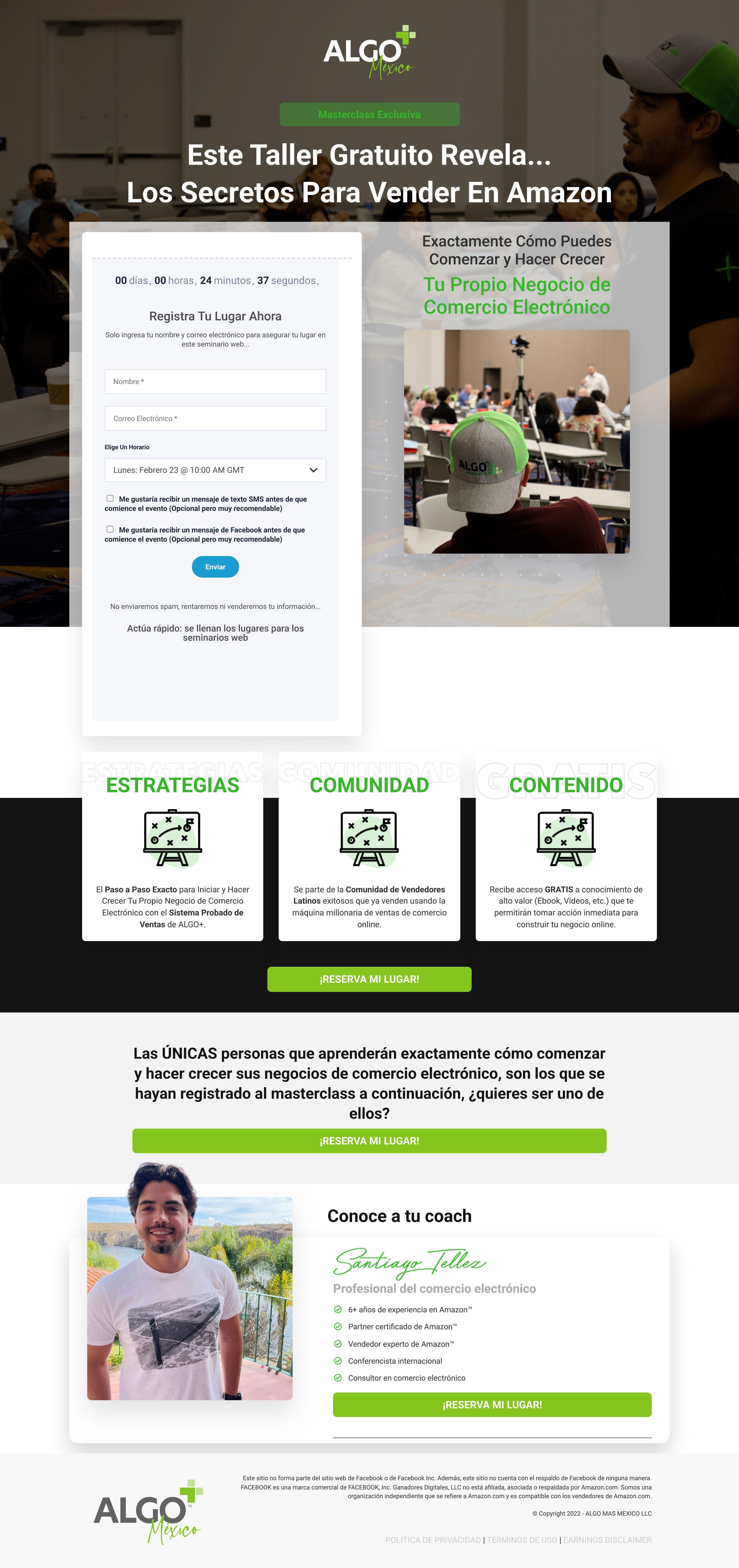
The landing page promotes a free "Masterclass" (workshop) titled "The Secrets To Selling On Amazon" by Algo Más México. Its primary business goal is to generate leads by registering users for a specific date/time webinar to learn e-commerce business strategies.
Check out our curated database of landing page examples to see what is working right now.
To create a high-converting page like this, use Swipe Pages, a leading landing page builder and funnel platform for conversion focussed marketers
Key Insights
What Works Well
- Clear Value Proposition: The headline "This Free Workshop Reveals... The Secrets To Selling On Amazon" is direct and clearly states the benefit.
- Prominent CTA: The sticky/repeated CTA "¡RESERVA MI LUGAR!" (Reserve My Spot) uses a bright lime green color that contrasts well with the dark and white backgrounds.
- Trust Signals: The "Conoce a tu coach" (Meet your coach) section establishes authority by listing Santiago Tellez’s credentials, such as "6+ years of experience" and "Amazon Certified Partner," accompanied by a professional photo.
- Mobile Responsiveness: The content stacks logically on mobile, keeping the registration form accessible near the top without clutter.
- Supporting Content: The breakdown of the workshop into three pillars (Strategies, Community, Content) helps users understand exactly what deliverables they will receive.
Opportunities for Improvement
- Visuals: The icons used for the three benefits sections (Estrategias, Comunidad, Contenido) are identical. Using unique icons for each would visually reinforce the distinct benefits.
- CTA Optimization: The button inside the form says "Enviar" (Send) and is blue, while the main page CTAs are "¡RESERVA MI LUGAR!" and lime green. Aligning the form button's text and color with the primary brand CTA would improve consistency and conversion.
- Social Proof: There are no visible testimonials or reviews from past attendees. Adding success stories or "results" screenshots would significantly boost credibility.
- Objection Handling: A mini-FAQ section addressing common doubts (e.g., "Is this for beginners?", "Do I need capital?") could reduce friction for hesitant visitors.
- Form Friction: The form asks for both Email and optional SMS/Facebook message consents. Simplifying this or making the value of the opt-ins clearer could improve completion rates.
Layout Differences: Desktop vs Mobile
- Desktop: Features a split layout in the hero section with the registration form on the left and the value proposition/imagery on the right. The benefits section displays horizontally in three columns.
- Mobile: The layout is fully stacked. The registration form appears very high up (above the fold), prioritizing immediate conversion. The benefits icons and text stack vertically, requiring more scrolling to see the full offer.
Summary
The page effectively uses a strong headline and urgency (countdown timer) to drive webinar registrations. The coach's credentials provide solid authority. However, the page misses a key opportunity for conversion by lacking social proof (testimonials) and using repetitive iconography. Aligning the form button design with the rest of the page would also create a more cohesive user experience.


